
To create a chart with three variables in Microsoft Excel, select the data for the chart, click the Insert tab, go to Insert Column or Bar Chart, and choose the chart style you prefer.
Let’s go over this in detail!
How to Graph Three Variables in Excel
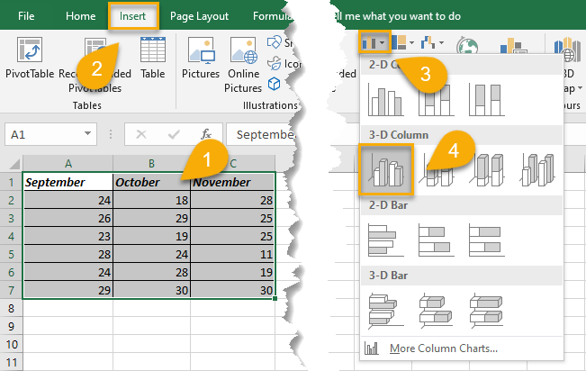
1. Select your data.
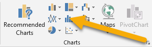
2. Navigate to the Insert tab.
3. In the Chart section, choose Insert Column or Bar Chart.
4. Pick the chart style you like.
Easy-peasy!
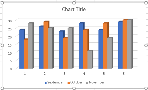
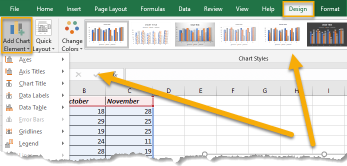
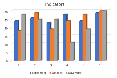
Just like that, you have produced a graph with three variables in a matter of seconds. However, sometimes the default version doesn’t provide as much detail as you need. To update the chart to reflect the data you desire, go to Add Chart Element in the Design tab and determine what options you would like to add (such as a title, a legend, or labels).
Excel Chart with Three Variables FAQs
Let’s go through some of the most frequently asked questions and their replies to better comprehend this topic!
What is the three variables chart?
The three variables chart is a graph that plots data points using three variables for each data point. It is useful when you need to represent data expressed through three variables. These variables can be any numeric value. Such a graph is an effective way to visualize the relationship between the three variables.
What types of charts can be constructed with three variables?
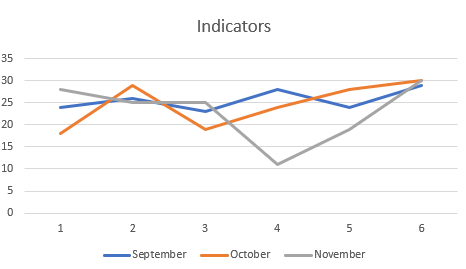
There are different types of graphs that can be used to display three variables. In this article, we show you a bar chart, a common chart type that can be used to show how three variables compare with each other.
Another popular type of chart is the line graph.
Finally, the scatter or bubble chart is often used to compare the values of multiple variables.
To create these charts, simply follow the step described above, but in the Chart section, choose a different type of chart to reflect the kind you need.
What are the practical aspects of charts with three variables?
Firstly, a chart can help you to see the relationships between variables more clearly than if you were looking at the data points individually. This is especially helpful if you have a lot of data.
Secondly, it can be used as a tool for communicating information to others. If you need to share data with colleagues, a graph can be a more visually appealing and easy-to-understand way to do so than by providing raw data points.
Lastly, charts with three variables can be used for trend analysis. By tracking changes in the variables over time, you can identify trends and make predictions about the future.
