Large chunks of data can be confusing to process for both experienced Excel users and newbies alike. It can be difficult to organize information and effectively express it in an Excel spreadsheet if you’re not sure what your options are. Fortunately, Excel provides the opportunity to create charts easily.
Read on for a step-by-step process on how to create a linear calibration curve in no time at all.
Prepare and Format Your Data
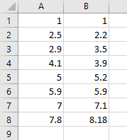
In order to make a linear calibration curve—or any chart, really—you need to have at least one column of data.
Here we have two columns with random indicators:
How to Make a Linear Calibration Curve in 8 Easy Steps
The following steps are fairly straightforward. Let’s do them together!
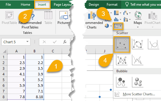
1. Highlight the data you need (A1:B8).
2. Click “Insert.”
3. Select “Insert Scatter (X, Y) or Bubble Chart.”
4. Choose “Scatter.”
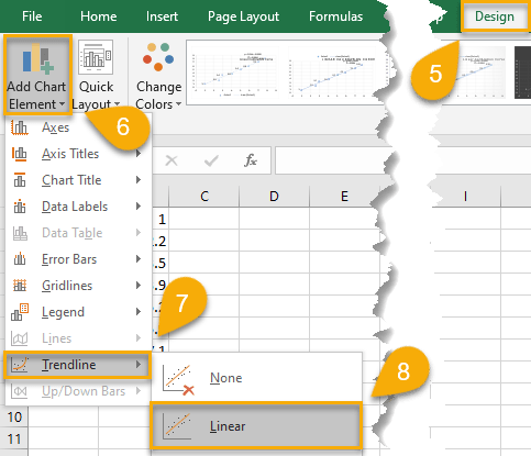
5. Navigate to the Design tab.
6. Click “Add Chart Element.”
7. Pull up the Trendline option.
8. Choose “Linear.”
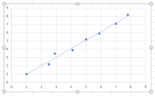
That’s all there is to it! You’ve successfully created a linear calibration curve. Scatter charts useful for creating other types of statistical graphs in Excel such as residual plots.
How to Customize Your Linear Calibration Curve
Now that you have your linear calibration curve, let’s see what we need to do to customize the look of your chart. Here are some tips on how to make it more informative and professional using Excel’s customization tools.
Changing the Title of Your Linear Calibration Curve
Charts are given titles to help the reader understand the data they represent. In Excel, adding or modifying your chart title can be done with ease.
1. Click once on your linear calibration curve chart.
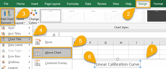
2. Navigate to the “Design” tab.
3. Open “Add Chart Elements.”
4. Select “Chart Title.”
5. Choose either “Above Chart” or “Centered Overlay” to set the position of your chart title.
6. Adjust the title text to reflect your chart’s data.
Just like that, your title is ready!
Adding a Legend to Your Linear Calibration Curve
If you need to display additional information in your chart, you can add a legend as well to help your reader understand your chart better. Here are five simple steps to add a legend to your chart:
1. Click on your linear calibration curve chart.
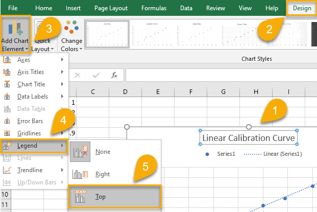
2. Pull up the “Design” tab.
3. Click “Add Chart Elements.”
4. Choose “Legend.”
5. Select “Right,” “Top,” “Left,” or “Bottom” to add the legend in the position that works best for you.
As easy as ABC!
Adding Data Labels to Your Linear Calibration Curve
Data labels can be used to display important indicators and make your linear calibration curve more informative. Once again, Excel makes improving your chart simple and convenient.
1. Click once on your chart.
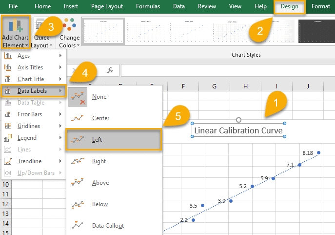
2. Go to the “Design” tab.
3. Open “Add Chart Elements.”
4. Choose “Data Labels.”
5. Select “Center,” “Left,” “Right,” “Above,” “Below,” or “Data Callout”—whatever makes your chart look amazing.
A piece of cake—and so helpful!
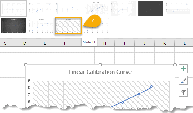
Applying a Different Style to Your Linear Calibration Curve
You can use some built-in Excel Chart Styles to complete the look of your chart. Follow this step-by-step guide to learn how to apply a different style:
1. Click once on your chart.
2. Select the “Design” tab.
3. Click the small arrow in the lower right corner of the Chart Styles to see all your options.
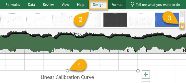
4. Choose the design you like the most.
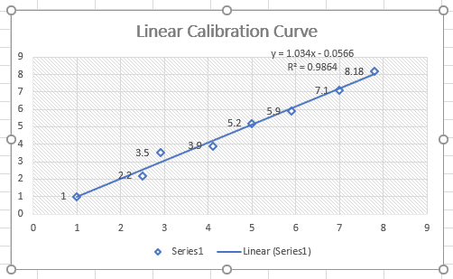
Showing Equation and R-squared Value on a Chart
If you wish to display the equation and r-squared value of the linear calibration curve on your chart, just follow these extremely easy steps:
1. Click on your Linear Trendline twice. This will open the Format Trendline task pane.
2. Select the “Design Options” tab.
3. Tick the boxes beside “Display Equation on chart” and “Display R-squared value on chart.”
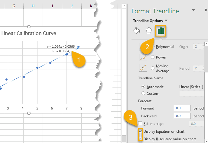
And there you go! If you need to move the equation and r-squared value to a different part of the chart, just select the Excel text box with that data and drag it to where you want it.
Excel Linear Calibration Curve – Free Template
If you lack the time to put a linear calibration curve together yourself, we’ve prepared a free template of the Excel Linear Calibration Curve for you to download.