Almost every chart consists of two axes: a horizontal axis (often known as the X-axis) and a vertical axis (the Y-axis). As essential as these axes are in general, the scaling used on each is just as important. If you put together a chart to compare salaries and your salary data scale is in billions, how informative will that be for your manager?
Now, perhaps you understand the seriousness of proper axis scales but need help managing those in your Google Sheets charts. Don’t worry—we’ve got your back! This article will lead you step by step through the process of managing axis scales in Google Sheets, including available customizations and many other cool features.
Let’s jump into it together!
Quick Jump
ToggleWhat Is an Axis Scale on a Google Sheets Chart?
Axis scales are the units by which each axis is measured. For example, if your X-axis contains values that range between 100 to 200, the chart you plot will divide your values into 4 or 5 intervals of 20 to 25 units each, ranging between 100 and 200.
Axis scales divide data points using gridlines to help you understand the data distribution more precisely.
Words of Wisdom: When one of your axes is plotted across categorical data, each category it holds becomes a separate scale for your axis. For example, if you have three soda bottle categories—small, medium, and large—your axis will only consist of these three scales.
How to Change the Horizontal (Category) Axis Scale
To change the horizontal axis scale (X-axis), follow the steps below:
1. Insert a chart (such as a scatter chart) based on your data by selecting the entire range of your data, going to the Insert menu, and selecting Chart.
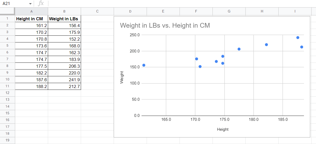
You can see here that the X-axis labels start at 165, although we have a value below that (161.2) in our data. This puts a data point right on the edge of the axis. By simply adjusting the scaling of the X-axis, we can improve the readability of the data.
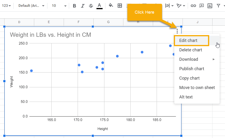
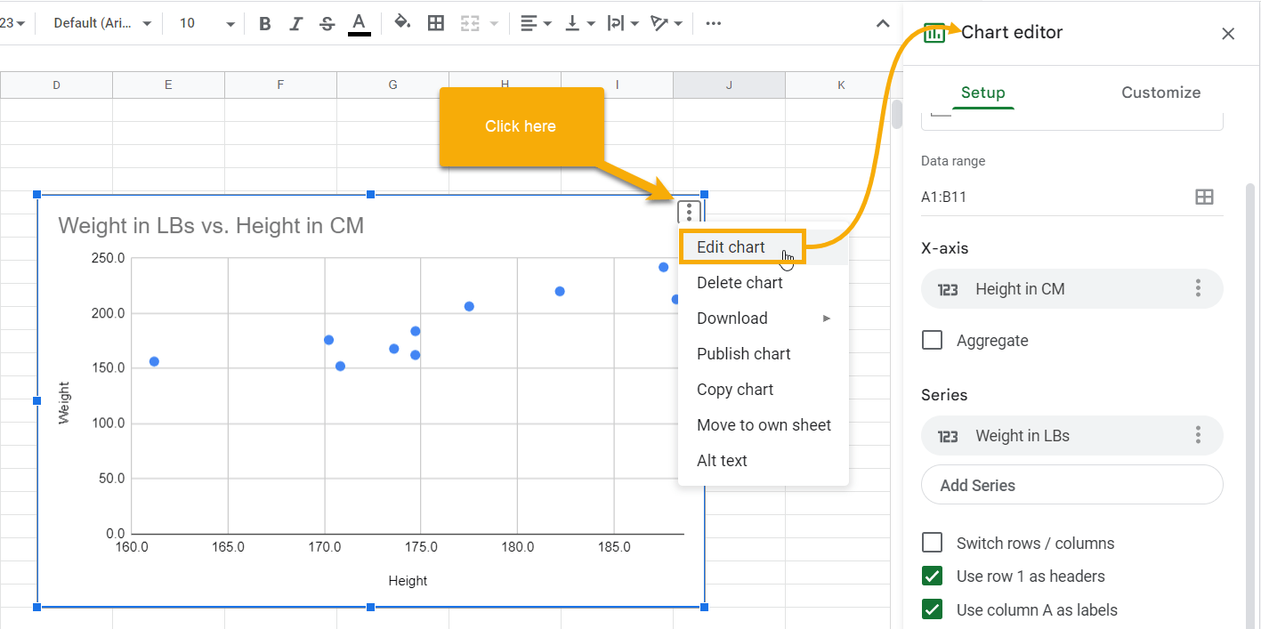
2. Select the graph and click the three dots in the upper right corner to reveal a menu. From the menu that appears, select Edit chart. This will open the Chart editor window to the right.
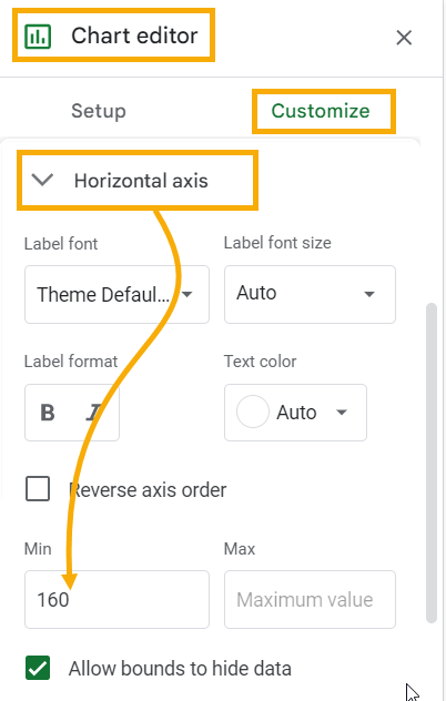
3. In the Chart editor, click on the Customize tab. Find the Horizontal axis section and expand it. In the Min input box, type the minimum value as 160. Click on any area of the sheet to apply this change to the chart.
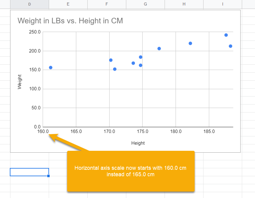
On the updated X-axis scale, you can now see one more unit (160) added at the extreme left of the horizontal axis. This gives you a clearer view of the height value of 161.2 cm.
How to Change the Vertical (Value) Axis Scale
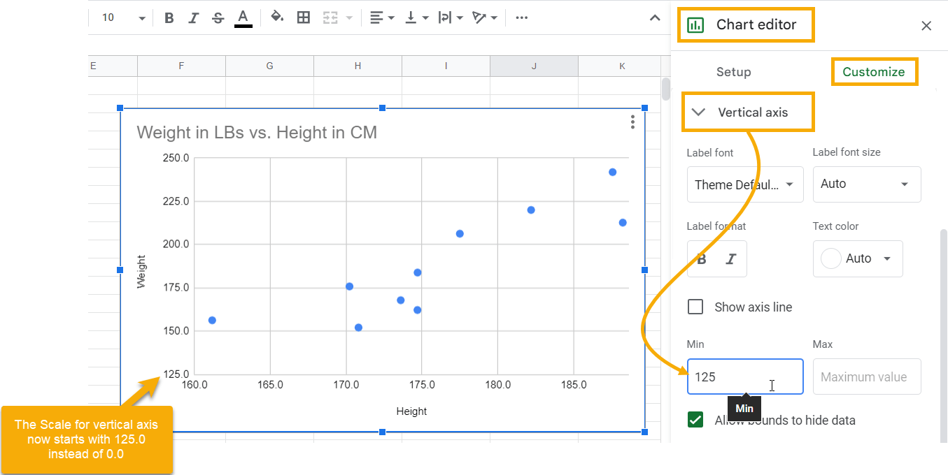
If you take another look at the chart, the weight values on the vertical axis actually start somewhere around 150, not zero. This is logical enough, as no weight value is ever zero. Since the data points start so far up the chart, let’s change the scale for this axis to start at 125.0.
The directions below will show us how to do just that:
1. With the scatter chart already created, click on it and select the three dots in the upper right corner. From the menu, select the Edit chart option to open the Chart editor window.
2. In the Chart editor, click the Customize tab and expand the Vertical axis section. Add the value 125 to the Min text box.
This changes the scale to start from 125.0 for weight instead of 0.0.
Pro Tip: Depending on the data you are working with, the Max text box is also helpful to adjust the axis scale to a maximum value. This option is available for both axes.
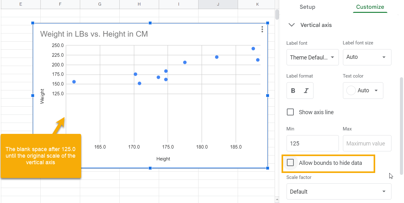
Words of Wisdom: Always make sure you tick the Allow bounds to hide data checkbox. Otherwise, while your axis scale will change, there will be a blank space below it. For example, in the example above, if you uncheck the Allow bounds to hide data checkbox, the vertical axis scale will change to start at 125.0, but there will be a blank space below it as the scale still extends to zero, as demonstrated below:
Axis Scale Customization Options in Google Sheets
While you’re making adjustments to the scales for your axes, also check out some other options for customization. In this section, we’ll take a look at what is available under the Chart options.
The Scale Factor for Both Vertical and Horizontal Axes
Different users look at data in different ways. For example, looking at salaries in the millions may be convenient for one person, but for someone else, it may be better to represent them in the thousands. This is where customization comes in. The Scale factor in Google Sheets allows you to change the units in which your values are displayed so that each factor you choose adjusts the chart accordingly.
Suppose you want to show the height values in our example in millimeters rather than centimeters across the horizontal axis. You could potentially make these conversions in the dataset by multiplying each height value by 10. But with the Scale factor, you can directly apply the appropriate scale to your axis data inside the chart without changing the source data.
Here’s how to do it:
1. Open the Chart editor window, go to the Customize tab, and expand the Horizontal axis section. Scroll down to the Scale factor option.
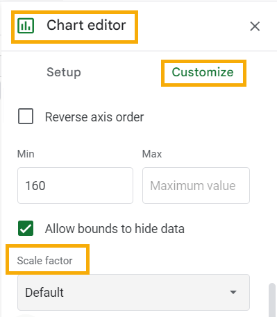
2. In the Scale factor drop-down menu, various options allow you to divide your scale. Choose the second option, 0.1, to convert the horizontal axis data from centimeters to millimeters.
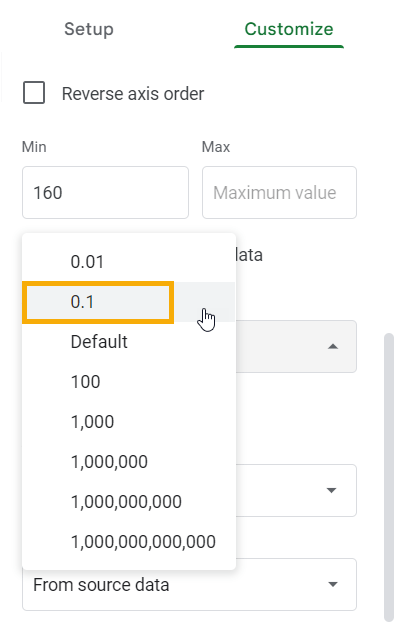
Note: Since the Scale factor divides the axis scale, use 0.1, as multiplying by 10 is equivalent to dividing by 0.1.
Now the horizontal axis shows the data in millimeters rather than centimeters. See below:
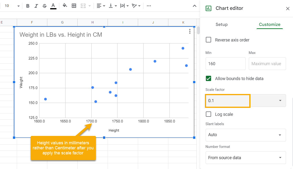
Follow these steps to change the Scale factor for the vertical axis as well.
The Slant Label to Customize Both Horizontal and Vertical Axes
When you have a lot of data in your chart, the labels can often end up crowding each other, making it rather difficult to read the chart.
Thankfully, there is a customization option that angles the label orientation so they won’t overlap each other. The Slant label option in Google Sheets offers a quick and easy way to do this.
Follow the steps below to slant the labels for the horizontal axis:
1. Go to the Chart editor, open the Customize tab, and expand the Horizontal axis section. Scroll down to the Slant label option.
2. Click the Slant label drop-down menu and select the angle by which you want to rotate your axis labels. You can change the orientation anywhere from 0 to 90 degrees using the drop-down menu. The 60 degree slant is a popular option to make the labels stand out.
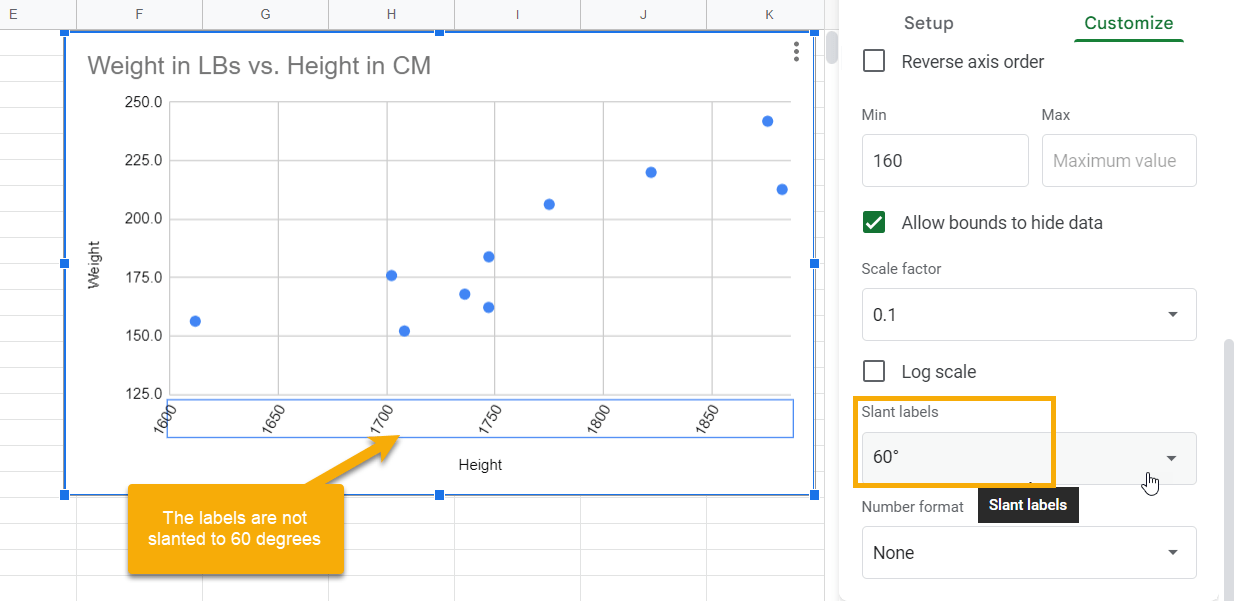
Pro Tip: You can also manually type the Slant label angle to change the orientation by the angle of your choice.
The Number Format Option
You may also want to make the number labels consistent between the two axes: if one goes to the tenths place, you may want to make the other do the same. Thankfully, the Number format option in Google Sheets can do this for you.
1. Open the Chart editor, select the Customize tab, and expand the Horizontal axis section. Go to the Number format section.
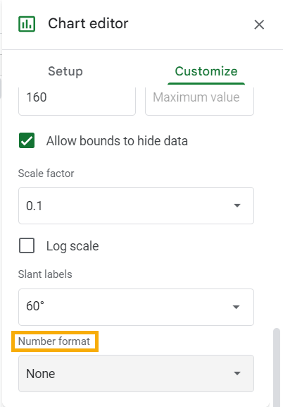
2. In the Number format drop-down menu, you will see various ready-made formats such as Currency, Date format, etc. You can also apply a custom format of your own under the Other custom formats option.
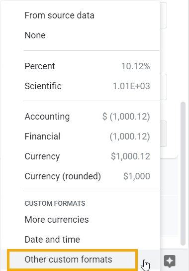
3. Once you click on Other custom formats, it will open the Custom number formats window. Choose from among the custom formats listed there or type one of your own. In the text box at the top, type in 0.0 and click Apply to apply the one-decimal custom numbering format to the horizontal axis labels.
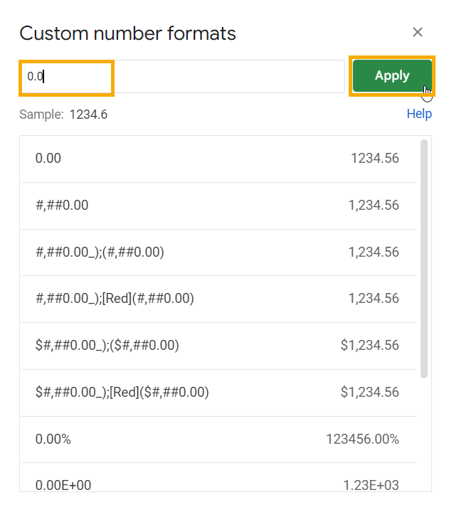
Pro Tip: Always pay attention to the Sample section below the text box in which you type a custom format of your own. It shows how the format will change the appearance of the numbers you are applying formatting to. This is an excellent way to preview the data after formatting. You can create multiple custom formats of your own by using this method.
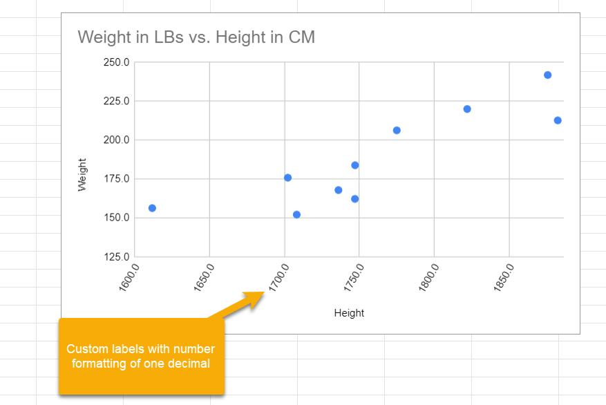
The horizontal axis label now should have an extra decimal after the whole number.
How to Change the Axis to Log Scale in Google Sheets
Follow the steps below to convert an axis scale to a Log scale:
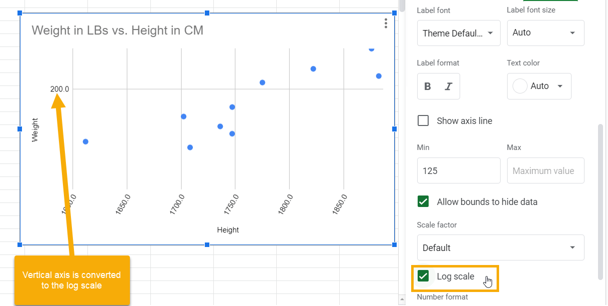
1. Open the Chart editor and go to the Vertical axis section.
2. Click on the Log scale checkbox, placed exactly below the Scale factor drop-down menu. Tick the checkbox to convert your vertical axis to the logarithmic scale. The graph will change, as shown in the screenshot below:
How to Adjust Axis Intervals
So far, you have manually changed the axis scale to a value of your choice by entering Min or Max value bounds. However, there is another option by which you can change these scales by intervals.
1. Open the Chart editor, go to the Customization tab, and expand the Gridlines and ticks section.
2. Select the Vertical axis from the drop-down menu.
3. In the Major spacing type drop-down menu, select Step.
4. In the Major step text box, type 10 to change the vertical axis scale to every 10 points.
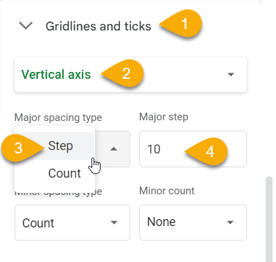
Use the same method to change the steps for the horizontal axis scale to 10 units as well by selecting the Horizontal axis from the Gridlines and ticks drop-down menu.
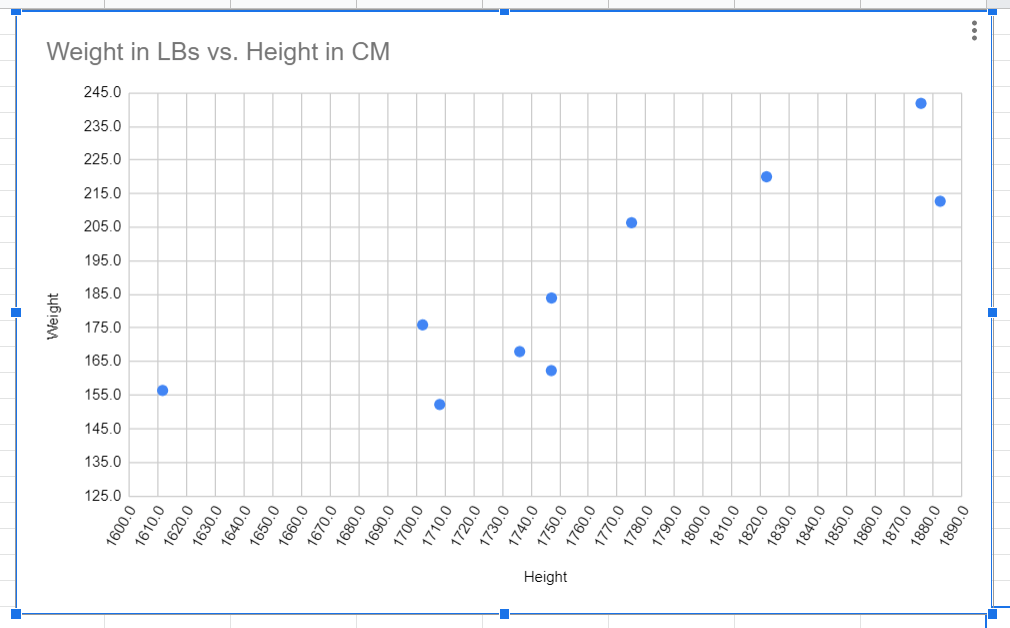
Finally, the scatter plot should look like the one shown below:
These are a few of the options and customizations available for the axes in your Google Sheets chart. Which one did you find most helpful? Let me know through the comment section below.