To add vertical or horizontal gridlines to your chart, select the chart and click the three dots in the upper right corner. From the menu, choose Edit chart to open the Chart editor. In the Customize tab, expand the Gridlines and ticks section, then check the boxes beside Major gridlines and/or Minor gridlines as needed.
Introduction
One common issue when working with charts in Google Sheets is figuring out how to add vertical and horizontal gridlines to help with readability. Gridlines are included by default when you insert any chart, but if the units used to establish the gridlines are not specified properly, they can end up making your chart harder to understand, not easier.
In this article, we will take a look at the methods to add horizontal and vertical gridlines to your chart in Google Sheets.
The Database
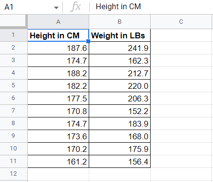
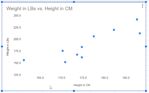
Suppose you have a dataset, as shown below, representing the height and weight of a group of people. You may decide to insert a scatter chart into your spreadsheet, showing the relationship of the two body measurements with each other.
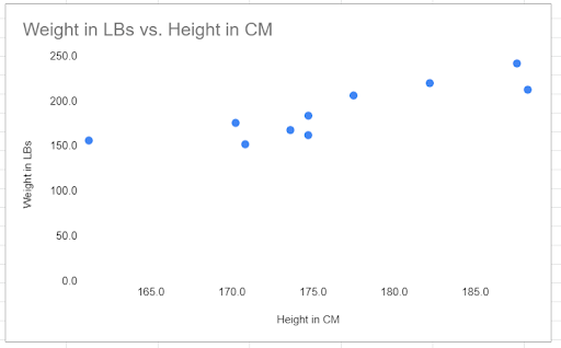
To add a scatter plot based on this data, click on the Insert menu and select Chart. Google Sheets will insert the most relevant chart type for your data. In this case, the scatter plot is the default chart type.
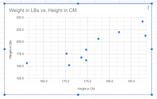
Because your data does not include anyone with a weight below 125 pounds, the data for the vertical axis (up and down) appears shifted to the top part of the chart. We can adjust that by changing the minimum value for the vertical axis from 0 to 125.
Here’s how we do that:
1. Double click on the vertical axis labels. This will pop up the Chart editor on the right side of the sheet.
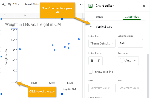
2. The Chart editor will open in the Vertical axis section of the Customize menu. In the Min box, type the value 125.
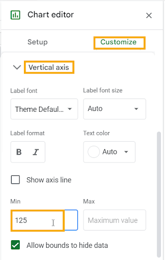
Once the change is applied, the data points will reset to better fill the chart.
How to Add Vertical Gridlines to a Chart in Google Sheets
Now, to add the vertical gridlines to this chart in Google Sheets, follow the steps below:
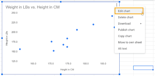
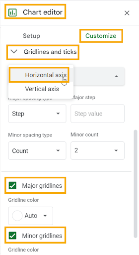
1. With the chart selected, click on the three dots in the upper right corner of the chart In the drop-down menu, select the Edit chart option. This will open the Chart editor.
2. Click on the Customize tab.
3. Scroll to the Gridlines and ticks section, at the end of the list of options, and expand it by pressing the arrow beside the name.
4. The first drop-down menu addresses Vertical and Horizontal axes. Select Vertical axis.
5. Tick the boxes next to Major gridlines and/or Minor gridlines as desired. These will allow you to add gridlines to your chart for the vertical axis.
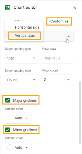
Major gridlines are the primary gridlines on a chart, representing the main axis label points. On our chart, the major gridlines start at 125.0 and go to 250.0, with a mark at each set of 25 units, resulting in six major gridlines.
You can change how your major gridlines appear by adjusting the Major spacing type between Step or Count.
Under the Step option, determine the Major step value, such as 25, which represents the number of units between major gridlines (from 125 to 150, from 150 to 175, and so on).
Under the Count option, choose a Major count value, such as 6, which represents the total number of major gridlines on your chart.
You can also choose a Gridline color to customize it to help it stand out.
Minor gridlines divide each main section into smaller sections, making it easier to determine the value of points that fall between the major gridlines.
Make adjustments to the Minor spacing type by choosing either Step or Count and choosing the amount, as well as selecting a Gridline color if you don’t want to use the default.
You can choose to show just the major gridlines or both major and minor gridlines, depending on your preference for your chart.
With both major and minor gridlines set, the final output should be as shown below:
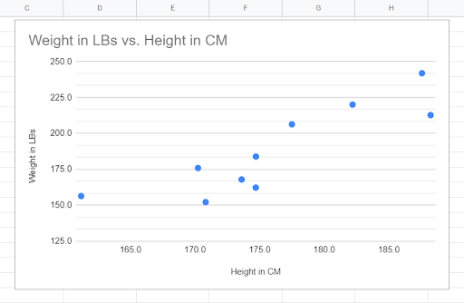
As you can see in our example, the Major gridlines are placed precisely on each data label for the vertical axis. The Minor gridlines are set to a Count of 2, which adds two Minor gridlines between each Major gridline.
How to Add Horizontal Gridlines to a Chart in Google Sheets
Now that we have set up the vertical gridlines, let’s take a look at adding the corresponding horizontal gridlines to finish up our chart. Simply follow these steps to add the horizontal gridlines:
1. Select the chart and click on the three dots in the upper right corner. From the menu that appears, select Edit chart to open the Chart editor.
2. Go to the Customize tab.
3. Expand the Gridlines and ticks section.
4. Select the Horizontal axis option.
5. Tick the boxes beside Major gridlines and Minor gridlines as desired, following the method described above to customize your gridlines.
In our sample chart, we can see that the Major gridlines for the horizontal axis correspond with the labels, while the Minor gridlines break up each larger section into smaller units.
The final output now looks like the one shown below: