
Predict future results or expected values of a dependent variable in Google Sheets using the trendline equation generated from a graph.
Extrapolation involves using historical information to make predictions about events that will happen in the future. In this post, you will learn how you can extrapolate a graph in Google Sheets.
How to Extrapolate a Graph in Google Sheets
Data analysis can be presented in various ways. Two of the most popular types of data analysis are descriptive and prescriptive analysis.
Descriptive analysis provides insight into what has happened in the past.
Prescriptive analysis, on the other hand, builds on descriptive analysis. When you do prescriptive analysis, historical data is used to create a model or an equation. This model is then used to speculate on future occurrences or expectations.
Predicting future events based on past occurrences is what extrapolation entails. To extrapolate a graph in Google Sheets, here are the steps involved.
Step 1: Prepare the Data
In preparing your data, make sure you do the necessary data cleaning and transformation. This includes checking for and managing outliers, missing values, improper formatting, and all types of errors that can reduce the model’s accuracy.
Step 2: Insert a Line Chart
Once the data is prepared, the next step is to insert a chart. Simply do the following:
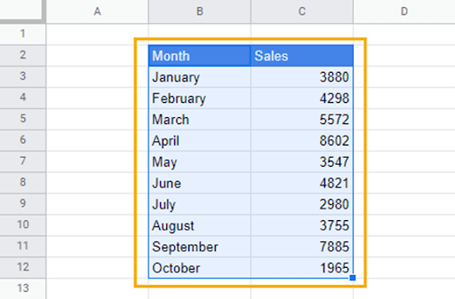
1. Select the data.
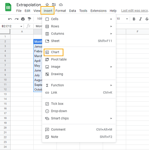
2. Go to the Insert menu. Select Chart from the dropdown options.
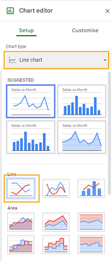
3. From the Chart editor window on the right of the spreadsheet, go to the Chart type section, click on the dropdown chart options, and select Line chart.
Now you should have a line chart on your spreadsheet.
Step 3: Add a Trendline
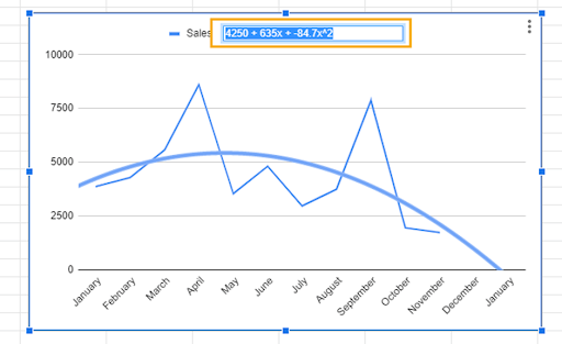
The trendline on a graph is used to estimate the underlying pattern of individual data points. Data points on a graph can be all over the place, but a trendline provides an estimate of the direction toward which the data tends.
Trendlines also provide a model or equation that is used to estimate the relationship between variables and predict future values.
To add a trendline, follow these steps:
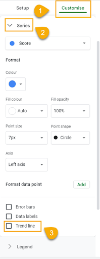
1. In the Chart editor, click on the Customize tab.
2. Scroll up until you find the Series dropdown.
3. After clicking on the Series dropdown, go to the options in the last row. Check the Trendline box.
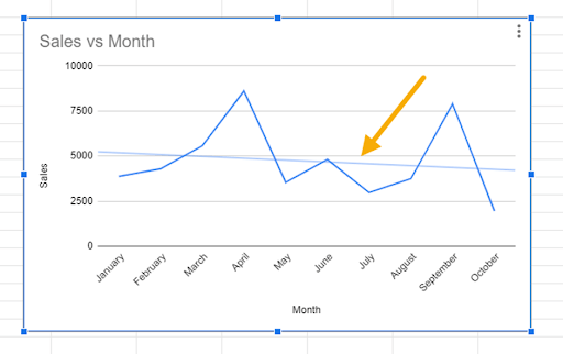
A straight line will appear across the graph as in the image below.
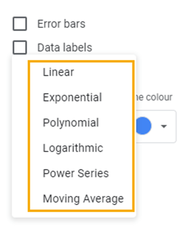
By default, the trendline uses a linear relationship to estimate the direction. However, the spreadsheet provides six different types of trendline options.
You can see these options by clicking on the Type dropdown box.
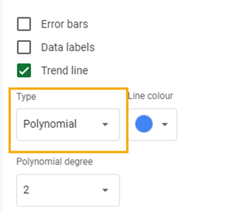
This will show you all the available trendline options.
To use the most appropriate trendline for your data set, you must consider the following important information.
1. The R-squared Value: The R-squared or coefficient of determination tells you how much variation in the dependent variable is explained by the independent variable. In other words, it measures how much influence variable X has on variable Y. By taking the square root of R-squared, you can get the correlation coefficient. The correlation coefficient is a measure of the strength and direction of the relationship between two variables.
To add the R-squared value to your graph, check the R-squared box.
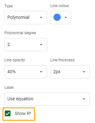
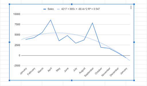
The R-squared value should appear on the graph alongside the equation of the trendline.
The R-squared value ranges from 0 to 1. When choosing a trendline, you should use one with an R-squared that is closer to 1. The closer the R-squared is to 1, the more reliable the trendline equation.
2. The Pattern of the Graph: Graphs have different patterns, and each one can be described using any of the trendline types mentioned above. Therefore, understanding the pattern of your graph will help you select the best-fit trendline for the model.
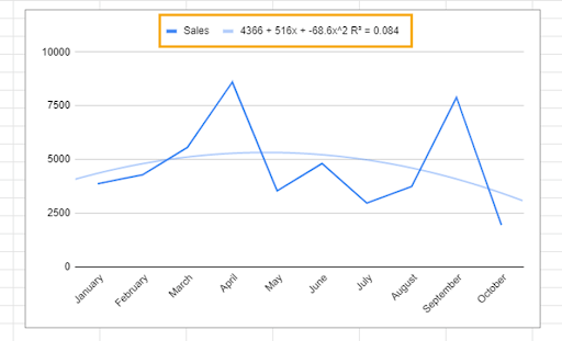
In our sample, our graph doesn’t display a straight-line pattern. It doesn’t rise and fall at a constant rate; therefore, a linear graph won’t be appropriate.
The graph has a polynomial pattern. A polynomial trendline is best fit for a curve that has multiple highs and falls or bends (hills and valleys). As such, a polynomial trendline is most appropriate for our sample data. You will also find that the R-squared is much closer to 1 than that of the linear trendline.
Step 4: Extrapolate Data
With the trendline equation, we can extrapolate values for the upcoming months in our sample data.
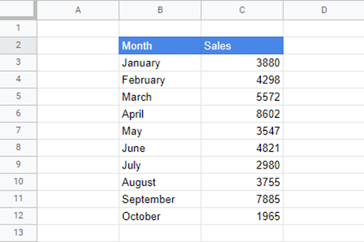
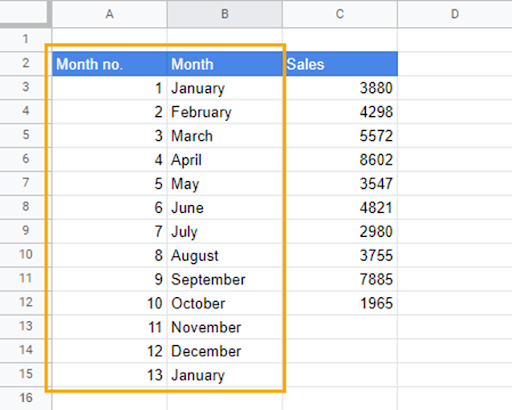
Our sample data contains sales information from January to October. The first thing we need to do is to add November and December to the Month column. After this, we will create a new column called month number (Month no.) and enter the corresponding month numbers.
Now, to get the expected sales value for November, follow these steps:
1. Double-click on the equation in the graph to highlight it. Then copy the highlighted equation.
2. Paste the copied equation into the cell that records the sales figure for November (C13).
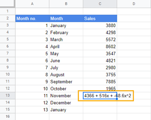
3. Transform the copied equation into a formula. Add an equal to sign “=” in front of the equation, replace the parentheses with asterisks “*” and replace “x” with cell references from the Month no. column.
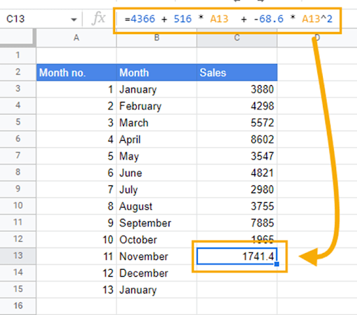
When you drag down the formula, you can predict future sales value for the remainder of the months.
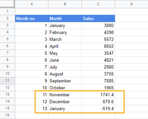
As the new values are added, the curve on the graph also adjusts with respect to the changes. The trendline equation will also update.
Extrapolation in Google Sheets: FAQs
Can you extrapolate a line in Google Sheets?
Yes, you can extrapolate a line graph in Google Sheets.
How do I extrapolate a graph?
Extrapolating a graph in Google Sheets is easy. The first thing you want to do is make sure your data is prepared. That means scanning for errors and outliers that can affect your model negatively. When you’re sure your data is in the right shape, select the ranges containing your data, go to the Insert menu, and select Chart. You can also insert the chart from the toolbar options.
After inserting the chart, change the chart type to a Line chart in the Chart editor. From here, you want to add a trendline. To add the trendline, click on the Customize tab, go to the Series option, and add a checkmark to the Trendline box. From the options that appear, add a checkmark to the Show R2 box and select Use equation in the Label option.
When you do this, a trendline, an equation, and the R-squared value should appear on the chart. The closer the R-squared value is to 1, the more accurate the equation will be.
To extrapolate future values, copy the equation by double-clicking on the equation in the chart. Paste this equation in the cell whose value you want to determine. Transform the copied equation into a formula by adding an equals sign “=” in front of the equation, replacing parentheses with asterisks “*” and “x” with cell references.
Dragging down the formula, you can now get the expected values of future events.
