
Graphs and charts are a great way to represent your data visually. Some may want to plot the relationship between two variables through a suitable chart (usually a scatter plot or line chart). Others may be more interested in the relationship equation between two variables. Whether the trend is linear, exponential, polynomial, or otherwise, if plotted on a graph, the equation provides a mathematical understanding of these trends and can be helpful in calculations.
In this article, we will teach you how to add an equation to a graph in Google Sheets, and you will also learn how to graph an equation without having data.
How to Add an Equation to a Graph in Google Sheets (Step by Step)
This section will teach you how to add an equation to your graph. The ideal situation here is that you plot your data in Google Sheets using an appropriate chart, and the equation for that plot is shown on the graph. Simply follow the steps below to accomplish this for yourself.
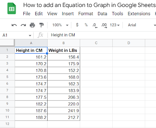
1. Start by setting up the data to plot and to create the equation for. The screenshot below shows Height vs. Weight comparison data. You can follow this demo to see how the process works. The Height values are measured in centimeters (CM), and the Weight values are measured in pounds (LB).
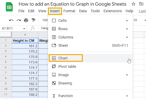
2. Highlight the entire data from columns A and B (A1:B11). Click on the Insert menu in the Ribbon. From the options in the list, select Chart.
Pro Tip: In the past, you were required to highlight the entire dataset in order to insert a chart. However, Google Sheets has evolved to the point where as long as you select a cell within the dataset, any chart you insert will be based on that dataset.
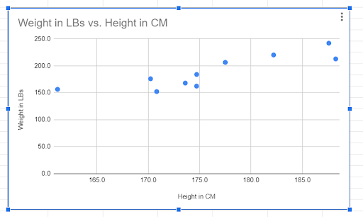
3. Your new chart will be added to your spreadsheet. The Google Sheets IntelliSense will automatically pick the most suitable chart for the data provided (in this case, a scatter plot).
Note: If you wish to change the chart type, you can do it through the Setup tab under the Chart editor window that opens up when you choose Edit chart from the Chart options.
Now let’s add a trendline to this chart, which will define the equation for the chart itself.
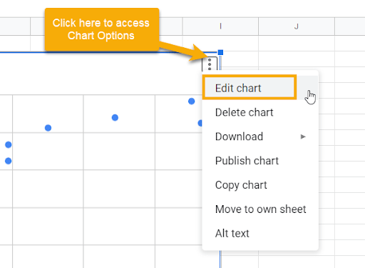
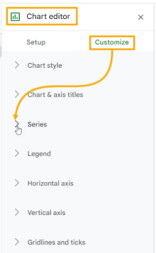
4. Click on the three dots in the upper right corner of the chart and select the Edit chart option.
5. The Chart editor will open on the right side of the sheet. Go to the Customize tab and expand the Series section.
6. At the bottom of the Series section, there are three checkboxes for adding three different elements to your chart. Tick the Trendline checkbox to add a trendline to the scatter plot.
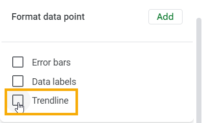
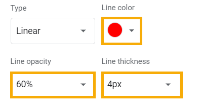
Pro Tip: Below the Trendline checkbox, you have various options to personalize your trendline. To get the exact result from our demo, do the following:
- Change the Line color to Red.
- Set the Line opacity at 60% (this will make the line pop up over the data points).
- Set the Line thickness to 4px (basically a line with a width of 4 points).
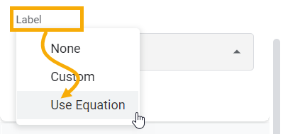
7. Finally, below the Trendline options you just set, there is a Label dropdown. Click on it and select the Use Equation option to add the equation to the scatter plot.
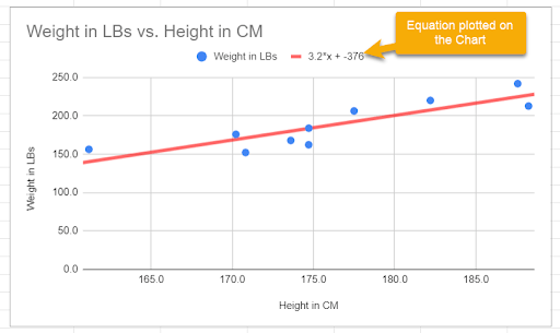
The final output should look like the one shown below, where the equation is also visible as a label on the chart.
This is how you can add an equation to your graph in Google Sheets.
Note: The equation represents the Trendline in mathematical form. You can also verify that with a small red line symbol next to the equation. This means that the points you plotted on this scatter chart follow this line closely.
Moreover, in the equation, if you input a height value of your choice, it should provide you with the weight value as a forecasted output.
Adding an Equation to a Graph in Google Sheets: FAQs
When it comes to adding a trendline equation to a graph in Google Sheets, you may find yourself asking more questions as you go along. We’ll take a look at some of the more common questions below.
How do I add a trendline equation to my graph in Google Sheets?
To add a trendline equation to a Google Sheets graph, follow the step-by-step guide above that has everything you wish to know in the process.
How do I graph an equation in Google Sheets without data?
This is a very frequent question. What if we don’t have values for a chart in Google Sheets, but we still want to graph an equation? As long as you have the equation, you can make the graph.
The equation can be of any type: a linear equation, quadratic, exponential, polynomial—any type of equation that you know should work fine. Just make sure you know what the equation is supposed to be.
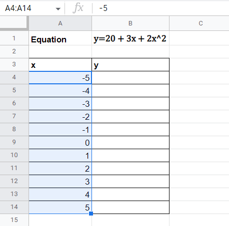
Suppose you have a polynomial equation of the second degree, as shown below: y=20+3x+2x2
Now, you want to create a graph and add this equation to that graph. Since you don’t have actual data available, you’re not sure what to do. The answer is actually quite simple.
Choose any numbers for the x variable, and you can use the equation to generate the y variable values in order to complete your dataset. Let’s assume that you have the values for the x variable between -5 and 5. You can implement this equation as a formula in Google Sheets to generate the values for the y variable.
1. In column A, add the values between -5 and 5, as shown below.
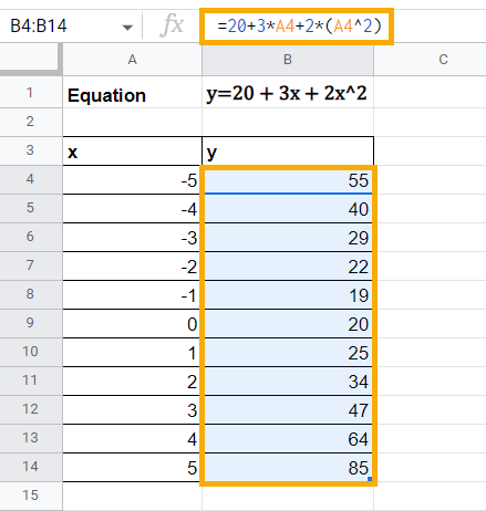
2. Now, in column B, plot the y values for the given x values using the equation. Use the following formula to replicate the equation for column B.
=20+3*A4+2*(A4^2)
3. Once your dataset is complete, select any cell from the data, go to the Insert menu, and add a Chart based on this data. If the inserted chart is not a scatter plot by default, you can change the Chart type in the Setup tab through the Chart editor.
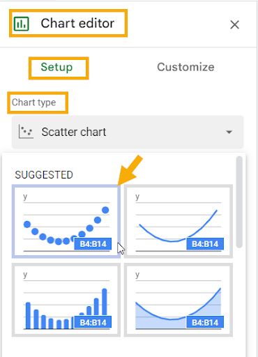
Note: You can also add an equation on the chart even if it is not a scatter plot. However, a scatter plot best suits such situations where you work with an equation.
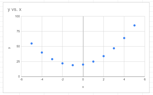
The scatter plot should look like the one shown below:
4. Go to the Customize tab in the Chart editor. Click on the Series section and tick the Trendline checkbox to add a trendline to the scatter plot to visualize the relationship between x and y.
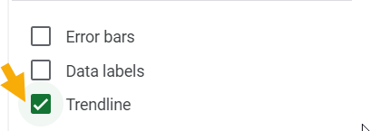
5. Follow the steps below to customize the trendline added to the scatter plot:
- Set the Type as Polynomial (the default is linear, which doesn’t suit this data).
- Change the Line color to Red to make the trendline pop out of the data points.
- Set the Line opacity to 60% and Line thickness to 4px.
The chart should now look like the one below:
Pro Tip: The Polynomial degree dropdown allows you to decide the degree of the polynomial equation. If you are plotting an equation that involves squared and cubed values of x, you should go with polynomial degree 3. But in this case, the equation is of the second polynomial degree, which is fine.
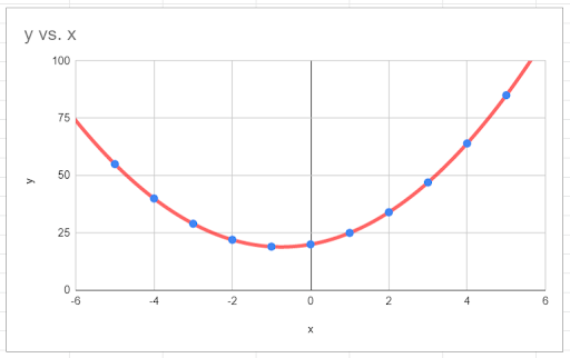
6. Finally, under the Label dropdown, select Use Equation. This adds the polynomial equation to your chart, as shown in the screenshot below:
This is how you can plot an equation even if you don’t have readily available data. The key here is this:
1. Change the equation into a formula in Google Sheets.
2. Generate dummy data of your own based on the formula.
