
By figuring out the correlation between variables, you determine whether they have a positive, negative, or non-existent relationship with each other. This can be estimated using either a mathematical model or a graphical method.
This article will show you a step-by-step breakdown of how to use the graphical method in Google Sheets to identify the relationships between variables.
How to Make a Correlation Graph in Google Sheets (Step-by-Step)
A scatter plot can be used to provide a visual representation of the correlation between two variables. Data points from both variables are plotted on the graph, allowing for a visual assessment of the nature or direction of the relationship.
Use the following steps to create a scatter plot in Google Sheets.
Step 1: Prepare Your Data
If you’re looking to put together a correlation matrix in Google Sheets, the first step is to prepare your data. When preparing your data, be sure to take note of two things, as they can negatively impact the result of your correlation if not taken into account:
- The data must be in numeric format. The scatter plot will omit any input that is not in numeric format, which means whatever results you get will be inaccurate because they are derived from incomplete data.
- Identify the dependent (y) and independent (x) variables and place them such that the independent variable comes before the dependent variable.
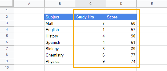
In our sample data, we want to find the relationship between Study Hours and Scores. The Study Hours column is the independent variable (x), so it comes before the Score (y, the dependent variable).
Put the columns containing the x and y variables in the proper order so they will be properly graphed on the scatter plot (x variables come first, then y variables).
Step 2: Insert the Scatter Plot
To insert the graph, follow these steps:
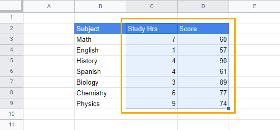
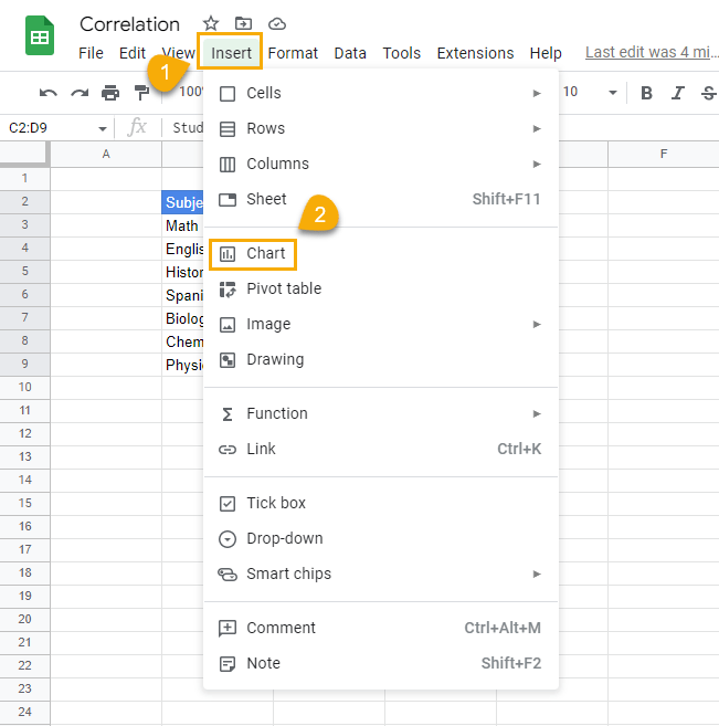
1. Select the columns containing the data you want to correlate (C2:D9).
2. Go to the Insert menu. Click on Chart.
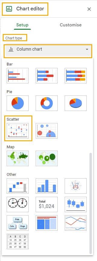
3. By default, a Column chart will be inserted into the sheet. To change the chart type, go to the Chart editor window that’s now open on the right side of the spreadsheet, find the Chart type section, and click the Column chart dropdown. Scroll to find and select the Scatter plot chart.
When you’re done with this step, your chart should look like this:
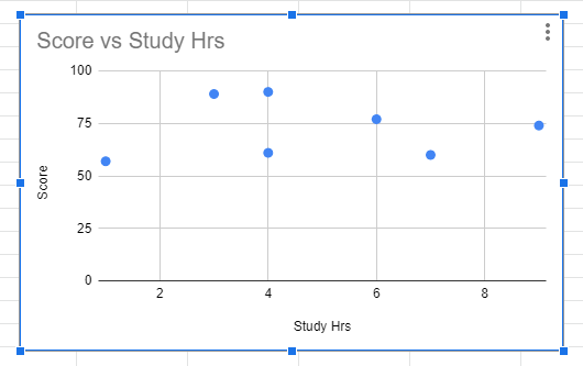
From the chart, you can easily tell there’s some sort of positive relationship between the Scores and the Study Hours variables. When there is a positive relationship between variables, the points on the chart will have a slope that moves upward from left to right.
Although it is not exactly a perfect upward slope in this case (as it is in most other cases), the direction of the points tends more toward a positive relationship.
To increase the accuracy of reading the correlation value, we can add two measures to the chart: a trend line and the coefficient of determination (r2 or R-squared).
Step 3: Add a Trend Line
The trend line is known as the line of best fit in statistics. It estimates the linear equation that best describes the nature of the relationship that exists between the variables. With the trend line, you can better understand the direction of the relationship between the variables on the scatter plot.
To add a trend line to the chart, simply follow these steps:
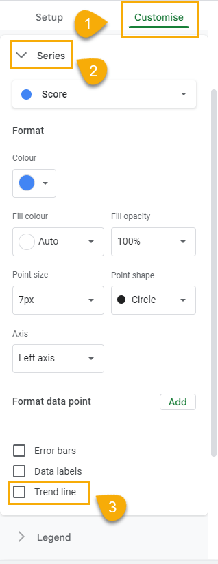
1. In the Chart editor, click on the Customize tab.
2. Scroll until you find the Series dropdown.
3. After clicking on the Series dropdown, go to the options at the bottom and check the Trend line box.
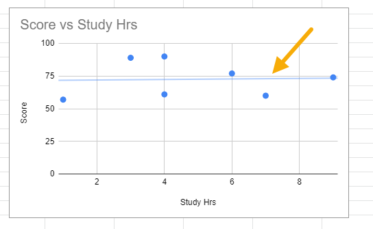
This will insert a line on the chart.
You can customize the line’s thickness and color for more visibility by following these steps:
1. In the Customize tab of the Chart editor, click on the Line color option to open the color palette and select your preferred color.
2. Click on the Line thickness option to choose any thickness you want. You can also increase (or decrease) the opacity using the Line opacity option.
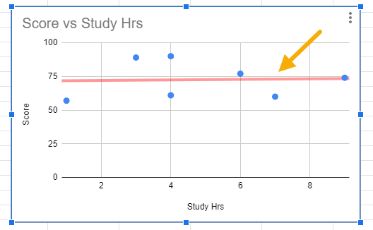
After customizing the line, it should be easier to see.
3. While it may not be entirely necessary since we’re only looking for correlation, you may like to see the equation of the line. This equation gives a clearer explanation of the linear relationship between both variables.
To see the equation of the trend line, click on the Line label option and select Use equation.
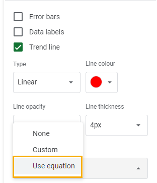
The equation should appear at the top of the chart as in the image below.
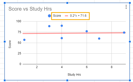
This equation further confirms that a positive relationship exists between both variables.
At the beginning, we mentioned making sure your data is in the right order when preparing for your chart. Here’s the reason why:
In the equation, we can see that the Score values were correctly identified as the dependent (y) variable, while the Study Hours variable was automatically assumed as the independent (x) variable. If our data wasn’t in the right order from the start, this would have been done the other way around. Not only would it have brought confusion, but the results also would definitely have been distorted.
At this stage, if there were any doubts about the trend line, the equation has now provided clear evidence that there’s a positive relationship between both variables.
Step 4: Add the R-squared or Coefficient of Determination Value
The R-squared or coefficient of determination value tells you how much variation in the dependent variable is explained by the independent variable. In our case, since Score is the y or independent variable, our R-squared will explain how much variation in Score is determined by the Study Hours variable.
You may ask how this is all connected with correlation. Here is the explanation:
The correlation value (also denoted with the letter “r”) multiplied by itself gives the r2 or coefficient of determination. This also means that taking the square root of the R-squared value will give the correlation value.
Since we can only get the R-squared value from the scatter plot, the square root of this value can be taken to identify the correlation value.
To show the R-squared, check the Show R2 box.
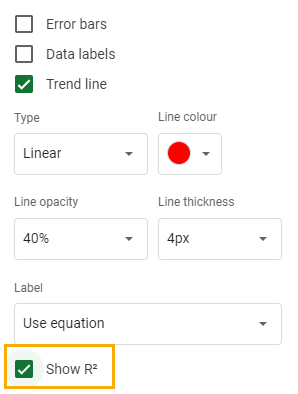
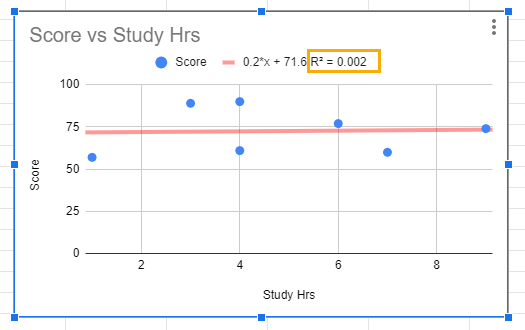
The R-squared value will be displayed beside the trend line equation.
You can then take the square root of this value to know the correlation coefficient of the correlation matrix.
In our case, the square root of 0.002 is 0.045. Therefore, the correlation coefficient of the correlation matrix – the correlation between the Score and Study Hours variables – is 0.045.
Knowing the direction of the correlation isn’t always enough. That’s why the correlation coefficient is important. It tells you the strength of the relationship. Correlation coefficients range from -1 to 1, with -1 indicating a perfect negative relationship and +1 indicating a perfect positive correlation. A correlation coefficient of zero indicates that there’s no relationship between both variables.
Between this range of variation are different measures of strength. This is because, although some variables may exhibit a relationship, this relationship may be weak.
The correlation coefficient of 0.045 from our sample correlation matrix would be considered a weak positive relationship by many measures as most measures consider any correlation coefficient ±0.2 and below as a weak relationship.
This would imply that Study Hours do not relate to a good or bad performance.
Correlation Charts in Google Sheets: FAQs
How do you graph a correlation in Google Sheets?
To graph a correlation in Google Sheets, start by making sure you format the data as numbers. When this is done, organize the columns so that the independent variable (x) comes before the dependent variable (y).
At this point, select the data you want to correlate, go to the Insert menu, and select Chart. A column chart will be inserted on the sheet by default. To change the chart type, select the Column chart dropdown in the Chart editor window and scroll until you see the Scatter chart option. Click on the Scatter chart.
What is the best graph to show correlation in Google Sheets?
The Scatter chart is the most suitable chart for showing correlation in Google Sheets.
