
If you have a scatter plot on your Google Sheets spreadsheet, you may find yourself considering the possibility of enhancing your chart by connecting the data points to help increase the readability of your data.
Technically, Google Sheets does not offer a way to connect the points on a scatter plot. However, as with many things, there is a workaround that could give you what you’re looking for.
By using a line chart, you could tweak things in such a way to make it look like you’ve connected the data points on your scatter plot.
To see just how to do this, check out the article below! And if you’re not sure how to create a scatter plot in Google Sheets in the first place, then check out the process here.
The Problem
Google Sheets does not provide a quick and easy method to create a scatter plot chart that allows you to connect the points on the chart with a line.
The Solution
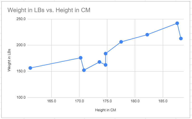
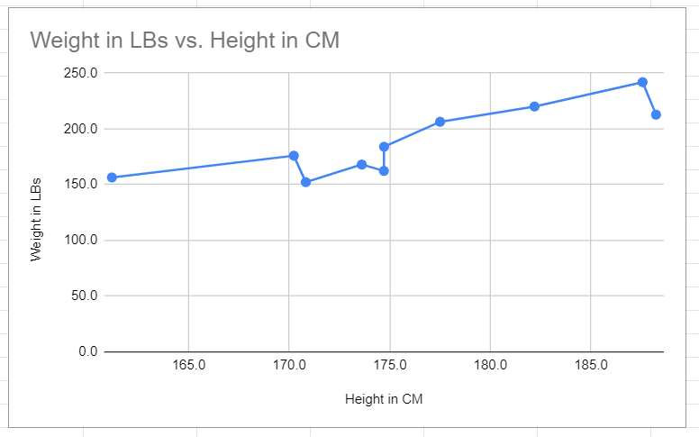
Use a line chart based on the same data as the scatter plot. Increase the point size for each data point so they stand out on the line. This will give the impression of a scatter plot with the points joined together by a line.
Check out the example below and follow the step-by-step guide to make one for yourself in the following section.
Connecting Scatter Plot Points: The Workaround
To tackle this problem, simply create a line chart and use the Chart editor to increase the size of the points in the Series Format section. Let’s go through the process together one step at a time.
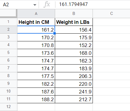
We will use the data of ten individuals, as shown below, showing the height in centimeters and weight in pounds under columns A and B, respectively.
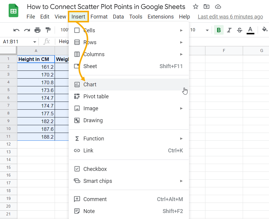
1. Select the entire range from A1 to B11 (including headers). Navigate to the Insert menu and click on Chart.
When you insert a chart, Google Sheets IntelliSense will automatically pick the best chart suitable for the selected data. In this case, it will create a Scatter plot as shown below:
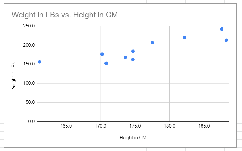
This chart looks great, but we want a line connecting these dots. To achieve this, we need to convert the chart to a Line chart.
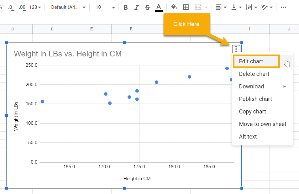
2. Select the chart (the chart window will appear blue when you select it) and click on the three dots in the upper right corner to open the menu. Select Edit chart.
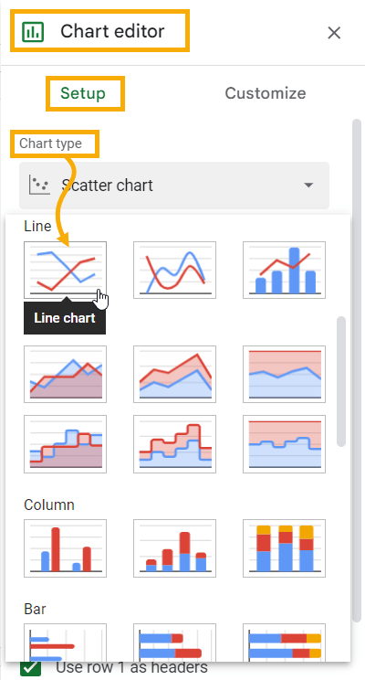
3. The Edit chart option will open up the Chart editor window on the right side of the screen. You will see two tabs: Setup and Customize.
Setup allows you to determine the appropriate chart type as well as to select axis and series ranges.
Customize allows you to customize the entire chart and its appearance (color, labels, etc.).
Go to the Setup tab. In the Chart type drop-down list, select Line chart.
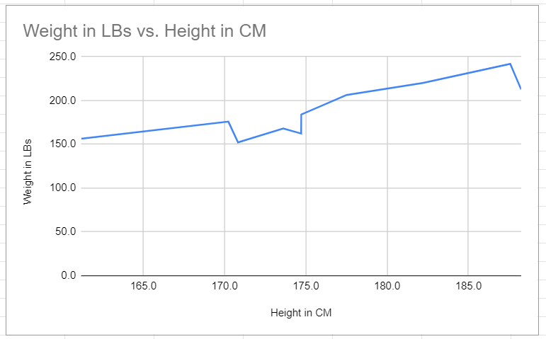
If you go back to your chart, you will see that it has been converted to a line chart. One step down—one more to go!
Adding points to the chart so it looks like a scatter plot is a customization feature, so we need to switch from Setup to Customize.
4. In the Chart editor, select the Customize tab and expand the Series section. We want to look at the Format options.
In the Point size drop-down menu, select an adequate point size to suit your chart (depending on how big a chart you create).
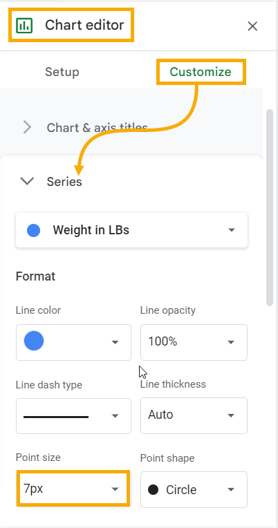
We will use a Point size of 7px, which means that each point on the line will be 7 pixels wide. You can see the results of this below:
While we’re on the right track, there are still a few more adjustments we need to make in order to have this chart look like our example at the beginning.
The Vertical axis (weight in pounds) is a bit off balance, with the data only in the upper half of the chart. We can reset the minimum bound for the chart in order to shift the data to a more centralized position.
In the Chart editor, go to the Customize tab and expand the Vertical axis section. Update the Min box to 100. This will set the lower bound of the axis to 100 rather than 0, reducing the white space and making our chart more aesthetically pleasing.
While you’re there, tick the Allow bounds to hide the data checkbox. Otherwise, the data bound will start from 100, but there will be a blank white space below.
And there you go! This is how you can use a workaround to make a scatter plot with points that are connected by a line, increasing readability and improving decision-making.
