
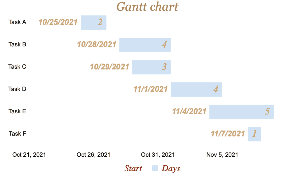
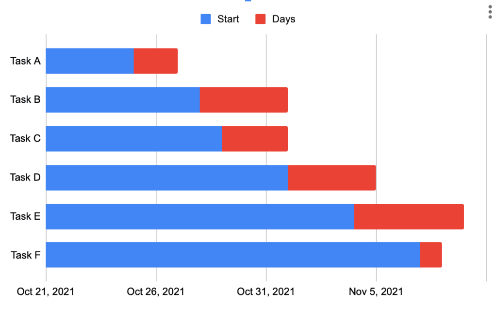
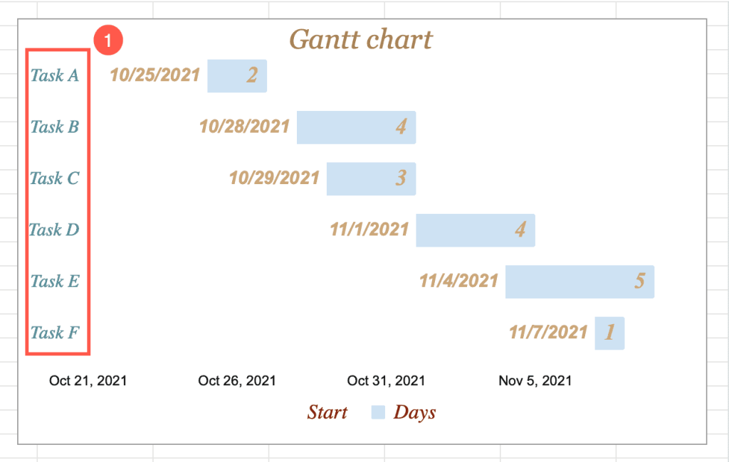
A Gantt chart is a type of bar chart in Google Sheets. It represents progress—for example, the progress of a project you may be working on. The chart shows the duration of each task involved: when you started doing it and when you intend to finish it. A Gantt chart can be helpful to see what activities must be done and when.
Let’s dive into creating and customizing your very own Gantt chart.
How to Prepare Data for a Gantt Chart
Before creating any type of chart, you must format your dataset correctly to get what you need.
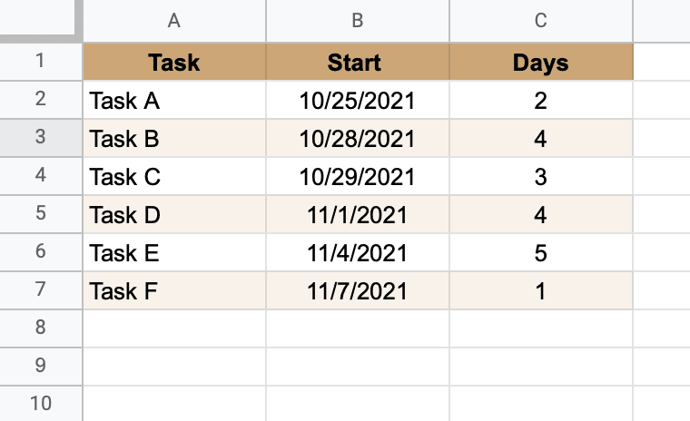
To create a Gantt chart, you need at least three columns:
- The first column (A) lists the tasks involved.
- The second column (B) states the day each task starts.
- The third column (C) establishes the duration of each process.
How to Create a Gantt Chart in Google Sheets
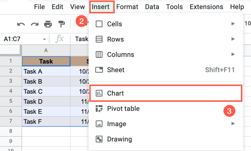
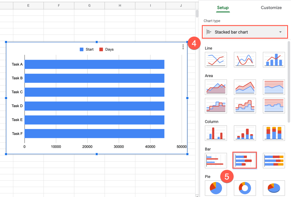
The data set is now ready to be converted into a chart. To create a Gantt chart, you must first insert a stacked bar chart. Follow these simple steps to do so:
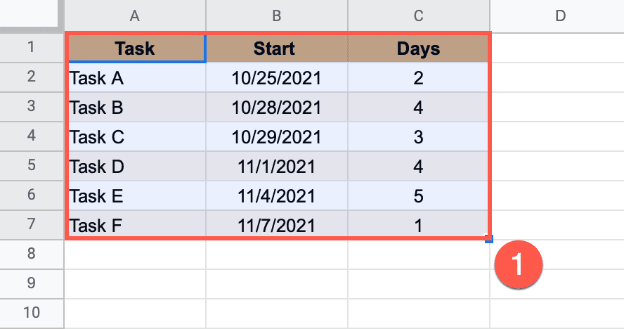
1. Highlight the dataset (A1:C7).
2. In the Toolbar, select “Insert.”
3. Navigate to Chart.
Google Sheets will insert the best chart to fit your data. Don’t worry! We can change it to what we need. Right-click on the chart and select “Chart style” to open the Chart Editor task pane.
4. Open the “Chart type” menu in the Chart Editor window under Setup.
5. Under “Bar,” select “Stacked bar chart.”
How to Change the Data Format and the Starting Data on the Horizontal Axis
The next step to format the data for your Gantt chart is to change the data format and the starting date on the horizontal axis so the stacked bar chart can be modified into a Gantt chart.
1. Double-click on the horizontal axis on the chart plot.
2. The “Horizontal axis” menu will appear.
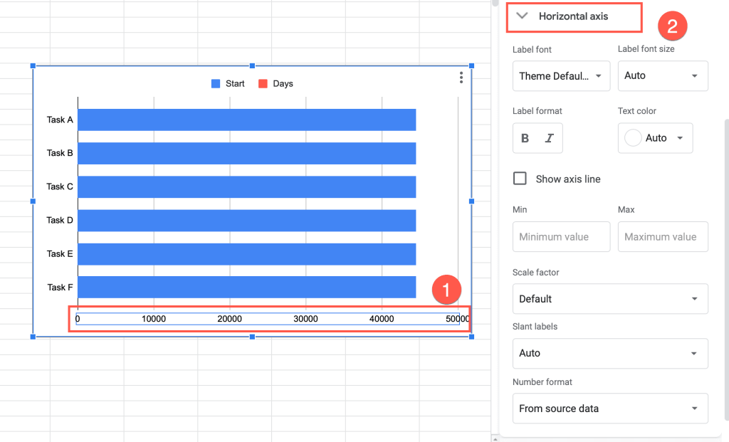
3. Open the “Number format” dropdown menu.
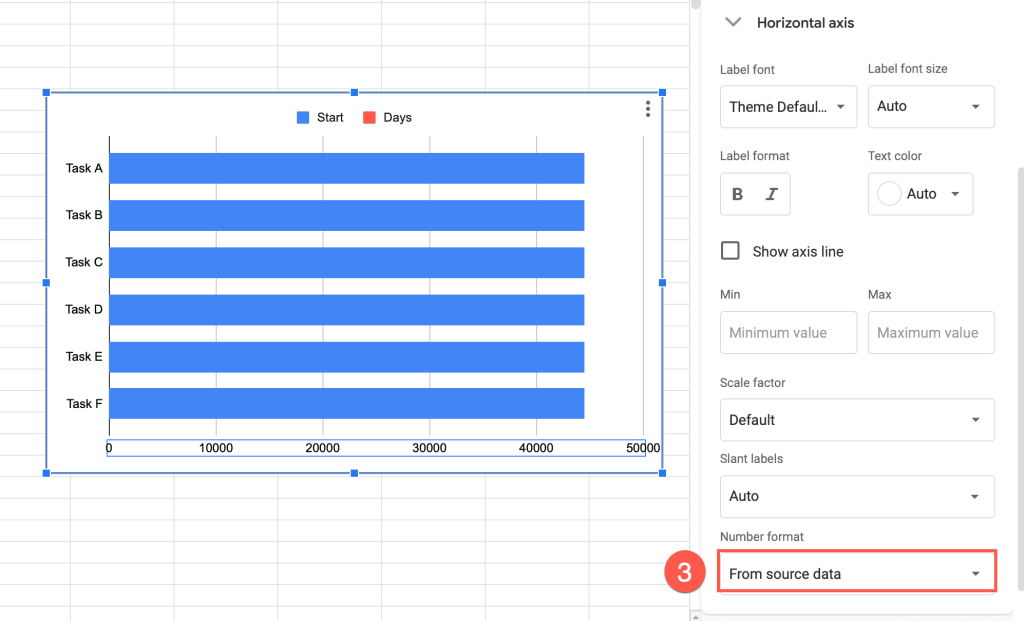
4. From the menu, select “Date and time.”
5. Choose the format of date and time that works best for you.
We selected this one: Aug 5,1930.
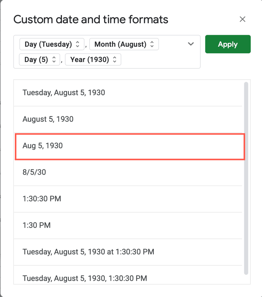
The format is great, but what happened with the date? August 5, 1930, is not what we have in our data! To change the date, follow these steps:
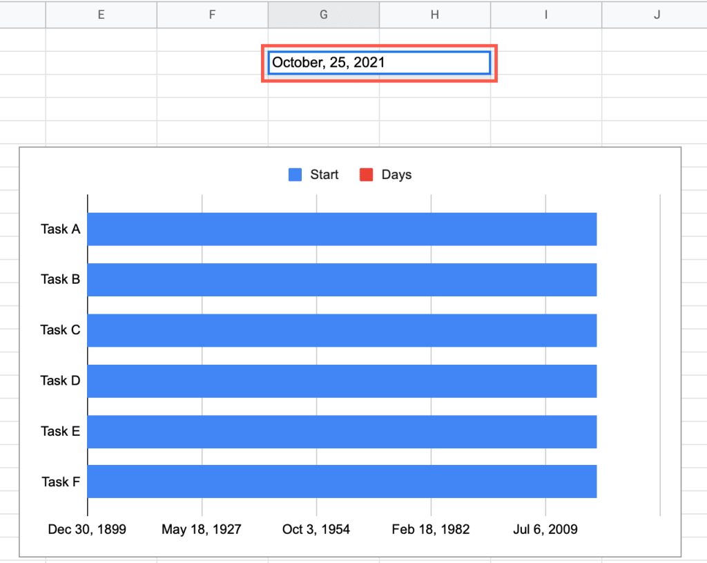
6. In an empty cell (in our example, we selected G2), insert the date you want to start with.
7. Go to Format.
8. Open Number > Automatic.
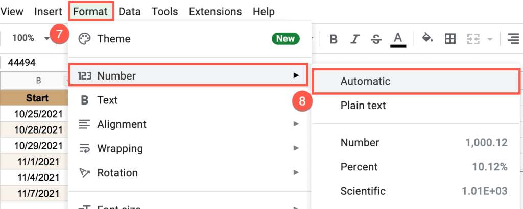
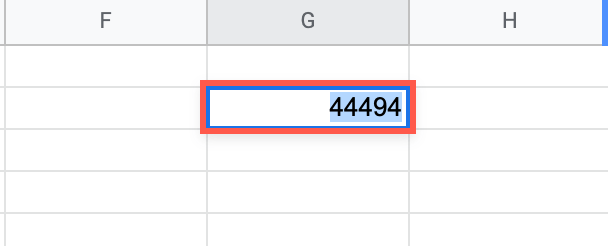
The date will automatically change into a serial number.
9. Copy this serial number (Ctrl+C for Windows; Command+C for Mac.)
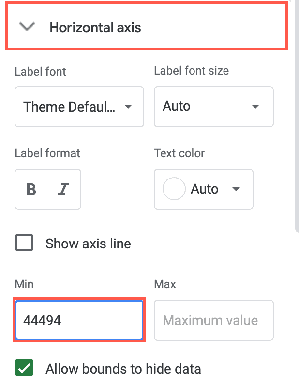
10. Double-click on the horizontal axis on the chart plot.
11. Insert this serial number into the “Min” box.
Now the stacked bar chart should look like this:
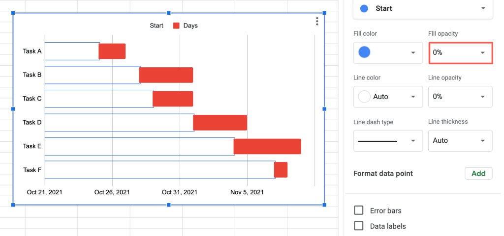
The next step is to make the blue bars invisible.
12. Click on any blue bar in the chart plot.
13. Set the “Fill opacity” field to “0%.”
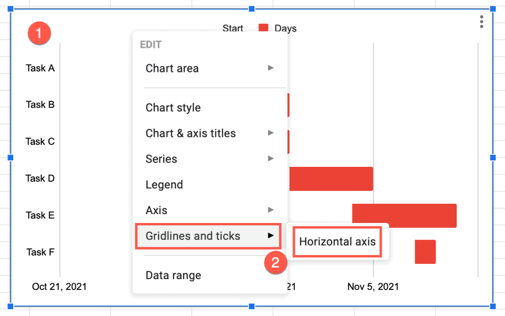
How to Remove Gridlines from the Gantt Chart
A Gantt chart usually doesn’t have grid lines, so you might need to remove them.
1. Right-click somewhere on the chart plot.
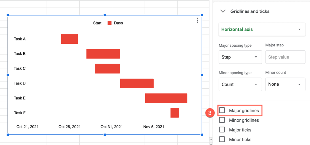
2. Choose Gridlines and ticks > Horizontal axis.
3. Untick the box “Major gridlines.”
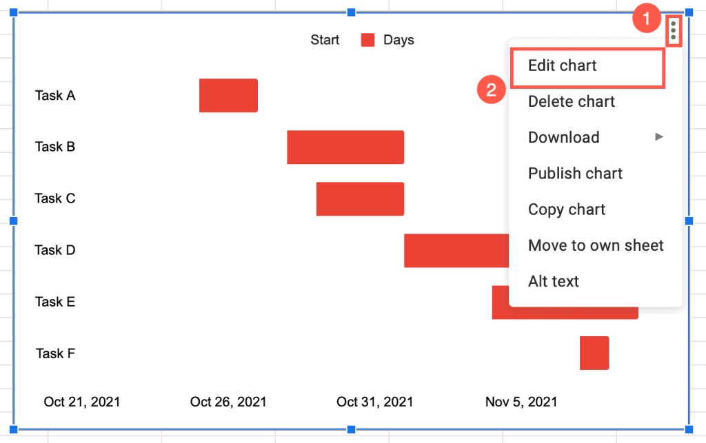
How to Add Data Labels for a Gantt Chart
When we set up the data for the Gantt chart, we included the duration of the tasks. However, you don’t see these values on the chart plot yet. You can add and customize them manually.
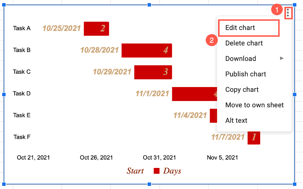
1. On the chart plot, click on the three dots in the upper right corner.
2. Go to Edit chart.
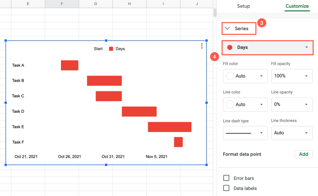
3. Navigate to the “Series” dropdown menu.
4. From the “Series selector,” choose “Days.”
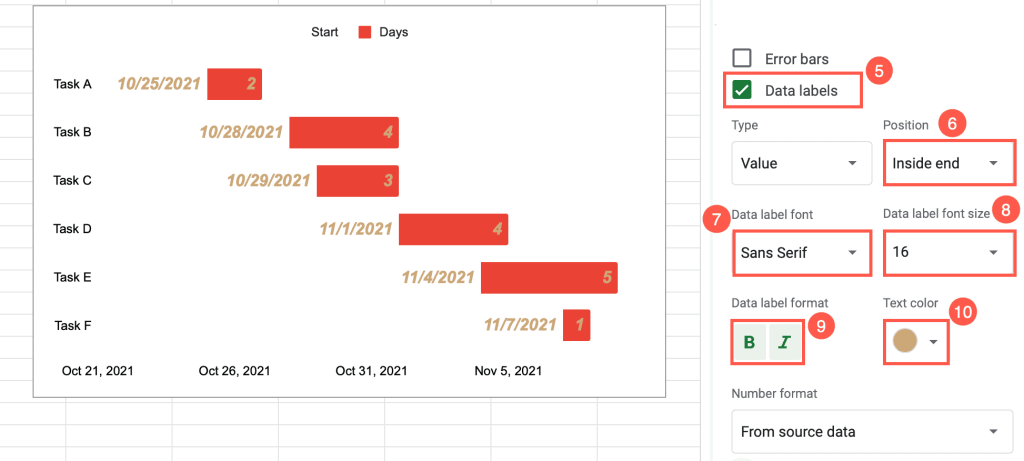
5. Tick the “Data labels” box.
6. Change the position of the labels under “Position.”
7. Select the font you want to use under “Label font.”
8. “Data label font size” increases and decreases the font size.
9. Under “Data label format,” adjust the style of the labels (bold or italic).
10. “Text colors” allows you to select the color for the labels.
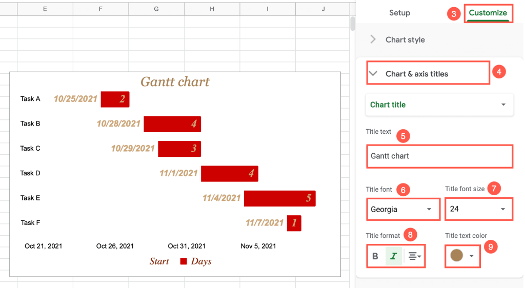
How to Change the Title of a Gantt Chart
Every chart needs a title. It’s the first thing people read. Adding a title to a chart is pretty easy. Just follow these few simple steps:
1. Click on the three dots located in the upper right corner of the chart plot.
2. Go to Edit chart.
3. Select the “Customize” section.
4. Choose the “Chart & axis titles” dropdown menu.
5. Under “Title text,” insert a title for the chart.
6. Under “Title font,” choose the font for the title.
7. Under “Title font size,” select the best size for the title.
8. “Title format” allows you to change the alignment and make the text bold or italic.
9. Under “Title text color,” adjust the color of the title to fit your style.
How to Customize the Bars of a Gantt Chart
Perhaps you would like to change the color of the bars on your chart. Here’s how to do this quickly and simply:
1. Right-click somewhere on the chart plot.
2. Choose “Series.”
3. Go to “Days.”
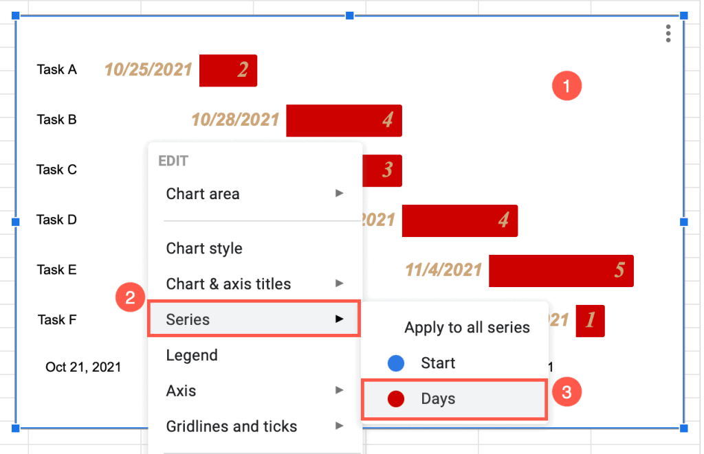
4. Select a new color for the bars under the “Fill color” box.
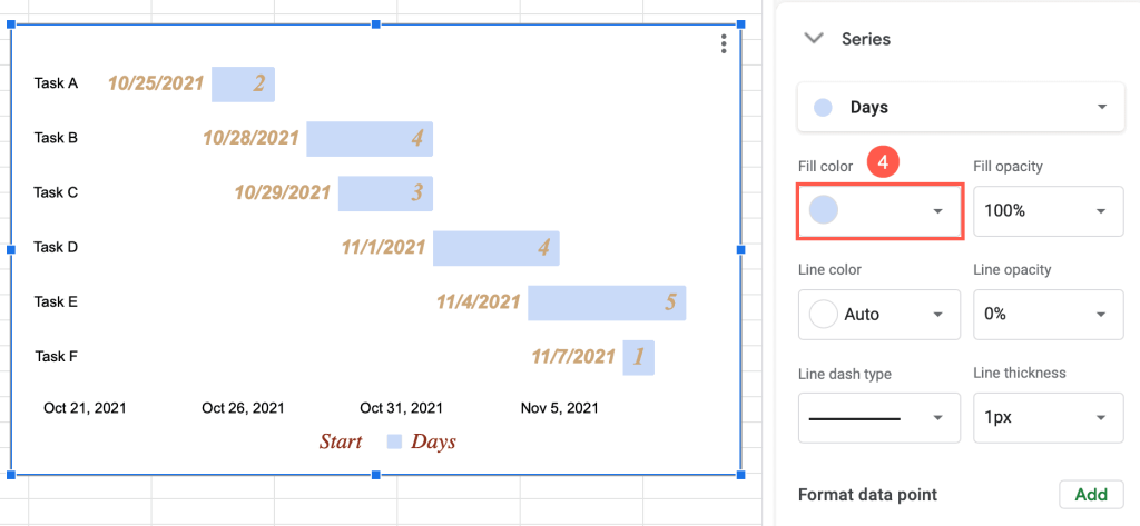
That’s it! If you also need to add lines for the bars, you can do that from this menu as well.
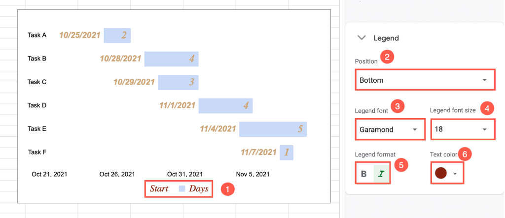
How to Modify the Legend of a Gantt Chart
The legend is the colored box indicating what each color on the chart means to the reader. This is an important part of the chart, and its positioning is essential. You want it to be easily found by the reader.
1. Double-click on the legend on the chart plot.
2. Under the “Position” dropdown box, place your legend on the chart plot in the position you want.
3. Select the font for the legend under the “Legend font” box.
4. “Legend font size” allows you to select the best size for the legend’s font.
5. Make the font italic or bold from the “Legend format” box.
6. To change the legend’s color, click on the “Text color” box.
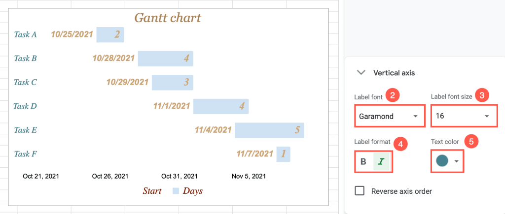
How to Adjust the Vertical Axis of a Gantt Chart
The vertical axis of your Gantt chart lists the names of the tasks in your project.
You can modify this as well.
1. Double-click on the vertical axis of the chart plot.
The “Vertical axis” window will automatically appear to the right.
2. Modify the font of the vertical axis under the “Label font” box.
3. Increase or decrease the label’s font size under “Label font size.”
4. In the “Label format” box, you can make the font bold or italic.
5. The “Text color” function allows you to change the font’s color.
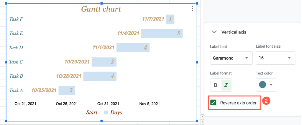
How to Reverse the Axis Order on a Gantt Chart
What if you need to change the order of the tasks on the vertical axis of the chart plot? Don’t worry! You can do this in two steps:
1. Double-click on the vertical axis on the chart plot.
2. In the task pane window, tick the box “Reverse axis order.”
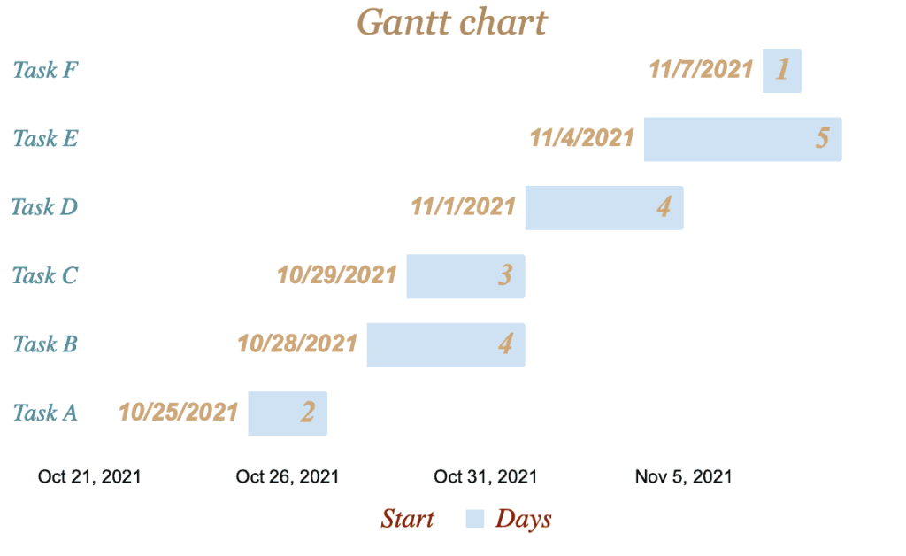
Voila! You did it!
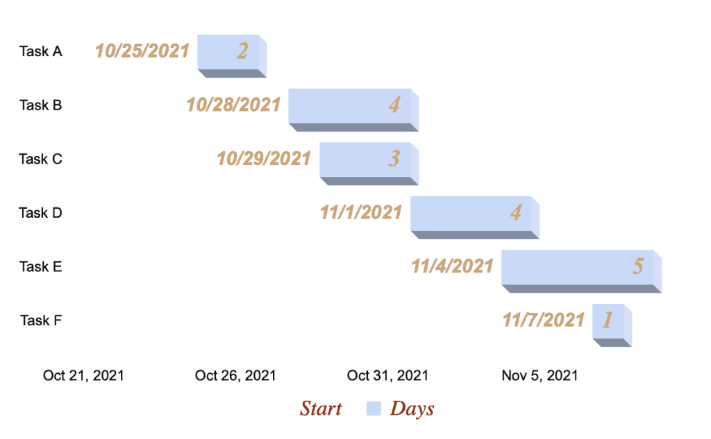
How to Make a 3D Gantt Chart
Some charts in Google Sheets have the option to look 3D.
To do this with your Gantt chart, try the 3D function.
1. Right-click on the chart plot.
2. Select “Chart style.”
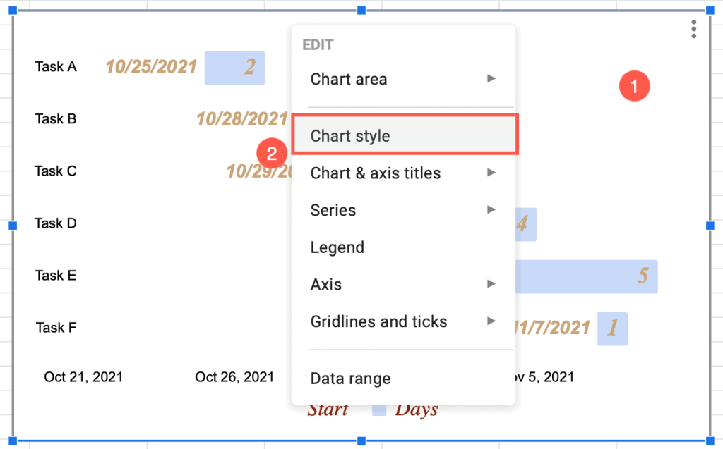
3. Tick the “3D” box.
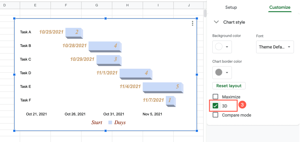
Boom! Your Gantt chart is now 3D!
Gantt Chart in Google Sheets – Free Template

If you don’t want to waste time creating and customizing a Gantt chart, use this free template:
