Bar graphs are a great way to provide a visual presentation of categorical data and are a great tool for illustrating trends and patterns in data over time.
In this article, we’ll cover how to make and customize bar graphs in Google Sheets.
Prepare a Data Set
To show you how the process from A to Z, we need to have a sample data set to work with. We made up some sales data of a fictitious company to help you follow our steps and adjust accordingly:
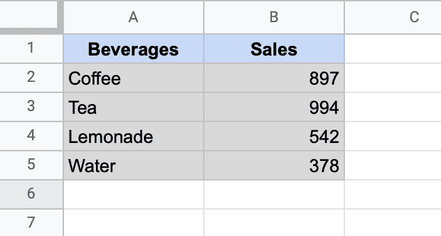
Here’s what each of the columns means:
- Column A – This is where you store your categories that define your data set.
- Column B – This column stores your actual values.
With this type of data formatting, chances are, Google Sheets will automatically generate a bar graph without messing up the chart plot.
So let’s dive in headfirst and build a simple bar graph.
How to Create a Bar Graph in Google Sheet
The process of creating a bar graph in Google Sheets is pretty straightforward:
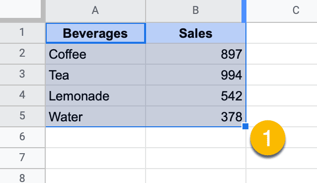
1. Highlight the data set that you want to visualize (A1:B5).
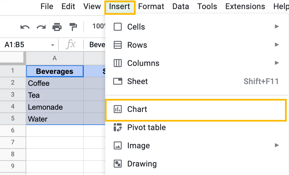
2. In the toolbar, click “Insert” and select “Chart” from the menu that appears.
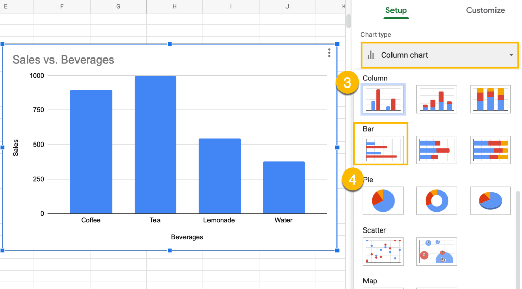
3. Once there, the Chart Editor task pane will pop up. Navigate to the Setup tab and open the “Chart type” drop-down menu.
4. Scroll down and, under “Bar,” choose “Bar Chart.” Alternatively, you can pick “Stacked bar chart” or “100% Stacked bar chart.”
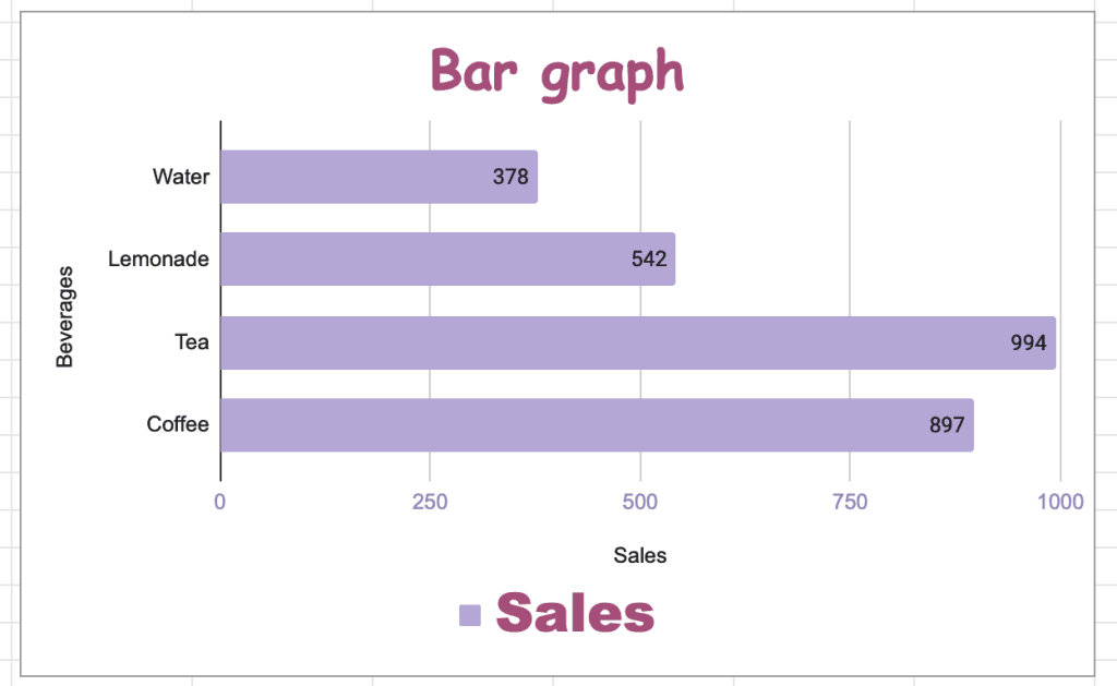
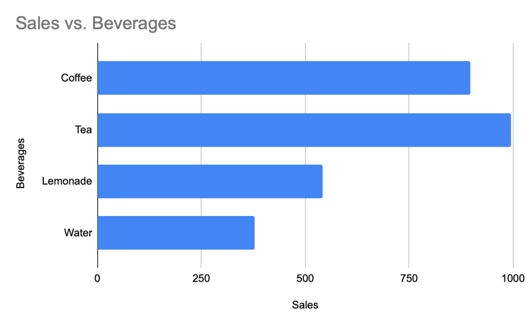
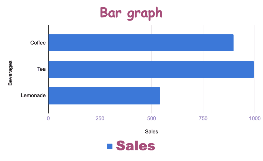
As a result, Google Sheets will transform the chart it suggested to you into a lovely bar chart:
How to Customize a Bar Graph in Google Sheet
Looking for something special? Google Sheets provides a wide range of customization tools for you to spruce up your bar graph and make it stand out.
Below, we cover some of the most common customization options when it comes to bar graphs in Google Sheets.
How to Change the Title of a Bar Graph
The title of your chart is the first thing people pay attention to.
If you just want to modify the default title that Google Sheets automatically generated for you, simply double-click on the chart and write a new title. Also, we created a separate guide coving how to change the default font in Excel so that you can modify
For those looking for more customization tools, here’s how to make the chart title of your bar graph even more appealing:
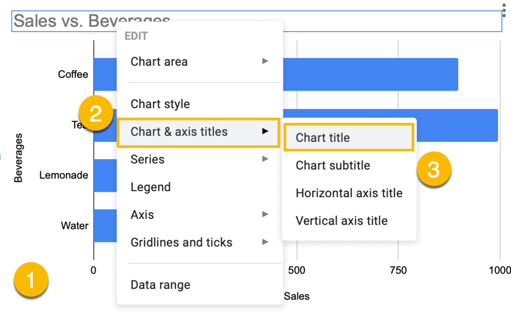
1. Right-click anywhere on the chart plot.
2. Click “Chart & axis titles.”
3. Choose “Chart title.”
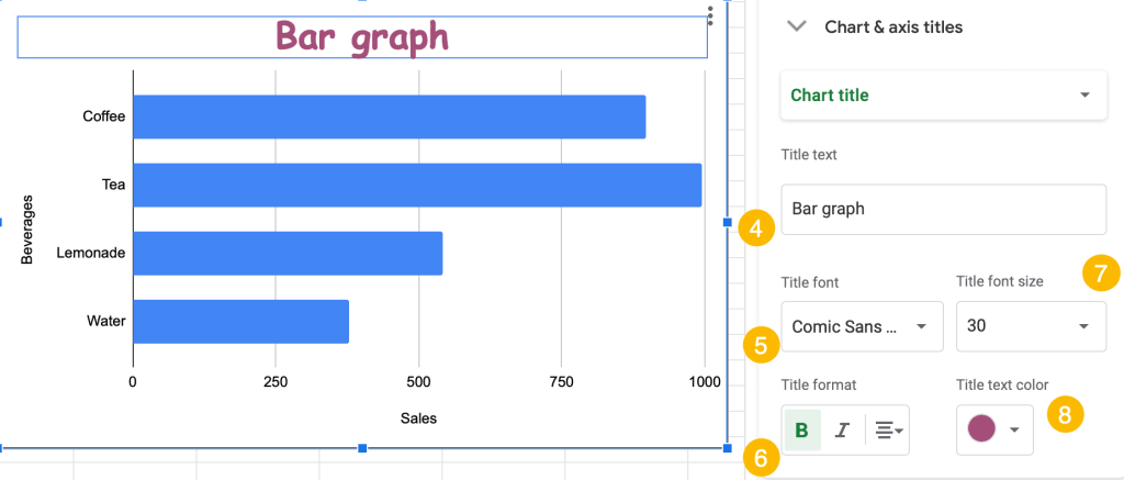
4. In the “Title text” field, enter your new chart title.
5. Under “Title font,” select the font you want to apply to your chart title.
6. Under “Title format,” adjust the styling (for example, you can highlight the title in bold or italic) and the alignment of your chart title.
7. Under “Title font size,” you can change the size of your chart title.
8. Under “Title text color,” pull up the color palette and pick any color that you want.
How to Create a 3-D Bar Graph in Google Sheets
Few people know that it’s possible to create 3-D bar graphs in Google Sheets. Here’s how you can do that:
1. Create a simple bar graph in Google Sheets (select your entire data table > Insert > Chart > Chart Editor > Chart Type > Bar Graph).
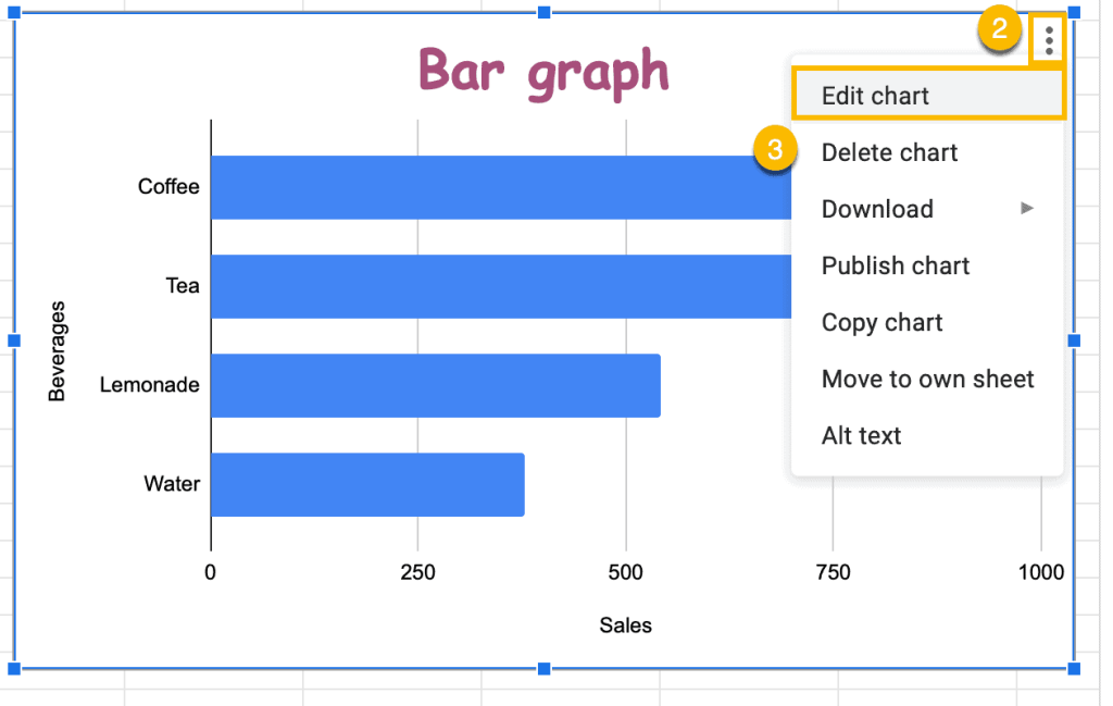
2. Click the three-dot menu.
3. Choose “Edit chart.”
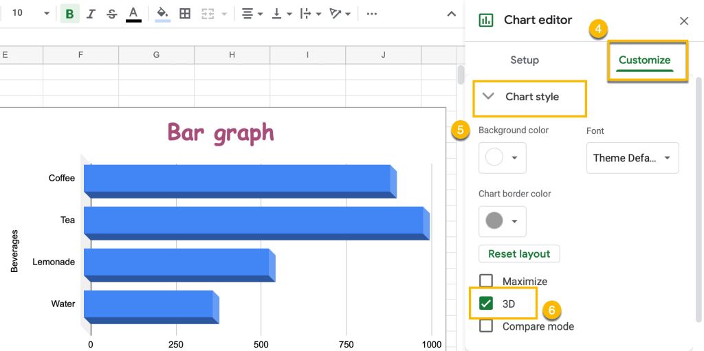
4. Switch to the Customize tab.
5. Open the “Chart style” drop-down menu.
6. Check the “3D” box.
That’s it! Your 3-D bar graph is good to go.
How to Change the Underlying Data Range of a Bar Graph
Sometimes, you need to change the data range without building a new graph.
Fortunately, you can easily modify the underlying data by following just a few simple steps:
1. Right-click on the bar graph.
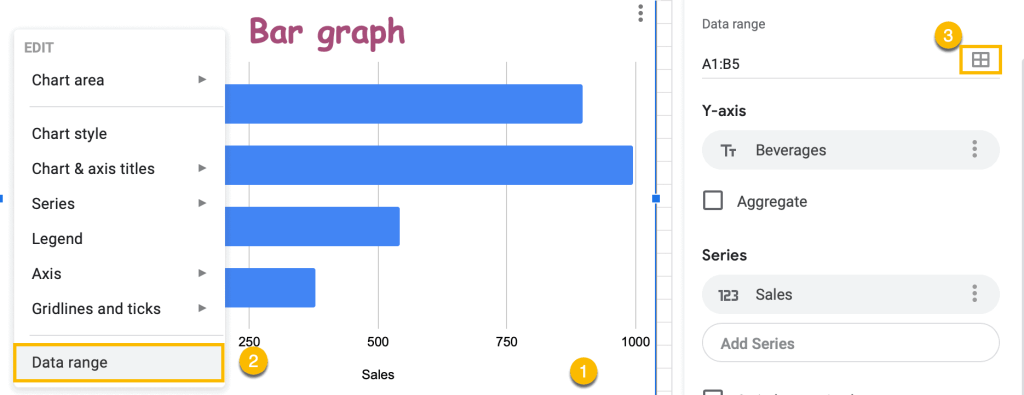
2. Click “Data range.”
3. In the Chart Editor, navigate to the “Setup” task pane and hit the “Data range” button.
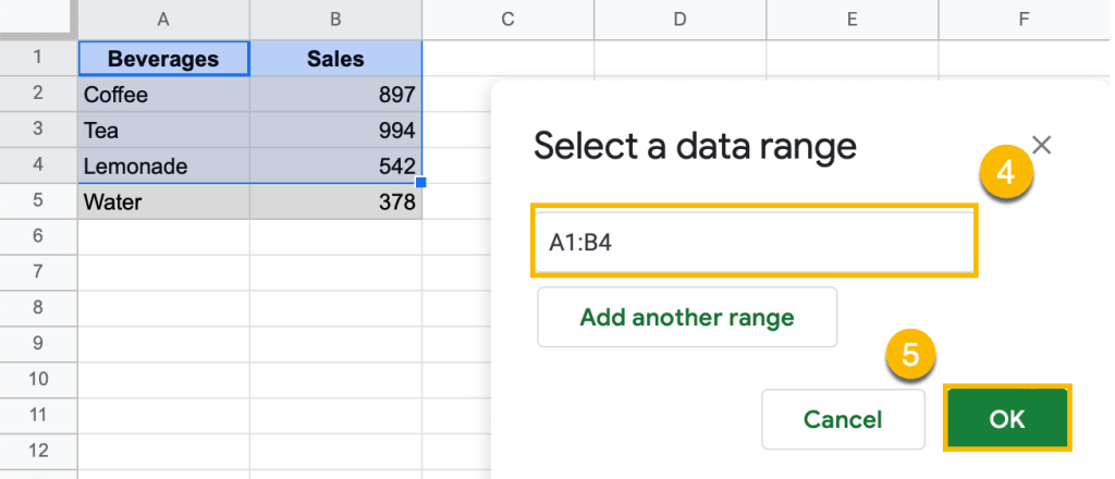
4. Once the dialog box pops up, highlight the data range you want your bar graph to be based on.
5. Click “OK.”
Look, in a few clicks and without building a new graph, you get a chart with a data range you need.
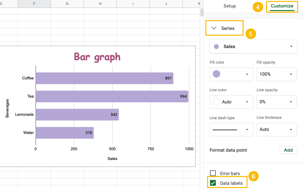
How to Add Labels to a Bar Graph
Adding data labels is a quick way to make your chart more informative:
1. Select your bar graph.
2. Click the three-dot menu.
3. Choose “Edit chart.”
This option also allows you to modify specific series.
4. Switch to the Customize tab.
5. Open the “Series” drop-down menu.
6. Tick the “Data Labels.”
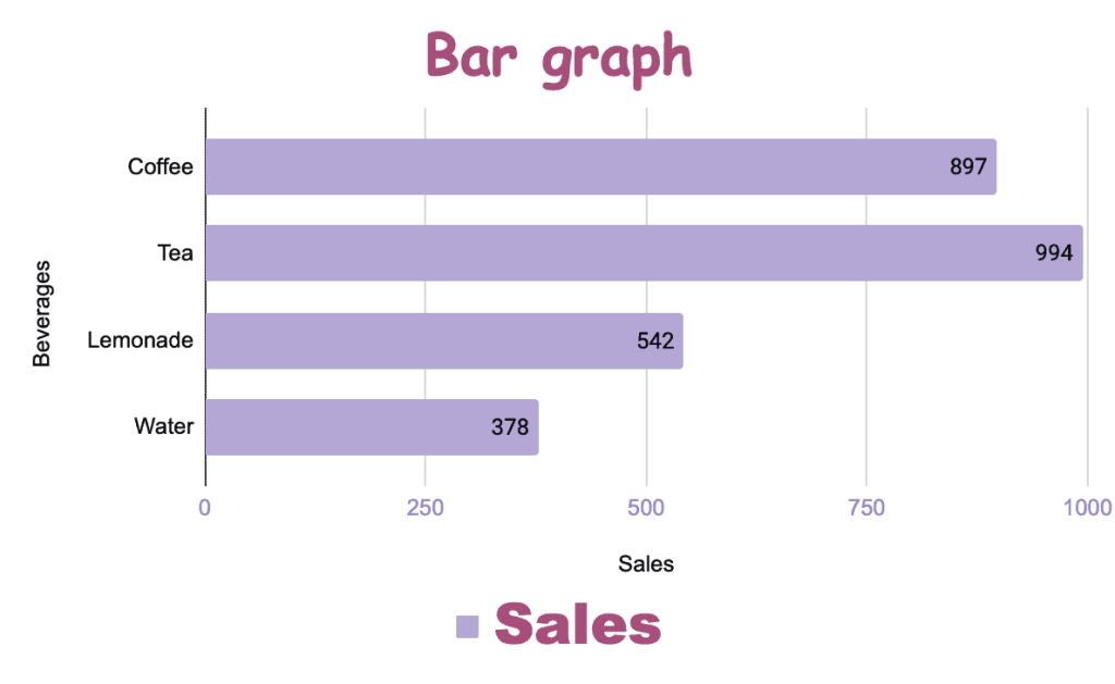
After you have followed these steps, the dynamic data labels will automatically appear on the chart plot:
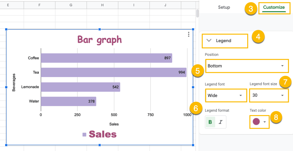
How to Change the Legend Position
If you have a bar graph, the legend will be automatically on the plot. But, let’s suppose you don’t like its position. Don’t worry. You will see how to change it in a few clicks.
1. Click the three-dot icon placed on the chart plot.
2. Choose “Edit chart.”

3. Click “Customize.”
4. Choose “Legend.”
5. Use the “Position” option to modify the position of your chart legend.
6. Under “Legend font,” you can apply a different font to your legend.
7. Modify the “Legend font size” value to change the font size of your legend items.
8. Under “Text color,” change the color of your legend however you see fit.
How to Reverse Axis Order
If you need to turn your bar chart upside down by changing the axis order, use this instruction:
1. Click on the vertical axis of your bar graph.
2. Choose “Reverse axis order.”
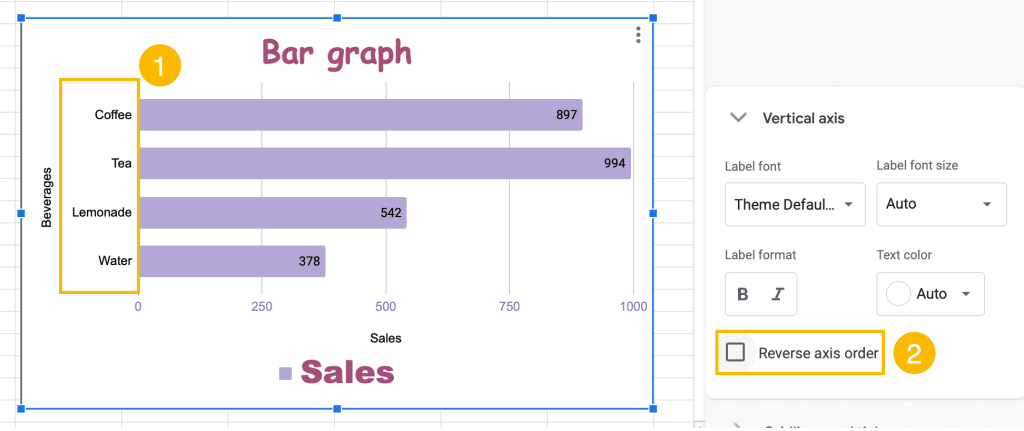
That’s it! You have just rearranged your bar chart: