
A scatter plot (also known as a scatter graph or scatter chart) uses dots to map out numerical values across the x- and y-axis.
This chart illustrates the relationship between the values in a data set, empowering better decision-making.
And in this step-by-step guide, you will learn how to make a scatter plot in Google Sheets in less than five minutes.
How to Prepare and Format Your Data Set
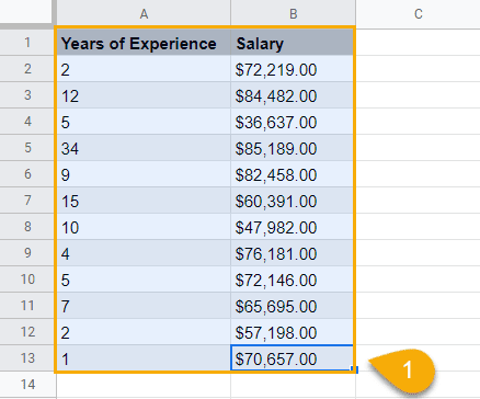
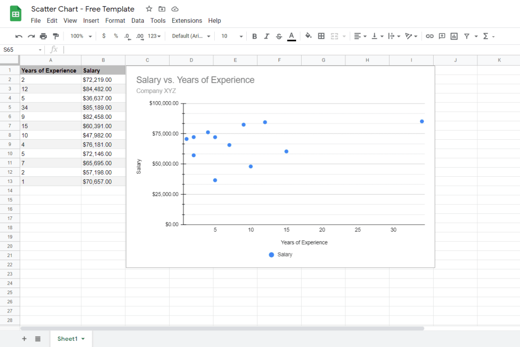
To show you the ropes, we’re going to use this data set to analyze the correlation between the experience of the team members working for a fictitious company and their compensation.

For you to adjust quickly, here’s the breakdown of what each of the columns means:
- Column A (Years of Experience) – The values in this column will make up the x-axis of your scatter plot.
- Column B (Salary) – Conversely, the values in this column will be used to plot the y-axis of your scatter graph.
Now that we’ve covered the basics, let’s get down to business.
How to Create a Scatter Plot in Five Simple Steps
Once you have your data ordered, it’s time to create a scatter plot in Google Sheets.
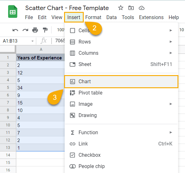
1. Highlight the data that you want to visualize with the help of a scatter chart (A1:B13).
2. Select the Insert tab.
3. In the drop-down menu that appears, choose “Chart.”
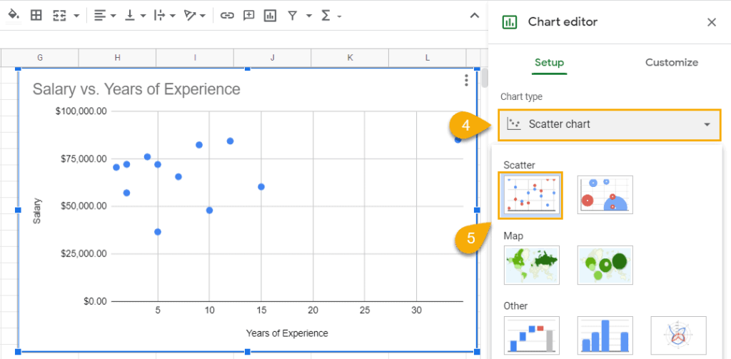
This will automatically generate a random type of chart based on what Google Sheets thinks would be the most suitable option for your data set and open the Chart Editor where you can customize your newly-created graph.
4. If you Google Sheets creates anything other than a scatter plot, in the Setup tab of the Chart Editor, click the “Chart type” drop-down menu.
5. Scroll down the list of data visualization options and under “Scatter,” select “Scatter plot.”
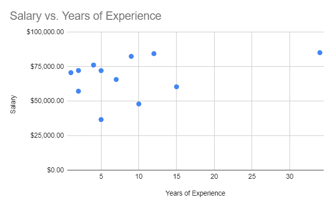
After finishing the steps outlined above, you should have your scatter plot ready to go.
Related Article: How to Create a Bubble Chart in Google Sheets
How to Customize Your Excel Scatter Plot
For those looking to polish up their scatter plot, Google Sheets provides a robust customization toolset to make your graph more informative and pleasing to the eye.
Below, we’re going to cover all of them in greater detail.
How to Modify the Chart and Axis Titles of Your Scatter Plot
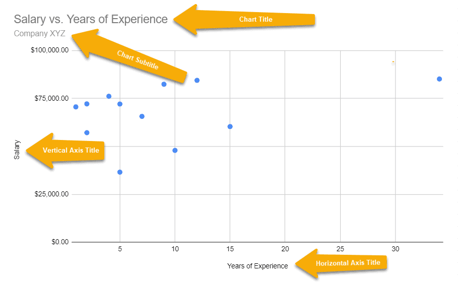
The title of your scatter plot provides the critical context needed to interpret the data the right way.
To modify the chart title, do the following:
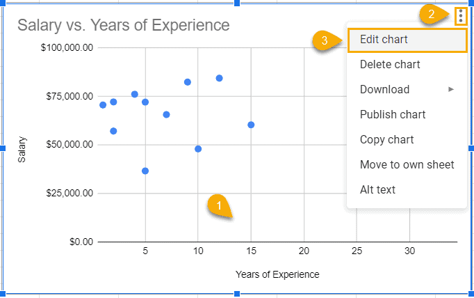
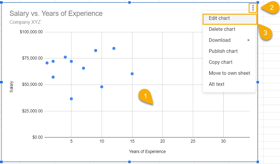
1. Select your scatter plot.
2. Click the three dots in the upper right corner of the chart plot.
3. Pick “Edit chart” from the menu.
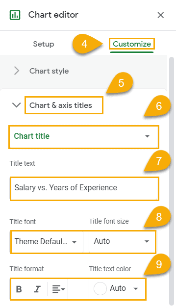
4. In the Chart Editor, switch to the Customize tab.
5. Open the “Chart & axis titles” section.
6. Select “Chart title” from the drop-down menu. Alternatively, you can use the “Chart subtitle” option to create (you guessed it) a chart subtitle as well as “Horizontal axis title” and “Vertical axis title” to modify the corresponding axis title.
7. Use the “Title text” field to name your scatter plot however you see fit.
8. Modify the “Title font” and “Title font size” to adjust the font of your chart title and its size.
9. The “Title format” and “Title text color” options grant you the ability to tweak the formatting and color of your chart title.
Here’s the breakdown of the chart elements you can modify using this section:
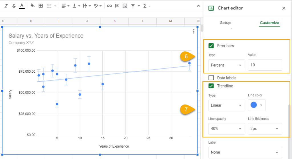
How to Add a Trendline and Error Bars to Your Scatter Plot
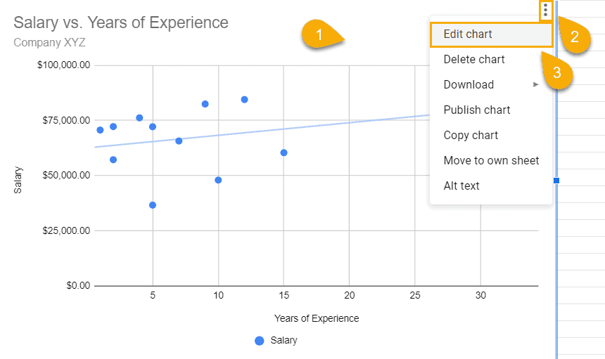
Error bars are a useful tool for demonstrating the data points that are outliers and visualize exactly how much they relate to the rest of your data set.
On the other hand, a trendline (also known as a line of best fit) helps see trends and patterns in your data.
To add error bars or a trendline to your scatter plot in Google Sheets, do the following:
1. Select your scatter plot.
2. Click on the three dots to open the contextual menu.
3. Choose “Edit chart.”
4. Once there, the “Chart Editor” task pane will appear where you have to open the Customize tab.
5. Navigate to the “Series” section.
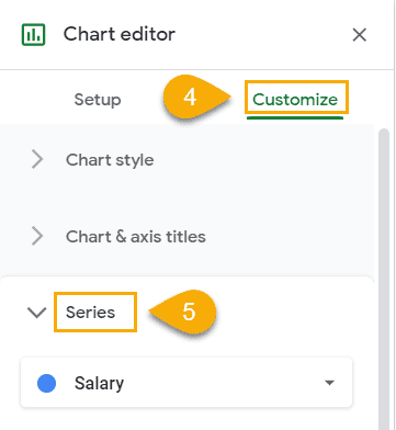
6. Check the “Error bars” box to create error bars for your data points. Use the “Type” and “Value” fields to fine-tune the details.
7. Check the “Trendline” box to add a trendline to your scatter plot in Google Sheets. Use the “Type,” “Line color,” “Line opacity,” and “Line thickness” options to customize the look and feel of your trendline.

If you want to learn more about this feature, here’s a quick guide covering how to add a trendline in Google Sheets.
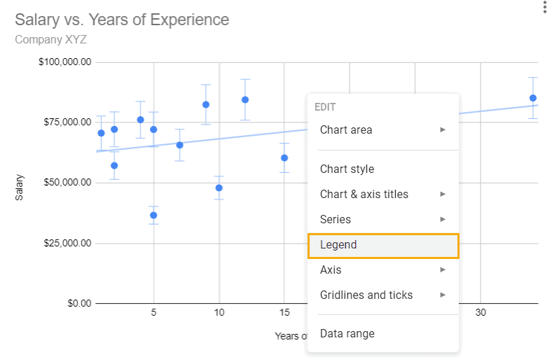
How to Add a Legend to Your Scatter Plot.
Add a chart legend to the equation to make it easier to interpret the data charted on your scatter plot.
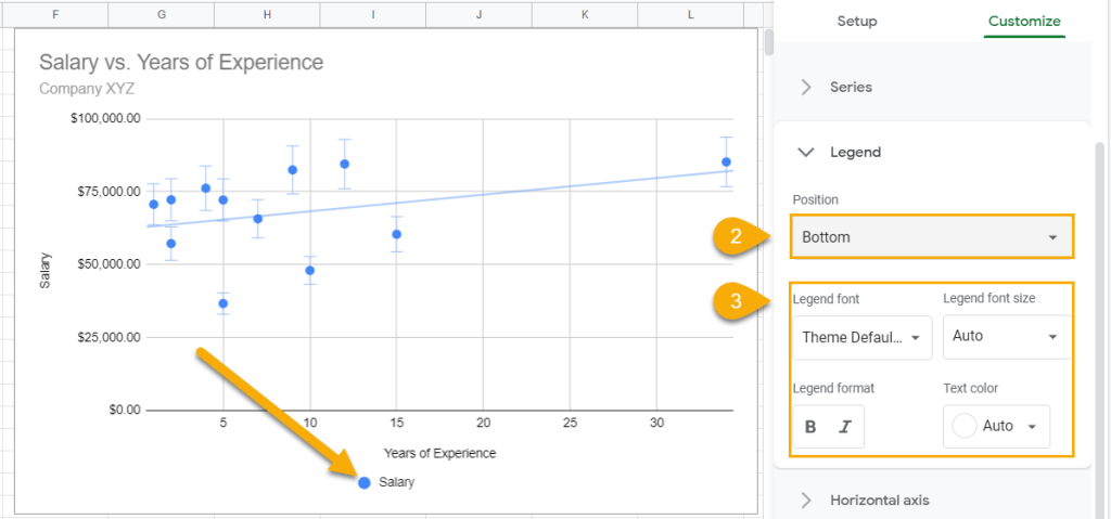
1. Right-click on the chart plot and select “Legend.”
2. Set the “Position” value to “Bottom.” Alternatively, you can “Top,” “Left,” “Right,” and “Inside” to position your chart legend accordingly.
3. Use the “Legend font,” “Legend font size,” “Legend format,” and “Text color” fields to customize the appearance of your chart legend.
Step 5. How to Add Data Labels to Your Scatter Plot
Supplementing your scatter plot with data labels is a great way to make your chart a lot more informative without breaking a sweat.
And here’s how you can easily add them to your graph in Google Sheets:
1. Select the chart plot.
2. Click the three-dot menu.
3. Pick “Edit chart” from the contextual menu.
4. Click “Customize.”
5. Open the “Series” section.
6. Scroll down the “Series” section and check the “Data labels” box.
7. Use the “Type,” “Position,” “Data label font,” “Data label font size,” “Data label format,” “Text color,” and “Number format” to customize your data labels based on your needs.
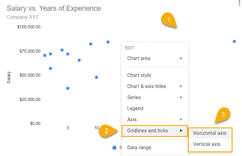
How to Add or Remove Gridlines and Tick Marks to Your Scatter Plot
Depending on your unique charting needs, you may want to either add or remove gridlines and tick marks from your scatter plot.
Follow the simple instructions outlined below to gain complete control over these chart elements:
1. Right-click on the chart plot.
2. Select “Gridlines and ticks.”
3. Choose either “Horizontal axis” or “Vertical axis.”
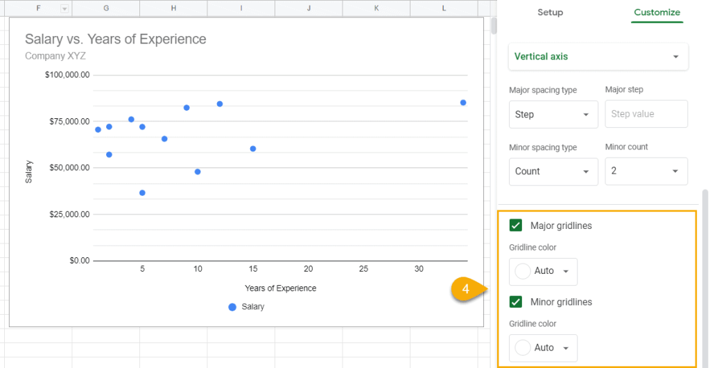
4. Check the “Major gridlines” and “Minor gridlines” boxes to add them to your scatter plot. Conversely, leave the boxes unchecked if you want to remove them.
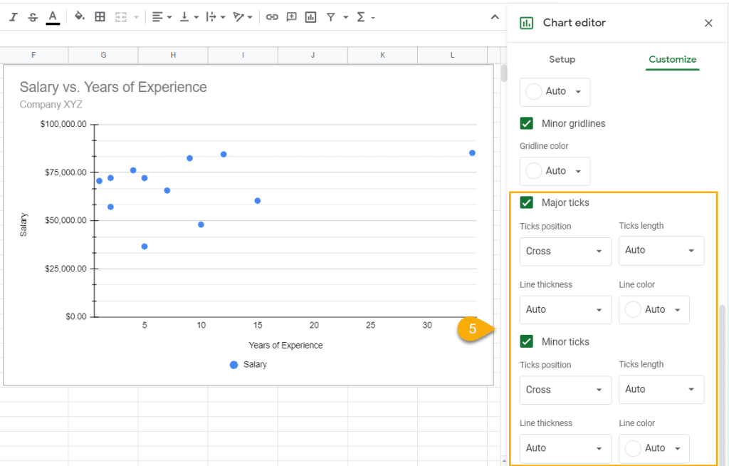
5. Check the “Major ticks” and “Minor ticks” boxes to add tick marks to your scatter plot. Use the “Ticks position,” “Ticks length,” “Line thickness,” and “Line color” fields to customize your ticks.
Is There a Way to Connect Scatter Plot Dots in Google Sheets?
Unfortunately, there’s no way for you to connect the dots between each other.
Instead, use a line chart with marks to achieve the outcome you’re looking for.
Scatter Plot in Google Sheets – Free Template
If you’re looking for a free scatter plot template to get up and running within seconds, grab the file we used to create this guide by clicking the link below:
Download Free Scatter Plot Template
Now you have all the information you need to leverage the power of scatter plots in Google Sheets to analyze your data and make better decisions.
