
Google Sheets offers many visualization tools that allow you to customize your worksheet. Charts are especially helpful to those who work closely with data. One highly beneficial aspect of a chart is the trendline.
The trendline tool in Google Sheets is designed to recognize patterns in the data of a chart. This can be extremely valuable for anyone who works with data, as it can help give an idea of where the data is moving.
You can add a trendline to a Scatter Plot, Line Graph, Column Chart, or Bar Graph in Google Sheets.
You can also customize your trendline to make it stand out. Let’s discover how to do this step by step.
How to Add a Trendline
Adding a trendline to your chart is pretty straightforward. Once you have created a chart with your data, take the following steps:
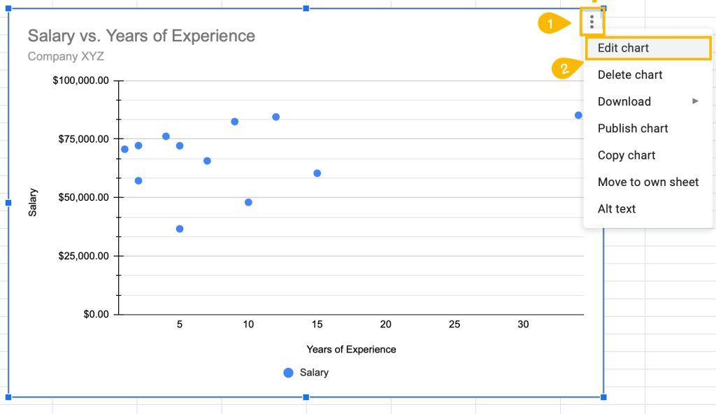
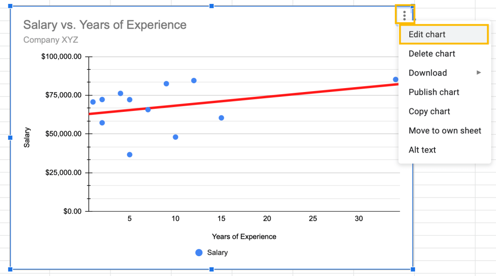
1. On the chart plot, click on the three dots in the upper right corner to expand the menu.
2. From the list that appears, choose the Edit chart option.
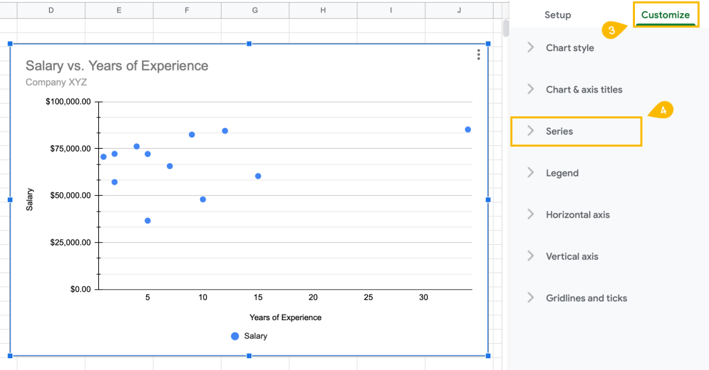
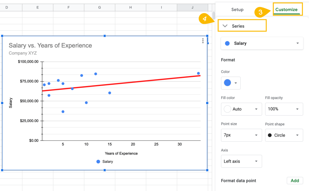
3. In the task pane on the right, switch to the Customize tab.
4. Open the Series menu.
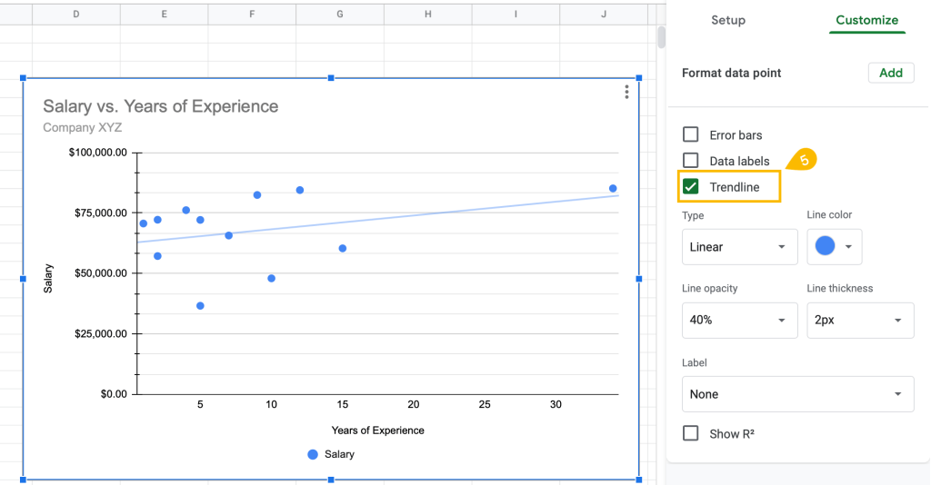
5. From the Series menu, tick the Trendline box.
That’s all there is to it! You now have a trendline on your chart plot.
How to Customize Your Trendline
You could use the default setting for your trendline, but if you personalize the style of your trendline, it can greatly improve your chart overall. So let’s see how to customize the trendline.
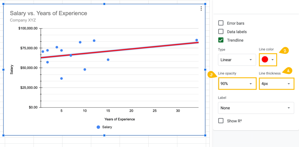
1. Double-click on the trendline on the chart plot.
Under the Trendline box, you will see customization tools.
2. To change the color of the trendline, select Line color.
3. Under Line opacity, you can modify how transparent or opaque the trendline is.
4. To make the trendline thinner or thicker, select the Line thickness box and enter a value.
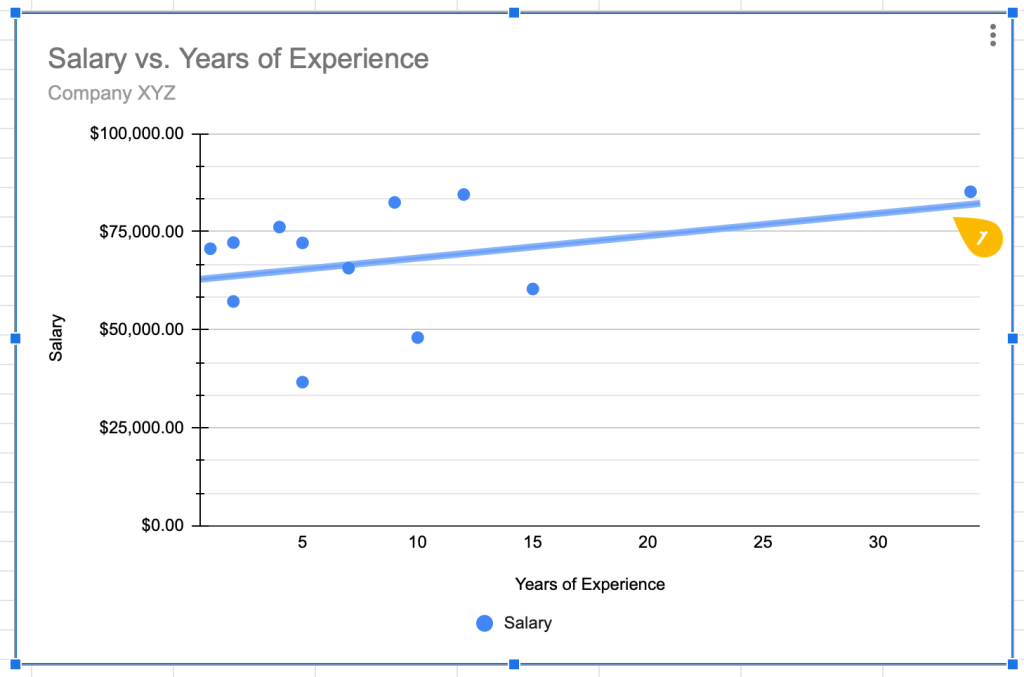
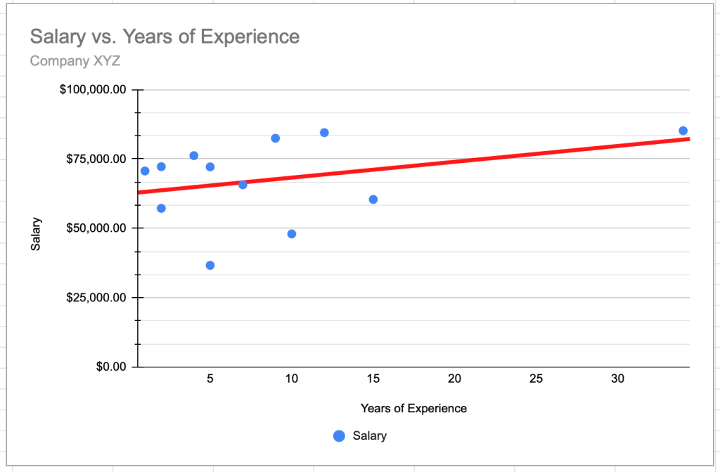
Customize the trendline to make it easy to see patterns in the data.
Related Article: How to Make a Scatter Plot in Google Sheets (use this article to add the line of best fit).
Types of Trendlines and Equations Available in Google Sheets
Google Sheets has more than one type of trendline you can choose from, and your best option will depend on your data. In this section, we’re going to show you the different types of trendlines you can use in your charts, but if you want to learn more, check out our guide on how to add an equation to a graph in Google Sheets.
To change the type of trendline you have on your chart, follow the steps below:
1. Click on the three dots in the corner of the chart plot.
2. Go to Edit chart.
3. In the task pane window, switch to the Customize tab.
4. Open the Series menu.
5. Tick the Trendline box to show the trendline.
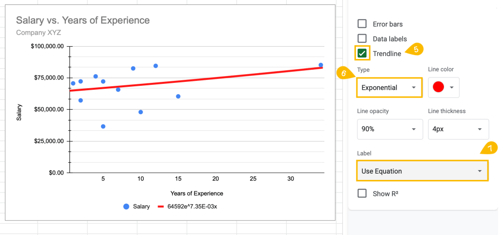
6. Under Type, you can select among the different trendline styles available. One option is Exponential.
An exponential trendline is used when data rises and falls proportional to its value.
7. Under Label, select Use Equation.
Exponential trendline equation: y = A*e^(Bx)
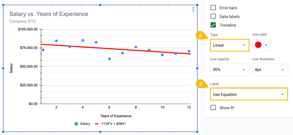
8. Under Type, select Linear.
A Linear trendline tends to be the default for Google Sheets. Linear trendlines are generally used for data that closely follows a straight line.
9. Under Label, select Use Equation.
Linear trendline equation: y = mx+b
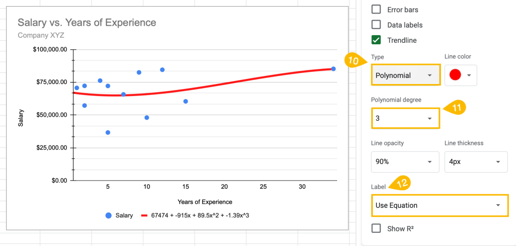
10. Under Type, select Polynomial.
If you have data that varies, choose a Polynomial trendline.
11. Under Label, select Use Equation.
Polynomial trendline equation: ax^n + bx^(n-1) + … + zx^0
12. You can also modify the polynomial degree under the Polynomial degree box.
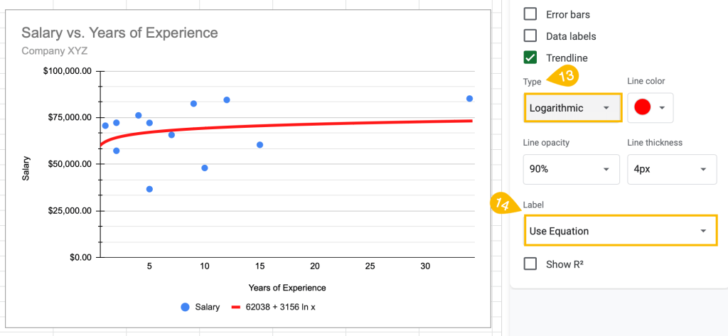
13. Under Type, select Logarithmic.
For data that rises or falls fast and then flattens out, use the Logarithmic trendline.
14. Under Label, select Use Equation.
Logarithmic trendline equation: y = A*ln(x) + B
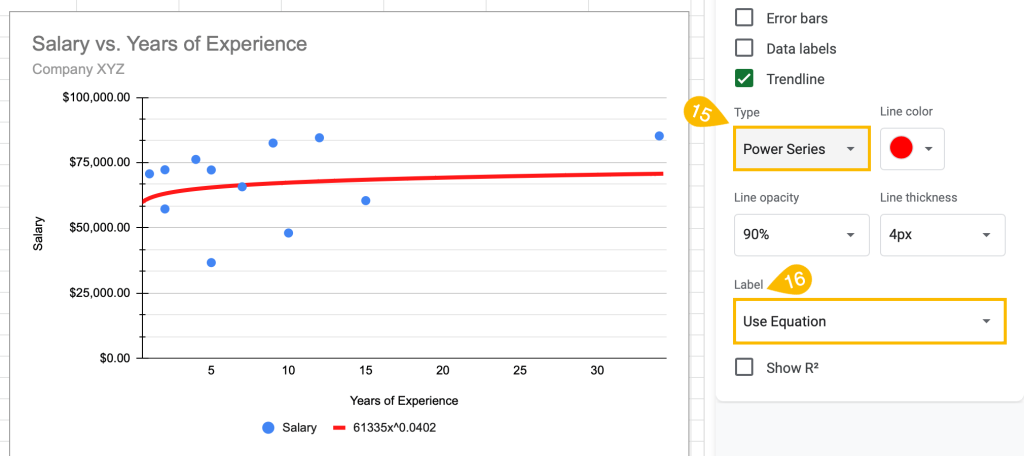
15. Under Type, select Power Series.
The Power Series trendline is used for data that rises or falls proportional to its current value at the same rate.
16. Under Label, select Use Equation.
Power series trendline equation: y = A*x^b
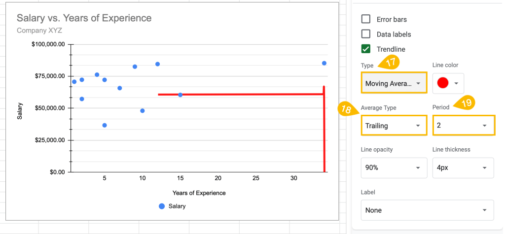
17. Under Type, select Moving Average.
The Moving Average trendline smooths out fluctuating data to more clearly show the pattern or trend.
18. Under Average Type, select Trailing
19. Under “Period” set the period.
Voila! That’s it. You see, it’s not difficult to add a trendline.
Choosing the right trendline for your chart can greatly improve the chart’s usefulness and allow you to provide valuable data.
