
Google Sheets provides the opportunity to create art with your data—to accentuate your work in creative ways. Use the handy chart feature to make your dataset readable at a glance.
Bubble charts are extremely useful to display multiple aspects of data at once. This is what makes the Bubble chart special.
At first sight, the Bubble chart is similar to a Scatter Plot chart, but there is more to it. The main aspects of a Bubble chart consist of the following:
- Position of the bubble on the X-axis
- Position of the bubble on the Y-axis
- Size of the bubble
Each type of chart is designed for quick visualization of data. The Bubble chart is no exception. When everything is set up right, your data will look amazing.
In order for the Bubble chart to display properly, you need to make sure you format the data correctly. In this article, we will show you how to create your own Bubble chart and answer any questions along the way.
How to Format Data for a Bubble Chart
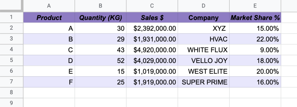
As with any chart, we must start with the data that we need to convey.
In our example below, we compare different products’ quantity, sales, and market share, using the following data points:
- Column A: Labels
- Column B: Position of the bubble on the X-axis
- Column C: Position of the bubble on the Y-axis
- Column D: Name of the company
- Column E: Size of the bubble on the chart
How to Create a Bubble Chart in Google Sheets
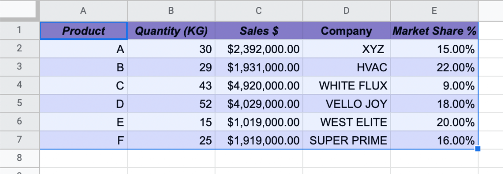
1. Highlight the dataset you need for your chart (A1:E7).
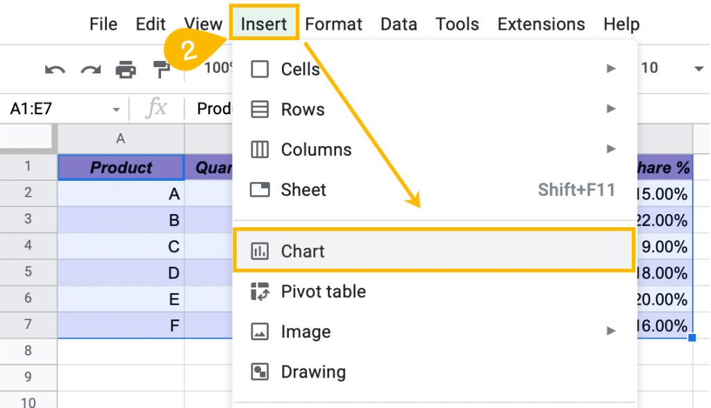
2. In the toolbar, select Insert. From the drop-down list, choose Chart.
3. This will open the Chart Editor task pane. Go to the Setup tab and select the Chart type menu.
4. Under Scatter, you will find the Bubble chart. Select this chart type.
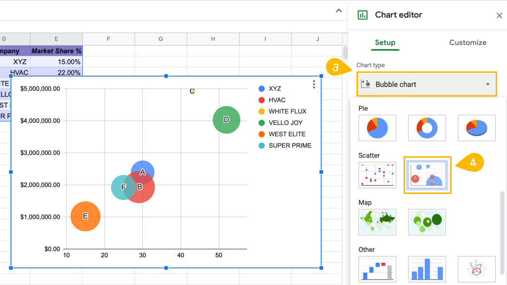
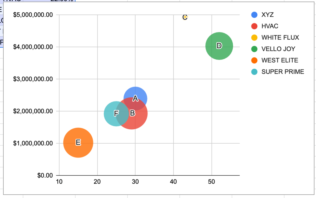
Your chart will look like this when you select the Bubble chart option. Now that your chart is ready, we can customize it.
How to Customize a Bubble Chart in Google Sheets
Let’s customize our Bubble chart to make it stand out and wow your readers.
To create a unique chart, rather than simply using the default settings, follow these simple steps.
How to Change the Title of the Bubble Chart
Let’s start by changing the chart’s title. The title is an essential part of your chart as it immediately informs your reader of what your chart is about.
There are two ways to update the title.
The first way is simply to double-click on the title itself and change the wording as needed.
Alternatively, if you don’t just want to change the title but also to customize it—or if the title wasn’t automatically added to your chart—do this instead:
1. Right-click on the chart plot.
2. Select Chart & axis titles.
3. Choose Chart title.
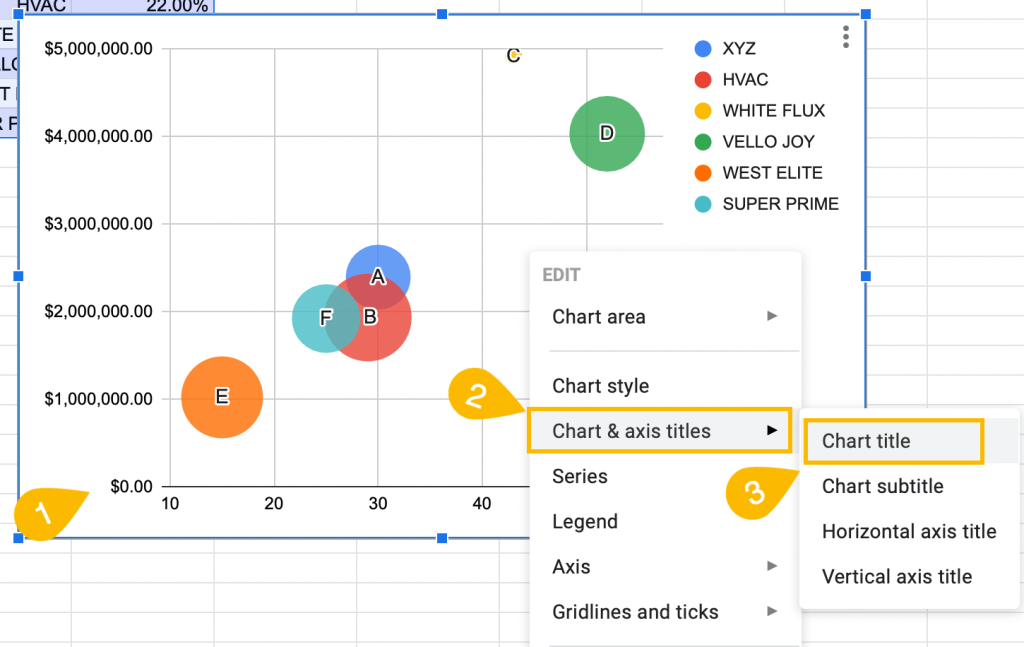
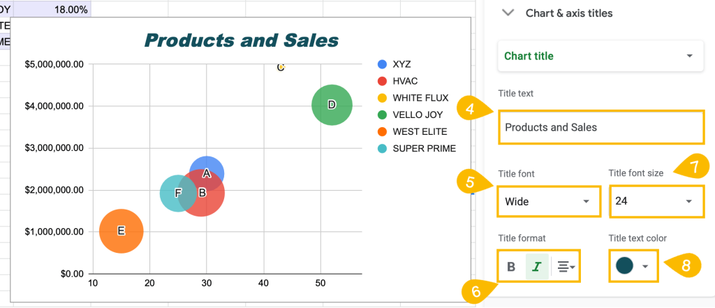
4. Under Title text, enter a title for your chart.
5. In the Title font section, choose the font for your chart title.
6. Title format will allow you to adjust the styling (such as highlighting the title in bold or italic) and modify the position of the chart title.
7. For Title font size, you can change the size of your chart title.
8. Title text color allows you to choose the color of your chart title.
Awesome! With that customization down, let’s move on to the next!
How to Change the Chart Style
Changing the chart style is the first option in the customization window. This is where you can play around with the background and border color.
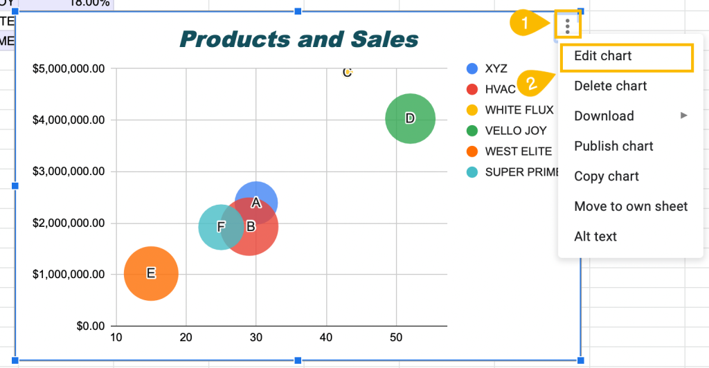
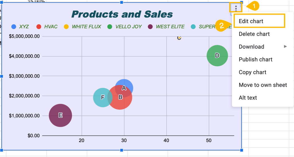
1. Click on the three-dot menu on the chart plot.
2. Select Edit chart.
3. Navigate to the Customize tab.
4. Choose the Chart style menu, and under Background color, pull up the color palette and pick any color you want.
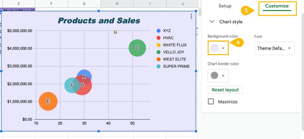
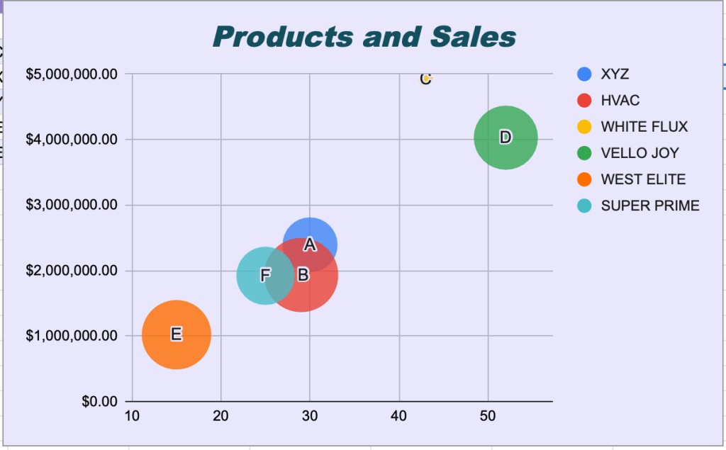
See how the color can change the look of your chart!
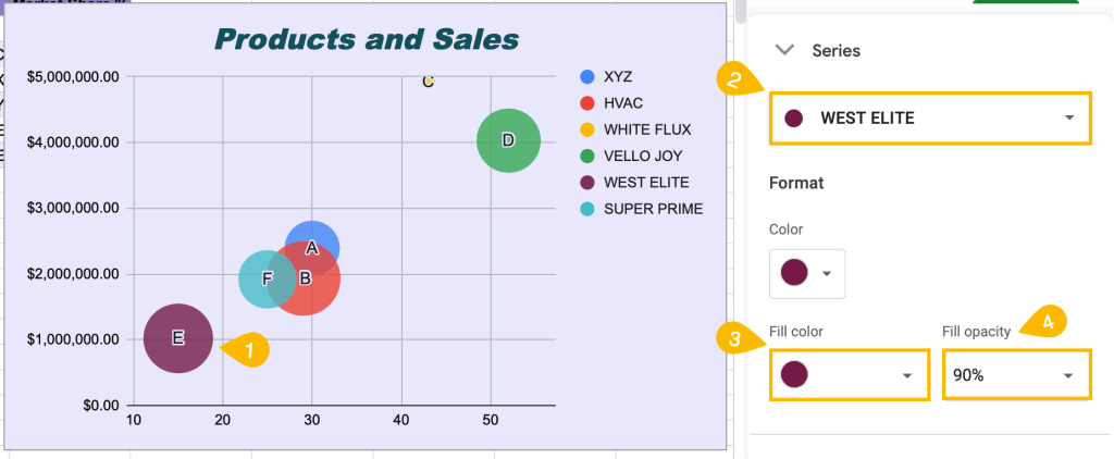
How to Customize Bubbles in Google Sheets
You can’t actually change the size of the bubbles on your chart. However, there are other features you can use to customize them.
1. With the Chart editor open, select a random bubble on your chart plot.
2. Under the Series section, select a specific bubble to modify it.
3. The Fill color field allows you to change the color of the bubble you selected.
4. In the Opacity field, you can adjust the opacity of each bubble.
Your chart is looking great!
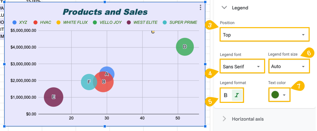
How to Modify the Legend of the Bubble Chart
Change the legend color, font, and position to fit the chart style you are creating.
1. Right-click on the Bubble chart.
2. Select Legend.
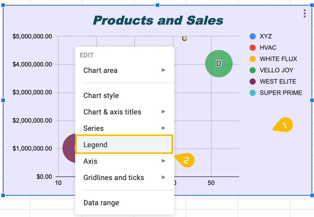
3. To change the legend’s position, click on the box labeled Position.
4. Under Legend font, modify the legend’s font.
5. Change the legend’s format (bold, italic) under the Legend format box.
6. Click on the Legend font size box to change the size.
7. Modify the color of the legend under the Text color box.
Beautiful! Finally, let’s take a look at the last step of customization.
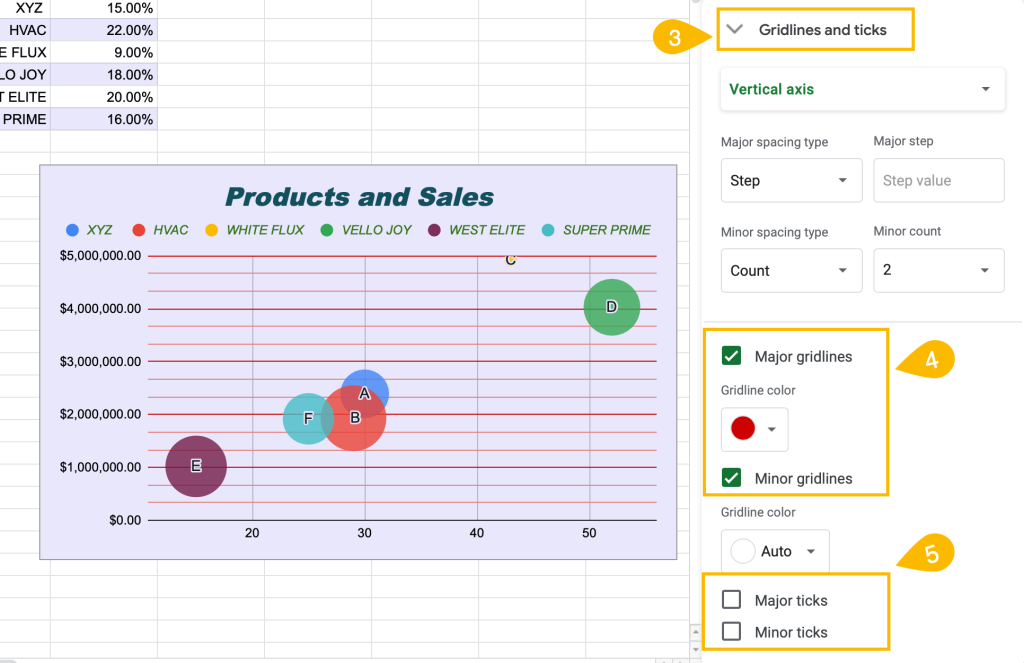
How to Add or Remove Gridlines and Tick Marks on a Bubble Chart
Gridlines and tick marks are typically used to help with the readability of a chart.
You have the option to modify gridlines and tick marks as needed.
1. Click on the three-dot menu.
2. Go to Edit Chart.
3. Navigate to the Gridlines and ticks menu.
4. Tick the Major gridlines and Minor gridlines boxes to add gridlines to your bubble chart. Use the Gridline color box to change the color of your gridlines.
5. Check the Major ticks and Minor ticks boxes to add tick marks. You can adjust Tick position, Tick length, Line thickness, and Line color as well.
To remove any of these marks, just uncheck the corresponding boxes.
Congratulations! You have made and customized your very own Bubble chart. As you have seen in this article, Google Sheets makes this process very simple.
Turn your data into art and impress your colleagues with your chart-making skills today!
