
To make a graph in Google Sheets, select the data for your graph, go to the Insert menu, click on the Chart option, and pick the graph you want to create.
The steps below will guide you through the process so you can learn all the details needed to create a graph in a few seconds.
This article will also show you some basics in how to change the chart type or data range in Google Sheets easily.
How to Make a Graph in Google Sheets
Graphs act as a visual representation of data, usually to track trends, compare data sets, and more. The following example will show you how to create one using just a few clicks of the mouse!
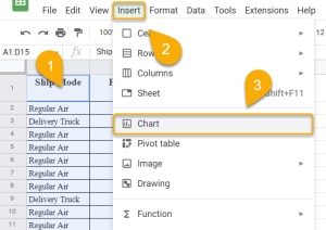
- Select the data from your spreadsheet that you would like to use to make your graph.
- Navigate to the Insert menu.
- Choose the Chart option from the list.
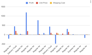
That’s all it takes to add a graph to your document.
How to Change the Chart Type
The above graph is the default version offered by Google Sheets, but it doesn’t take much to change it to fit your needs. Let’s take a look at how this can be done.
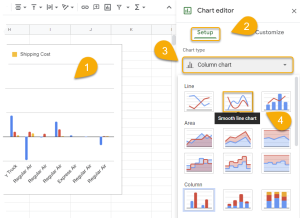
- Double-click on the graph.
- Select the Setup menu.
- Click on the Chart type.
- Choose the type that better serves your purpose.
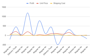
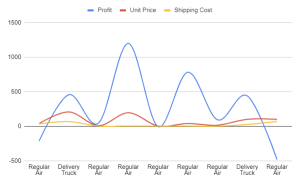
Take a look at the result below!
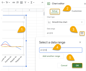
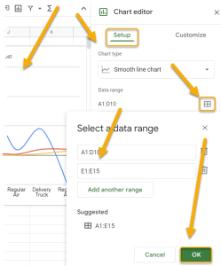
How to Change the Data Range
Once you’ve created a graph, you may need to expand on it or update it over the course of time. This function is useful because you can add additional values to the graph or remove them as needed. Read on to learn how to do it.
- Double-click on the graph.
- Click on the Setup menu.
- Select the grid icon next to Data range.
- Enter the updated data range for the chart.
- Click OK.
Voila! The chart will update automatically with the new data.
Google Sheets Chart Free Template
You can download a free chart template here.
Google Sheets Chart FAQs
Read on to learn more about making charts and graphs in Google Sheets.
How do I add data to a chart in Google Sheets?
To add data to a chart, double-click on the chart, choose the Setup menu, click on the grid icon, enter the range of data you need to add, and click OK.
What are the types of charts available?
There are many types of charts you can make in Google Sheets: bar charts, line charts, pie charts, scatter plots—you name it.
Bar charts are good for visualizing data that is categorized into groups.Line charts are used for showing how something changes over time. Pie charts are best for displaying data that is part of a whole. And scatter plots are used to show the relationship between two sets of data.
How do I find the chart editor in Google Sheets?
To find the chart editor, click on the three-dot menu in the corner of the chart. From the list that pops up, choose the Edit chart option.
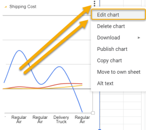
Alternatively, you can just double-click on the chart, and the chart editor will appear automatically.
What is the difference between a chart and a graph?
A chart is a graphical representation of data, while a graph is a mathematical representation of data. In other words, a chart is used to visually display data, and a graph is used to represent data in numbers.
It is possible to communicate information effectively using both charts and graphs. However, you may want to use one over the other depending on the type of data you are working with and what you want to communicate.
