To add a secondary axis to a chart in Google Sheets, first highlight the data, go to the Insert menu, and pick Chart. Next, select your chart, click on the three-dot menu on the chart to open the menu list, and choose the Edit chart option. Finally, open the Customize menu, pick Series, click on the series you need to add, and choose the axis you want to put on the chart.
Use the guide below to learn how to add and customize a secondary axis in Google Sheets in just a few clicks.
How to Insert a Second Y-Axis
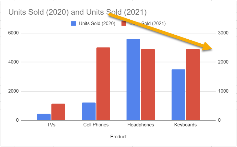
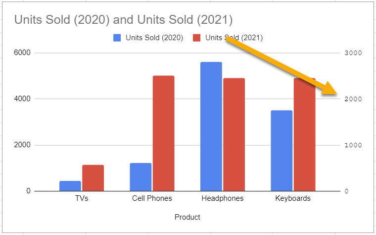
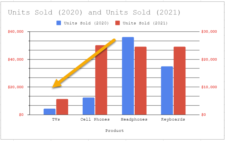
This section will include an example of adding a secondary axis to your graph, which allows you to represent additional values.
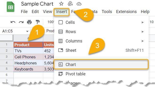
- Select your data.
- Navigate to the Insert menu.
- Choose the Chart option from the list.
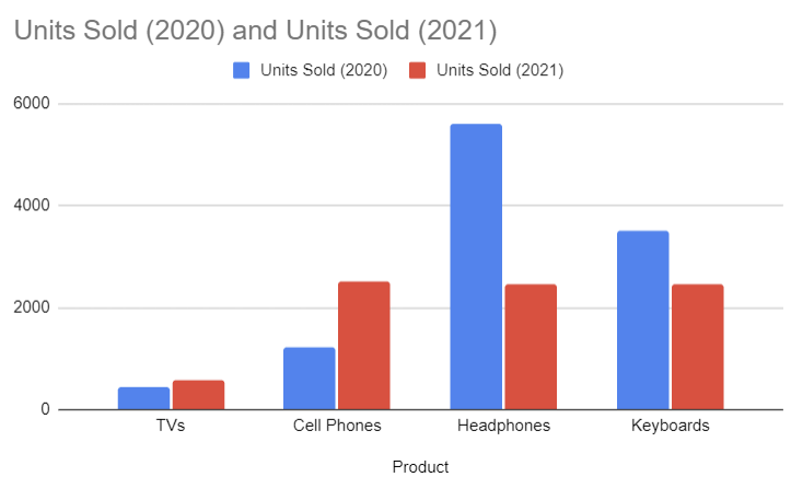
Just like that, you’ve added a chart.
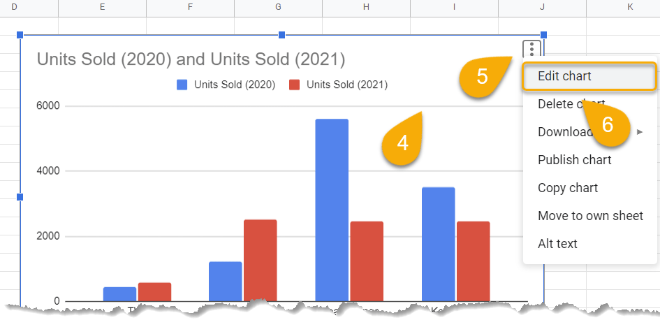
- Click on the chart.
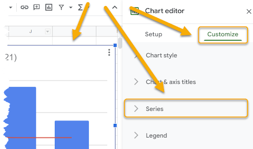
- Select the three-dot menu on your chart.
- Pick the Edit chart option.
- Click the Customize option once the Chart editor appears.
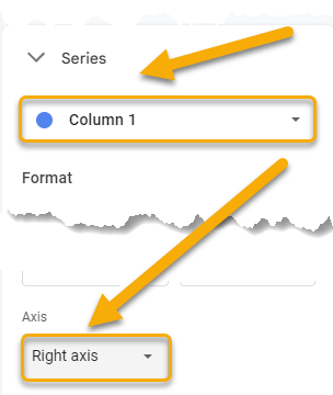
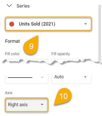
- Select Series.
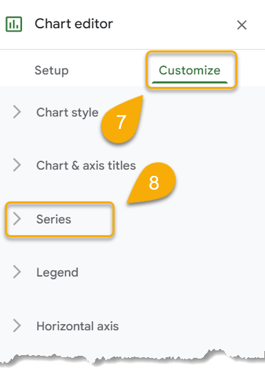
- Choose the series you need to add.
- Pick the axis you want to put on your chart.
Voila! Let’s move on.
How to Customize a Secondary Y-Axis Label
Let’s dig into the details of how to customize a secondary Y-axis.
Label Font
Change the label font to improve the visual aesthetics of your chart and make it easy to read your data. Check out the steps below to make this change:
- Double-click on the labels.
- In the Right vertical axis menu, click on Label font.
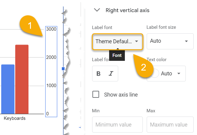
- Choose the font that works best with your document.
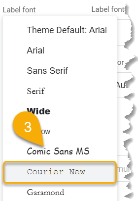
Just like that, the font will be updated to your new choice.
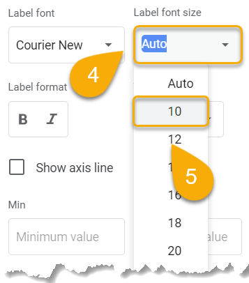
Label Font Size
It is very easy to change the size of your font by using the following method:
- Click on Label font size.
- Set the size.
Easy as ABC!
Label Format
Changing the label format involves the use of bold or italic styles of fonts that can distinguish labels from other text or simply change their appearance.
- Go to the Label format section.
- Pick the format you want.
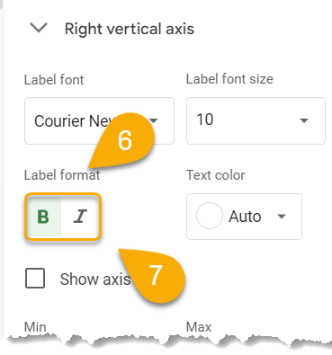
See how this can improve your chart style!
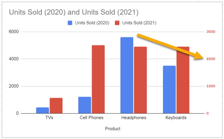
Text Color
Try changing the font color to customize the labels here using the tips provided below:
- Tap on the Text color option.
- Choose the color that works best for your chart.
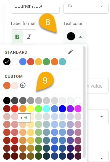
Piece of cake!
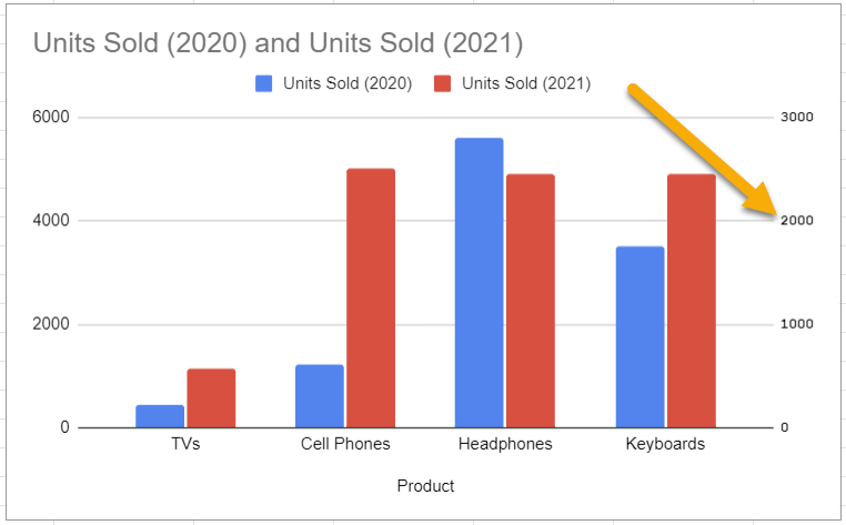
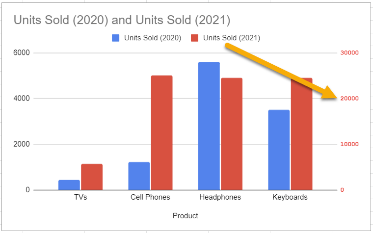
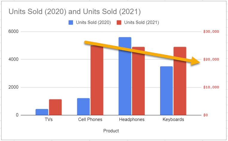
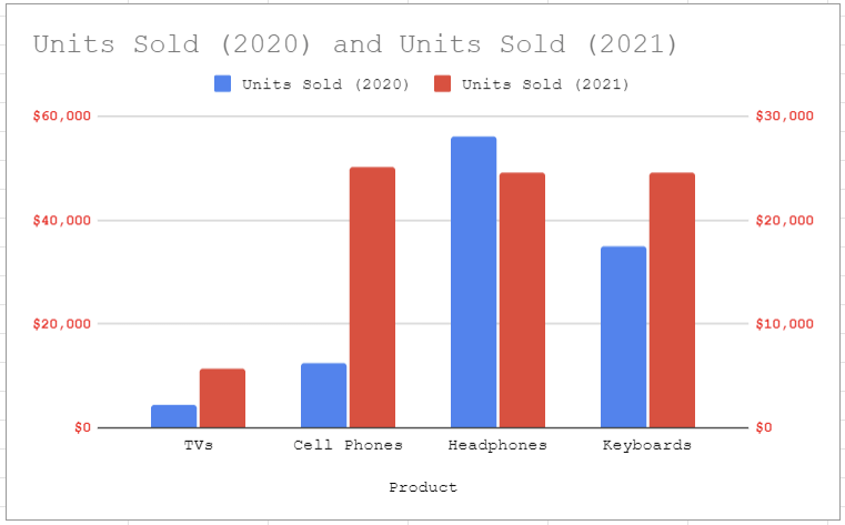
Scale Factor
You may want to adjust the scale of your secondary axis so that it more accurately reflects the data you’re trying to display. If so, take a look at how to do this:
- Go to the Scale factor option.
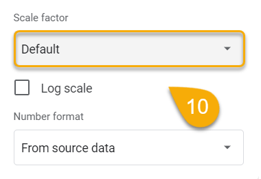
- Set the scale you need.
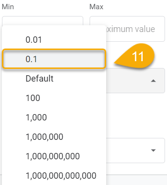
Here’s what you get:
Number Format
If you need to change the number format for your labels, you can use the guide below to organize your values correctly in relation to the graph and data.
- Go to the Number format section.
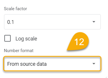
- Choose the format you need to represent your data.
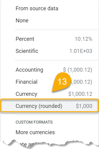
Voila!
These steps should be followed for any axis that you need to personalize.
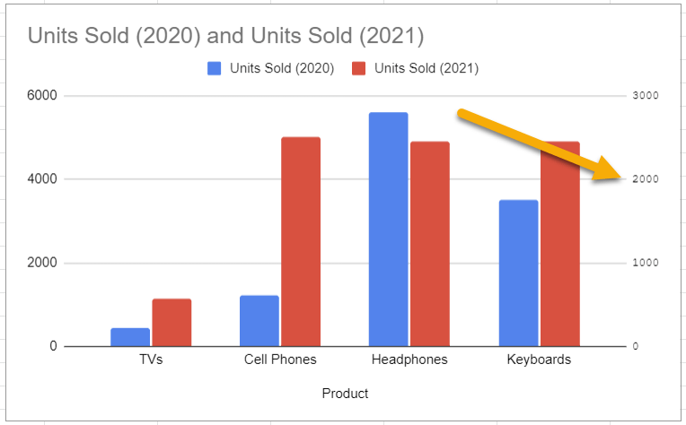
That’s it! Here is how it looks.
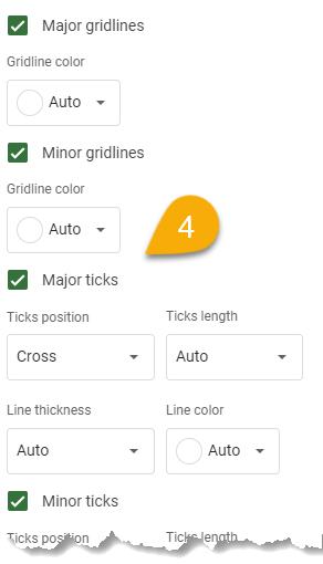
How to Add and Modify Gridlines and Ticks for the Secondary Y-Axis
In this section, we are going to show you how you can easily add and customize gridlines and ticks in just a few seconds.
- Double-click on the chart.
- Click on the Customize option.
- Choose the Gridlines and ticks menu.
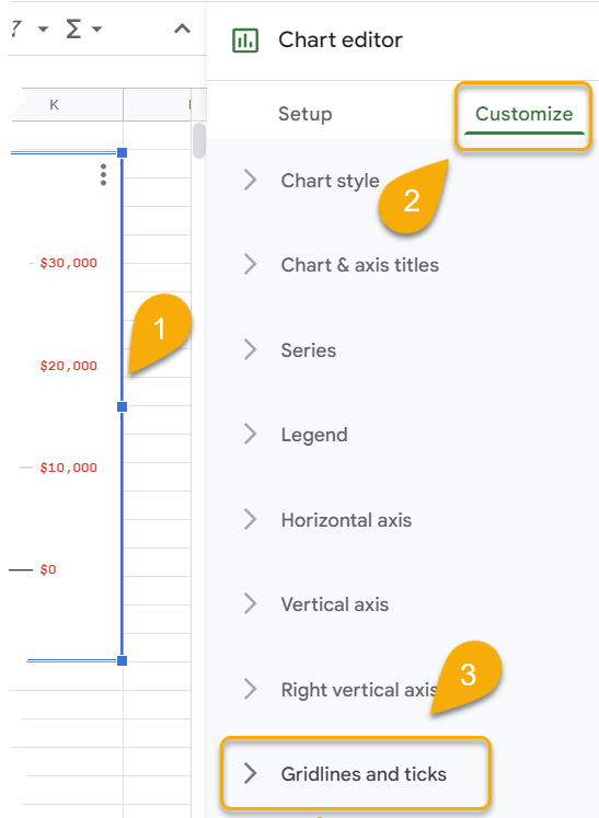
- Check the marks to add gridlines and ticks.
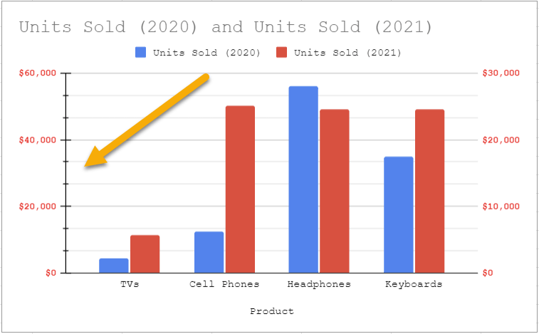
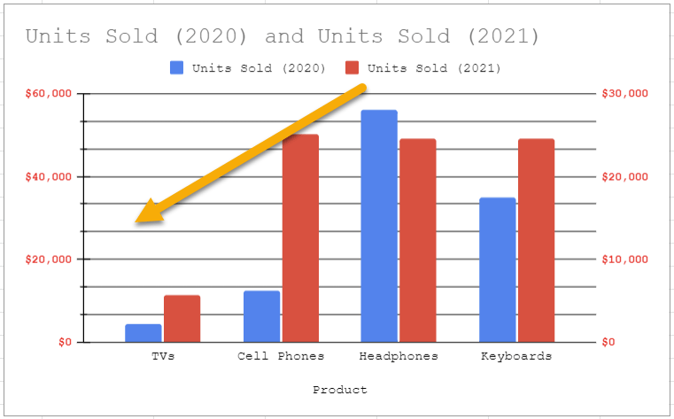
Here is what that looks like:
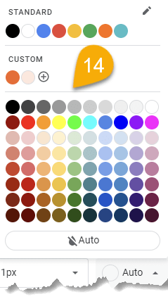
- Click on the Gridline color option.
- Set the color you need.
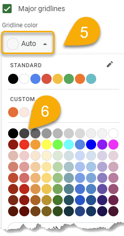
Easy as 1-2-3!
Next, let’s deal with ticks.
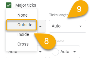
- Go to the Ticks position section.
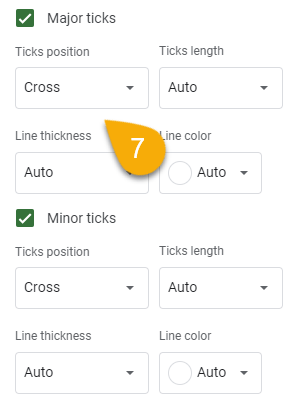
- Select the position you need.
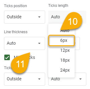
- Choose the Ticks length option.
- Choose the length you want for your chart.
11. Click on Line thickness.
- Set the thickness you prefer.
- Move to the Line color option.
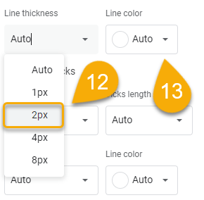
14. Pick the color you like.
Congratulations! You have personalized your chart!
Secondary Axis in Google Sheets FAQs
You can learn more about this topic in the FAQs below.
What is a secondary Y-axis in Google Sheets?
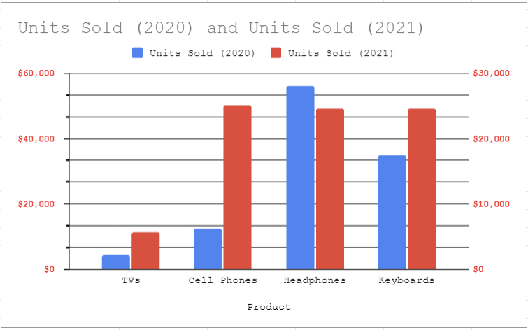
A secondary Y-axis is an axis that appears on the side of your Google Sheets graph. For example, if you have data that goes from 1 to 10 and another dataset that goes from 100 to 1000, adding a secondary Y-axis can help you visualize both sets of data at the same time.
What is the purpose of adding a secondary Y-axis?
There are various reasons why you might add a secondary Y-axis to a graph in Google Sheets. For example, if you’re graphing two sets of data that have different units of measurement, you can use a secondary Y-axis to ensure that both sets of data are represented accurately on the same graph. By doing so, you will be able to better visualize the information that you have presented in your graph.
Which chart types allow adding a secondary axis?
Currently, the secondary axis can be added to the line, area, and column charts.
Can I add a secondary Y-axis to a combo chart?
Yes, you can add a secondary Y-axis to a combo chart in Google Sheets. To do this, you need to double-click on the chart you want to change, navigate to the Customize option in the Chart editor menu, and go to Series.
Next, choose the series to which you want to apply additional values, and select the axis.