
A waterfall chart is a type of graphic visualization used to represent changes in a data set over time. It uses horizontal and vertical bars to illustrate changes in values over multiple time periods, with each bar representing the total value at a specific point in time.
Typically, these charts are used to demonstrate how financial gains or losses from one period impact subsequent periods, and they can be an effective tool for analyzing trends or unfolding processes.
Moreover, large quantities of data in Excel spreadsheets can sometimes be perplexing and overwhelming. Charts such as these can help make the data more accessible and understandable.
Below, you will learn how to create and customize your very own waterfall chart. If you’re looking for more charting options, check out our blog post covering how to create a stacked waterfall chart in Excel.
How to Create a Waterfall Chart in Excel
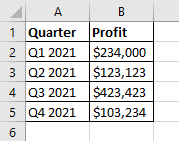
Before creating the waterfall chart, you will need to prepare the data you want to display. Here is the sample data we will use:
Setting up the chart itself is very easy and can be done in just a few clicks.
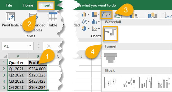
1. Start by selecting the data you need for your chart (A1:B5).
2. Open the Insert tab.
3. Go to the Charts section and select the dropdown with the Waterfall chart option.
4. Choose the Waterfall chart.
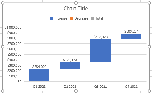
And just like that, you have your waterfall chart.
How to Customize Your Waterfall Chart in Excel
Your waterfall chart is now ready to go. However, you don’t really want to stick with the default appearance if you intend to wow your audience. If you are looking to customize your waterfall chart in Excel, there are many different tools and plugins available that can help you easily build and customize your chart. Read on to learn some of the options available to make your chart more attractive.
How to Change the Chart Title on Your Waterfall Chart in Excel
One of the main keys to an effective chart is a good title. Let’s take a look at how to add or update the title on your waterfall chart.
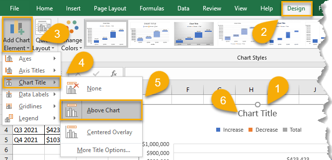
1. Click on your chart.
2. Go to the Design tab.
3. Select Add Chart Element.
4. Choose the Chart Title option.
5. Pick the position of the title on the chart.
6. Double-click the title text to change it.
Easy as ABC!
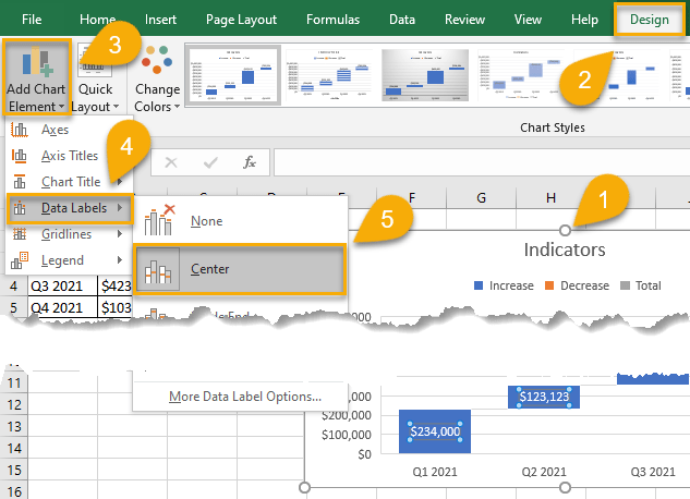
How to Add Data Labels to Your Waterfall Chart in Excel
Adding data labels to your Excel charts can help you visually communicate your data in a more impactful way. By default, most charts will have some form of data label automatically applied, but you can also add your own custom labels if needed. Let’s see how to do it!
1. Click on your chart.
2. Navigate to the Design tab.
3. Choose Add Chart Element.
4. Click Data Labels.
5. Select the label position: Center, Inside End, Inside Base, Outside End, or Data Callout— whatever works best for your chart.
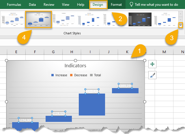
How to Apply a Different Style to Your Waterfall Chart in Excel
If you want to further customize your chart, you can update the chart’s entire design—all with just a few clicks!
1. Select your chart.
2. Go to the Design tab.
3. Click the More arrow in the lower-right corner of Chart Styles to see your options to change the overall visual style of the chart.
4. Select the style you like.
Waterfall charts are a helpful way to visualize changes in data over time and can be used to identify trends or patterns in financial data. When used correctly, they can be an invaluable tool for analyzing data and making informed decisions.
