
To create a stacked waterfall chart in Microsoft Excel, first calculate the values needed to make the chart using the formula =B3+C3+D3, where B3, C3, and D3 represent the cells with indicators from the previous row. Drag this cell with the result down through the remaining cells to copy the formula into each one. Next, highlight your data and navigate to the Insert menu. Select the stacked waterfall chart from the list.
Follow the procedure below to make sure you don’t miss a beat!
Step 1: Modify Your Table
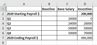
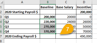
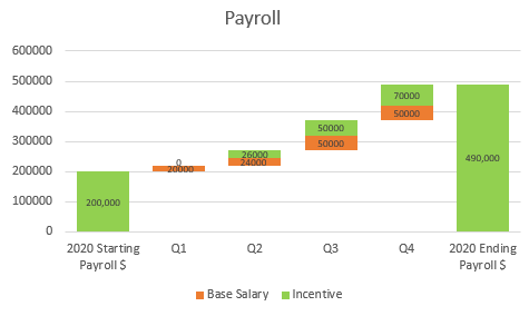
To make your chart, you’ll need to modify your data table and calculate new indicators. In our example, we have a table displaying the Payroll during the year, Base Salary, and Incentive. D7 is the cell with the total amount. We added the Baseline column for the new indicators.
Now let’s calculate the Baseline. Here’s how to go about it step by step.
1. Click on the cell where you need to place the first value. In this case, it’s B3.
2. Go to the Formula bar and type =D2. This indicator is equal to the Incentive amount (starting amount) from the first row.
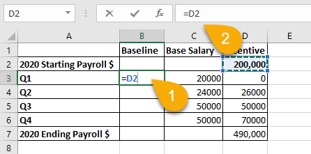
3. Press Enter on your keyboard.
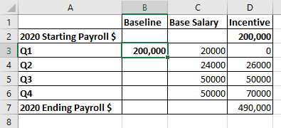
4. Select the cell for the second indicator (B4).
5. Navigate to the Formula bar and type the formula =B3+C3+D3, where B3, C3, and D3 are the indicator cells from the previous row.
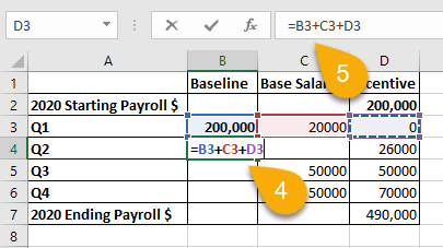
6. Press Enter.
7. Drag the cell with the result down through the other cells to copy the formula into those cells.
Easy peasy! Let’s move on.
Step 2: Create a Stacked Waterfall Chart
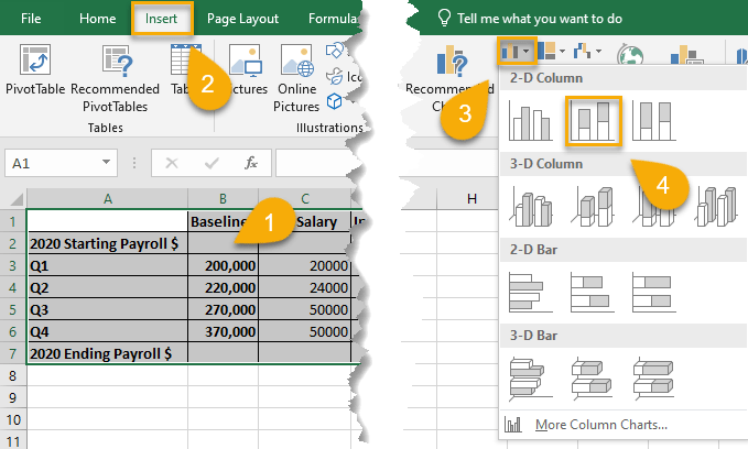
1. Highlight all data in your chart (A1:D7).
2. Go to the Insert tab.
3. Choose Insert Column or Bar Chart from the Chart menu.
4. Pick Stacked Column.
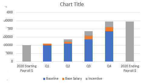
Just like that, you’ve got your chart!
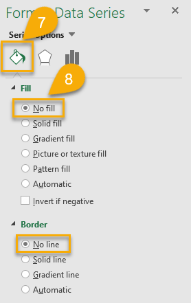
5. Right-click on the Baseline section of the columns (blue).
6. Pick Format Data Series.
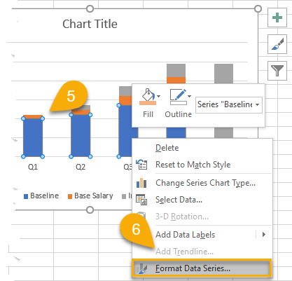
7. Choose the Fill & Line option.
8. Select No fill and No line.
If you want to alter the look of your chart, you can change the color of your columns.
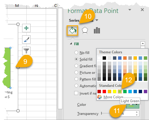
9. Select your columns.
10. Pick Fill & Line in the Format Data Point menu.
11. Choose the Fill Color option.
12. Select the color you like.
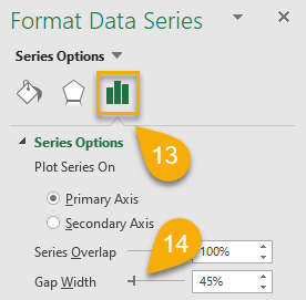
13. Navigate to the Series Options.
14. Reduce the Gap Width.
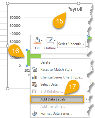
Let’s enhance the detail of your stacked waterfall chart by adding a chart title and data labels.
15. Double-click the default chart title to select it and type your own title.
16. Right-click on the columns.
17. Select the Add Data Labels option.
Super easy! You have successfully created a stacked waterfall chart.
Stacked Waterfall Chart FAQs
Dive deeper into the study of stacked charts by checking out some frequently asked questions below.
What Is a Stacked Waterfall Chart in Excel?
A stacked waterfall chart is a type of Excel chart that shows how various parts contribute to a whole. It’s useful for seeing how individual items impact the total and for comparing different data sets.
What Are the Uses of a Stacked Waterfall Chart?
A stacked waterfall chart is used to visualize how a value progresses from one state to another. Each column in the stacked waterfall chart represents a change in value, and the total height of the stacked columns represents the cumulative value. Stacked waterfall charts are often used to visualize how an initial value changes over time. They can be used to visualize a variety of data sets, including financial data, such as budget balances, sales revenue, account balances, etc.
What Is a 100% Stacked Chart?
A 100% stacked chart is a stacked chart where each bar represents 100% of the value. This type of stacked chart is often used to visualize data sets where the total value is more important than the individual values.
