
To create a cumulative sum chart in Google Sheets, create a separate column with cumulative sum values using a custom formula “=SUM($B$2:B2)” and build a regular chart based on these values.
A cumulative sum chart is a graph that visualizes the running total of your values to help you spot trends and patterns for data-driven decision-making.
This chart type is not supported in Google Sheets, but with just a few simple steps that we’re going to cover in this article, you can easily create a nice-looking cumulative sum chart without using any add-ons.
Grab a copy of our free cumulative sum chart Google Sheets template if you’re short on time.
How to Create a Cumulative Sum Chart
To walk you through the process, step-by-step, we’re going to use this sample data table as a running example:
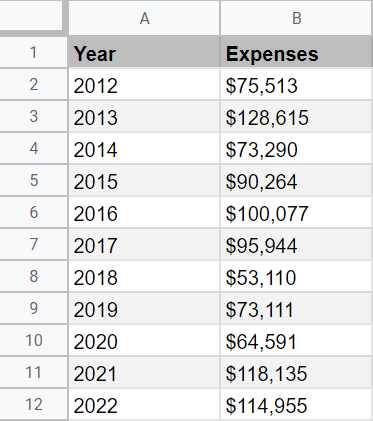
Let’s quickly break down what each column of our sample data means to help you easily adjust with your values.
- Column A (Year) – This column contains category values.
- Column B (Expenses) – This column contains the actual data values we’re going to use to calculate the running total of the column and plot our graph.
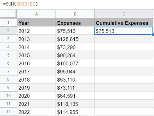
1. In the adjacent column to your data table (Column C), calculate the running total of column B by typing the following SUM function in cell C2:
=SUM($B$2:B2)
In this function, we lock cell B2 using an absolute cell reference to increase the cell range processed by the SUM function by one cell to cumulatively add up with each execution.
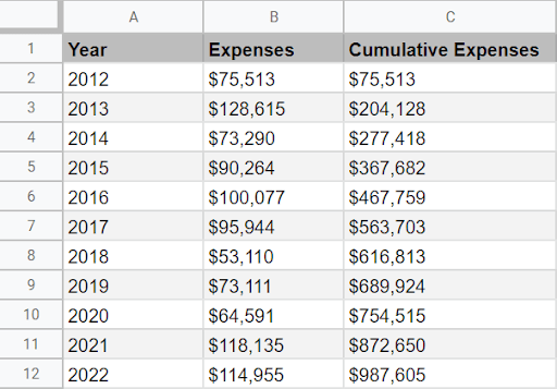
 2. Now we need to execute the SUM function for the rest of the cells in the column (C3:C12). To do that, double-click the fill handle (the blue square marker) to automatically calculate the running total of the entire data range.
Now, it’s time to create our cumulative sum chart using built-in Google Sheets charting tools.
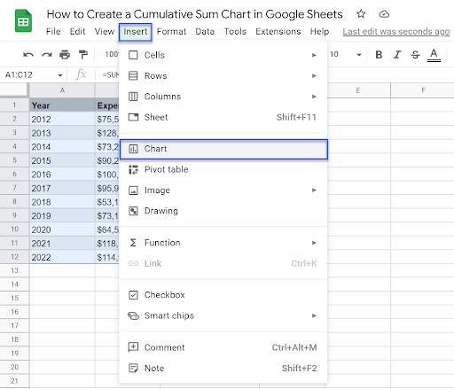
3. Highlight all of your data (A1:C12), go to the Insert tab, and choose “Chart” from the drop-down menu that appears.
As a result, you get one of the default charts (in our case, it’s a line chart). It doesn’t really matter what you get as we’re going to turn it into a combo chart anyway.
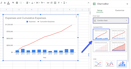
Once you create your chart, the Chart editor pane will immediately pop up. This is where the transformation is going to happen.
4. In the Setup tab of the Chart editor, open the “Chart type” drop-down and pick the option that fits your needs from the “Suggested” section.
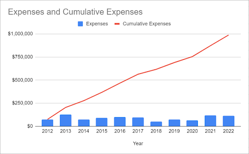
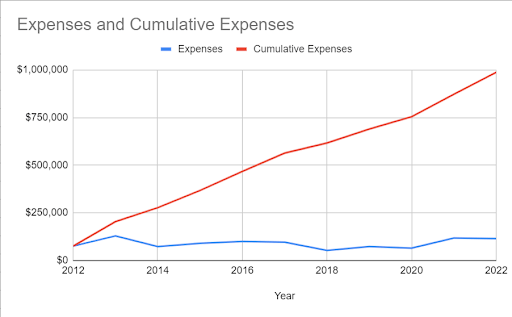
Finally, you get your nice and neat cumulative sum chart in Google Sheets. In our case, this chart helps us understand the burn rate of our project to spot outliers so that we can deeper analyze the expenses.
In addition, the columns give us a bird’s-eye view of the expenses broken down month by month, helping us compare how the allocated budget was spent on a more granular level.

