
When you work with data, you need to know how to present your data visually in a way that is effective and meaningful. Visual representation not only helps your users understand the data but also provides insight to assist with making efficient decisions from that data.
Understanding the distribution and shape of your data is a valuable tool, and frequency polygons can play a vital part in determining this.
In the article below, we will take a look at what frequency polygons are and how to create one in Google Sheets.
What Is a Frequency Polygon?
For those who are new to this term, a frequency polygon is a visual representation of data using a line graph to draw the frequency values based on their classes.
It allows you to understand the distribution as well as the shape of the data through the line chart, which is closed on both ends to give it a polygon shape.
Follow the steps below to create your own frequency polygon in Google Sheets.
How to Make a Frequency Polygon in Google Sheets (Step by Step)
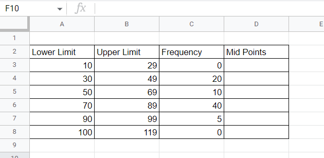
Let’s start with some data, such as the science test score data shown below. The Lower Limit and Upper Limit data columns are the class bounds, representing the starting and ending points, respectively. (For example, the first class includes any scores between 10, the lower limit, and 29, the upper limit.) Frequency measures the number of students who have achieved marks in the respective class bounds. This is a perfect setup for a frequency polygon in Google Sheets.
We will create a frequency polygon based on this data. Follow the steps below to see how it’s done:
1. In column D (“Midpoints”), in cell D3, input a formula to capture the midpoints of each class. The formula will add the Lower Limit and the Upper Limit together and then divide by 2 to find the average, or midpoint. Use this formula:
=(A3+B3)/2
Once this formula is added to D3, click and hold the bottom right corner of the cell and drag it down through the remaining cells in the column. This will copy the formula and apply it to each new row.
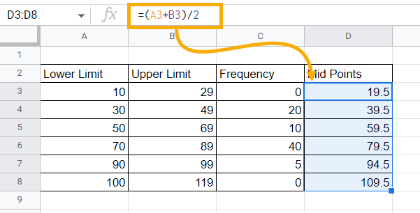
Calculating midpoints is crucial because you will be plotting the frequencies across these midpoints to create the frequency polygon.
2. Now we need to add the line chart. Select any blank cell, go to the Insert menu, and click on the Chart option.
Note: You must select a blank cell first in order to insert a blank chart.
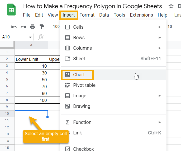
By inserting a blank chart, we can personalize the chart to shape it as a frequency polygon by selecting our own series and x-axis data.
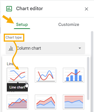
3. Click on the three dots in the upper right corner on the newly placed blank chart and select Edit chart. This will open up the Chart editor window on the right side of the sheet.
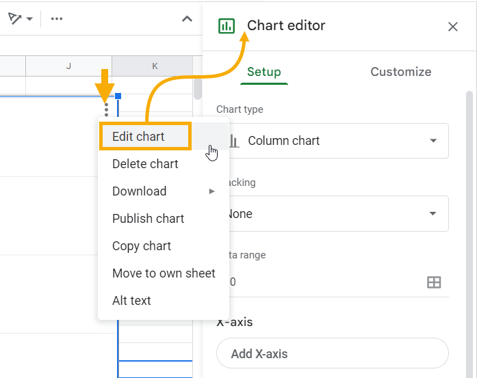
4. In the Chart editor, click on the Setup tab. Select Line chart in the Chart type drop-down menu.
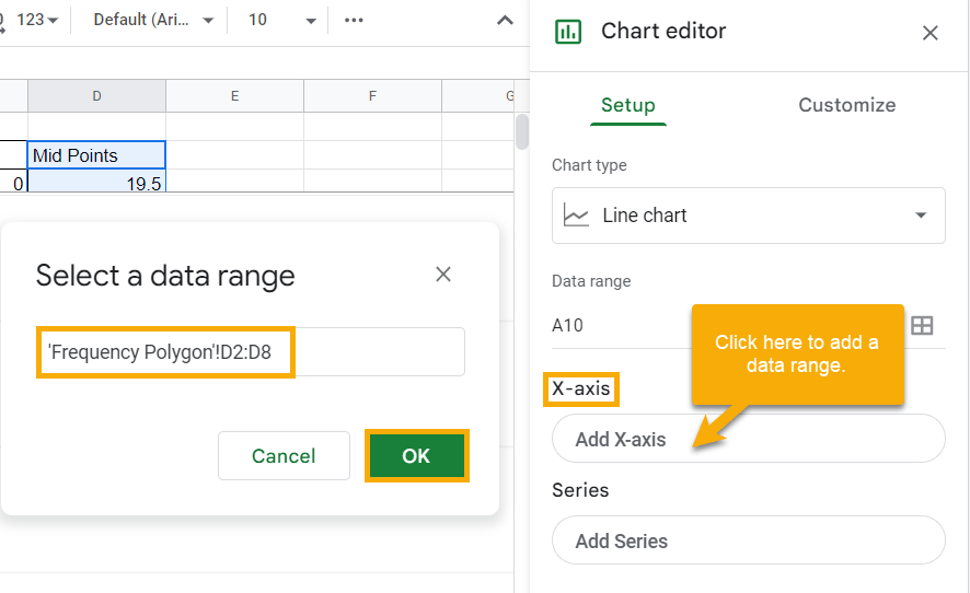
5. In the X-axis section, click Add X-axis. In the Select a data range window that pops up, select the range D2:D8, which represents the Midpoints data. Click OK to add this range to the X-axis.
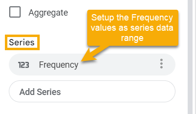
6. Similarly, click the Add series option in the Series section and use the range C2:C8 as the data range representing the Frequency.
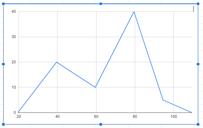
And that’s it! If you take a look at your chart, you will see that you have successfully created a frequency polygon based on the test score data provided. It should look like the one shown below:
You can add titles in the Chart & axis titles section of the Customize tab in the Chart editor to increase the readability of the chart.
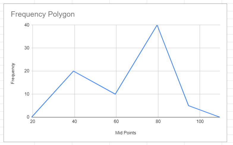
Note: Having zero frequencies at the start and end of your data is crucial because it allows you to have a closed frequency polygon structure rather than a simple line chart. To give a closed frequency polygon, those zeros will work as closing points at both ends of your frequency data.
Frequency Polygons in Google Sheets: FAQs
Below you’ll find some commonly asked questions regarding frequency polygons. Read on for more information.
How do you add frequency data in Google Sheets?
Many people ask about how to add or create a frequency list in Google Sheets. To answer this, let’s take a look at a step-by-step process that will allow you to determine frequency in your raw data based on some built-in formulas.
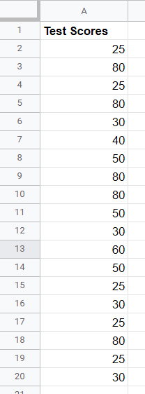
Start with some data, like the test score data shown below, where each cell represents an individual’s test score.
Manually adding frequency information based on data can be painstaking because you have to identify the classes first, and then you need to make sure each value goes into the proper class. If you have a lot of data, simply organizing it can end up consuming your whole day. Instead of doing that, use the method described below to make things much easier for yourself.
1. The first thing you need to do is determine the classes. In cell B3, type the following formula to create classes from unique values in your data.
=SORT(UNIQUE(A2:A20))
The UNIQUE function first discovers the unique values from cell A2:A20. The SORT function then sorts this data in ascending numerical order. Your result should look like this:
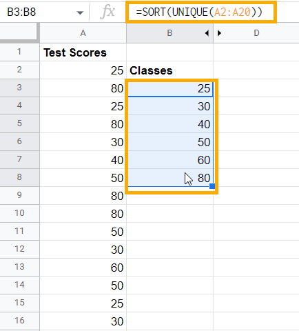
The formula above is an array formula, so you don’t need to worry about dragging it down. It will automatically span through all the potential cells with value.
Now that your classes are established, you can look at counting the frequencies. For example, how many times does the number 25 occur in your data?
2. In cell C3, type the following formula, which captures the frequencies specific to each class value:
=FREQUENCY(A2:A20,B3:B8)
The first argument for the FREQUENCY function is the data which specifies the range of cells out of which the frequency needs to be pulled. In this case, the entire Test Scores data spans A2:A20. The second argument represents the classes that will allow the function to count the frequencies. In this case, the values from B3:B8 will represent the class values. The result is the count of occurrences of each value in a specific class.
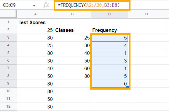
You can see that the last value is zero in the Frequency table, which is there because the FREQUENCY function itself works in a way that it searches for each data value and makes sure that it falls in a specific class. At the end, it checks for a condition above the last class value. In this case, it is by default checking if any value is above 80 and setting frequency to zero because there is no value above 80 in the data.
Using this method, you can determine frequency in Google Sheets based on raw data.
How do I make a frequency histogram in Google Sheets?
Perhaps you want to make a histogram based on frequency data in Google Sheets.
The most straightforward answer to this is to go to the Insert menu, click on the Charts option, and Google Sheets’ IntelliSense will automatically pick the histogram chart for data arranged like this, provided that the classes are uniformly created for the data.
However, if you want a step-by-step guide, check out the article How to make a histogram in Google Sheets. It describes the steps to follow in order to make your own histogram and personalize it.
What is the best way to display frequency data in Google Sheets?
If you have frequency data to share with others, you likely want to know the best way to present that data. Here is some advice in that regard:
1. If your database is relatively huge and cluttered, create frequency classes and distribute the frequencies using the method described above. This will make a frequency table, which will make your data more easily understood.
2. Histograms are a great way to visually describe your frequency data when the number of classes are defined and are generally less than 20 or 25. This is because the histogram best visualizes the distribution when there are less than 20 to 25 bins; otherwise, it gets too cluttered.
3. If you have more than 20 to 25 classes and want to show the area your frequency data covers, using a frequency polygon is the best option. It works just as well for fewer classes, so you can use it in place of a histogram.
In short, the frequency polygon is an excellent go-to option to display your frequency data in Google Sheets, no matter how much data you have.
