
To make a histogram in Google Sheets, select your data, go to the Insert menu, and click on Chart to insert a chart into your document. Then navigate to Setup in the Chart editor menu, tap on the Chart types, and choose Histogram.
Stick around so you don’t miss any important steps on how to create a histogram in Google Sheets. You will also learn how to format your data before creating a histogram and how to edit and personalize the histogram to suit your needs.
How to Format Your Data for a Histogram Chart
The first step in making a histogram in Google Sheets is to format your data. To do this, you’ll need to create a column or columns of data. Let’s take a look at how to do it.
- In your Google Sheets spreadsheet, click on the cell where you want to input the header for your data set.
- Type the header title.
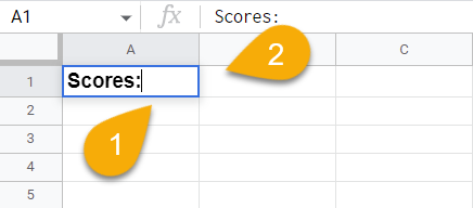
- Go down to the next row.
- Enter your values, going down the column with each new value.
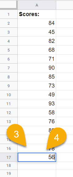
Voila! Your data set is ready. Create more columns as needed to incorporate all your data. In our example, we will use only one column of data.
How to Make a Histogram in Google Sheets (Step by Step)
Histograms are graphical representations of data and are similar to bar charts except that they use ranges of values (called buckets) instead of bars representing individual data points. Let’s jump right in and see how it’s done!
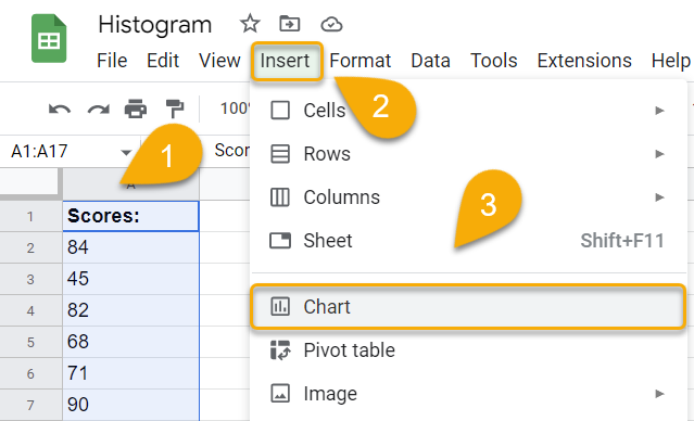
- Select your data.
- Navigate to the Insert menu.
- Choose the Chart option.
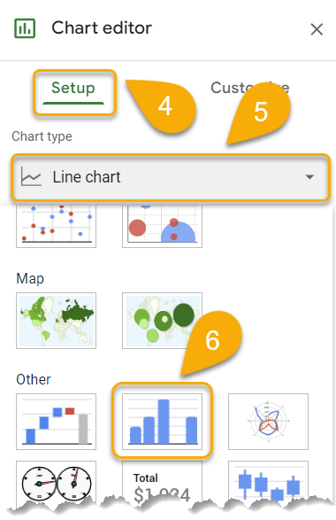
- Go to the Setup section in the Chart editor menu.
- Click on Chart type.
- Pick the Histogram chart type from the Other section.
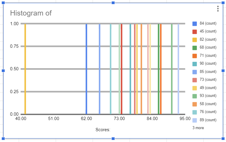
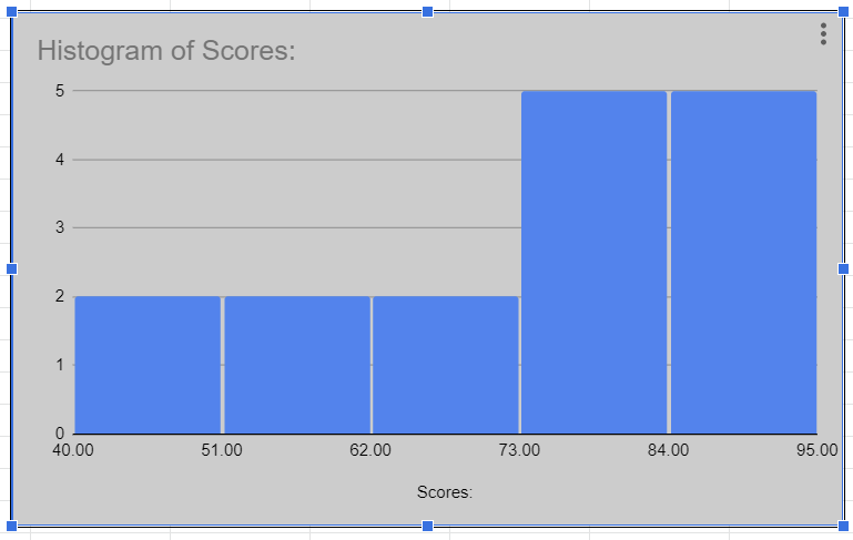
Piece of cake! You have quickly and successfully made a histogram for your data!
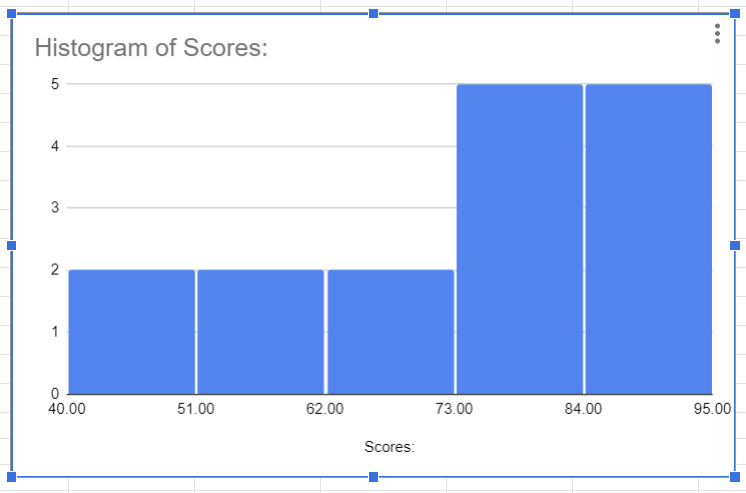
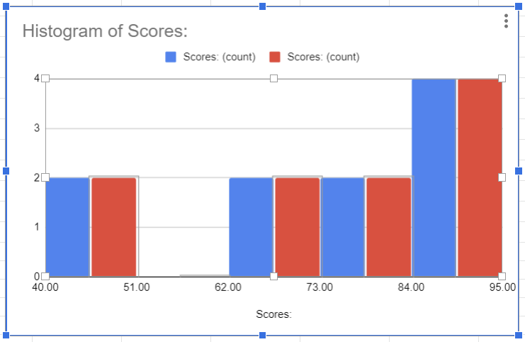
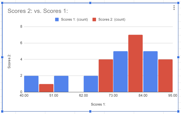
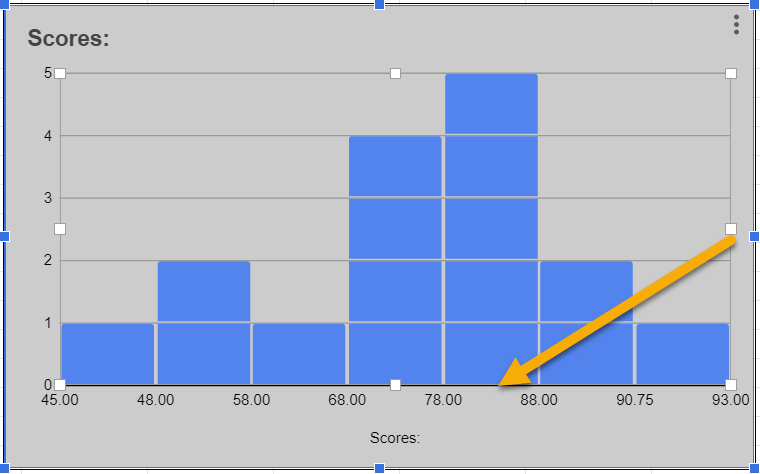
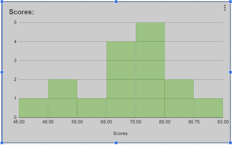
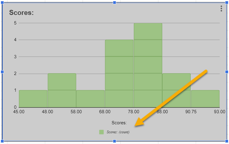
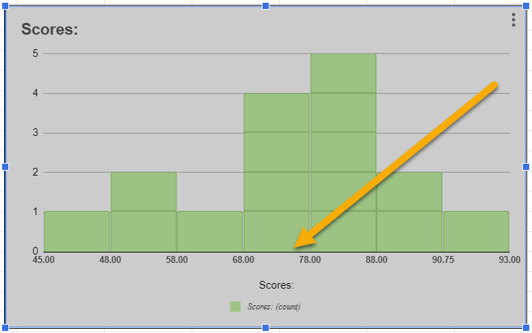
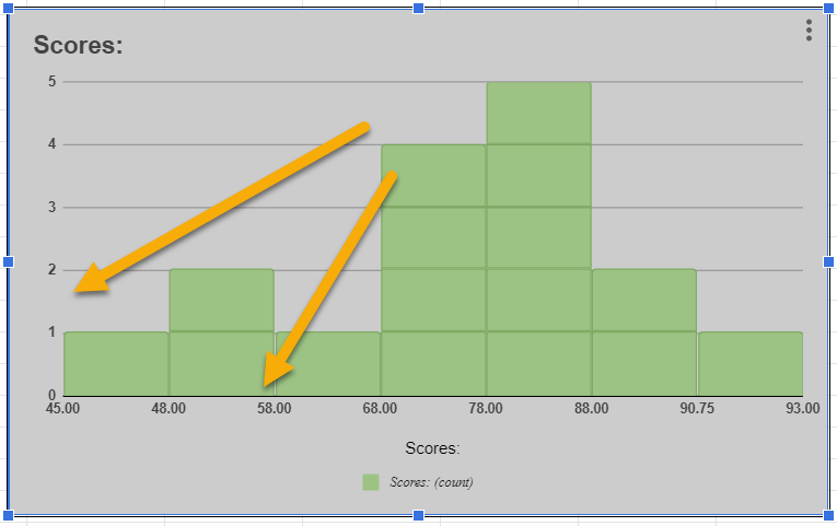
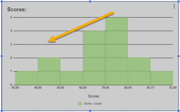
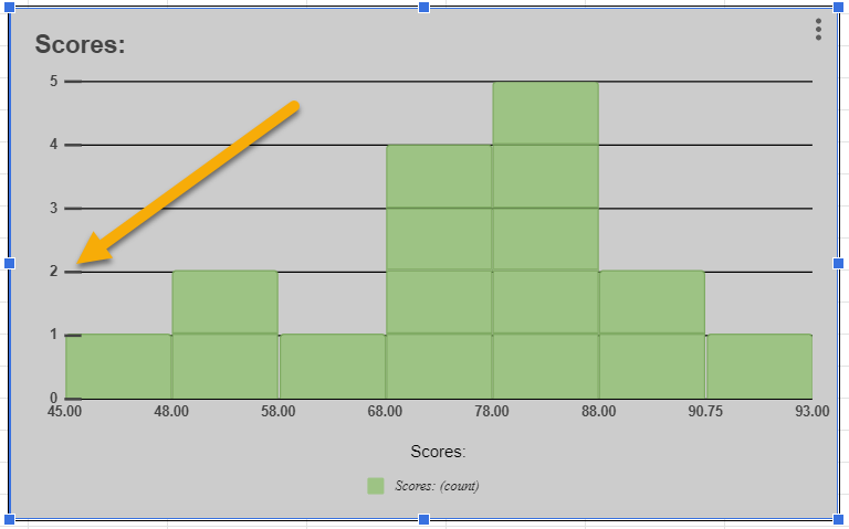
Notice how the histogram has grouped together similar scores and is representing them by group (or bucket). For example, two scores out of the total dataset fall within the bucket of 40–51 points, and five scores out of the total fall within the bucket of 84–95 points.
How to Customize a Histogram
In this section, you will learn how to customize your histogram according to various criteria. Let’s get started!
The Setup Tab
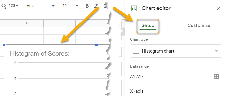
First, you need to double-click on the histogram and go to the Setup menu as shown below. In the Setup menu, explore and test the various options to see how you want your histogram to look.
Change Histogram Bin Range
The data range is the set of values that you want to use to create the histogram. If you would like to change the range after creating a histogram, you can do so at any time.
- Click on the grid icon in the Data range section.
- Enter the range you want to display.
- Press OK.
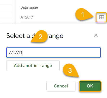
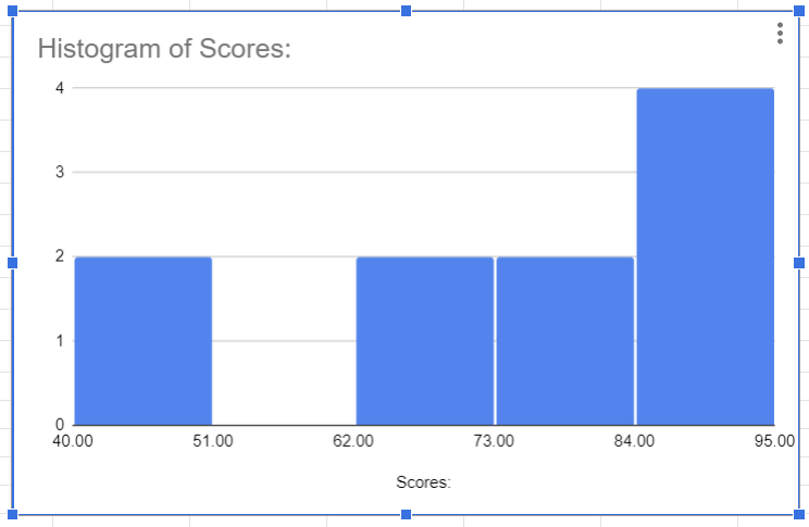
Easy as ABC! You can follow these steps to adjust the data range for the histogram whenever necessary.
Expand Histogram with Additional Series
You can add columns to the histogram to compare more than one set of data at a time. Let’s take a look at the steps below to see how it works.
- Navigate to the Series section and click on the Add Series option.
- Pick from the list of series available. In this case, select Scores.
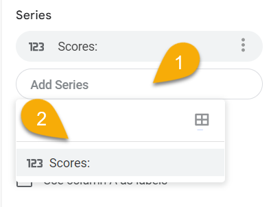
As simple as that! The new series will be included on the histogram.
Reorient Histogram Data
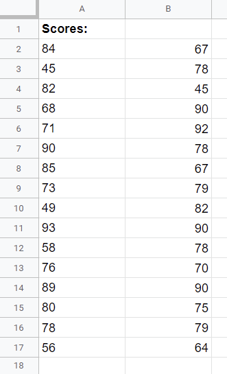
With the Switch rows / columns option, you can manage data that contains several columns or rows of values. Imagine that you have two columns of data, such as the following:
- In the Setup menu, check the box beside the Switch rows / columns option.
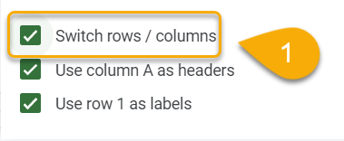
And the result is below!
This is especially useful if your data is written in rows rather than columns, as this function will allow you to swap the data orientation in your histogram.
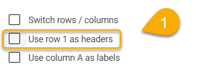
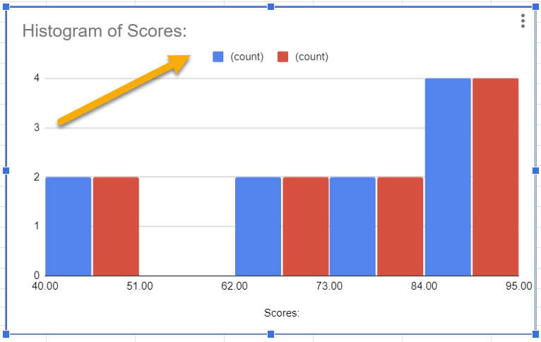
Set or Remove Histogram Headers
Whenever you create a histogram, the title defaults to the first row of your data. To change this, simply follow this one step:
- In the Setup menu, uncheck the Use row 1 as headers option.
Here is the updated histogram:
Set or Remove Histogram Labels
By default, the histogram displays data from the first column. But you can change this by following the step below:
- Uncheck the Use column A as labels option.
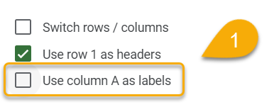
As simple as 1-2-3!
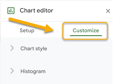
The Customize Tab
Next, move to the Customize menu in the Chart editor box. Let’s take a look at what options are available here.
Сhart Style
Let’s go ahead and change the appearance of the histogram in just a few clicks!
- Click on the Chart style section.
- Go to Background color.
- Choose the color you like.
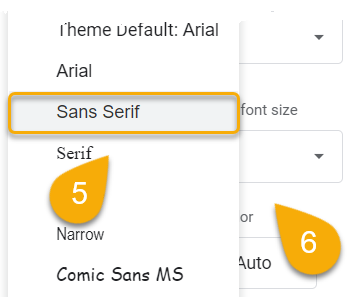
- Navigate to the Font tab.
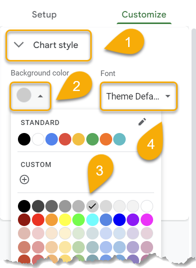
- Pick the font you prefer. Note: This changes the font of the entire histogram.
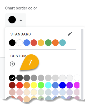
- Move to the Chart border color.
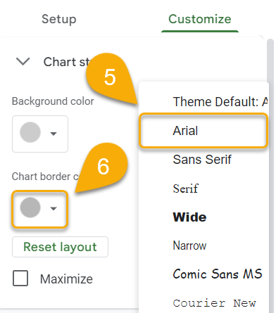
- Choose the color that best fits your chart.
Here is the result!
Histogram
If you need assistance in modifying your histogram, follow the steps below to do so:
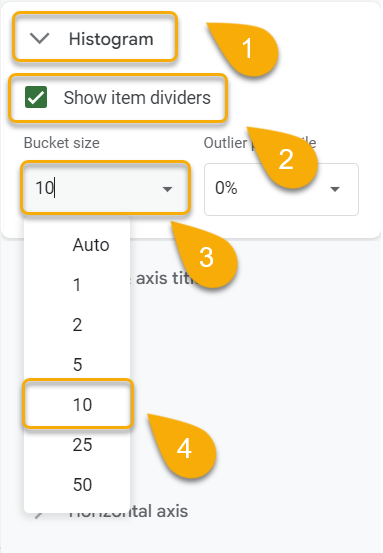
- Select the Histogram section.
- Check Show item dividers if you wish for the dividers to be visible.
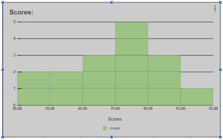
- Click on the Bucket size section.
- Set the size you need if you don’t want to use the Auto setting.
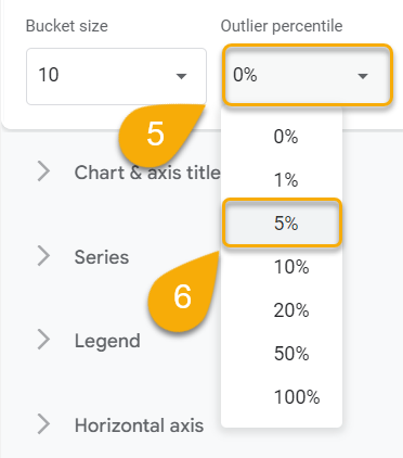
- Go to the Outlier percentile.
- Pick the value you prefer.
Voila! Now let’s see how this has modified our histogram!
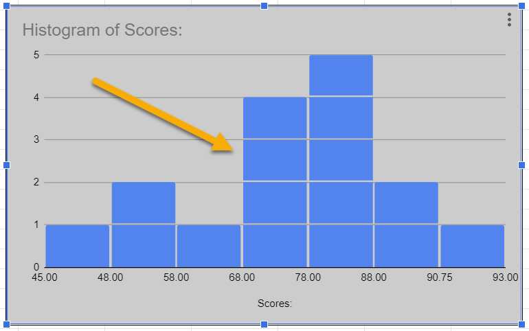
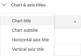
Chart & Axis Titles
Let’s see the steps on how to customize the title and axis labels of your histogram in detail.
- Select the Chart title option from the list.
- Enter the title you need.
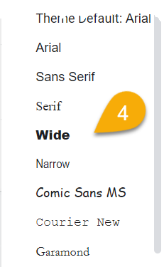
- Go to the Title font tab.
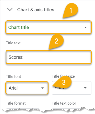
- Choose the font you like. Here you can customize the font from the rest of the histogram.
- Click on the Title font size tab.
- Pick the size.
- Set the title format (bold, italic, alignment).
- Move to the Title text color option.
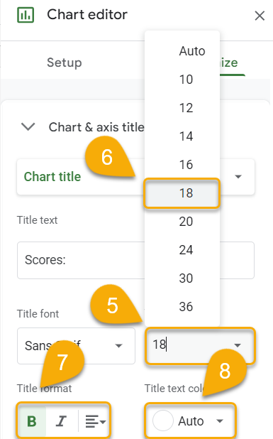
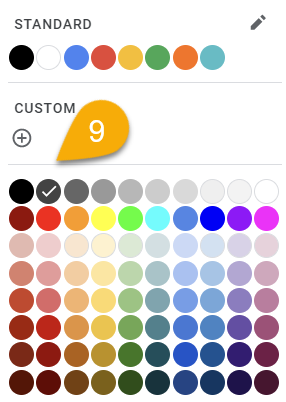
9. Select the color you prefer.
If you want to modify other types of titles, follow the steps you just applied.
Here’s your updated histogram. Let’s move on to the next step!
Series
This section is where you go to customize aspects of your histogram such as the color scheme, the background, the color or thickness of the lines, etc.
- Open the Series menu.
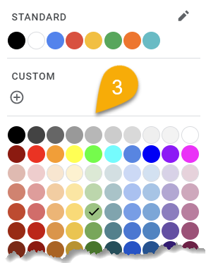
- Go to Fill color.
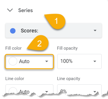
3. Click on the color you like.
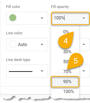
- Move to the Fill opacity option.
- Set the opacity percentage you want.
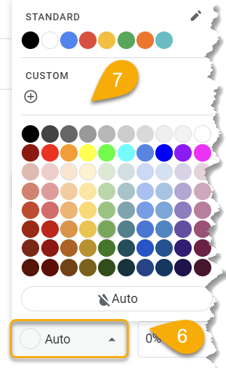
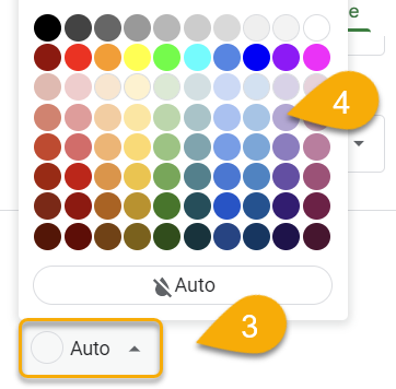
- Go next to the Line color.
- Select the color you prefer. You can also choose not to have an outline by selecting the Auto option.
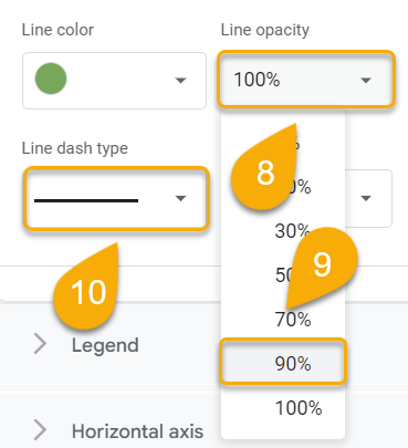
- Navigate to the Line opacity tab.
- Decide what percentage you want and click on it.
- Select Line dash type.
- Choose the type you want for your lines.
- Move to Line thickness.
- Set the thickness you need.
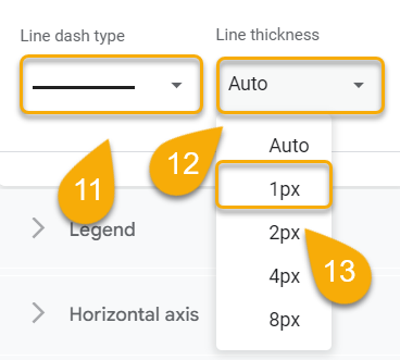
Super easy! If you have more than one series in your histogram, simply repeat these steps for each one.
Legend
The legend is a key part of any histogram. A well-constructed legend can make a histogram much easier to interpret. Let’s see how to add a legend to our histogram.
- Open the Legend section.
- Go to the Position menu.
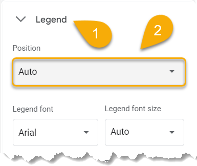
- Set the position you want for your legend.
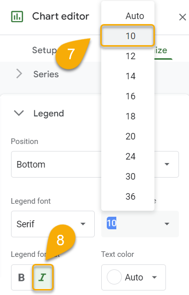
- Click on Legend font.
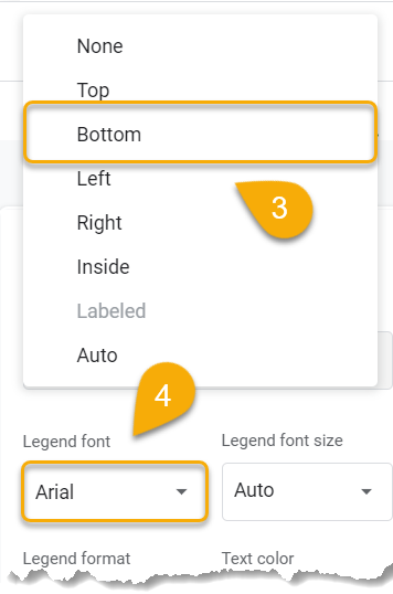
- Choose an appropriate font that is easily readable and doesn’t clash with the rest of the histogram.
- Navigate to Legend font size.
- Set the font size.
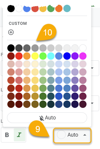
- Select the Legend format you prefer.
- Click Text color.
- Pick the color you want.
Here’s the updated legend!
Horizontal Axis and Vertical Axis
Now let’s look at how you can add an axis to fill your histogram with additional data!
- Select the Horizontal axis tab.
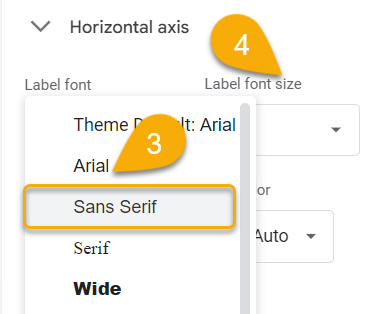
- Go to Label font.
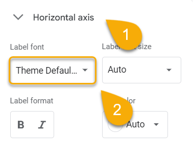
- Choose the font you like.
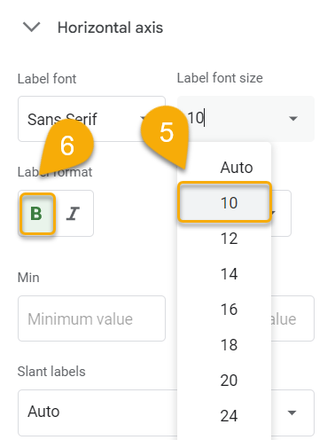
- Navigate to Label font size.
- Apply the font size.
- Pick the Label format you need.
- Move to Text color.
- Choose the color you prefer.
- Set the Minimum and Maximum Values if you need them.
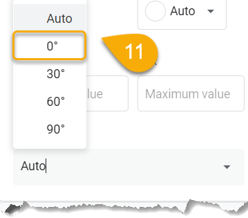
- Click on the Slant labels menu.
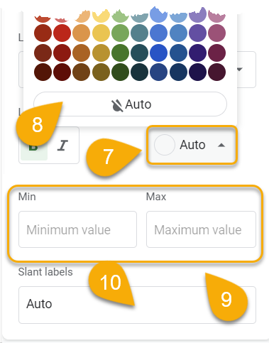
11. Choose the desired indicator if you wish to slant your label text.
Check out what you’ve got!
Use the previous method to modify the vertical axis in the same way.
Gridlines and Ticks
On a graph, gridlines appear as horizontal and vertical lines. By using them, data can be read and interpreted more easily. Now let’s apply gridlines and ticks to our histograms.
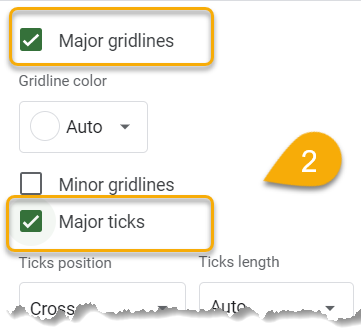
- Click on the Gridlines and ticks menu.
- Check the marks to add gridlines and ticks as needed.
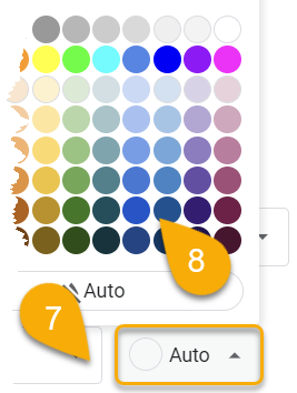
- Click on the Gridline color option.
- Choose the color you prefer.
Here it is!
Now let’s move on to the ticks!
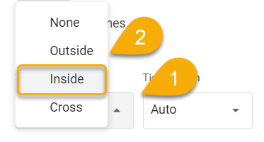
- Move to Ticks position.
- Choose the position you want.
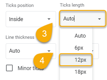
- Next, click the Ticks length option.
- Choose the length you want.
- Select Line thickness.
- Apply the thickness you prefer.
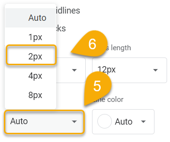
- Press on the Line color option.
- Pick the color you like.
Congratulations! You have done it!
The Histogram in Google Sheets – Free Template
Below you will find the Histogram template used in this tutorial.
The Histogram Chart in Google Sheets FAQs
To learn more about histograms, check out the frequently asked questions below!
What is a histogram in Google Sheets?
Google Sheets offers a built-in histogram tool that you can use to easily create histograms from your data. Basically, a histogram is a graphical representation of the data that you have collected. In a dataset, it shows how often certain values occur in a particular set of values.
What are the use cases of histograms in Google Sheets?
There are many potential use cases for histograms in Google Sheets:
- To graphically display the distribution of numerical data.
- To assess whether the data are skewed or symmetrical.
- To find out if there are any outliers in the data.
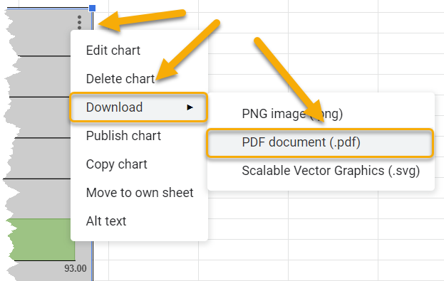
How do you export a histogram?
To export a histogram, click on the three-dot menu on the chart, select the Download option, and pick the format you need.
How are histograms different from bar graphs?
Histograms and bar graphs may look similar, but they are quite different. Both are ways of representing data, but histograms are used for data that is continuous, while bar graphs are used for data that is categorical.
