
A frequency table categorizes and provides a summary of the categories or groups present in a dataset. It’s a tool that provides insight into the elements of the datasets in tabular (or table) form. A frequency table is effectively a bar or column chart in tabular format.
A pivot table is the tool of choice for creating a frequency table in Google Sheets. Not only does it summarize data, but a pivot table also allows you to view data from various perspectives. In this post, we will show you how to create a frequency table from your dataset using a pivot table.
How to Create a Frequency Distribution Table
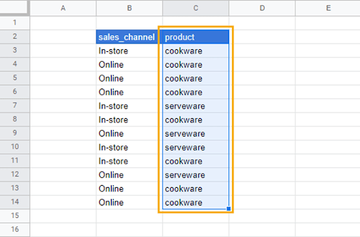
Our sample data contains product and sales channel information. We want to create a frequency table that shows the total number of products sold as well as the number of products sold in each category.
To create a frequency distribution table for the products, we will follow these steps:
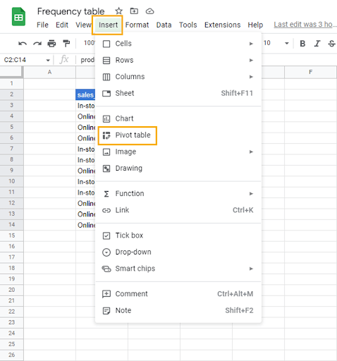
1. Select the product column.
2. Go to the Insert menu and select Pivot table.
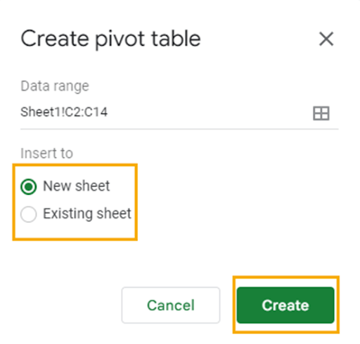
3. In the Create pivot table window, select the New sheet radio button to insert the pivot table into a new sheet or use the Existing sheet option to insert the pivot table in the current sheet. Click on Create to make the pivot table.
Since we selected New sheet, the pivot table preview appears on the new spreadsheet.
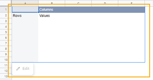
Additionally, the Pivot table editor will open on the right side of the spreadsheet. In the Pivot table editor are two tabs. The first contains the dimensions—Rows, Columns, Values, and Filters—that are used to organize data in the pivot table.
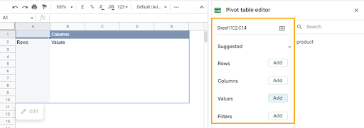
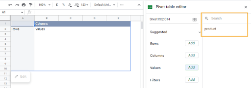
The second tab in the Pivot table editor displays a list of the selected column(s) containing the data.
4. Add the product data to the Rows dimension in the pivot table by dragging and dropping from one tab to the other.
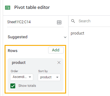
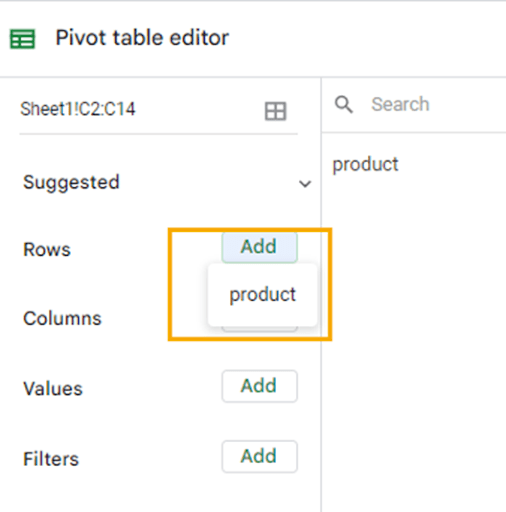
You can also use the Add option for each dimension (in this case, Rows) to select the data you want for the pivot table.
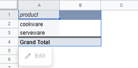
The data in the product column will now be categorized in the pivot table preview.
To get the number of each product category, drag the product data into the Values dimension.
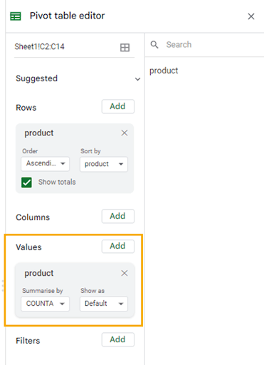
Data in the Values dimension can be summarized using a number of mathematical operations. That is because, ideally, data in the Values dimension is expected to be numeric.
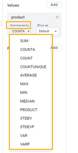
To see the options with which you can summarize the data in the Values dimension, click on the dropdown arrow in the Summarize by section.
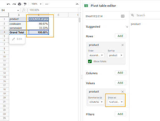
In the pivot table preview, you can now see the number of products available in each product category.
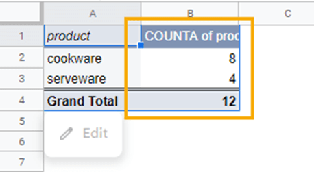
With this setup, the pivot table will update each time new data is added to the product category column.
How to Create a Relative Frequency Table
While the frequency table organizes data into categories, a relative frequency table allows you to see the percentage of items in a category relative to the total number of items in that dataset.
Building on the process for creating a frequency table in the previous section, follow these steps to create a relative frequency table:
1. Go to the item in the Values dimension and select the dropdown in the Show as section.
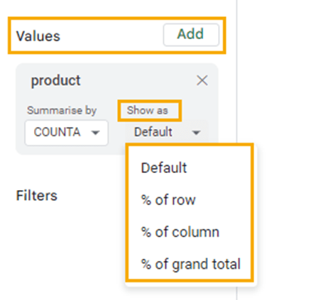
The options in the dropdown are explained below:
- % of row: This returns the relative percentage of the sum of all the numbers in the rows.
- % of column: This returns the relative percentage of the sum of all the numbers in the column.
- % of grand total: This returns the relative percentage of the column or row grand total.
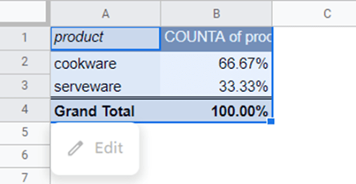
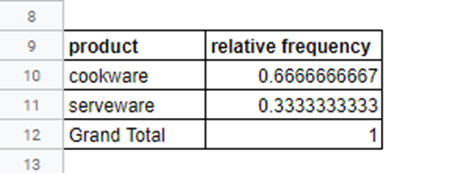
Select the % of column option to return the relative frequency for the product data.
Usually, the relative and categorical frequencies appear together on the same table. If you want to do this, follow these steps:
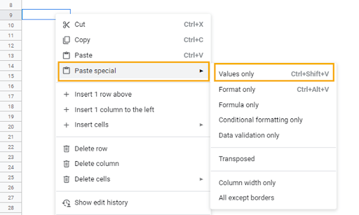
1. Select the relative frequency table as is and copy using Ctrl + C for Windows or Cmd + C for Mac.
2. Select any cell in the sheet, right-click on the cell, and select the Paste special option. From the contextual menu, click on Values only. Alternatively, you can use the shortcut Ctrl + Shift + V (Cmd + Shift + V).
This will create a new table that’s not connected with the pivot table. After pasting the table, change the column header and add borders.
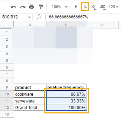
Change the number format in the relative frequency column to percentages. To do this, select the values in the column and click on the Format as percent command in the font toolbar.
3. When this is done, go back to the pivot table and select the Default option in the Values dimension. However, this time copy only the COUNTA of product column and Paste special as done in the previous step.
After pasting, you can rearrange the table so the frequency column comes before the relative frequency column. Don’t forget to add borders around the frequency column.
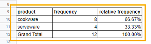
This table provides a simple summary of all the product categories, the count (frequency) of each product, and their relative counts in percentages.
Frequency Tables in Google Sheets: FAQs
What is a frequency table?
A frequency table is a table that displays the number of occurrences (frequency) of each unique value in a dataset. It is a way to organize and summarize data in a concise and informative manner so that it is easy to understand and analyze. The table typically includes two columns: one for the unique values (the categories or levels in the data) and one for the corresponding frequencies. The values can be arranged in ascending or descending order based on the frequency. A frequency table is also known as a frequency distribution table.
How do you make a two-way frequency table in Google Sheets?
A two-way frequency table, also known as a contingency table or a cross-tabulation, is a table that displays the frequency (or count) of observations for each combination of two categorical variables.
To create a two-way frequency table, you typically would have two categorical variables. A categorical variable is not numerical.
Earlier, we created a frequency distribution using one column of data. To create a two-way frequency table, follow these steps:
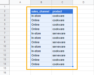
1. Select the sales_channel and product columns from the sample dataset.
2. Insert a pivot table as described earlier.
3. Drag the sales_channel data to the Columns dimension and the product data to the Rows dimension. Also, drag the product data to the Values dimension.
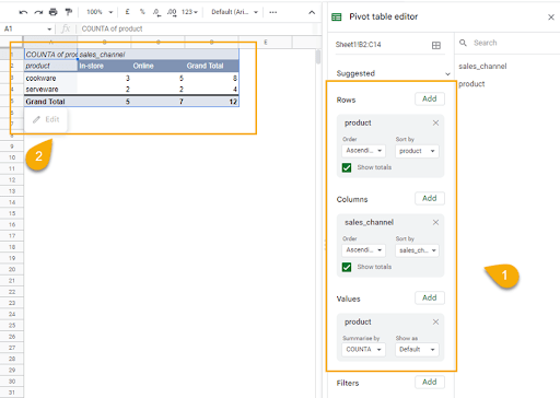
With this table, you can see an analysis of the number of product categories sold in each store_channel, and the total number of sales each store_channel made.
