
To rotate a pie chart in Google Sheets, you need to alter the position of your rows. There is no simple way to achieve this task as the Series Option is not available, which would allow you to rotate the pie chart clockwise.
A Quick Workaround: Manually Rearranging Data
Pie charts are an essential part of any data visualization when you want to represent values across different categories and their proportion to the whole.
Once you make a pie chart, you may want to customize it, rotating it so that a particular “slice” of the pie is at the top.
Unfortunately, there is no easy way to do this in Google Sheets because we don’t have the Series Option for this chart, which holds the key to rotating the chart. However, there is a workaround that allows you to achieve the same result.
Follow the steps below to see how to manually rotate your pie chart in Google Sheets.
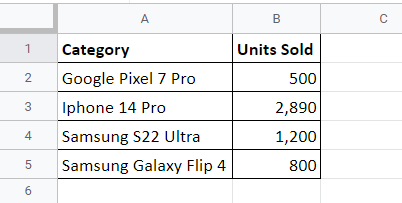
To see the process, let’s use the dataset shown below for our example. It shows mobile phone types in column A and how many units sold in column B.
1. To insert a chart based on the data above, select the entire data, including headers (A1:B5).
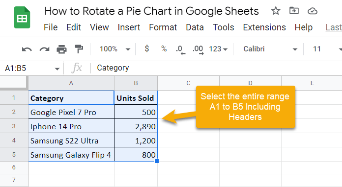
Pro Tip: You can use the Shift, Ctrl, and Arrow keys on your keyboard to select the data range. Hold the Shift button and press the Right Arrow key once to go from cell A1 to B1. Then, hold the Shift and Ctrl keys together and press the Down Arrow key to move downward to the last cell holding data from both of these columns (A5:B5).
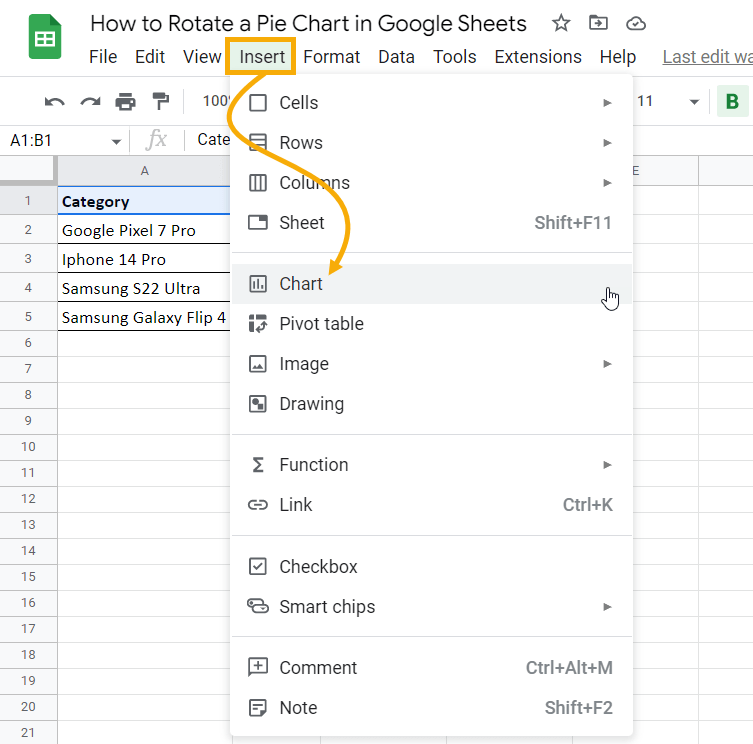
2. Go to the Insert menu and select Chart. This will insert a chart into your spreadsheet based on the data you have selected.
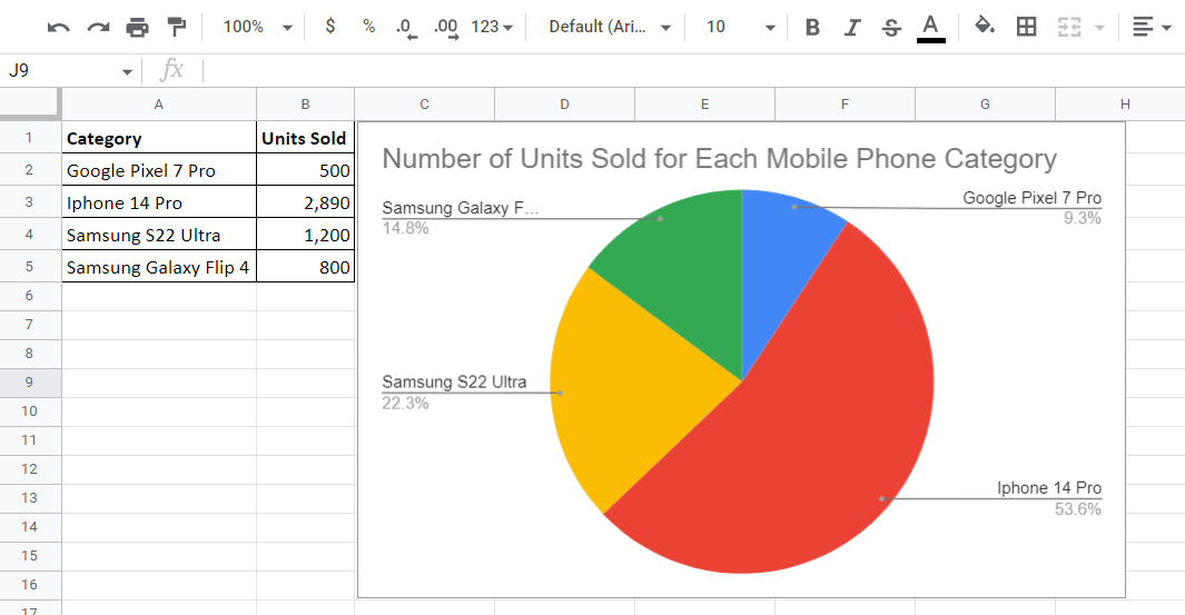
3. Google Sheets’ IntelliSense will generate a chart that best represents the data—which is a pie chart in this case. However, if the chart it generates is not the one you want, just follow the article How to Make a Pie Chart in Google Sheets in Less than 60 Seconds to see how to make your own pie chart.
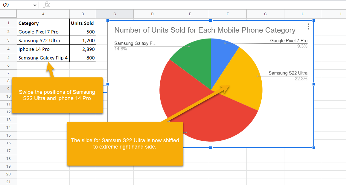
4. Now, swap the positions of the iPhone 14 Pro and Samsung S22 Ultra inside your database so the Samsung is listed first.
Right away you will see that the pie chart slices have changed their positions. The slice representing the Samsung Galaxy S22, which was at the extreme left, has shifted to the extreme right.
Although it does take some extra steps and a bit of extra thinking and testing, this does allow you to shift the slices around in your pie chart to go where you want them. Play around with other combinations to find the best layout for you.
