Quick Jump
ToggleA pie chart illustrates how different parts of a given data set relate to each other, showing the relative size of each value.
This chart type is a simple yet effective way to visualize data to communicate key data insights to empower effective decision-making.
The process of creating a pie chart in Google Sheets is pretty straightforward – and on top of that, there are plenty of options for customizing the look and feel of your graph.
And in this article, you’ll learn everything you need to know to create pie charts in Google Sheet. Also, don’t forget to check out our guide covering how to make a pie chart in Excel.
Prepare a Data Set
Before we dive right in, let’s quickly break down how to format your data for Google Sheets to automatically build a pie chart from it, saving you up some time.
If you already have your data ready to go, feel free to skip this brief section.
To create a pie chart in Google Sheets, you typically need a two-column table. Here’s the table we’re going to use as a running example throughout the entire article:
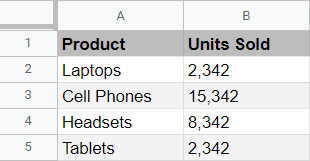
And here’s how each of the columns is going to be used:
- Column A (Product): The first column of the table is typically where the names of the categories are stored. When that’s the case, the data in this column make up the legend of a pie chart.
- Column B (Units Sold): This column contains all of your actual values that are going to be visualized on the chart plot.
Now that we’ve covered the essentials, let’s get our hands dirty and build a pie chart using the table shown above.
A Quick-and-dirty Way to Make a Pie Chart
As mentioned before, provided you have your data formatted the right way, making a pie chart in Google Sheets is as easy as shelling peas.
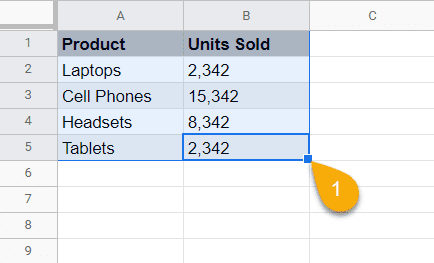
- Highlight the entire data table that you want to visualize – in our case, we need to select A1:B5.
3. Click “Insert.”
4. Choose “Chart” from the drop-down menu that appears.
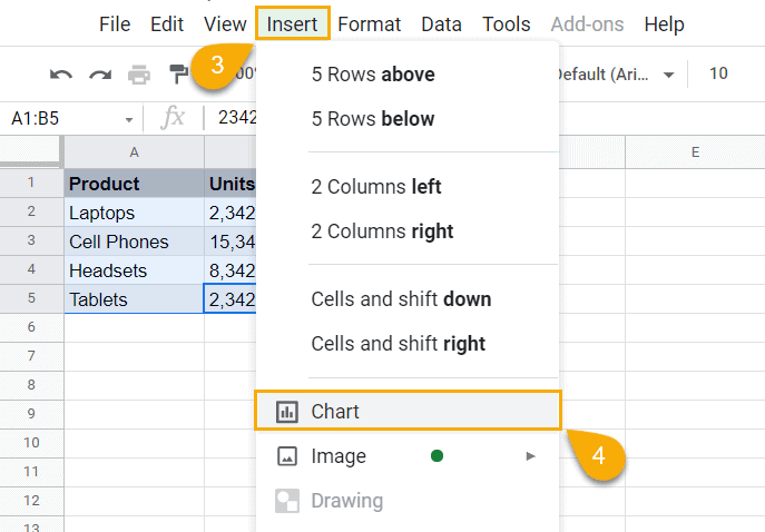
And as a result, we get… wait, a column chart? What is going on here?
You see, Google Sheets automatically tries to predict what kind of chart you’re hoping to create, generating the most optimal graph based on the data you’re feeding the charting tool with.
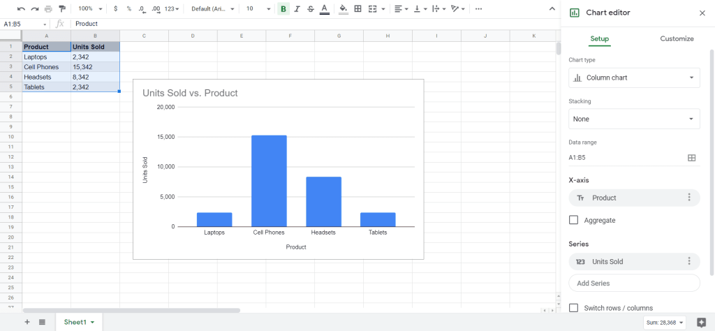
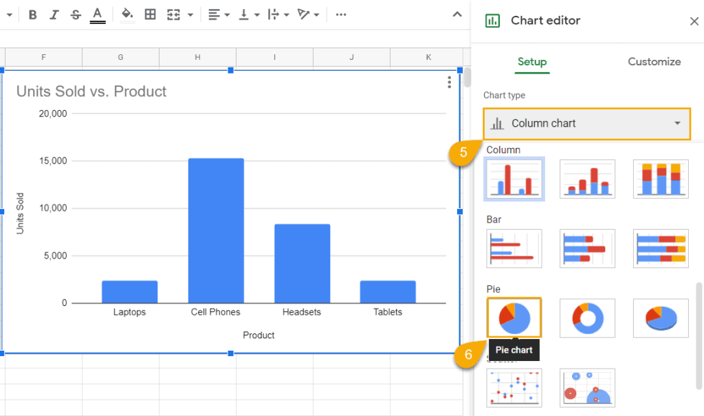
See that task pane to the right of the column chart on the screenshot shown about? We just need to change one setting in there to transform the auto-generated column chart into a pie chart. So let’s do just that.
5. In the Setup tab, click the drop-down menu right under “Chart type.”
6. Scroll down the tab and, under “Pie,” select “Pie Chart.”
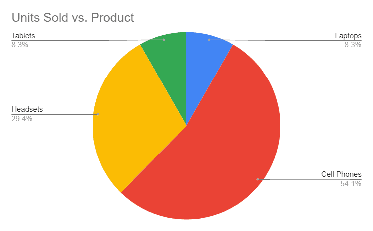
Once you have tweaked the chart type setting, your lovely pie chart should appear with everything automatically formatted just the way we want.
How to Customize Charts in Google Sheet
Technically, your pie chart is ready to go. However, why should you settle for anything less than perfect?
If you want to take your data visualization to the next level, Google Sheets offers a few customization tools to spruce up charts – and pie graphs are not an exception.
Stick around to learn a couple of simple yet powerful tips to enhance your pie charts – you will, hands down, find them helpful, we promise.
How to Change the Title of a Pie Chart
Copywriters know that 80% of people don’t read past the headline. By the same token, if you want to make your chart a bit more engaging, the easiest way to do that is simply to change the chart title.
To change the title of your pie chart in Google Sheets, just select the chart plot and double-click on the current chart title to edit it.
However, if you’re looking for more customization options, here’s an alternative route you need to take:
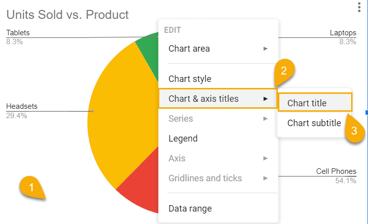
1. Right-click anywhere on the chart plot.
2. Click “Chart & axis titles.”
3. Choose “Chart title.”
Once there, a completely new realm of customization options open up for you:
4. Under “Title text,” enter your new chart title.
5. Under “Title font,” select the font you want to apply to your pie chart title.
6. Under “Title format,” change the styling (so far, you can either highlight the title in bold or italic) and the alignment of your chart title (left, center, or right).
7. Under “Title font size,” you can modify the size of your chart title.
8. Under “Title text color,” let your inner artist out and change the color of your chart title however you see fit.
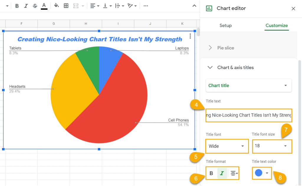
As you can see from the screenshot above, I’m not particularly good at all things visual, but I’m sure you will crush it.
How to Change the Data Range of a Pie Chart
Suppose you created your lovely pie chart only to have to change the original data table down the line.
How do you add/remove data without having to build a new pie chart from scratch? We have the answer.
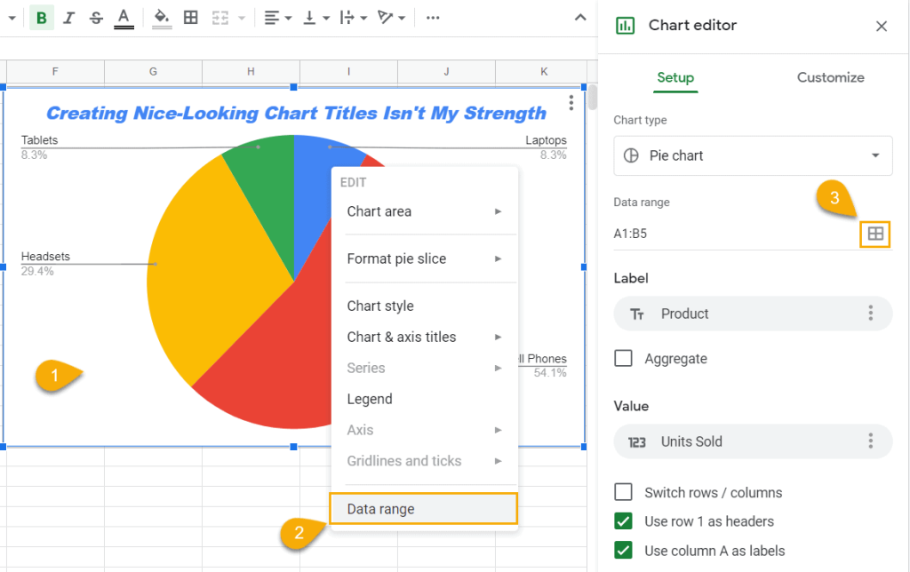
1. Right-click on the pie chart plot.
2. Click “Data range.”
3. In the Chart Editor, navigate to the “Setup” task pane and hit the “Data range” button.
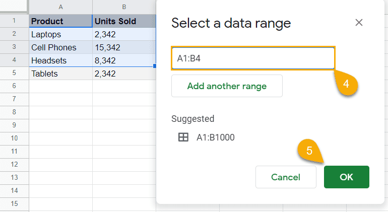
4. Once the dialog box pops up, highlight the data range you want your pie chart to be based on – our current pie chart is made of four categories, so let’s remove one just to show you the ropes.
5. Click “OK.”
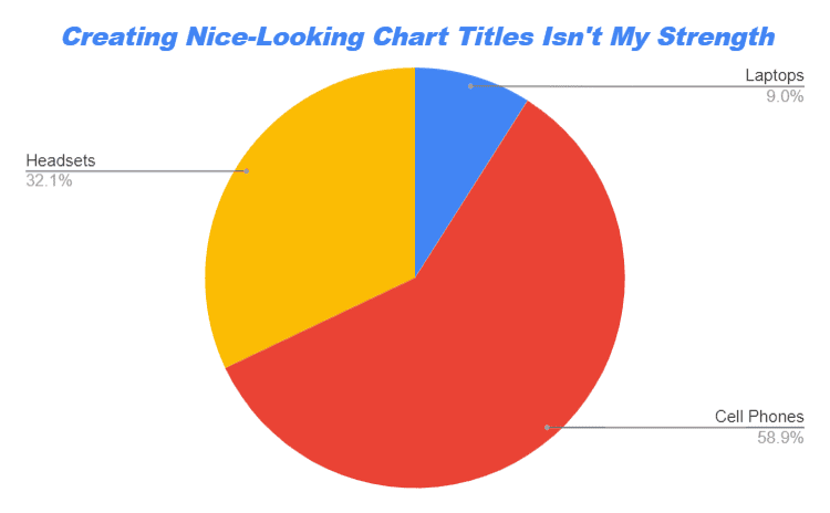
Once you’ve made it to this point, our pie chart will be automatically updated to reflect the changes to the underlying data range.
How to Modify the Labels of a Pie Chart
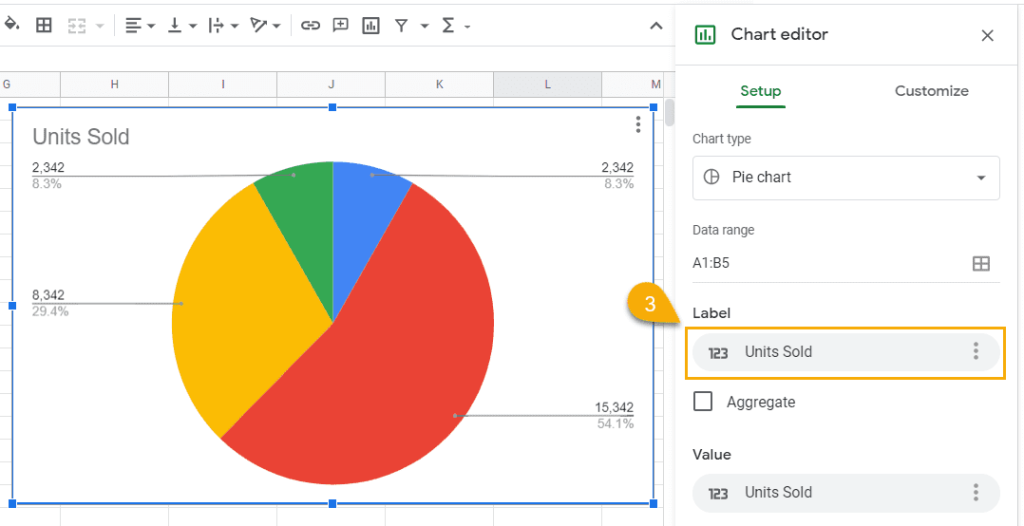
If you’re not happy with your labels and want to change the underlying data used for them, here’s how you do it.
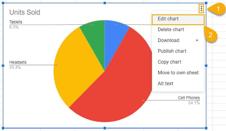
1. Click the three-dot icon placed on the chart plot.
2. Choose “Edit chart.”
3. Under “Label,” change the column you want to use as the souce of data for your pie chart labels.
How to Add Slice Labels to a Pie Chart
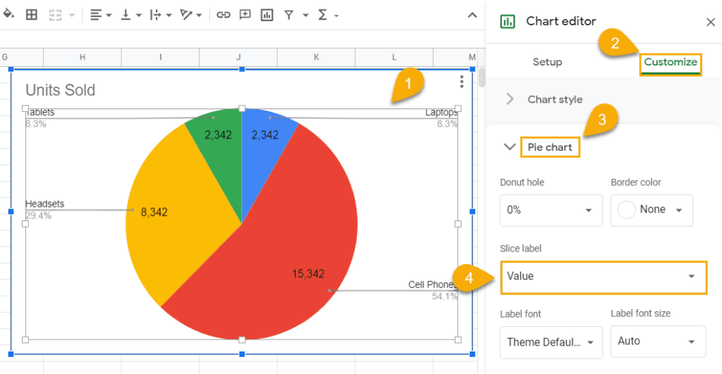
If you want to make your pie chart a bit more informative, adding slice labels is a great way to do just that.
1. Double-click the pie chart plot to open the Chart Editor.
2. Navigate to the Customize tab.
3. Open the “Pie chart” section.
4. Under “Slice label,” select either “Label,” “Value,” “Percentage,” or “Value and Percentage” based on your charting needs.
How to Create a 3-D Pie Chart in Google Sheets
Are you looking for a way to create a 3-D pie chart in Google Sheets? Well, you’ve come to the right place.
1. Create a simple pie chart in Google Sheets (select the data range > Insert > Chart > Chart Editor > Chart Type > Pie Chart).
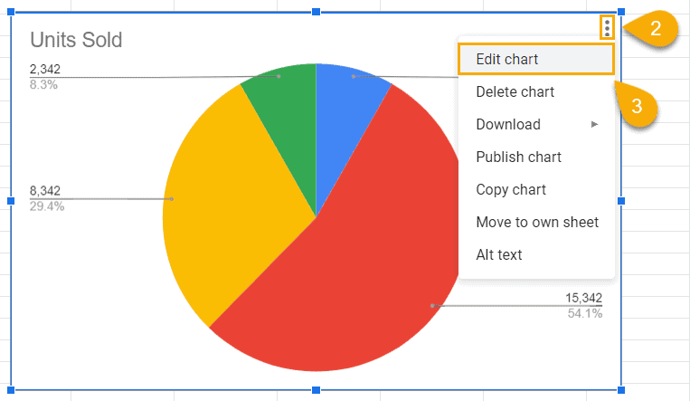
2. Click the three-dot menu.
3. Choose “Edit chart.”
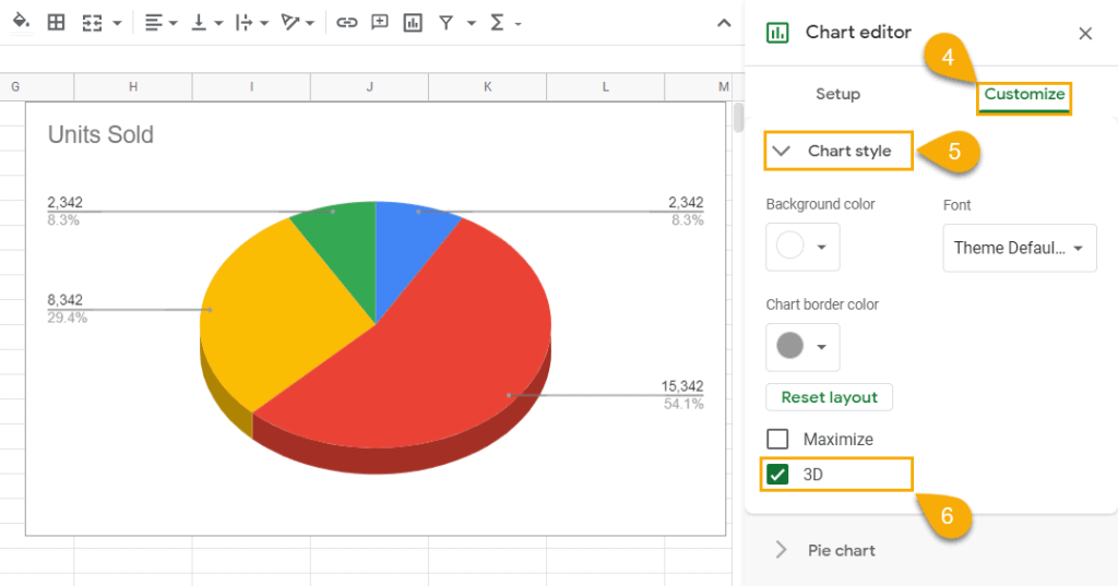
4. Switch to the Customize tab.
5. Open the “Chart style” drop-down menu.
6. Check the “3D” box.
For data visualization enthusiasts looking to expand their skillset, we create a guide covering how to create a 3-D pie chart in Excel.
How to Add a Donut Hole to a Pie Chart
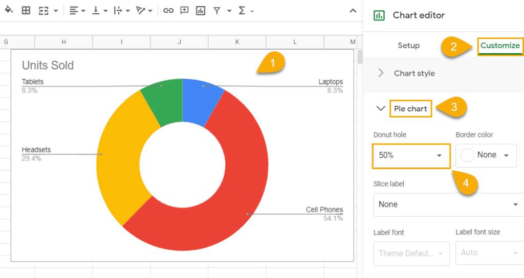
For those looking to add a donut hole to a pie chart in Google Sheets, all you need to do is follow a few simple steps:
1. Double-click on your pie chart to pull up the Chart Editor.
2. Go to the Customize tab.
3. Navigate to the “Pie chart” section.
4. Set the “Donut hole” to either “0%,” ”25%,” “50%,” “75%,” or manually type in the value that works for you.
How to Modify an Individual Pie Slice on Pie Chart
Do you want to make certain pie slices unique and make them stand out?
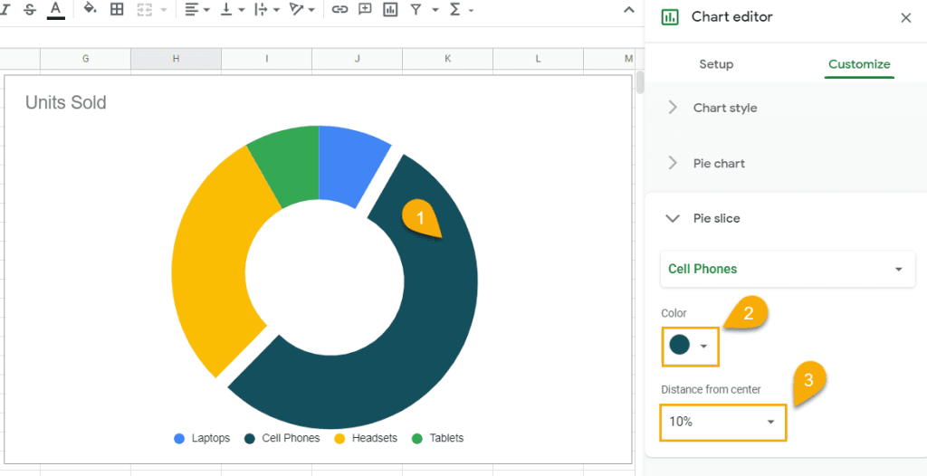
Here is how to do this in Google Sheets:
1. Click multiple times on the pie slice that you want to modify.
2. In the Customize tab of the Chart Editor, navigate to “Pie slice.” Under “Color,” pick the color that you want to apply to your pie slice.
3. Set the “Distance from Center” value to “10%” or anything that works for you.
Pie Chart in Google Sheets – Free Template
If you’re looking for a simple pie chart template in Google Sheets without having to set anything up, just click the link below and copy our free template.

Finally, you know everything you need to know to absolutely crush it when it comes to pie charts.