
Presenting well-thought-out data is important when making your case on a topic. And a histogram is a great tool for that purpose. This tutorial will show you how to change histogram bins in Google Sheets.
How to Change the Number of Bins in a Histogram
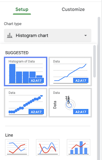
Let’s assume you have tabulated data and have already created a histogram. A histogram contains data collected and displayed in groups called “bins” or “buckets.” If you don’t like the default number of bins included in your histogram, this is something you can change by making adjustments to certain parameters. Read along to learn the step-by-step process on how to do just that.
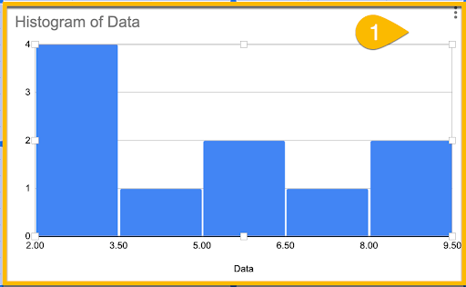
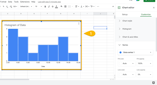
Step 1: Highlight Your Histogram
On your Google Sheets spreadsheet, select the chart you want to edit.
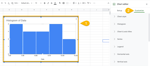
Step 2: Open the Chart Editor Panel
If you double click on your histogram, the Chart editor panel should appear on the right side of your screen. From there, click on Customize, then select the Histogram tab.
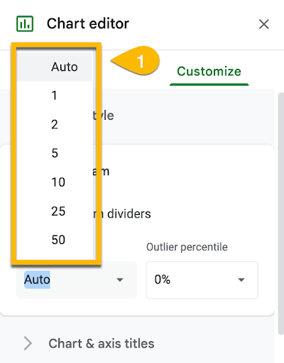
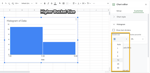
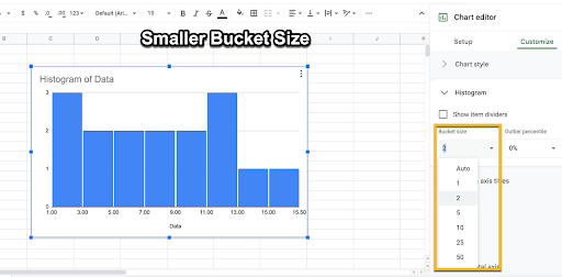
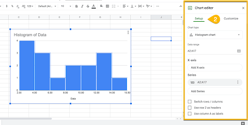
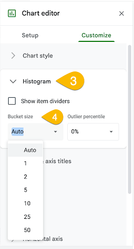
Step 3: Choose Your Desired Bin Size
Under the Histogram section, you will find a drop-down menu that allows you to determine bucket sizes. Typically, “Auto” is the default selection. To change this, simply choose the value that best matches your current requirements.
You can also adjust the outlier percentage functions, but this is only applicable for more complicated case studies.
Important Note:
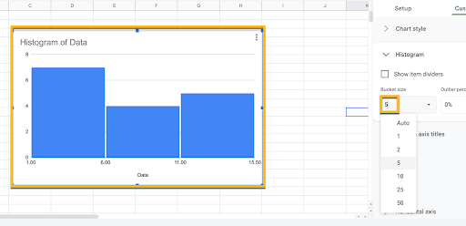
Remember that increasing the bin size means reducing the number of buckets.
Conversely, decreasing the bin size will cause more bins to appear. Adjusting them will also change how your information is presented.
How to Add a Bin to an Existing Histogram
Sometimes after creating a histogram, you might need to make additional changes. Adding extra bins for new data is the most common cause of this.
It takes a few steps to make these adjustments, so here’s a quick guide on how to do that.
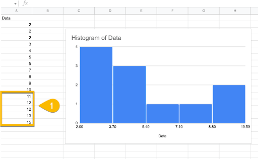
Step 1: Input Any Additional Data on Google Sheets
Chances are the reason why you need to add more bins is to cover a wider data set. As such, start by inputting the supplemental information in the data list on your Google Sheets spreadsheet.
Make sure everything is complete before moving on to the next step.
Step 2: Add the Data to the Histogram
The next step is to include the additional data you tabulated onto the actual histogram. Do this by expanding the data set range. One again, double-click on the chart to open the Chart editor.
In the Chart editor panel, click on the Setup tab and find the Data Range section.
Click on the spreadsheet icon so the Select a data range window pops out.
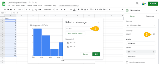
In the drop-down box, you can either type the cell range manually with the information you want added or highlight the range of cells on the spreadsheet itself.
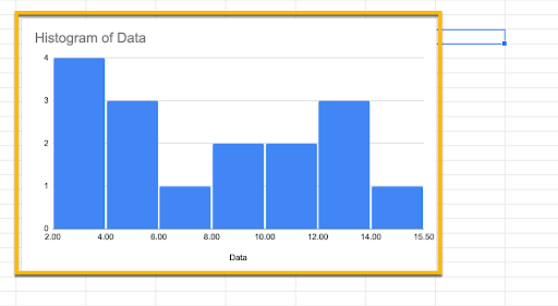
Once you’ve accomplished these key steps, you should notice that there are now more bins on your existing histogram.
How to Increase or Decrease the Width of Bins in a Histogram
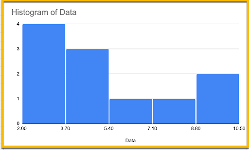
Although this question is phrased differently, increasing or decreasing the width of bins is actually the same as changing its bucket size.
Step 1: Select Your Desired Chart
Choosing a bigger bin size means each data set becomes wider, while minimizing it makes the bins narrower. To adjust things, once again double-tap on your histogram and wait for the Chart editor to appear.
Then select the Customize tab.
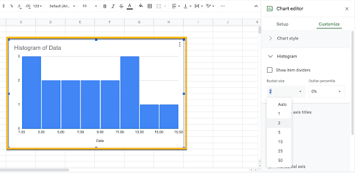
Step 2: Adjust the Bin Size
Click on Histogram and adjust the bin size to your liking.
When you go back to the Google Sheets spreadsheet, you should notice that the width of each bin has either increased or decreased, depending on your chosen bucket size. In this case, it has become substantially wider.
If you feel overwhelmed when editing a histogram on Google Sheets, don’t worry. Even the experts went through that at some point. Just remember all it takes is practice and access to the right resources.
