To add or edit labels in a pie chart in Google Sheets, go to the Chart editor and click on the Customize tab. From there, click on the Pie Chart section and make the desired changes.
When preparing a Google Sheets document, it is essential to have functional and reliable tools for data analysis. The pie chart is one of a variety of valuable analysis tools available in Google Sheets.
Labels are necessary in order to properly interpret the information presented in a pie chart. Each slice in a pie chart can be labeled to represent their part of the whole chart. Accurate labeling in a pie chart ensures maximum efficiency for the reader.
Quick Jump
ToggleHow to Label a Google Sheets Pie Chart
Labeling a pie chart in Google Sheets is quite simple. For a pie chart—as with any chart you make—you must start with the proper data.
Step 1: First, create a data set that is relevant for a pie chart. For our example, we will use the data for a set of four products and the quantity sold for each product.
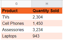
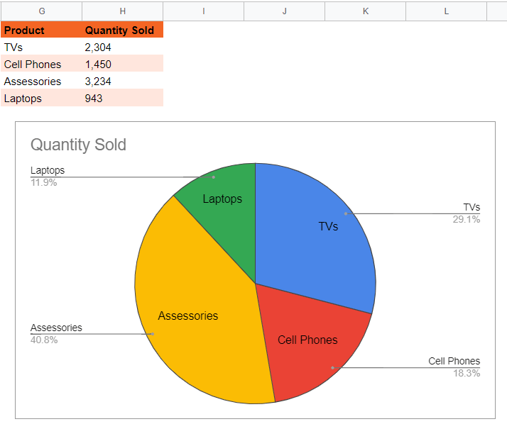
Step 2: Use this data to create a pie chart (Insert > Chart). When you have your chart, double click on the chart or select the three dot menu in the top right corner of the chart to open the Chart editor. (Note: If you can’t see the three dot menu, simply click the chart once to reveal it.)
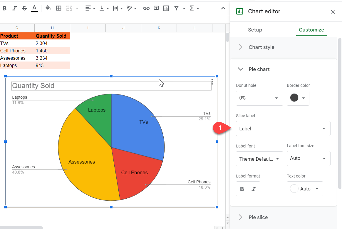
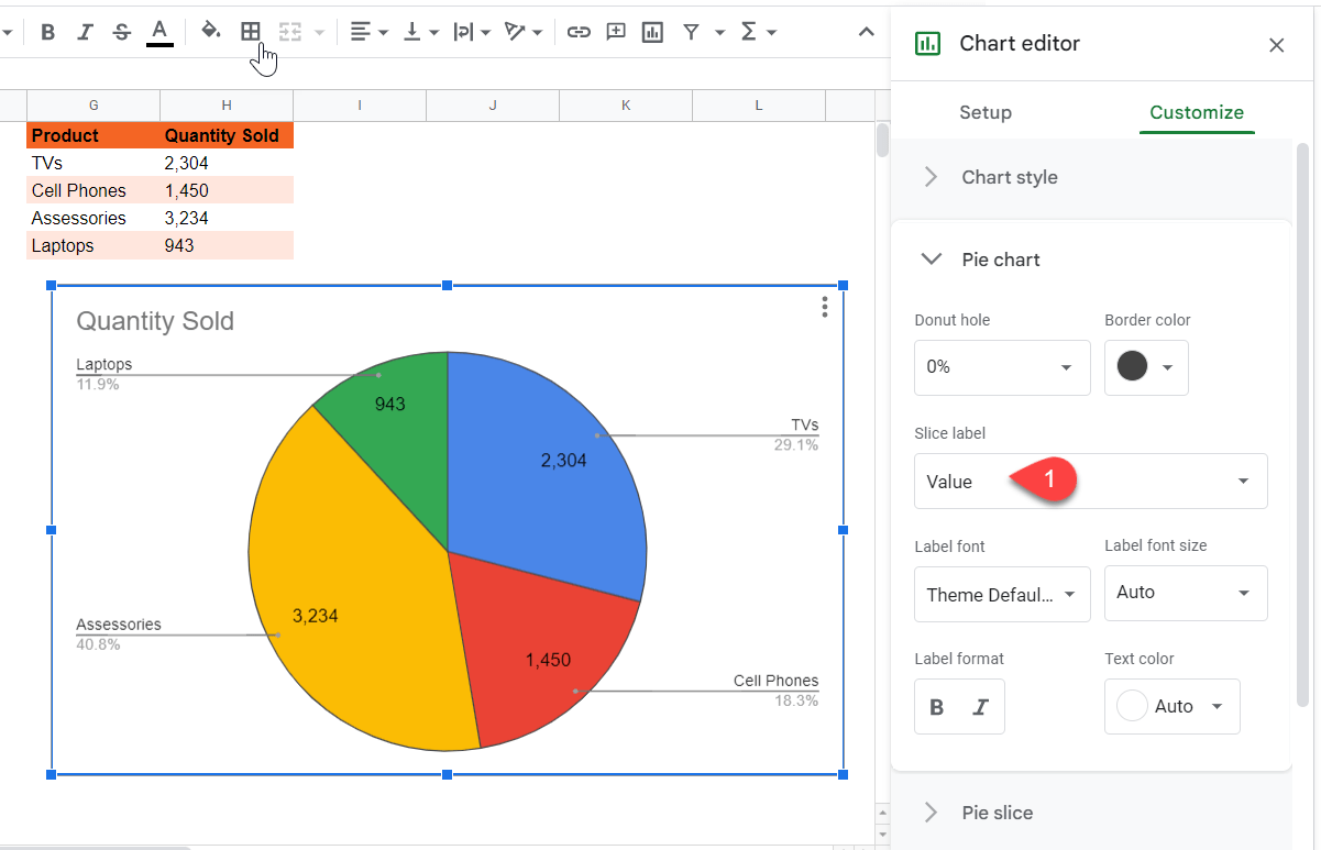
Step 3: In the Chart editor, go to the Pie chart section under the Customize tab. From here, click on Slice label. This will list four labels options which you can use to label your pie chart.
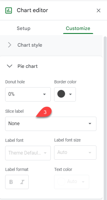
The four options available in the Slice label menu are Label, Value, Percentage, and Percentage and Value.
Label – This adds labels based on the rows of your data set. In our example, choosing the Label option would yield the names of the products, i.e., TVs, Cell Phones, Accessories, and Laptops.
Value – This option displays the respective values of all the components of the data set. In this case, it will show the number of units sold for each product.
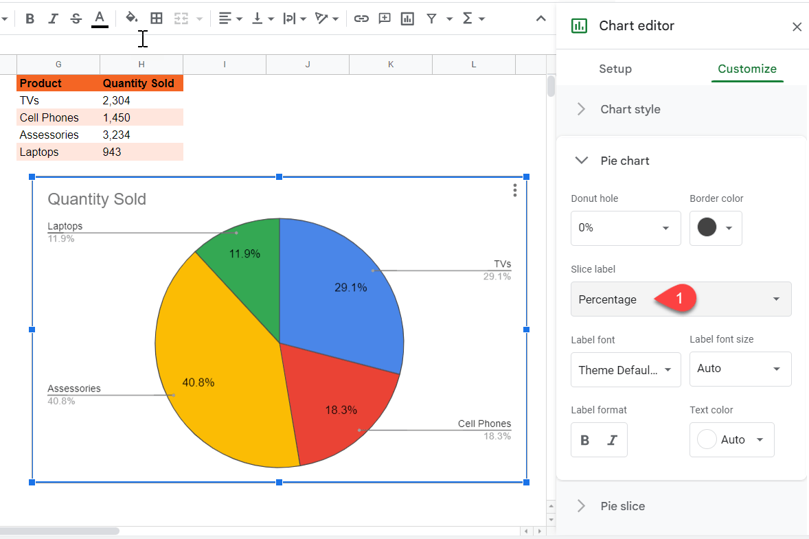
Percentage – This label shows the percentage of each element of the data set as a part of the whole. For our example, choosing the Percentage label would display the percentage that the sales of each unit represents out of the whole (a total of 100%).
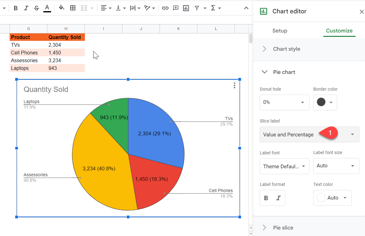
Percentage and Value – This label reveals both the percentage of each unit in the data as it pertains to the whole along with the value attached to each unit. In our example, it shows the percentage of each device as part of the total sales along with the number of units sold for each electronic.
How to Customize Pie Chart Labels in Google Sheets
You can customize labels through various customization options provided by Google Sheets.
To customize the labels in a pie chart in Google Sheets, simply follow these steps:
Step 1: Create a pie chart in Google Sheets from a relevant data set.

Step 2: Once you’ve made the pie chart, double click on the chart or open the three dot menu at the top right to open the Chart editor. In the Chart editor, click on the Customize tab and go to the Pie chart section.
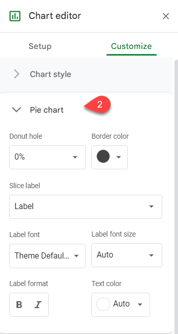
The Pie chart section provides various methods of adding and customizing labels for a pie chart in Google Sheets:
Label Font – Change the font type by going to the Label font menu and selecting the desired font to fit your spreadsheet.
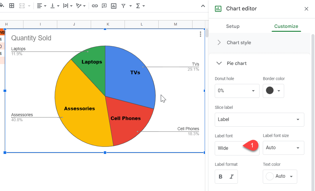
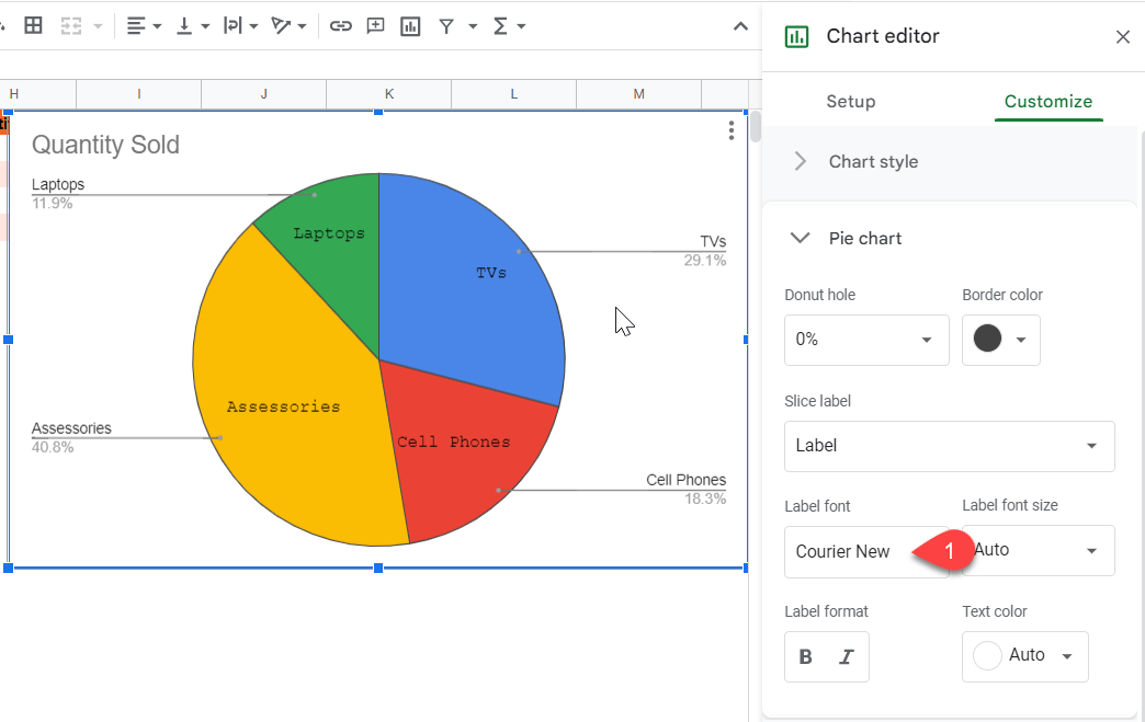
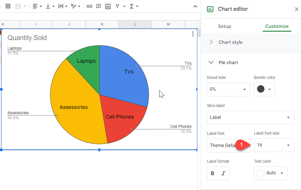
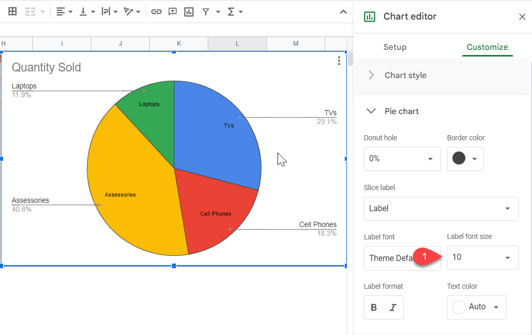
Label Font Style – Change the size of the font for your labels by opening the Label font size menu and determining the best font size to fit your pie chart.
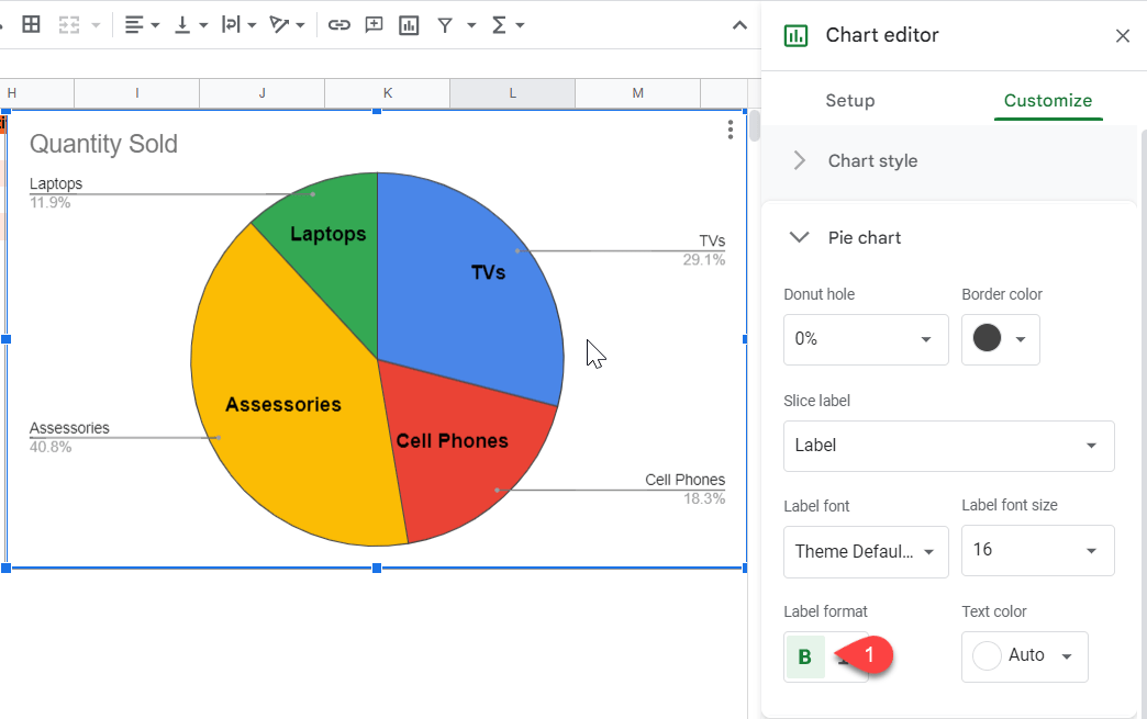
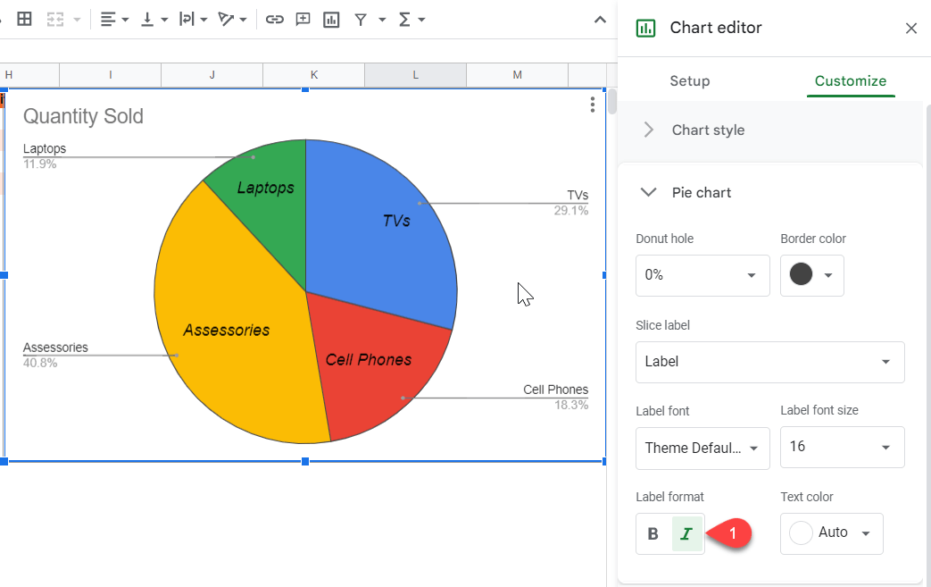
Label Format – Change the format of the text in your pie chart labels under the Label format section. This will allow you to make your text bold or italic.
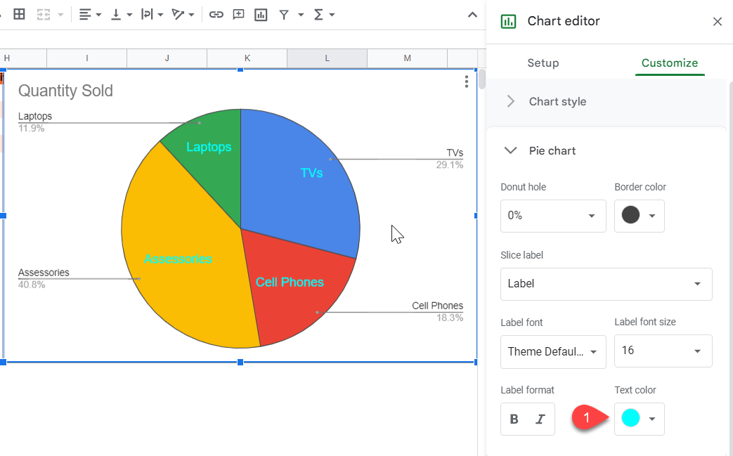
Text Color – Change the color of the text for your labels by checking out the Text color options. Google Sheets offers over 90 color options to help customize your chart.

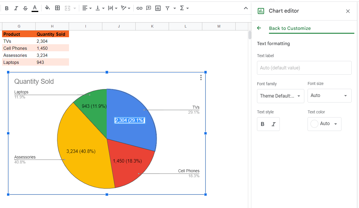
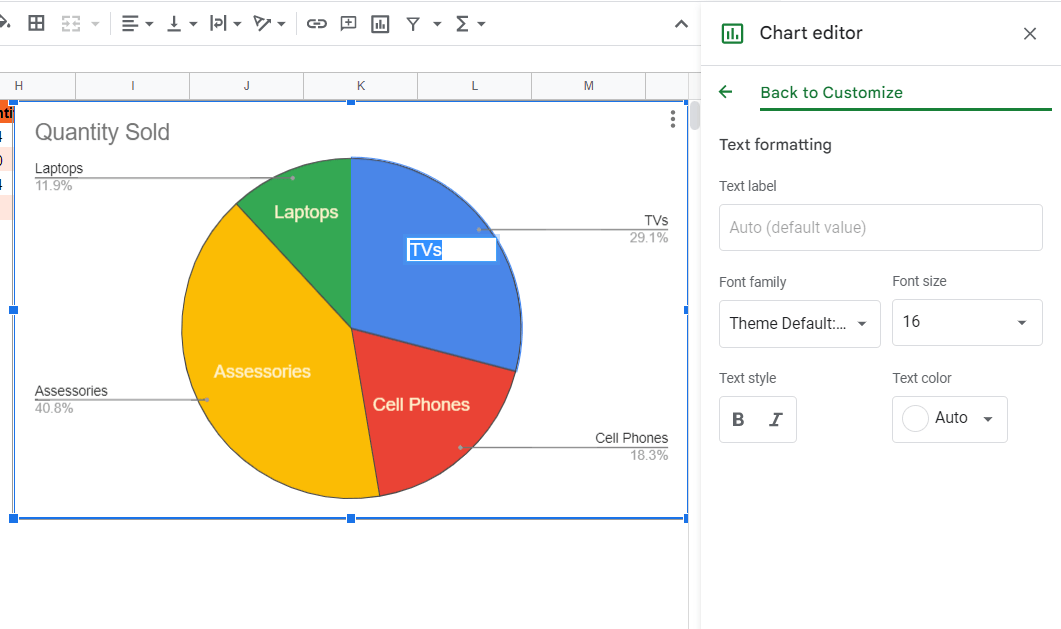
Text Formatting – You do have the option to change the text in the labels to add your own specific value. To do this, double click on the label you want to change. The Text formatting task pane will show up on the side.
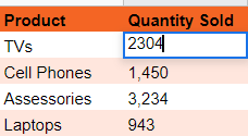
Under Text label, add your own customized text. Repeat the process for each label you want to customize. This action can also be performed by changing the data value or manually entering the required data value in the underlying data.
Use the options described above to customize and alter the labels in your pie chart so you can create the most accurate and efficient interpretation for the reader.
Troubleshooting: Google Sheets Pie Chart Label Problems
Many users face issues with labels for pie charts in Google Sheets. The most common issues that surface while working with pie charts include the labels not showing as well as formatting problems. Let’s take a look at some of these.
Data Labels in Pie Chart Slices Disappear
The most probable reason for disappearing label values in pie chart slices is that the text is too long to fit in the slice. You can fix the problem by double clicking the label and rewriting it manually (if, for example, you want to shorten or remove any of the words).
Unable to Manually Edit Label Values
In certain conditions, you might be required to manually edit one specific label or multiple pie chart labels, especially if you want to differentiate labels from each other. This can be a result of the default modifications of Google Sheets, or due to the improper formatting of the chart or underlying data. To manually edit a label value, double click on the label, or change the value in the underlying data and edit the slice label accordingly.
Pie Chart Labels Attributed to the Wrong Positions
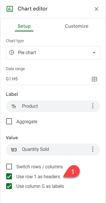
Sometimes pie chart labels might be attributed to the wrong positions or the wrong slice. This can be rectified either by remaking the chart with correctly attributed data or by checking the boxes beside “Use row ‘**’ as headers” and “Use column ‘##’ as labels” under the Setup tab of the Chart editor.
Here, the ‘**’ represents the row number in which you placed the headers and ‘##’ represents the column number in which the labels are placed in the data set.
FAQs: Using Labels in Pie Charts
How to Label Individual Pie Chart Slices in Google Sheets
You can label individual slices in a pie chart in Google Sheets by double clicking the pie chart slice. Doing this will allow you to edit, modify, and adjust the pie chart label.
How to Rename Pie Chart Slice Labels
You can rename pie chart slice labels in two ways: You can either modify the values in the underlying data set used to create the pie chart, or you can double click the label and edit, add, or otherwise modify the text of the pie chart slice label manually.

How to Change the Color of Slices in a Pie Chart
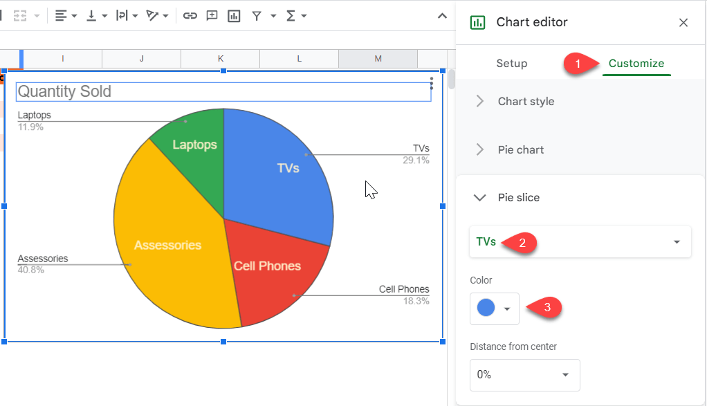
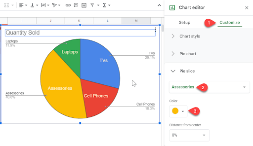
Change the color of the slices in a pie chart in the Pie slice section under the Chart editor. Select the slice you want to change from the drop-down menu and apply the desired color. You can also change the distance of the slice from the center if you want it to look like a slice is being removed from the pie or to provide spacing between all the slices.
How to Show Both Value and Percentage Values in the Label
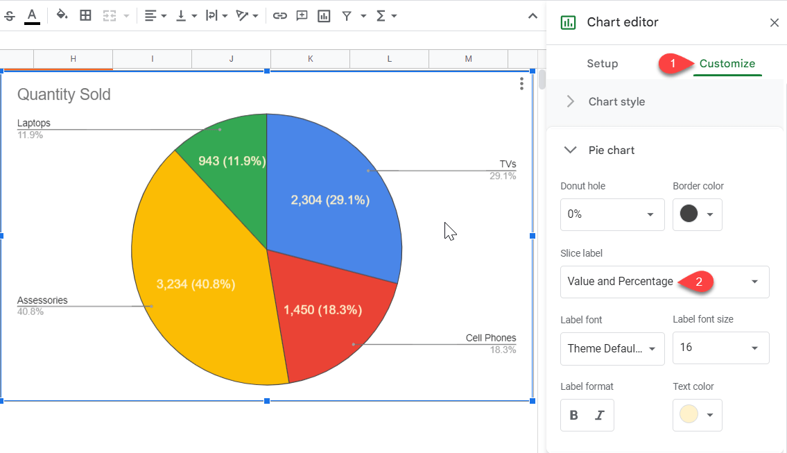
If you want your pie chart labels to show both value and percentage, click on the Pie chart option under the Customize tab of the Chart editor. Select Value and Percentage in the Slice label drop-down menu.
How to Make It So the Pie Chart Label Automatically Fits Text
Google Sheets automatically makes the pie chart label fit the text. If the text in the label is too long, Google Sheets won’t allow the label. Your best option is to make the label short and descriptive.
How to Edit the Size of the Pie Chart Slices
Google Sheets doesn’t allow the user to resize the pie chart slices. It automatically adjusts the size of the slices on the basis of the underlying data.