
To create a pivot chart in Google Sheets, highlight your data, go to the Insert menu, choose Pivot table from the list, select the location you need to insert the table, and hit Create. Next, click on the Add button to add the suggested Rows, Columns, Values, and Filter. Then choose the options you need to add. Following that, select the Pivot table, go to the Insert menu, and click Chart.
In this article, you can find out what a pivot chart is and how you can create one easily using the step-by-step instructions provided!
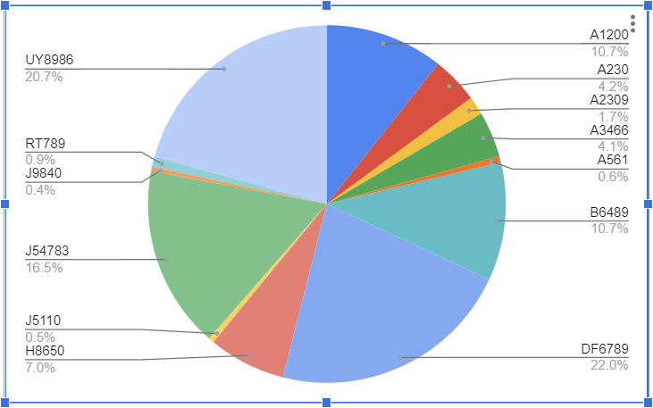
What Is a Pivot Chart?
A pivot chart is an interactive tool that allows you to visualize and explore data in new ways. Google Sheets allows you to use a pivot chart to summarize data, show relationships between different data points, and compare data without having to scroll through long lists or tables.
What’s the Difference Between a Regular Chart and a Pivot Chart in Google Sheets?
Pivot charts and regular charts are both useful tools for representing data visually. In spite of this, there are some significant differences between the two types of charts.
A regular chart is typically used to visualize data that is already organized in a specific way. For example, if you have a dataset that contains information about different types of products and their sales figures, you could use a regular chart to compare the sales of each type of product.
The pivot chart is more flexible and can be used to show data that is not as easily organized. Using this chart, you will be able to compare data regardless of its type.
How to Create a Pivot Chart in Google Sheets (Step by Step)
The first step to creating a pivot chart is to make a pivot table. Take a look at the detailed description below on how to create a Pivot table so you can make your own with no trouble at all.
- Select the data you need to add to the Pivot table.
- Go to the Insert menu.
- Pick Pivot table.
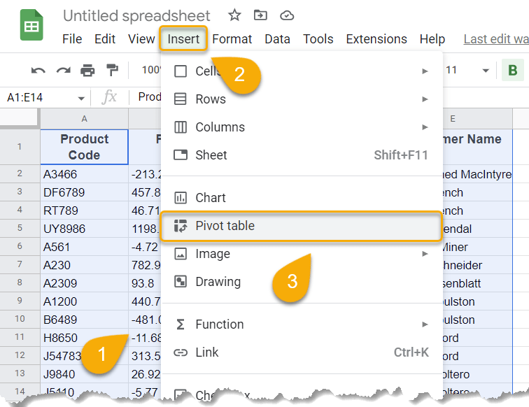
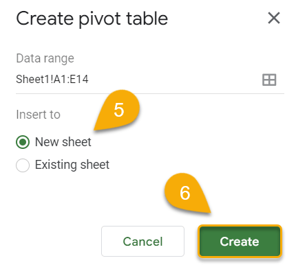
- Next, choose the location where you need to insert the Pivot table. Here we use the New Sheet option.
- Click the Create button.
Now let’s move on to adding options to your table!
- Click the Add button to add the suggested rows.
- Select the row you need to add.
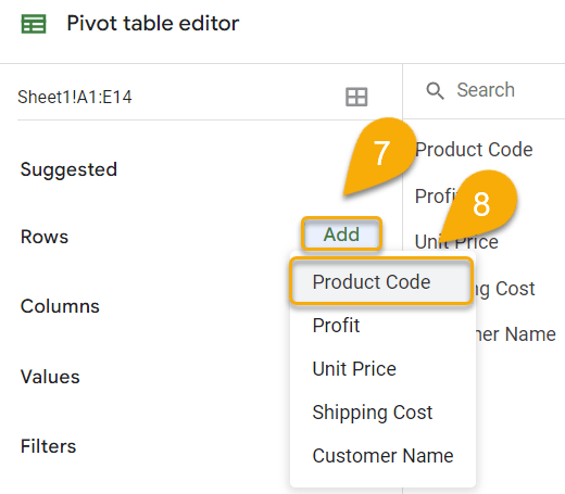
Repeat the action to add other rows as needed. And now your table is ready to go!
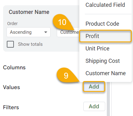
Let’s get down to Columns, Values, and Filter options. In our example, we need to add the Values.
- Click on the Add option.
- Choose the appropriate category.
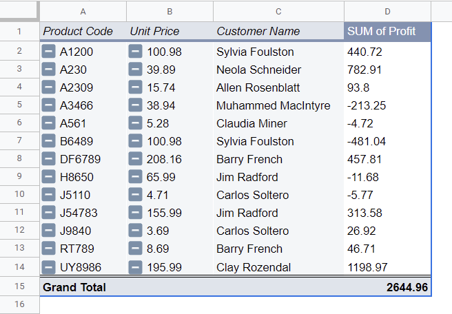
Voila! You have created a pivot table! Let’s move on to the next step.
- Select the Pivot table.
- Navigate to the Insert menu.
- Click on Chart.
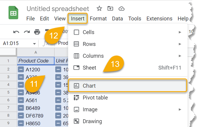
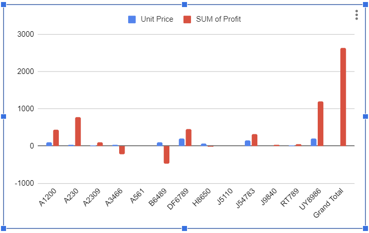
Easy-peasy! A pivot chart has now been created from your pivot table.
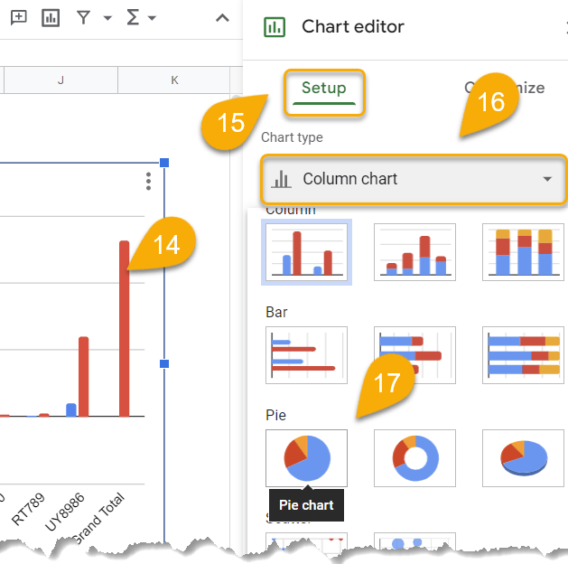
If you don’t like the default chart, you can easily change its type:
- Double-click on the chart.
- Go to the Setup menu.
- Click on the Chart type option.
- Pick a chart you do like.
Congratulations! You have done it!
Pivot Charts in Google Sheets FAQs
For more information, you can check out our FAQs section below.
When should you use a pivot chart?
You should use a pivot chart if you need to summarize large amounts of data visually.
For example, you could use it to show your data and see which weeks, months, or years had the highest or lowest sales or prices, how they changed over time, and so on. With the help of this chart, you will be able to compare data regardless of its format.
What are the pros and cons of using a pivot chart?
If you’re considering using a pivot chart, it’s important to weigh the pros and cons before making a decision.
Pros
- It is one of the best ways to summarize and visualize data quickly and easily.
- It can be used to show trends over time or to compare different groups of data regardless of its type.
Cons
- They can be tricky to set up, and they may not always be accurate.
- They can be difficult to read if they contain a lot of data.
