
Graphs and charts are efficient, effective ways to visualize your data. And Google Sheets has a wide range of charts to choose from. In this article, we will explore a special type of chart—the Timeline chart.
We use a timeline to list events in chronological order or to present a list of project tasks and their deadlines. It is typically portrayed as a long bar marked with dates.
Timelines are used for project management. You can see what milestones your team needs to achieve and under what time schedule, such as setting a project schedule for the development of a new computer application.
A Timeline chart can help you keep multiple tasks on schedule and can also work as an aid in making decisions about current or planned projects. If you’re looking for something more advances. check out our top picks for the best timeline software.
Let’s take a look at how to create and customize a Timeline chart in detail.
How to Prepare a Dataset for a Timeline Chart
To create a chart, you must start with your dataset. This data will need at least two columns:
- The first column (A) will have the dates and times you want to show.
- The second column (B) will contain the numeric data or category names (optional).
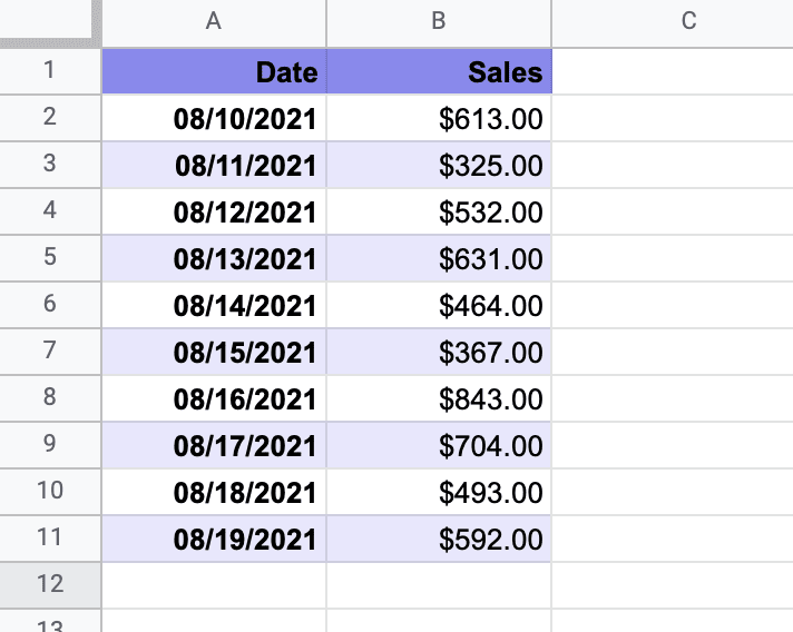
Our sample data represents the dates and sales of products for a fictitious company.
Related Article: How to Create a Candlestick Chart in Google Sheets
How to Create a Timeline in Google Sheets
The dataset is ready to be modified into a chart or graph. Let’s get started.
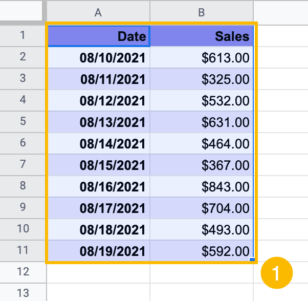
1. Highlight the dataset on the sheet (A1:B11).
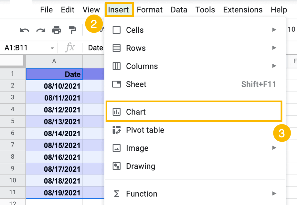
2. Go to the Insert tool.
3. Select “Chart.”
4. In the “Chart editor” task pane that will appear on the right, click on the “Chart type” dropdown arrow.
5. Select the Timeline chart.
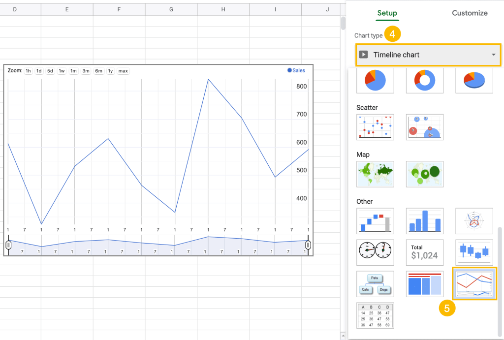
As easy as that, the Timeline chart will appear on the sheet.
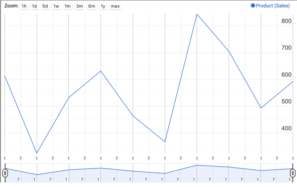
This chart differs significantly from other charts and graphs. You can especially see this during the customization of your chart. It offers customization tools we don’t see in other charts.
Let’s go over this step by step.
Related Article: How to Create a Scorecard Chart in Google Sheets
How to Customize a Timeline Chart
Now that you’ve created your Timeline chart, let’s spruce it up a bit to make it more readable and visually appealing.
How to Change the Styling of a Timeline Chart
Google Sheets allows us to change the fill opacity or modify line thickness of the different parts in the chart.
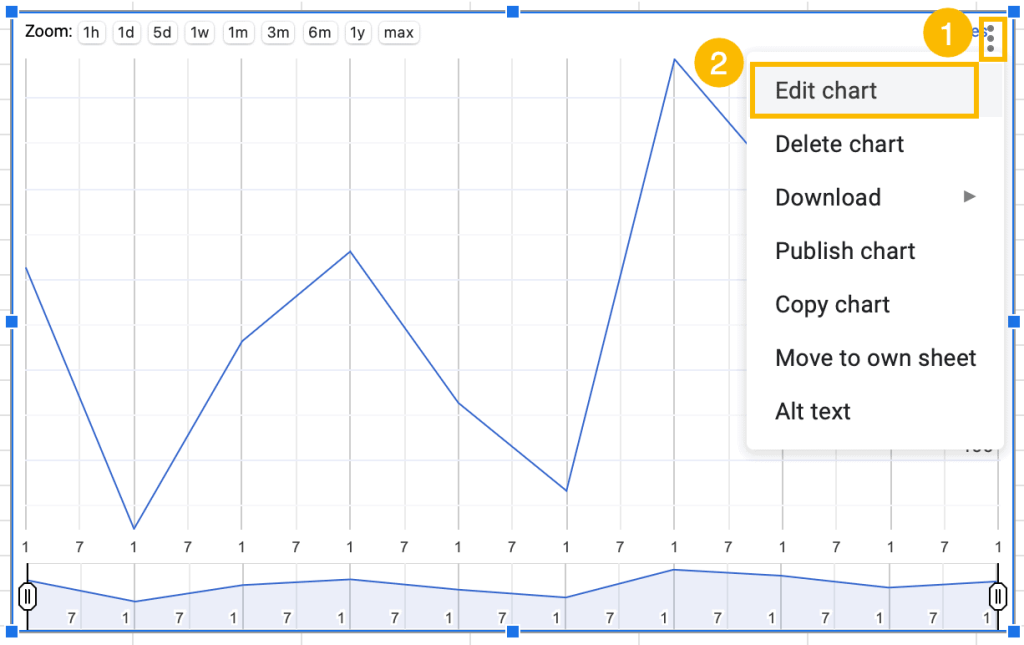
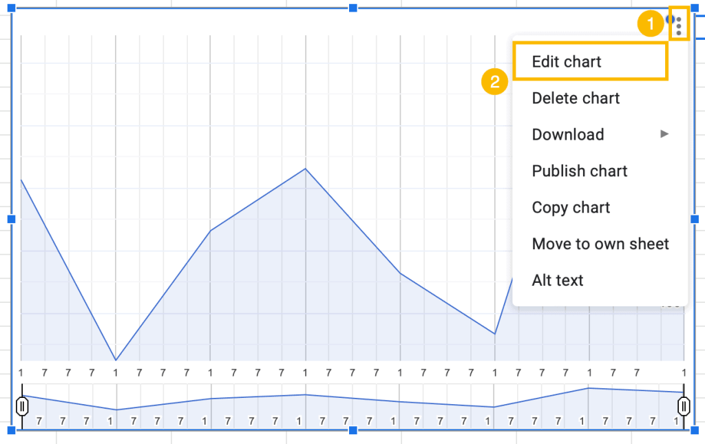
1. Click on the three dots in the upper right corner of the chart plot.
2. Select “Edit chart.”
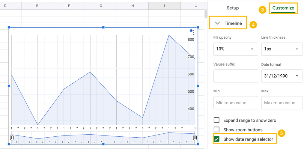
3. Go to the Customize tab.
4. Open the “Timeline” menu.
5. Under the “Fill opacity” box, change the opacity to a level that fits your chart style.
6. Under the “Line thickness” box, adjust the thickness of the line as needed.
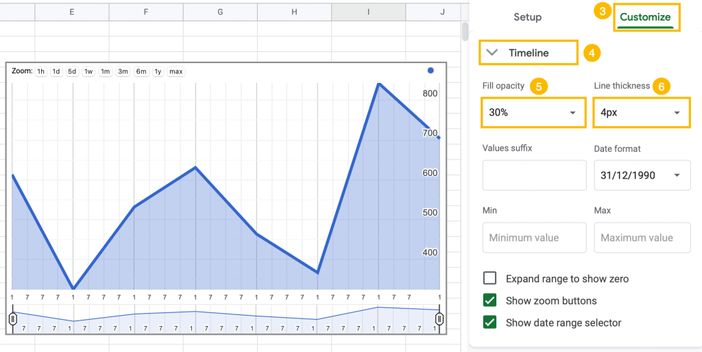
Here you can see the adjustments—30% opacity and a line thickness of 4px.

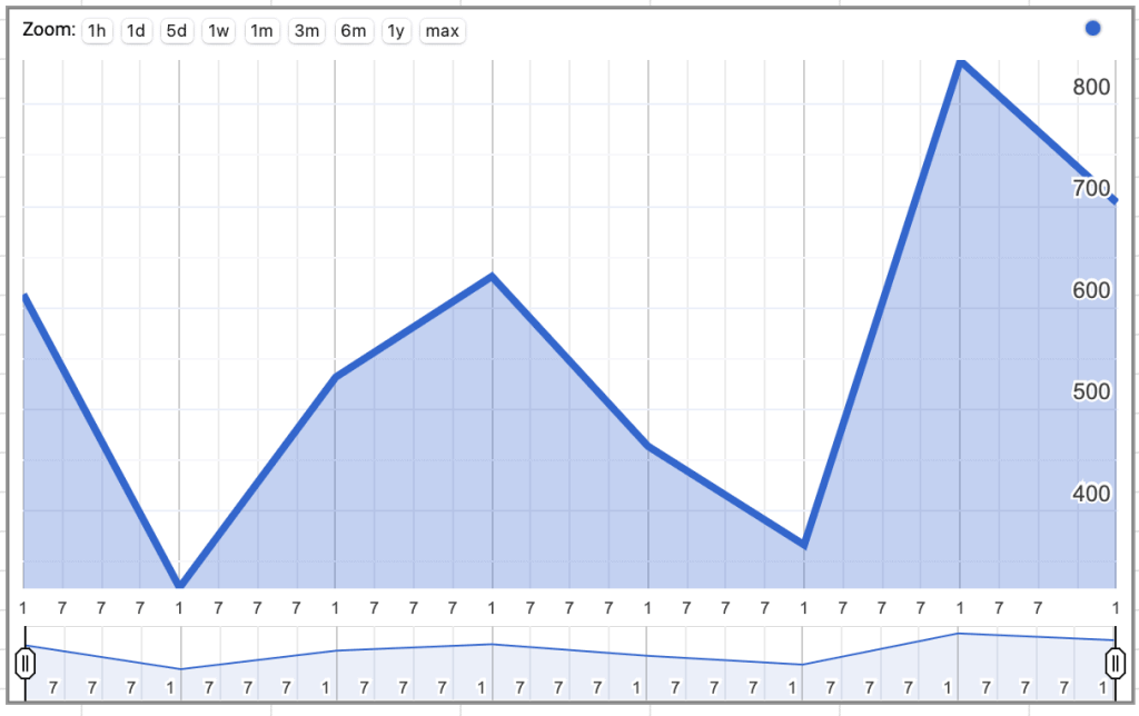
How to Add or Remove the Date Range Selector
The next feature we will look at is the date range selector, located at the bottom of the chart.
By simply dragging the start and end markers, you can zoom in or out on specific date ranges.
If you zoom in on just a few months, you will see that the date range selector also zooms in to allow you to more specifically locate the start and end markers. To zoom out again, simply move the left and right date markers to the far left and far right, respectively.
If you want to add or remove this feature, do the following:
1. Select the three dots in the upper right corner of the chart plot.
2. Go to “Edit chart.”

3. Navigate to the Customize tab.
4. Open the “Timeline” menu.
5. Tick the “Show date range selector” box to add it to your chart, or untick the box to remove it.
How to Add or Remove the Zoom Buttons
There are also zoom buttons at the top left of the chart with some standard time periods (such as hour, day, week).
The markers in the date range selector show the start and end of the date period selected for the graph. You can select the zoom option and then click and hold between the start and end date markers, dragging the date range left and right along the timeline. Here is how to add or remove the zoom buttons:
1. Click on the three dots in the upper right corner of the chart plot.
2. Select “Edit chart.”
3. Tick the “Show zoom buttons” box to add the zoom buttons to your chart.
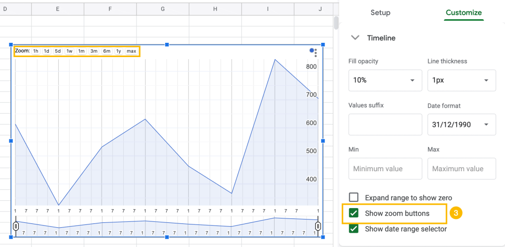
To remove the zoom buttons, untick this box.
Have fun experimenting with and personalizing your Timeline chart!
