
3-D Pie Chart Template – Free Download
A 3-D pie chart is a graph plotted on three-dimensional space. 3-D charts look a lot more visually appealing than their “flat” 2-D counterparts, making them a great tool to add to your Excel belt.
And today, you will learn how to build this 3-D pie graph by following just a few simple steps:

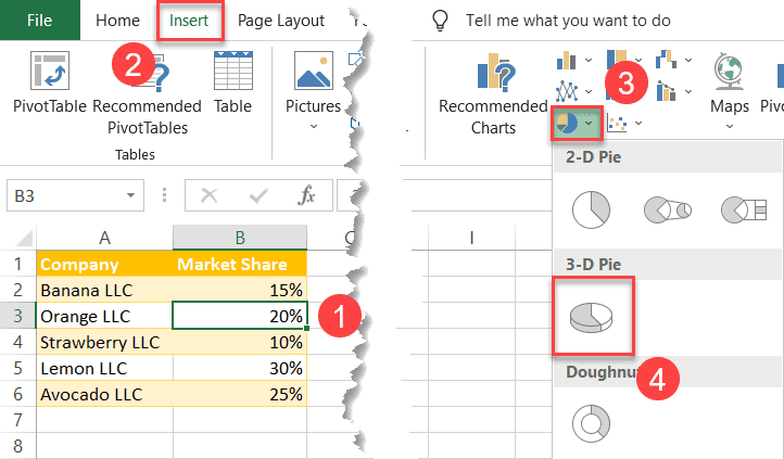
4 Simple Steps to Build a 3-D Pie Chart
Before we begin, consider the table we’re going to use to build our graph:
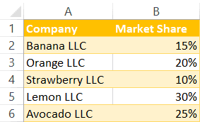
The data in the table is pretty self-explanatory, so move on to the nitty-gritty. Here’s the easiest way to create a 3-D pie chart:
- Select any cell in the data table (A1:A6).
- Switch to the Insert tab.
- Choose “Insert Pie or Doughnut Chart.”
- Click “3-D Pie.”
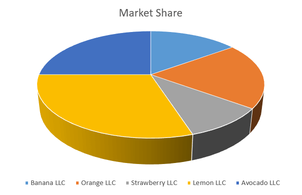
Just a few clicks are your 3-D chart is ready to go:
How to Customize a 3-D Pie Chart
Technically, you’re all set. But why settle for less? Stay tuned to learn how to spruce up your chart a bit with a drop of spreadsheet magic to make your 3-D chart pleasing to the eye.
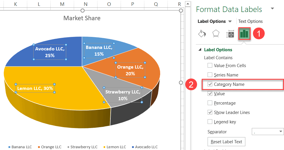
Create Data Labels
Let’s start with adding data labels to illustrate the actual values represented by each of the slices.
Right-click on your 3-D pie graph and click “Add Data Labels.”
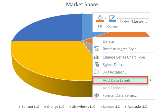
- Go to the Label Options tab.
- Check the “Category Name” box to display the names of the categories along with the actual market share data.
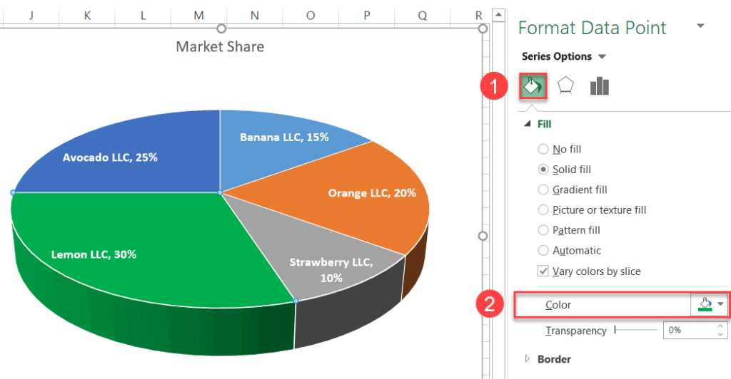
Recolor the Slices
Next stop: changing the color of the slices.Double-click on the slice you want to recolor and select “Format Data Point.”
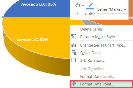
- Hit the “Fill & Line” button.
- Click “Fill Color” and recolor the slice in green.
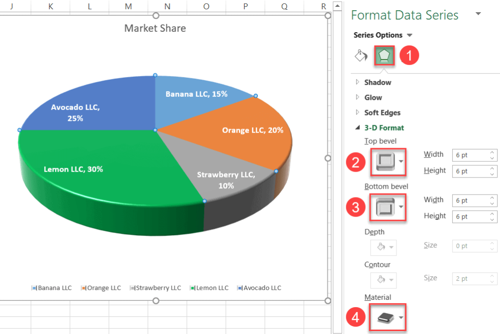
Add 3-D Formatting
Finally, let’s add some 3-D effects to make our chart even more aesthetically appealing.
- In the Format Data Series task pane, navigate to the Effects tab.
- Under “Top bevel,” select “Cutout.”
- Under “Bottom bevel,” choose “Cutout” as well for the sake of consistency.
- Under “Material,” pick “Metal” from the options available.
As you can see, building impressive 3-D pie charts is laughingly easy once you know every step of the process. Over to you.
