Sometimes newbies can be confused by large amounts of data in Excel spreadsheets. It can make a big difference if you organize the data, ultimately making it easier to work with it.
One effective way to do this is to group the data into a chart for a quick understanding of what the data represents.
Read below for a step-by-step action algorithm on how to create a column chart with ease.
Prepare & Format Your Data
In Excel, you can operate on the data in a column, take various actions to incorporate that data for different purposes. You do need at least one column to accomplish this. For our example, we will look at data in two columns:
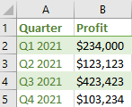
Here is a description of these columns:
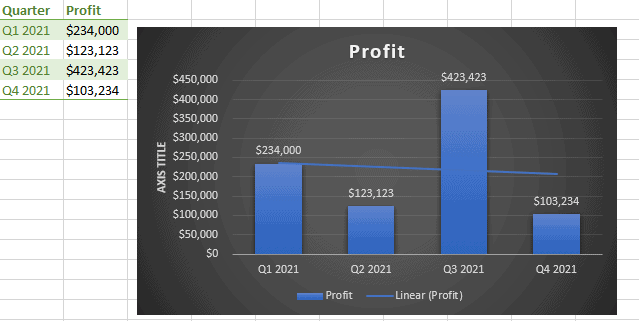
- Column A (Quarter): This column lists the category or description of the data and will represent the x-axis of our chart.
- Column B (Profit): This column has the actual values for our chart which will be placed on the y-axis.
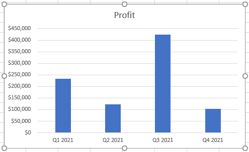
How to Create a Column Chart in Excel in 4 Easy Steps
It will take you practically no time at all to create a column chart because we offer you 4 extremely simple steps to follow:
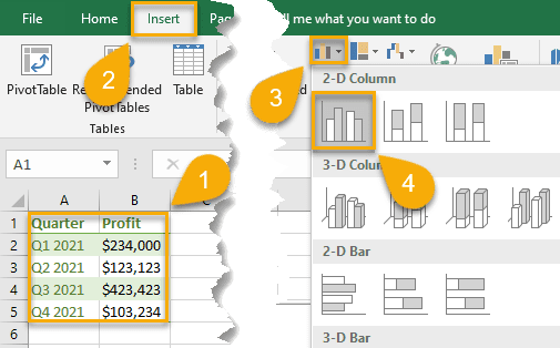
1. Select the data you need (A1:B5).
2. Click “Insert.”
3. Choose “Insert Column or Bar Chart.”
4. Under “2-D Column,” pick “Clustered Column.”
Bob’s your uncle! Your column chart is ready in just a few seconds.
How to Customize Your Excel Column Chart
Once you have created a column chart, it may, no doubt, look incomplete.
If you want to change the look of your chart and transform it into something more eye-catching, you should use some of the customization tools available in Excel. Let’s take a look!
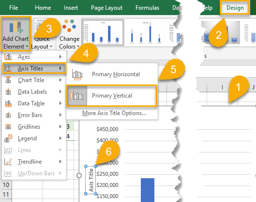
How to Add Axis Titles to Your Column Chart in Excel
Axis titles will help you understand what your chart represents without much effort. How does one do this? Just follow this step-by-step guide:
1. Click on your column chart.
2. Choose the Design tab.
3. Select “Add Chart Element.”
4. Pick “Axis Titles.”
5. Choose “Primary Horizontal” and/or “Primary Vertical.”
6. Name the axis accordingly.
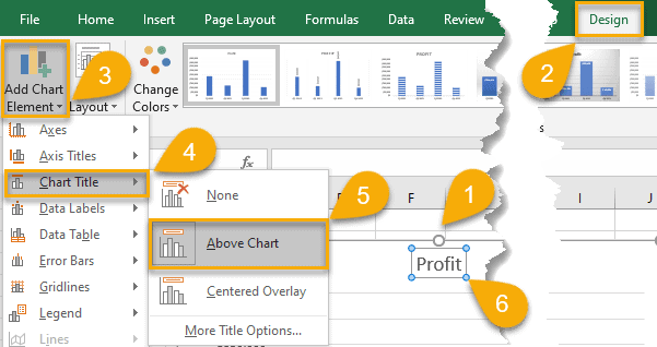
How to Change the Chart Title in Your Column Chart in Excel
One of the many helpful features we can give to a chart is a title. Here are the straightforward steps to make that happen in just a few clicks. Let’s apply it with ease!
1. Click on your column chart.
2. Choose the Design tab.
3. Pick “Add Chart Element.”
4. Click “Chart Title.”
5. Choose either “Above Chart” or “Centered Overlay” to set the position of the title on the chart.
6. Name your title.
So simple! You’ve done it!
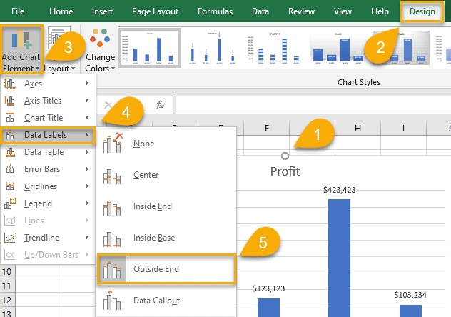
How to Add Data Labels to Your Column Chart in Excel
Data labels play a vital part in your column chart. They should be easily seen and easily read. Here are several easy-peasy steps to follow to create data labels:
1. Click on your column chart.
2. Open the “Design” tab.
3. Choose “Add Chart Element.”
4. Pull up “Data Labels.”
5. Choose “Center,” “Inside End,” “Inside Base,” “Outside End,” or “Data Callout”—whichever one best fits your column chart design.
And now your column chart looks quite informative, doesn’t it?
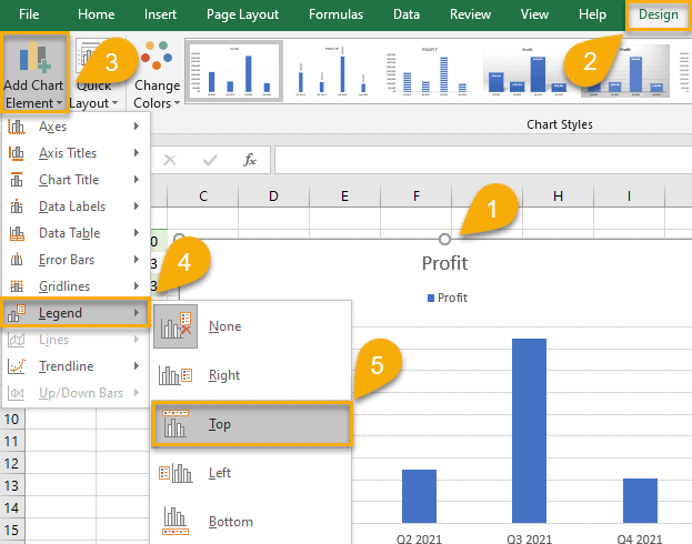
How to Add a Legend to Your Column Chart in Excel
A legend can help your chart be easier to read and understand, especially if you are using and comparing multiple columns of data. It also makes your column chart more presentable. Why not learn how to add a legend to an Excel chart? Here are some simple steps to follow:
1. Click on your column chart.
2. Select the Design tab.
3. Choose “Add Chart Element.”
4. Click “Legend.”
5. Pick “Right,” “Top,” “Left,” or “Bottom” to set the legend in the position you like.
How to Add a Trendline to Your Column Chart in Excel
A trendline complements your chart and enhances the data. This additional line makes your column chart more understandable and meaningful. Let’s see how to add a trendline:
1. Click on your column chart.
2. Choose the “Design” tab.
3. Click “Add Chart Element.”
4. Pick “Trendline.”
5. Choose “Linear,” “Exponential,” “Linear Forecast,” or “Moving Average” to insert the trendline that would best fit your data.
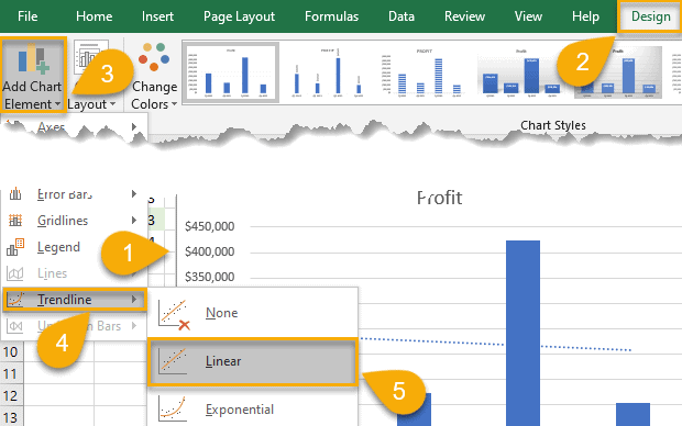
Wow! The trendline is here!
How to Apply a Different Chart Style to Your Column Chart in Excel
To complete your column chart, you should update its appearance. Here are some steps to make you chart neat and presentable:
1. Click on your column chart.
2. Select “Design.”
3. Click the small arrow in the lower-right corner of the Chart Styles.
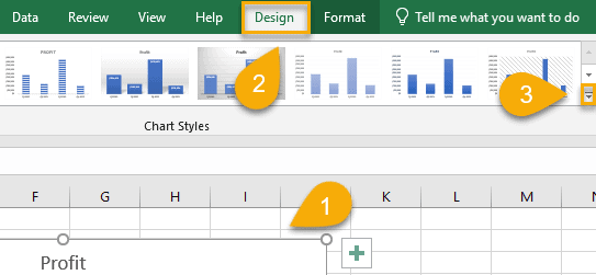
4. Choose the chart style that works best for you.
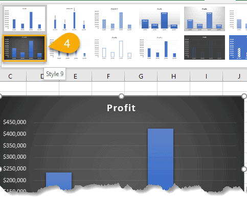
Great job! You have successfully completed your column chart.
Excel Column Chart – Free Template
Here we have prepared a Free Template of the Excel Column Chart that you can download in one click: