Quick Jump
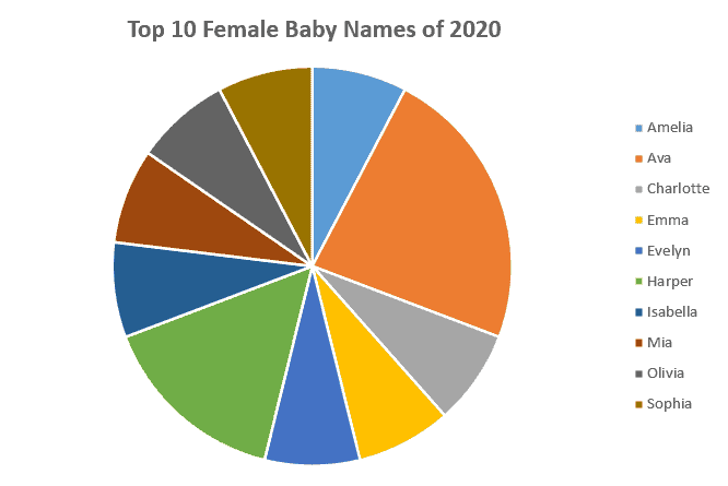
ToggleBuilding a one-column pie chart that accurately accounts for multiple occurrences of the same value in a data set is a pretty challenging task for newbies.
Excel Pie Chart from a Single Column Template – Free Download
But not if you’re armed with the technique you’re about to learn about today. Stick around to find out how to build this one-column pie chart in less than 60 seconds – even if your list contains thousands of items.
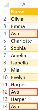
Sample Data
In order to show you the ropes, we’re going to use the following list of female baby names where some of them are repeated multiple times:
Let’s delve right in.
Step 1. Set up a Pivot Table
The first step is to create a simple pivot table based on our column of data:
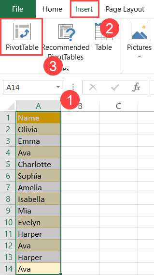
- Highlight the entire column with your data (A1:A14).
- Switch to the Insert tab.
- Click “PivotTable.”
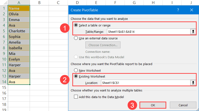
In the “Create PivotTable” dialog box, build your pivot table by following these simple steps:
- For “Select a table or range,” highlight the entire column (A1:A14).
- Select “Existing Worksheet” and pick any empty cell near your column (C1).
- Click “OK.”
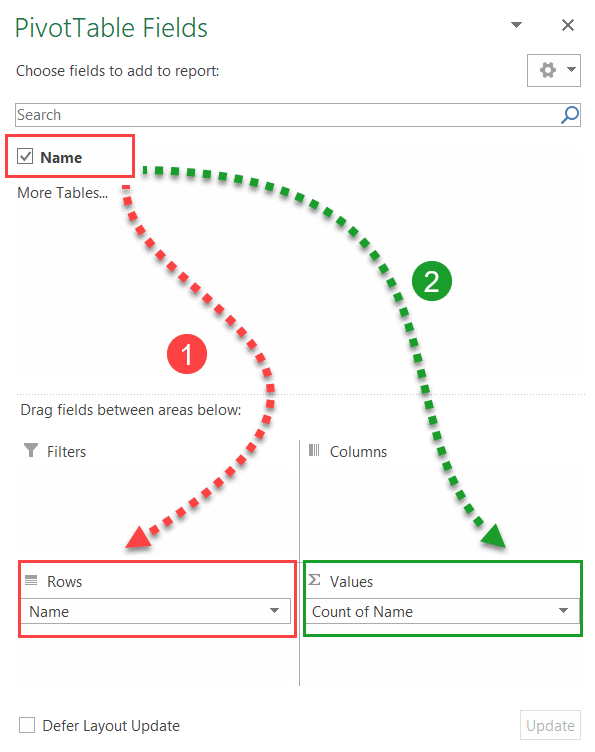
In the PivotTable Fields task pane that appears, do the following to map out the structure of your pie chart:
- Drag “Name” to “Rows.”
- Drag “Name” to “Values.”
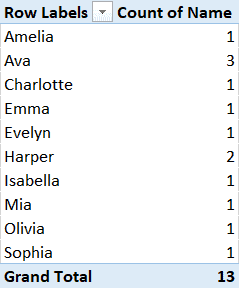
Having rearranged the values, your pivot table should look like this:
Step 2. Create a Pie Chart from the Pivot Table
With everything we need in place, it’s time to create a pie chart Excel using the pivot table you just built.
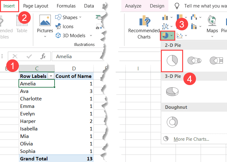
- Select any cell in your pivot table (C1:D12).
- Navigate to the Insert tab.
- Hit the “Insert Pie or Doughnut Chart” button.
- Under “2-D Pie,” click “Pie.”
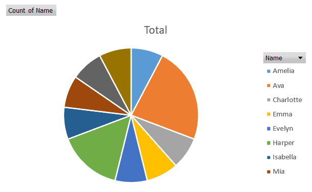
Once you do that, Excel will automatically plot a pie graph using your pivot table.
Step 3. Clean up Your Pie Chart
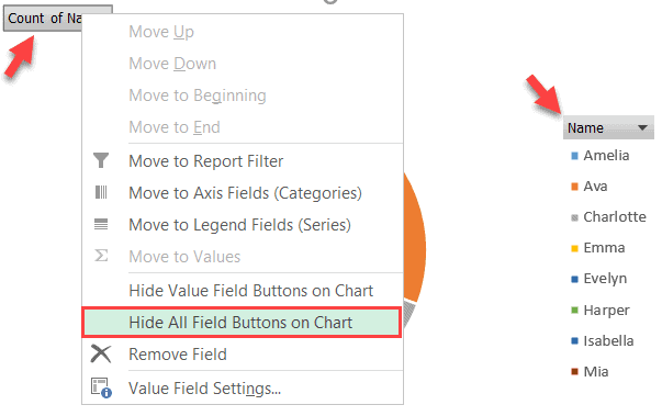
Before calling it a day, let’s remove the field buttons related to our pivot table to make the graph look like a regular pie chart.
- Right-click on any of the field buttons – either “Count of Names” or “Names.”
- Select “Hide All Field Buttons on Chart.”
Rewrite the default chart title, and you’re good to go!