Are you looking for a quick step-by-step tutorial showing you how to create a double line graph in Google Sheets?
You’ve come to the right place.
Stick around the quick-and-dirty way to plot two lines in Google Sheets. Or grab a free copy of our double line graph Google Sheets template and replace the placeholder values with your data.
What Is a Google Sheets Double Line Graph?
A double line graph is, well, a chart with two lines plotted on it. Each line connects individual data points to show a continuous change over time.
It’s one of the easiest ways to compare two things to identify patterns and trends in your data.
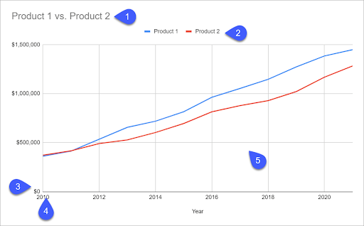
A typical double line graph in Google Sheets is made of five key components:
- A title provides a general overview of what is being displayed.
- A legend refers to the information being analyzed.
- The horizontal (X) axis illustrates the categories being compared over time.
- The vertical (Y) axis maps out the scale used to plot data points and is broken up into equal intervals.
- The charting area is where the actual values are being plotted.
Now that we’re done with the essentials, let’s dive into the process of creating a two line graph.
Step 1: Prepare Your Data
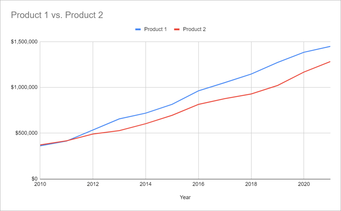
First, let’s create a simple table comparing the revenue generated by two products from 2010 to 2021.
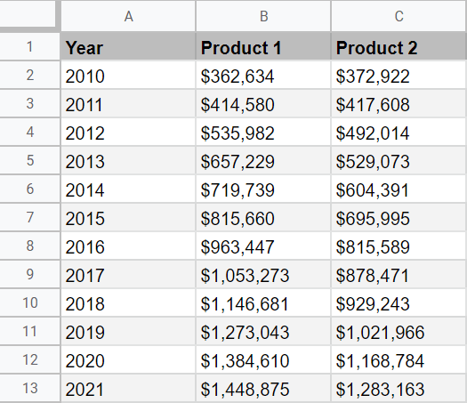
In our data set, Column A stores the category values we will plot on the x-axis, whereas Column B and Column C represent the actual values which will be used to chart a two-line graph.
Step 2: Create a Double Line Graph in Google Sheets
1. Now that we have our data in place, let’s start off by creating a chart from our original data. Select all of your data (A1:C13), go to the Insert tab, and choose “Chart.”
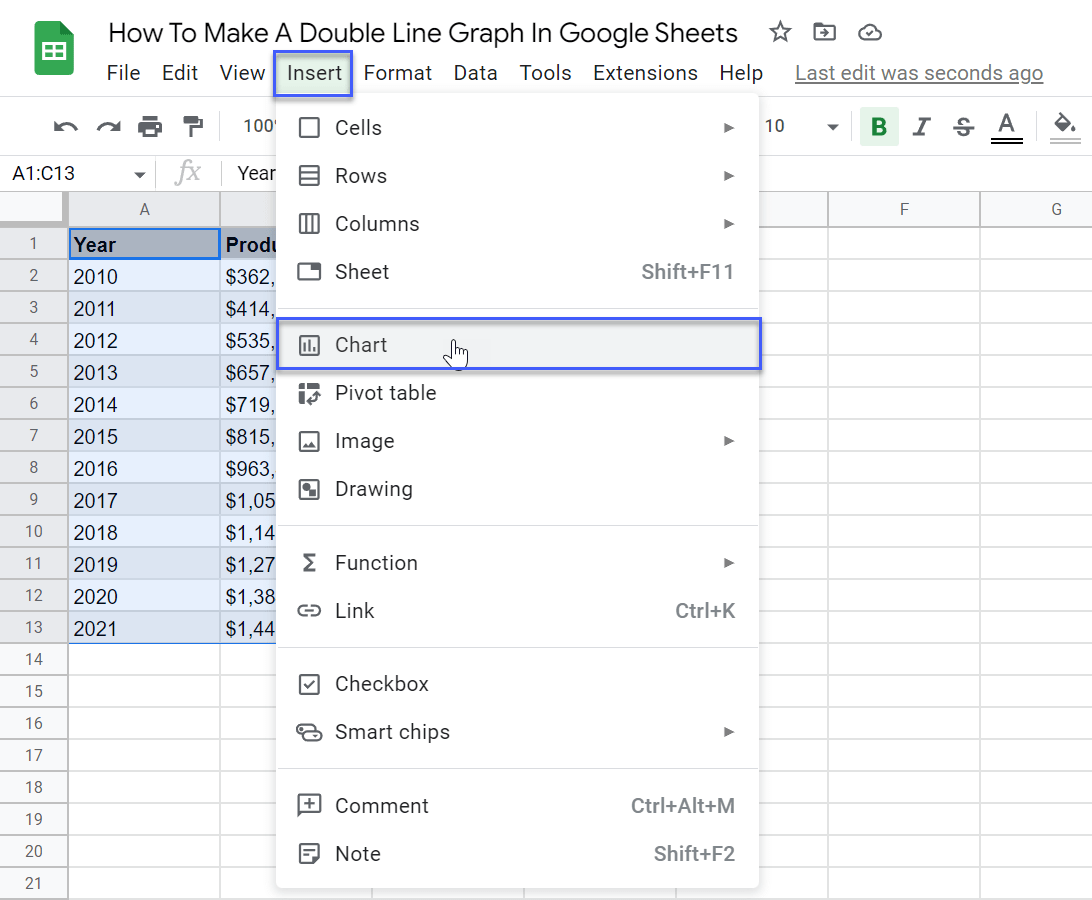
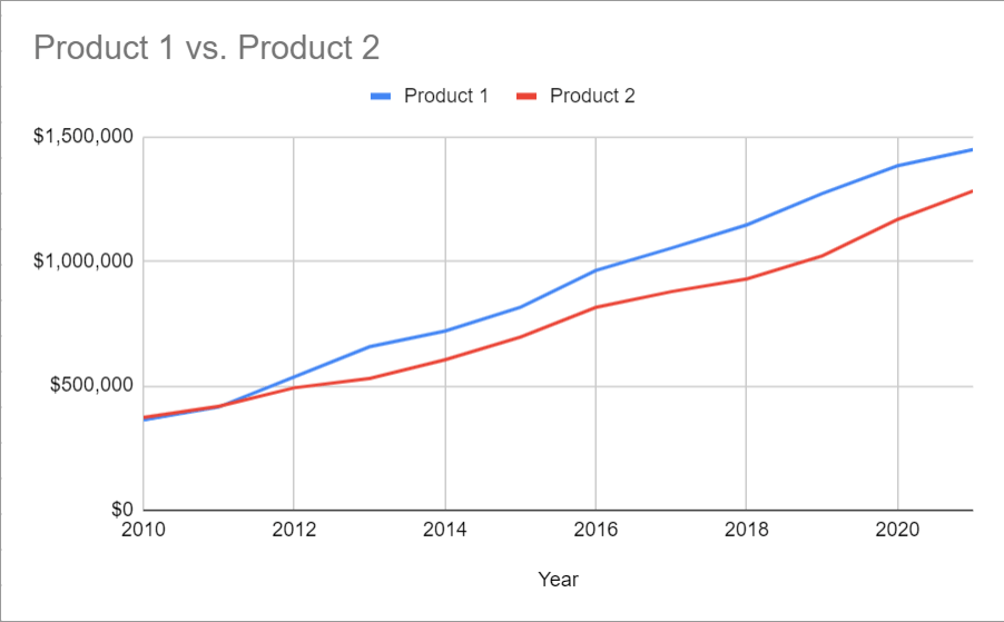
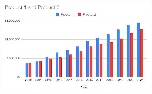
Chances are, you’re going to get a two-line graph right away. However, in our case, Google Sheets decided to automatically generate a column chart instead.
2. If you get anything other than a graph with two lines, you need to manually change the chart type. Double-click on your chart to open the Chart editor, navigate to the Setup tab, and open the “Chart type” drop-down menu.
Under “Line,” choose either “Line chart” or “Smooth line chart” to graph two lines in Google Sheets.
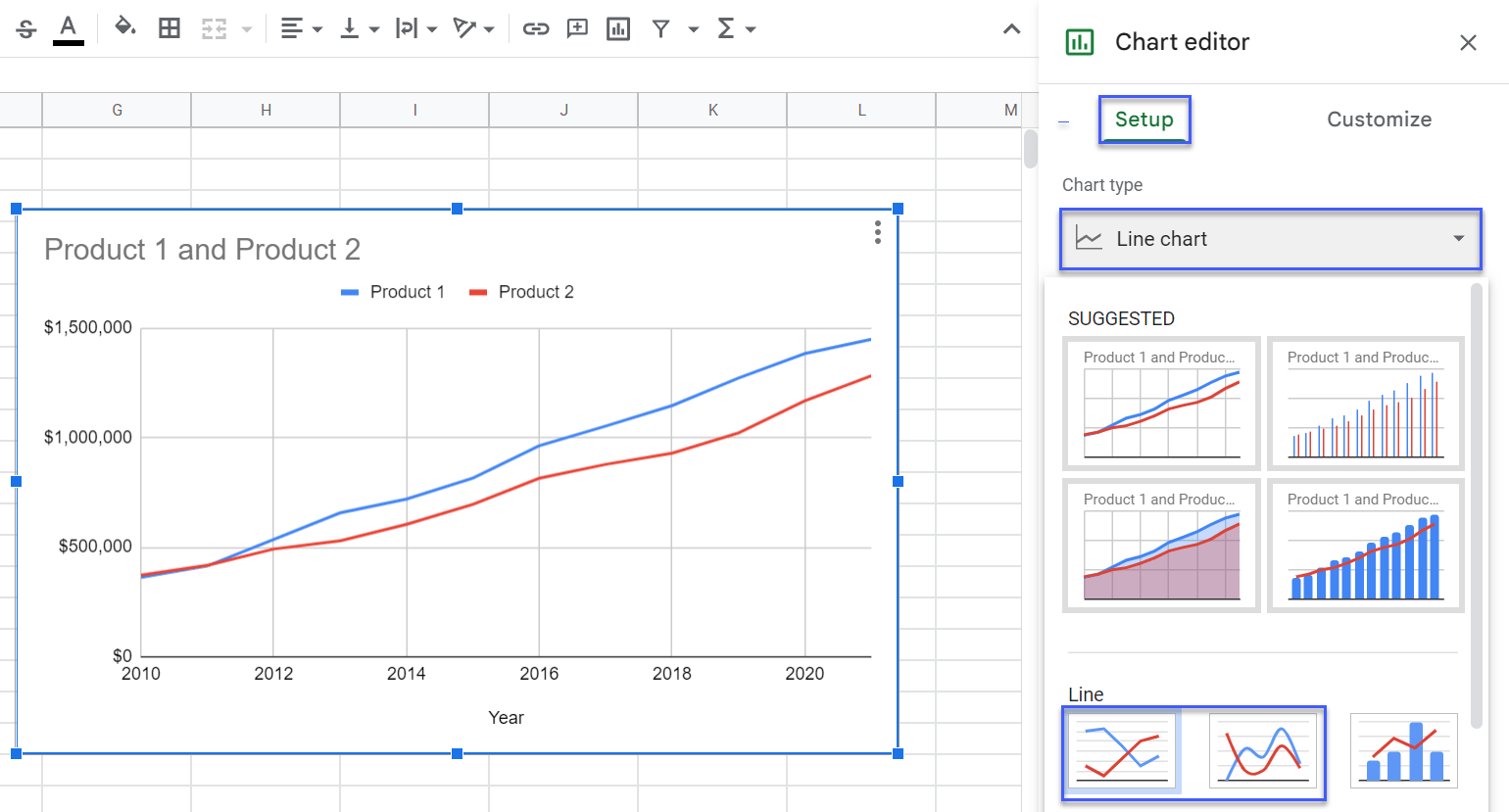
Having done that, you get a simple graph with two lines.