

So you created a Google Sheets pie chart from your data and want to get rid of any percentages on the plot and/or use absolute values instead.
While you might think there should be some sort of a toggle to turn the percentage values on and off, the actual process is a bit more complicated.
But don’t worry. We’ve got you covered.
In this article, you will learn how to remove any percentage labels from your pie chart and use absolute values (numbers) instead in Google Sheets.
Step 1: Modify the Chart Legend
Whenever you create a pie chart in Google Sheets, you’ll automatically get these percentage labels.
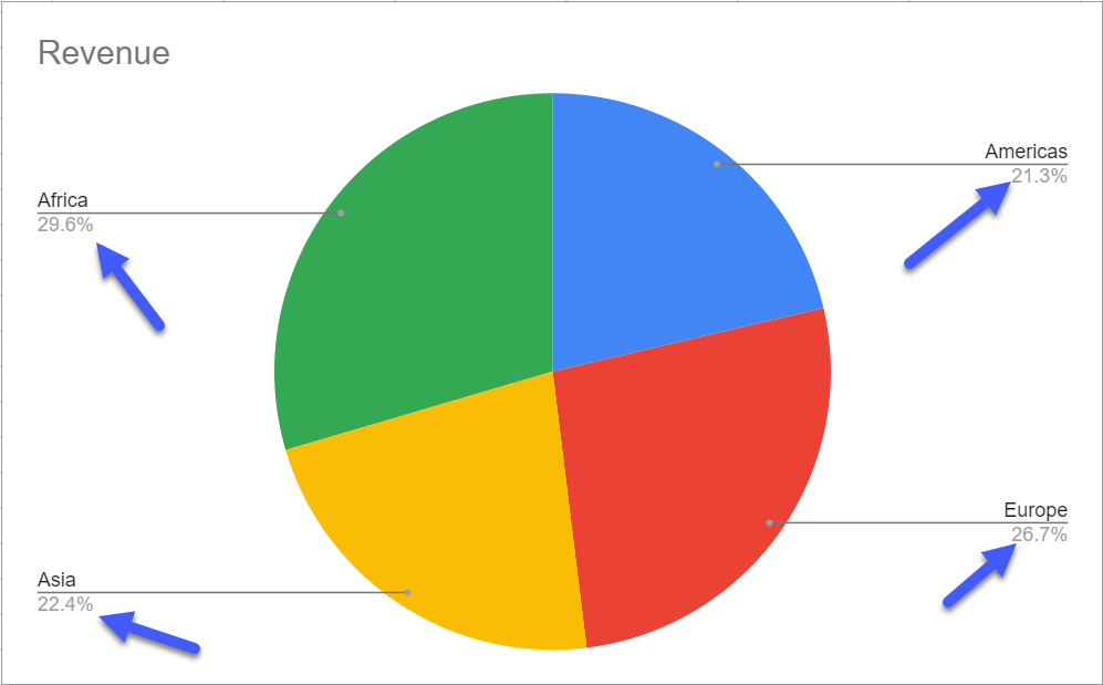
The problem is that these labels are hardcoded into Google Sheets because pie charts are, by design, supposed to show how different slices of a pie chart proportionally relate to each other.
So, in order to remove those percentage values from our pie chart, we need to change the position of the chart legend. That’s the only workaround available to us without resorting to Google Sheets add-ons.
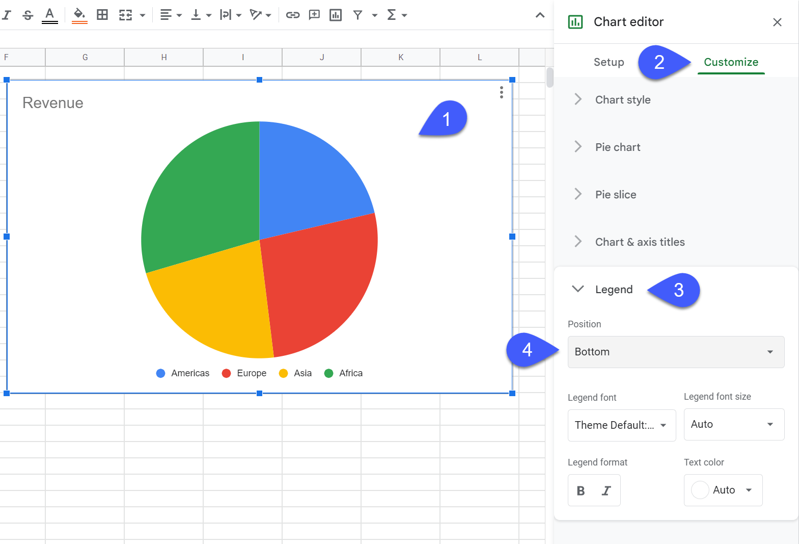
1. Double-click on your pie chart plot to open the Chart editor.
2. Go to the Customize tab.
3. Navigate to the Legend section.
4. Change the “Position” value from “Auto” to “Right,” “Left,” “Bottom,” “Top,” or “None.” Using “Auto” or “Labeled” adds percentage values to a pie chart.
If your goal is to simply remove percentages from your Google Sheets pie chart, you can call it a day.
However, the problem is that without any labels whatsoever, it’s impossible to interpret the data visualized with the help of our pie chart.
That’s why our next step is to add custom labels with absolute, numeric values.
Step 2: Create Custom Pie Chart Slice Labels with Absolute Values
Now it’s time to replace the percentage labels we just removed with the actual numeric values to ensure the data plotted on the charting area can be actually analyzed.
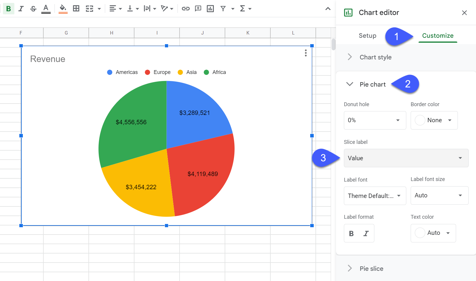
1. In the Chart editor, go to the Customize tab.
2. Navigate to the “Pie chart” section to access additional customization options.
3. Under “Slice label,” choose “Value” to create the absolute value labels for your pie chart.
4. Add the final touches by changing the label font, font size, format, and text color values in the same “Pie chart” section.
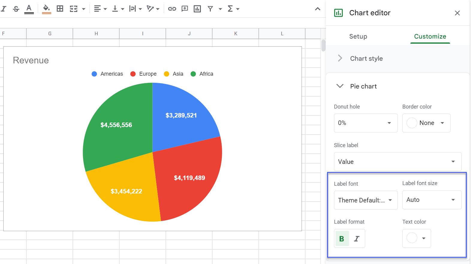
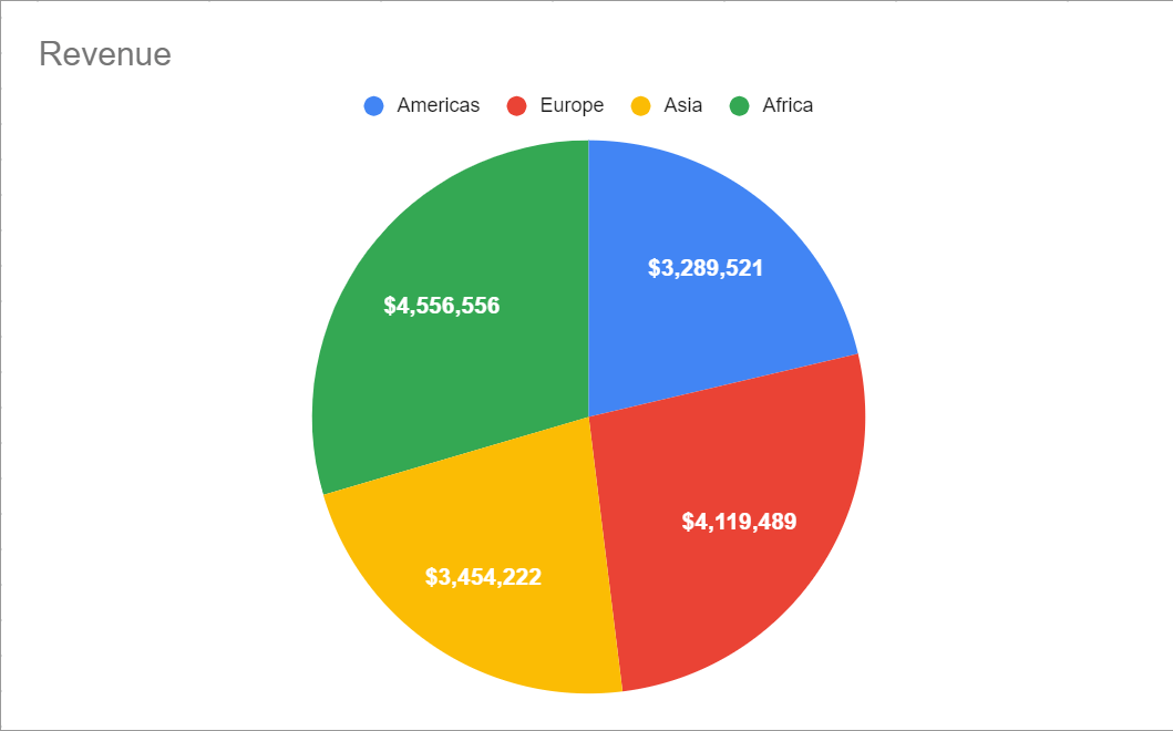
As a result, we end up with a pie chart without any percentage labels that uses absolute values to showcase how the slices relate to each other.
And that’s how you do it. Regardless of the reason why you might want to change or remove pie chart percentage labels, you now have all the information you need to pull off the task.
