
To switch the X- and Y-axes in Google Sheets, select your chart, click on the three dots menu in the top right-hand corner, and choose Edit chart. From there, select the X-axis category and choose the unit that you want to display on the X-axis. Then click on Series and select the column that you want to display on the Y-axis. Finally, double-click on the labels and rename them according to the indicators displayed on the chart.
If you insert a chart with your data in Google Sheets, the values assigned to the X and Y axes are set automatically by default. You can, however, easily switch the X and Y axes if necessary.
The article below will show you the quick and easy steps to follow to accomplish this without any trouble.
How to Swap X- and Y-axes in Google Sheets
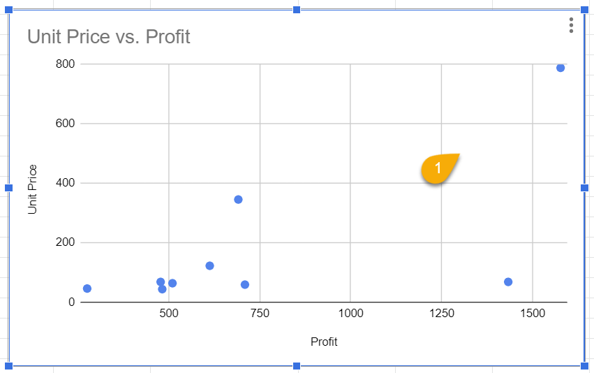
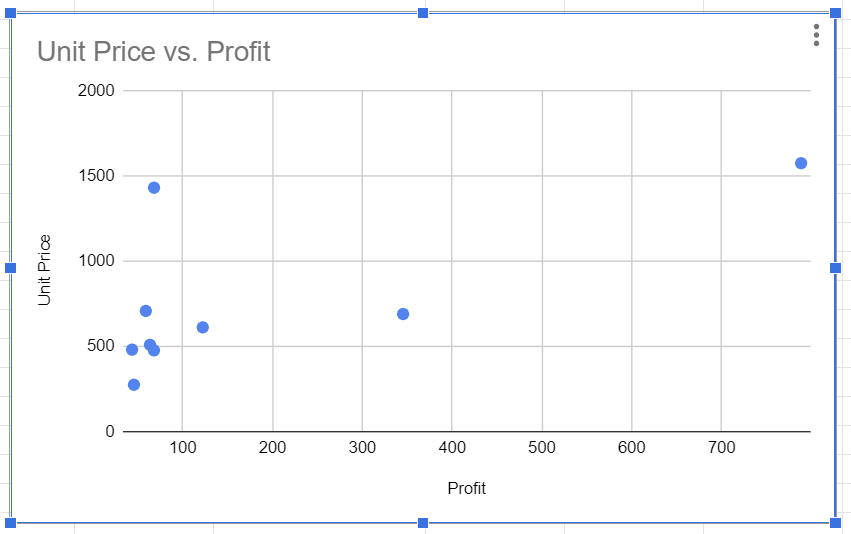
Before you can change the axes in a chart, you need to have a chart. Let’s use a regular Google Sheets scatter plot as our example.
Take a look at the steps below to see how to swap the X- and Y-axes.
Step 1: The first thing to do is to click on the chart you want to edit.
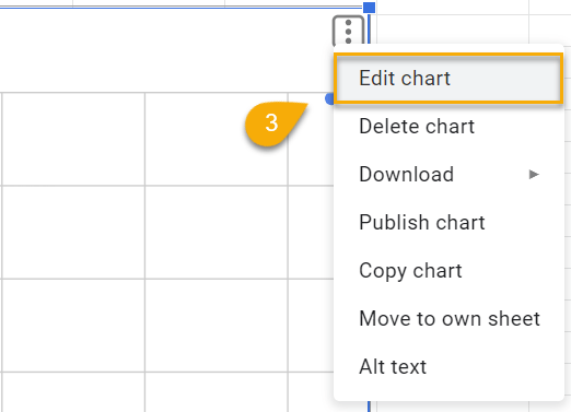
Step 2: Open the three dots menu at the top right-hand corner of the chart.
Step 3: From the drop-down menu, click the Edit chart option.
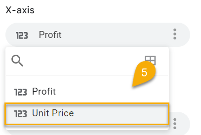
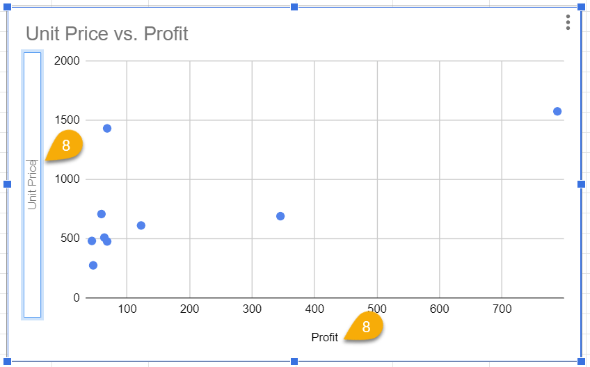
Step 4: The Chart editor task pane will appear. Scroll down to the X-axis category and select it to reveal your options.
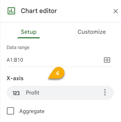
Step 5: Choose the data series you want to display on the X-axis (Unit Price).
Here is the result:
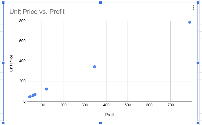
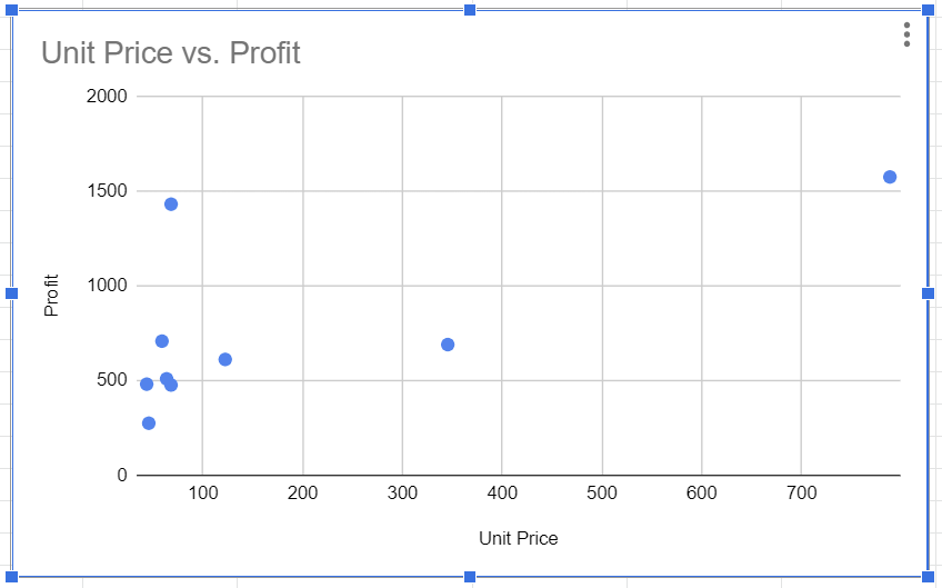
However, there is still more to be done. Our next task is to specify the data series for the Y-axis.
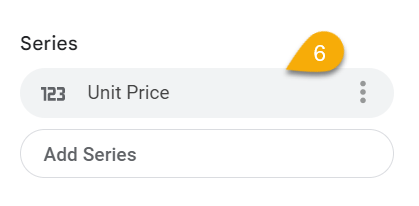
Step 6: In the Chart editor menu, under the Series category, you will see the name of the series you selected for the X-axis (Unit Price). Click on the series name to show your options.
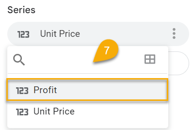
Step 7: From the drop-down list, select the series that you want to display on the Y-axis (Profit).
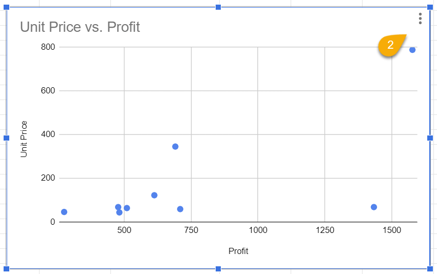
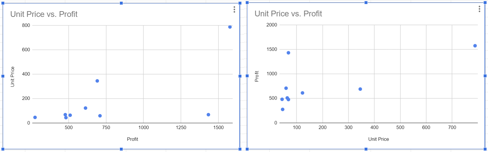
Once this has been done, the chart will update as shown below:
Although the indicators have changed their position, the labels have remained unchanged. Let’s update them to match the indicators they represent.
Step 8: To rewrite the labels, double-click on the label and rename as needed (here we are swapping them to accurately represent the indicators).
And there you go! See the final result with the axes on the chart switched around:
Which Chart Types Can Be Tweaked to Flip X- and Y-axes in Google Sheets?
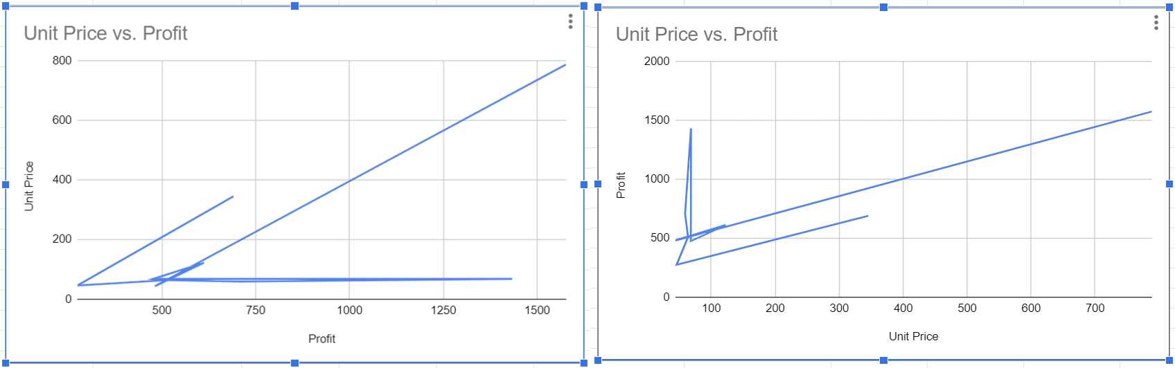
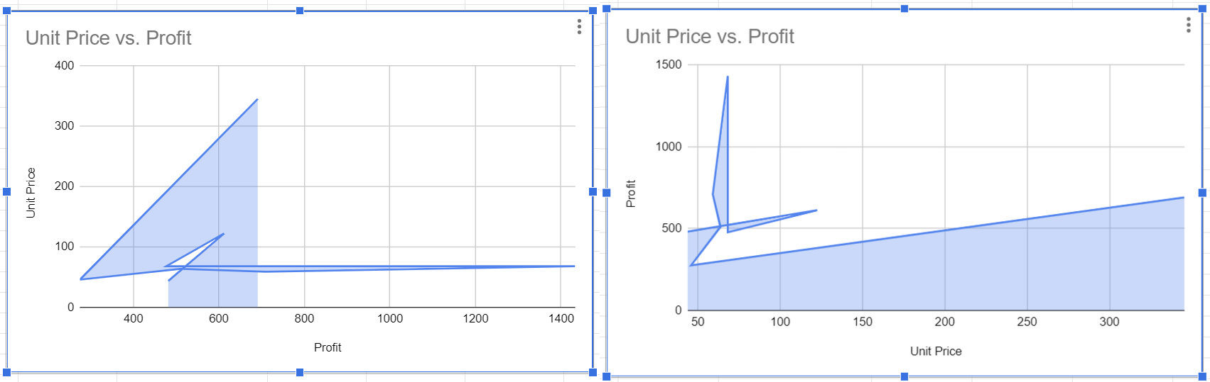
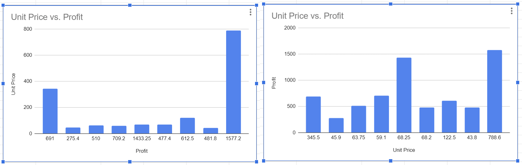
In this article, we used a scatter plot with X- and Y-axes, so you were able to switch between them easily.
The thing to keep in mind is that if you plan on swapping the axes on other chart types, then you should know which charts allow you to do so.
There are a variety of charts available in Google Sheets, including line, area, column, bar, pie, and scatter charts.
The pie chart is the only chart type that does not come with an X-axis or a Y-axis. Because of this, you cannot swap the X- and Y-axes for the pie chart. You can see just by looking at the pie chart that it does not have an X- or Y-axis.
Now let’s look at the сharts where we can switch the axes, and you will see the differences between them.
Line Chart
Area Chart
Column Chart
Bar Chart
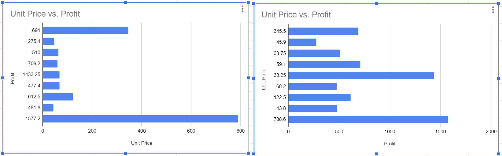
Scatter Chart
If you want to switch the axes on a chart, don’t forget to take note of what kind of chart you’re using so you can determine if it’s feasible in the first place.
