To add a target line to a chart in Google Sheets, click the Insert menu in the Ribbon and select the Chart option. From that point, add the Combo Chart or Line Chart in the Chart editor to create a target line in the chart.
To learn more on this topic, read the following article to gain more knowledge about how target lines are added in Google Sheets.
What’s the Purpose of Adding a Target Line Versus an Actual Line?
A target line is an efficient tool used to analyze the trends and levels between the data set and the expected variable levels. A target line is added to a chart to measure the deviation of the data components from the expected measures.
For example, if we have the data of the attendance of students accumulated in a month, we can create a column chart and add a target line to measure the deviations of individual students’ attendance from the set standard norms.
How to Add a Target Line to a Column Chart
A target line can be added in a column/bar chart to compare the target variable value with the actual value of the variables. This can be done in the following way:
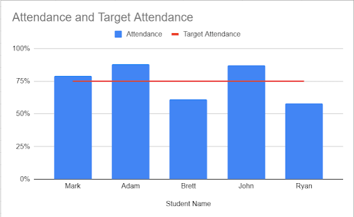
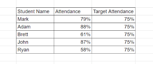
Step 1: Create a data set suitable for the analysis. In the given example, we have taken the attendance records of five students, with the target attendance required for all the students determined as 75%.

- Column F (Student Name) – This column provides the names of the students.
- Column G (Attendance) – This column shows the attendance record of each student.
- Column H (Target Attendance) – This column determines the target attendance level that is required by all students.
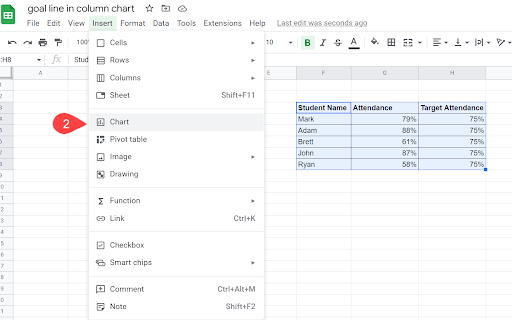
Step 2: Select all the columns and rows from the data that we have created. Then go to the Ribbon at the top of your Google Sheets document and click Insert. From the Insert menu, select Chart.

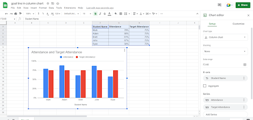
This will automatically input a column chart and will also open the Chart editor on the right side of the screen. You will then have the chart displayed on the screen; the default chart type is the column chart.

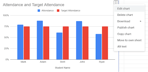
** If the Chart editor does not open automatically, you can open it by clicking on the three dots menu on the top right corner of the chart.
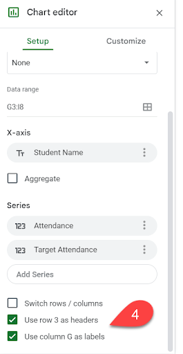
Step 3: In the Chart editor, select the chart type as Combo chart.
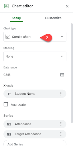
Step 4: In the Chart editor, check the “Use row 3 as headers” and “Use Column G as labels” boxes. (The row and column will differ depending on your data set.)

Following these steps will add a target line to a column chart. In this example, this line can be used to compare which students fulfilled the target attendance needs (75%).
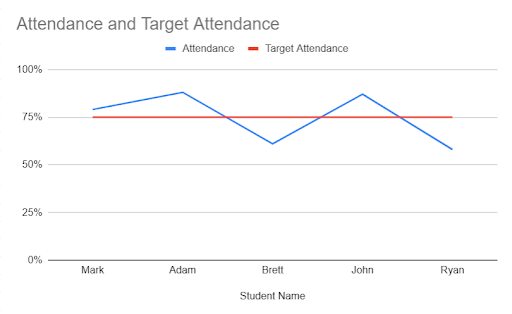
How to Add a Target Line to a Line Chart
A line chart in Google Sheets is an essential tool used in analyzing the trends and patterns in a data set. With a target line in a line chart, it is quite easy for a user to analyze what components of a data set meet the target parameters.
For example, if we have the data of five students’ attendance records and the minimum target attendance required by all these students, a target line in a line chart would be really fruitful in determining which students have met the minimum standards.
Step 1: The first step is to take a data set suitable for the required trend. We can use the same data of attendance records of five students from the previous example. The target attendance requirement for all students is set at 75%.
Step 2: Select the rows and columns in the data set. After making the selection, click Insert on the taskbar and choose Chart from the drop-down menu.
This will automatically provide a column chart and will also open the Chart editor on the right side of the screen. The chart will then be displayed on the screen; the default chart type is a column chart.
** If the Chart editor does not open automatically, you can open it by clicking on the three dots menu on the top right corner of the chart.
Step 3: In the Chart editor, select the chart type as Line Chart.
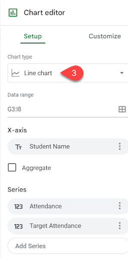
Step 4: In the Chart editor, check the “Use row 3 as headers” and “Use column G as labels.”
This will give the desired output—i.e., a line chart with a target line.