Quick Jump
ToggleA waterfall chart (also called a Mario chart or a flying bricks chart) is a great visualization tool for analyzing the cumulative effect of sequentially illustrated positive or negative values.
The process of creating a waterfall chart in Google Sheets is pretty straightforward, and in addition, there are many options for customizing its appearance.
In this step-by-step guide, you will learn how to create and customize a waterfall chart in Google Sheet.
How to Prepare a Data Set
Before diving into the nitty-gritty, you need to know how to format your data so that Google Sheets can actually generate a waterfall chart from it.
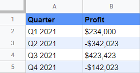
The screenshot above is the data set we’re going to use as a running example for this tutorial. Here’s the breakdown of the columns for you to successfully follow my footsteps:
- Column Quarter (Column A): This column contains the categories of your flying bricks chart.
- Column Profit (Column B): This column stores your actual values.
How to Create a Waterfall Chart in 6 Simple Steps
Having covered the essentials, let’s get the ball rolling. Here’s what you need to do to set up a waterfall chart in Google Sheets:
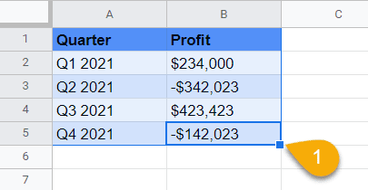
1. Highlight the entire data set (A1:B7).
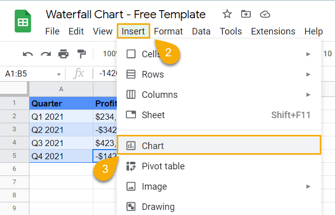
2. In the Home tab, click “Insert.”
3. Select “Chart.”
Once there, Google Sheet will automatically generate a waterfall chart.
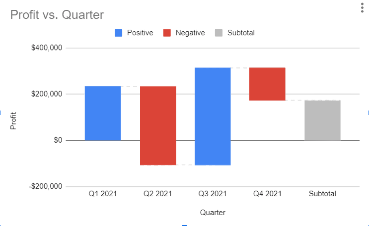
If that did happen and Google Sheets set up anything other than what we’re looking for, you need to take some extra steps to modify the underlying chart type.
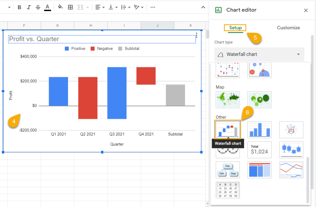
4. Double-click on the chart plot to open the Chart Editor.
5. Go to the Setup tab.
6. Under “Chart type,” scroll down below and click “Waterfall chart.”
Once there, your waterfall chart should appear.
How to Customize Charts In Google Sheets
Technically, your Mario chart is good to go, and you can call it a day. But if you’re looking for ways to spruce up your graph, Google Sheets offers a wide range of customization tools.
In the next section, we’re going to cover all of them.
How to Change the Title of a Waterfall Chart
The first thing people pay attention to is the chart title. Its main purpose is to be descriptive enough to tell anyone what the chart is all about within seconds.
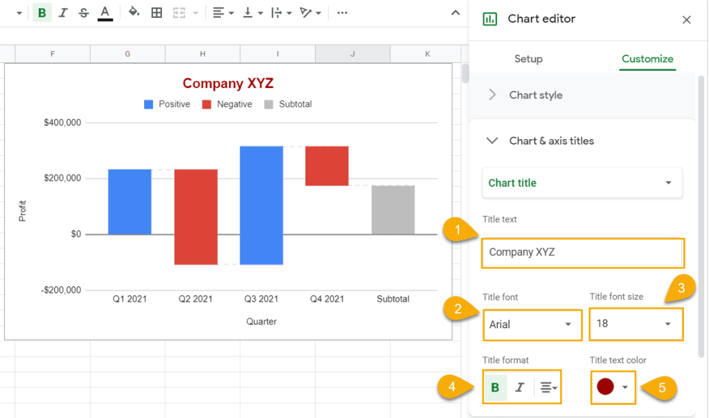
To modify the title of your waterfall chart in Google Sheets, double-click on the chart to open the Chart Editor, click the Customize tab, and navigate to the “Chart & axis titles” section.
Once there, use any of the following options to fine-tune the details:
1. The “Title text” field allows you to change the name of your waterfall chart.
2. The “Title font” field enables you to choose the font you want to apply to your waterfall chart.
3. The “Title font size” field can be used to change the size of your chart title.
4. The “Title format” field can be modified to change the position of the title on the plot or make it bold or italic.
5. The “Title text color” field makes it possible for you to color your waterfall chart title however you see fit.
How to Change the Style of a Waterfall Chart
Do you find the regular white background boring and dull? Do you want to change the style of the chart? Do you need to add connector lines?
All of these adjustments can be done using just one customization tool.
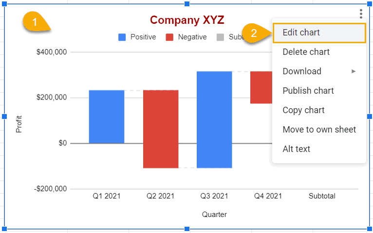
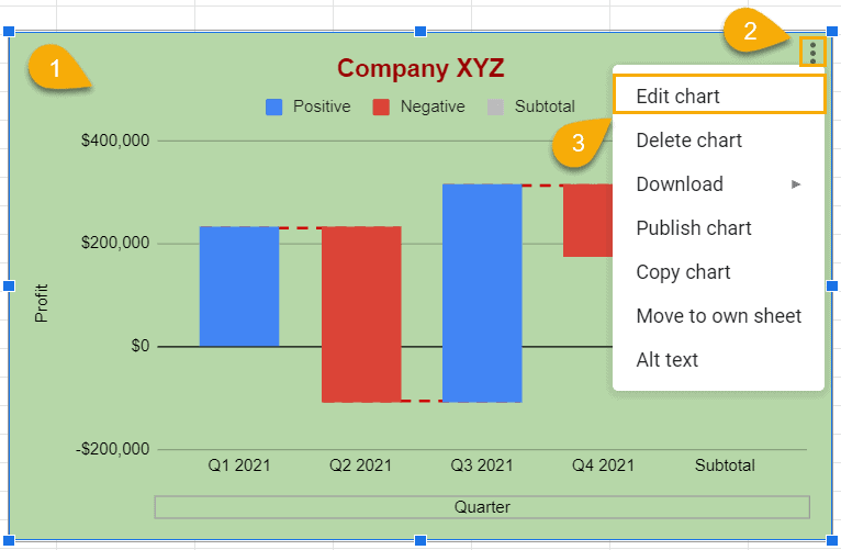
1. Select your waterfall chart and click the three-dot menu.
2. Select “Edit Chart.”
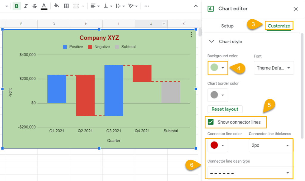
3. Go to the Customize tab.
4. In the “Chart style” section, use the color palette under “Background color” to change the background color.
5. To add connector lines to your flying bricks chart, select the “Show connector lines” option.
6. Customize your connection lines by changing the color, thickness, or line dash type however you want.
How to Add Data Labels for Waterfall Chart in Google Sheets
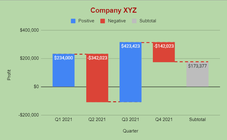
Chart labels help make your waterfall chart a lot more informative, so there’s no reason to leave them out.
And here’s how to add them to your flying sticks chart in Google Sheets:
1. Select your waterfall graph.
2. Click the three-dot menu.
3. Select “Edit chart.”
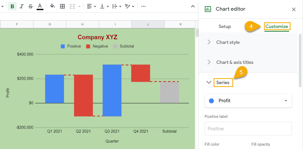
4. Navigate to the “Customize” tab.
5. Open the “Series” menu.
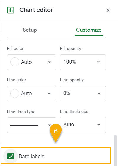
6. Scroll the menu and tick the “Data Labels” box.
After you have followed these simple steps, your waterfall chart should look like this:
How to Modify the Horizontal Axis (X-axis) or Vertical Axis (Y-axis)
Automatically, on the chart you’ve created, the horizontal axis will represent the first column (column A) of the data you have. H
However, you may want to change it. So there is a question: how to modify it?
1. Select your waterfall chart and click the three-dot menu on the chart plot.
2. Select the “Edit chart” tool.
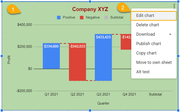
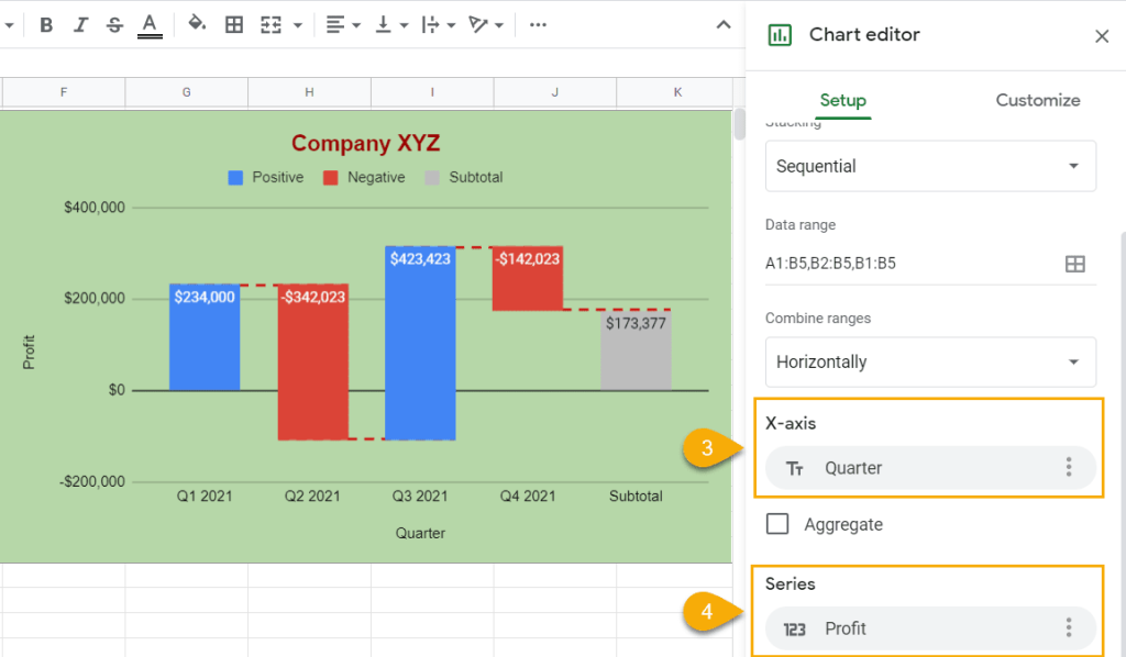
3. In the “Setup” tab, under “X-axis,” change the underlying data for your x-axis to column Profit (B1:B2) to see the chart getting immediately updated.
4. Use the “Series” field to change the data used to plot the y-axis.
A pro tip: you can use a custom data range to easily modify your waterfall chart without having to build everything from scratch.
How to Add (and Remove) Gridlines and Tick Marks to a Waterfall Chart
Google Sheets makes it possible for you to add gridlines and tick marks to your waterfall graph to make it more digestible.
1. Select the chart plot and click the three-dot menu that appears.
2. Choose “Edit chart.”
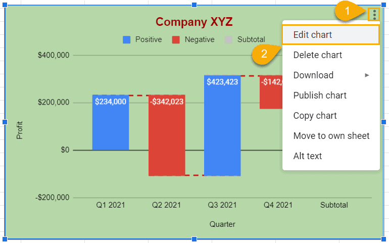
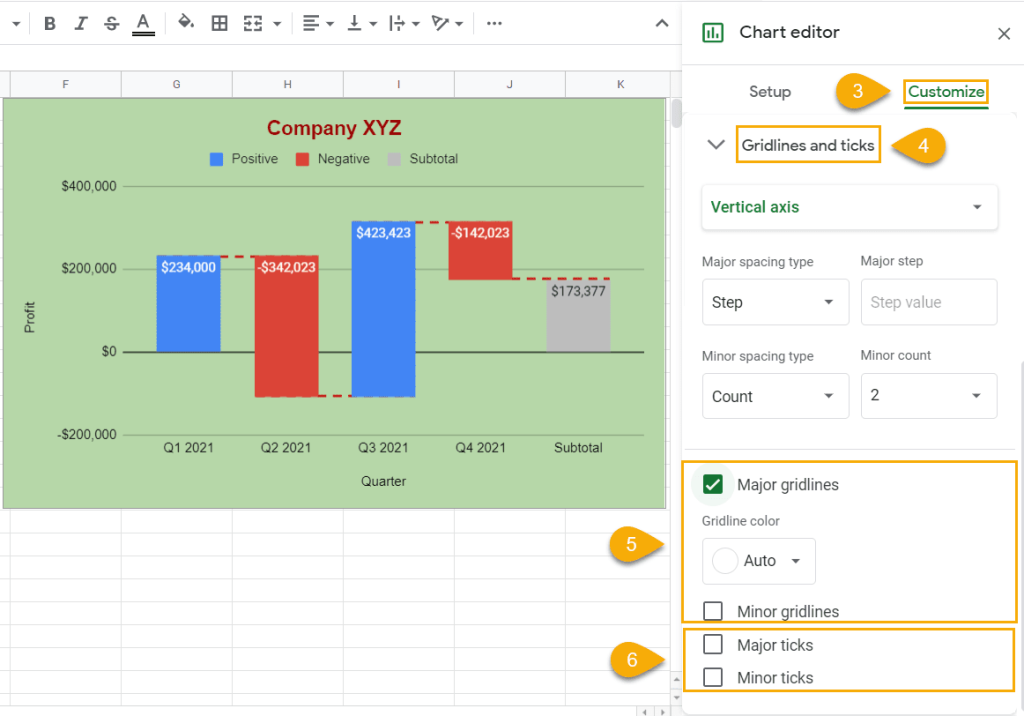
3. Go to the Customize tab.
4. Open the “Gridlines and ticks” section
5. Check the “Major gridlines” and “Minor gridlines” boxes to add gridlines to your waterfall chart.
6. Check the “Major ticks” and “Minor ticks” boxes to add tick marks to your Mario chart.
If you want to remove gridlines or tick marks, just uncheck these boxes.
Waterfall Chart in Google Sheets – Free Template
If you’re short on time and looking for a ready-made solution to get up and running in seconds, grab our free waterfall chart template in Google Sheets by clicking the link below:
Waterfall Chart in Google Sheets – Free Template
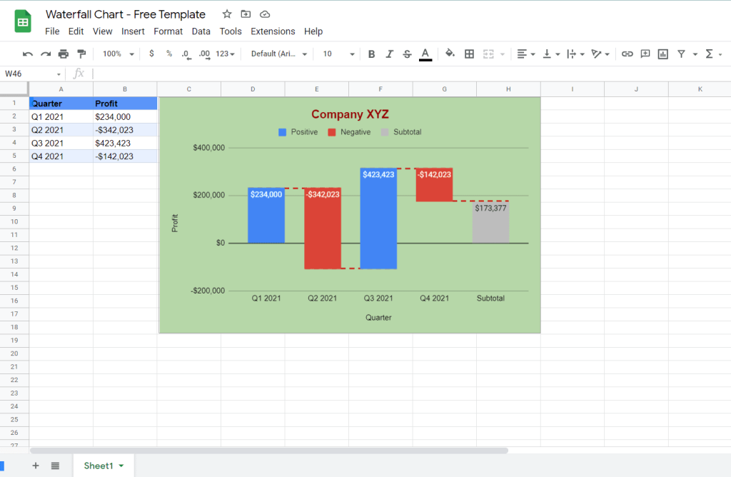
That’s it. Now, you know everything about creating a waterfall chart in Google Sheets. And if you’re looking for more customization options, as an alternative, check out this guide on creating a waterfall chart with stacked bars in Excel.