Excel Panel Chart Template – Free Download
A panel chart (also known as a small multiple, lattice chart, grid chart, or trellis chart) is a set of small graphs placed next to each other that use the same scales and axes for comparing similar categories across a data set.
The goal of a panel chart is to help you quickly compare multiple sets of closely related data without overwhelming you with its volume or taking up too much precious dashboard space.
As a general rule, the more data series you have mapped out on your plot, the messier it gets—but not in the case of lattice graphs.
Enough of the theory. Let’s move on to the practice. By the end of this tutorial, you will create this panel chart from the ground up—even if you are a complete Excel newbie:
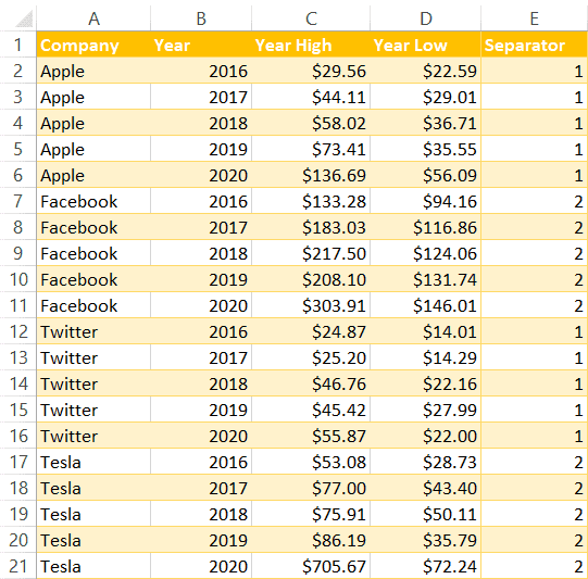
Sample Data
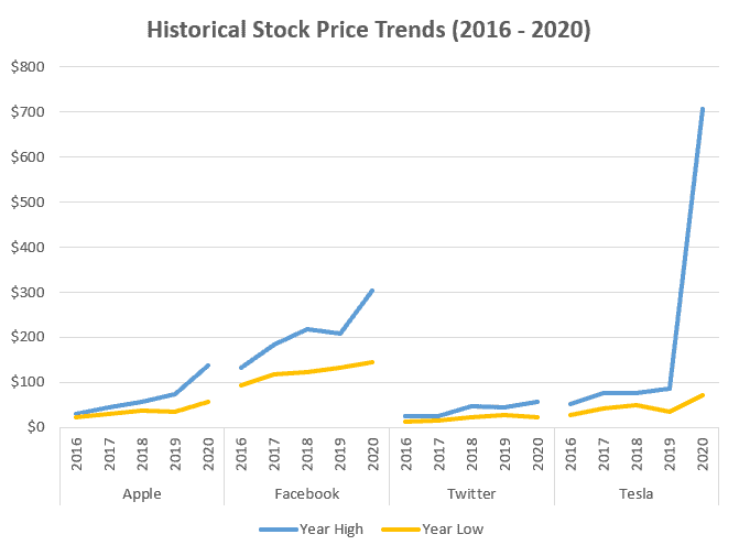
To walk you through the process, we need some data to work with. In order to build our panel chart, we’ll use some random data on historical stock price trends scraped from the Web:
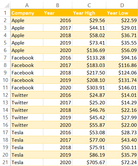
Before we dive in, here’s the breakdown of this table to help you know what we’re working with:
- Column A (Company): This column maps out the categories that will be compared with each other across all the sections of the future grid chart.
- Column B (Year): This column represents the y-axis of our panel chart; for your panel chart to make sense, you need to measure your data with the same yardstick.
- Columns C and D (Year High and Year Low): These columns determine the actual values; the beauty of the technique you’re about to learn is that you can use as many columns as you want.
Now that we’re on the same page, let’s get down to business.
Related Article: How to Make a Residual Plot in Excel
Step 1. Create the Separators
Our first step is to add a helper column with alternating separators to split the table into four separate sections (panels).
- Next to your data table, create Column E (Separator).
- For each of the categories in Column A, assign a custom value—either “1” or “2”—to each of the companies in the table in alternating order as shown in the screenshot below.
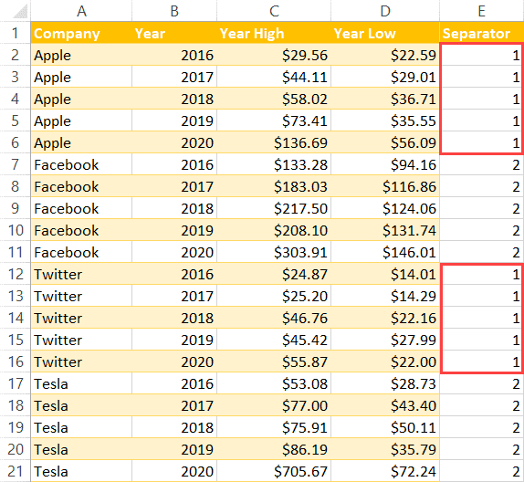
Once there, your data table should end up like this:
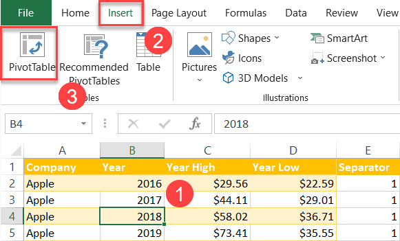
Step 2. Create a Pivot Table
Next stop: create a pivot table based on the expanded table.
- Select any cell in the data table (A1:E21).
- Navigate to the Insert tab.
- Choose “PivotTable.”
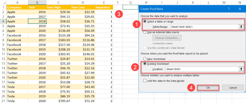
In the dialog box that pops up, set up your pivot table by following these instructions:
- For the “Table/Range” field, highlight the entire data table (A1:E21).
- For where to place the table, select “Existing Worksheet.”
- Pick any empty cell in your worksheet.
- Click “OK.”
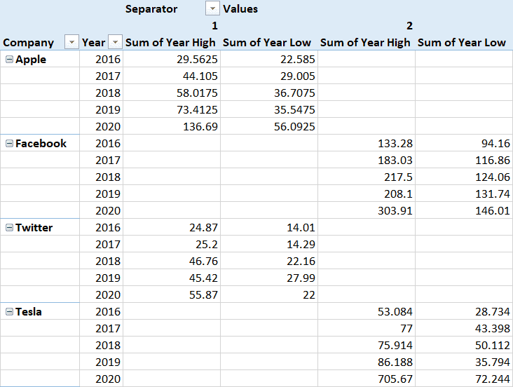
The moment you close the dialog box, the PivotTable Fields task pane will appear. In the task pane, you’ll need to rearrange the layout in the following way to lay the groundwork for your small multiples:
Shift the columns around in the exact same order as shown below (it’s important):
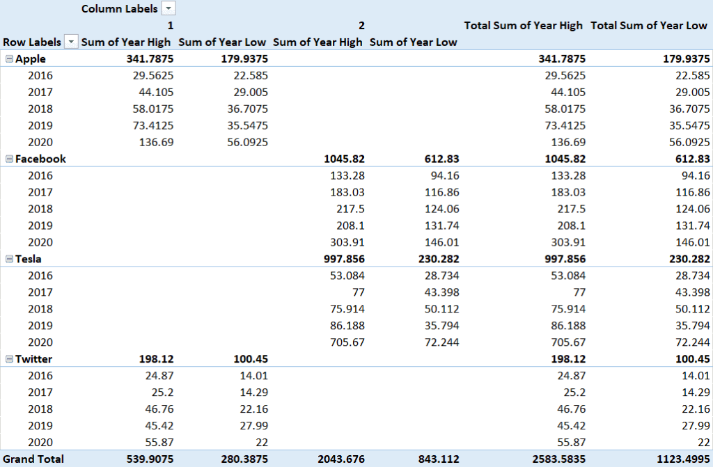
- Drag “Company”and“Year” to “Rows” (with “Company” on top).
- Drag “Year High”and“Year Low” to “Values.”
- Drag “Separator” to “Columns” and place it above “Values.”
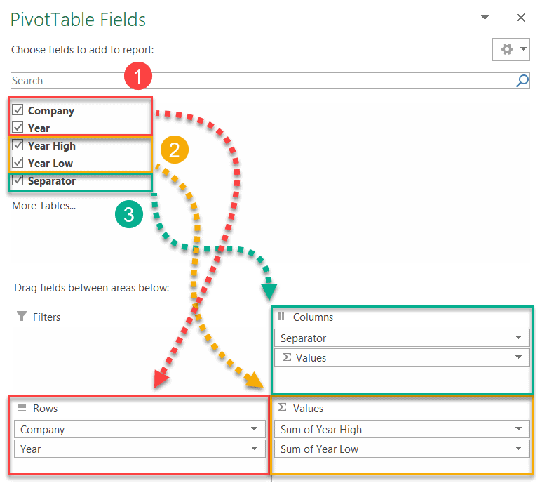
Doing all of that will result in this pivot table:
Step 3. Format the Pivot Table
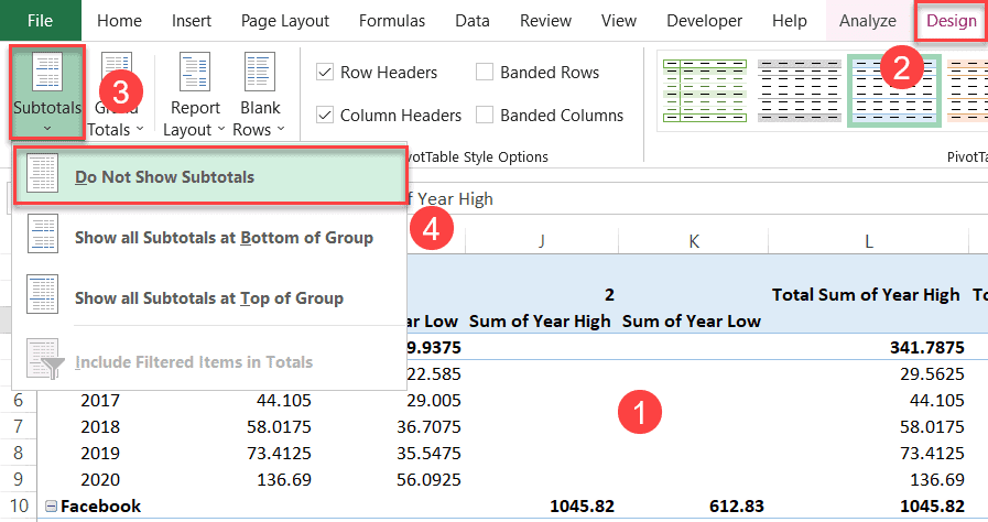
Now that you have put together the pivot table, let’s get rid of the elements we don’t need. Start by removing the subtotals:
- Select the pivot table.
- Go to the Design tab.
- Open the “Subtotals” dropdown menu.
- Click “Do Not Show Subtotals.”
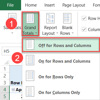
Next, remove the grand totals:
- In the same tab, select “Grand Totals.”
- Choose “Off for Rows and Columns.”
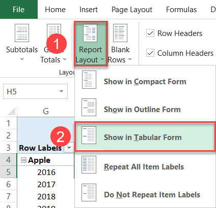
Finally, convert the pivot table into tabular form:
- Again, in the same tab, select “Report Layout.”
- Click “Show in Tabular Form.”
By the end of this stage, your pivot table should look like this:
Step 4. Rearrange the Pivot Table (Optional)
Provided you have followed all of the steps outlined above, Excel should automatically position the categories in alternating order using the separators. But that doesn’t always happen.
If you ever get stuck at this stage, here’s a quick-and-dirty way to fix the issue:
- Right-click on the name of the category you want to move up or down (such as “Tesla”).
- Choose “Move.”
- In the menu that appears, select “Move ‘Tesla’ Down.”
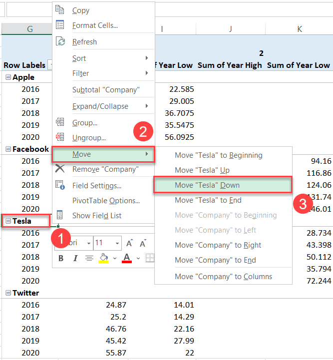
Armed with this simple technique, you can quickly and easily rearrange the pivot table so that the categories are arranged in alternating order.
Step 5. Prepare the Chart Data
At this point, you need to separate the data from the pivot table to be able to use it for building your grid chart.
To start with, drop the sorted data in the pivot table into empty cells somewhere near it (Copy > Paste Special > Values).
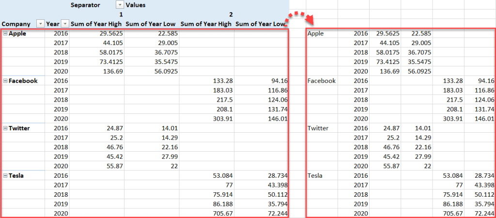
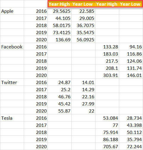
After that, copy the column labels characterizing the actual values (“Year High” and “Year Low”); since the dividers split the data into two separate data sets, you need to duplicate the labels as well.
NOTE: The values in the header row will be used for generating the legend of your panel chart.
Step 6. Create a Panel Chart
At last, after all that preparation, you can now get down to building your panel chart:
- Highlight the freshly created table (N3:S23).
- Go to the Insert tab.
- Click “Insert Line or Area Chart.”
- Choose “Line.”
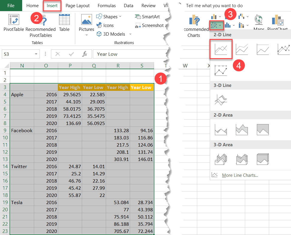
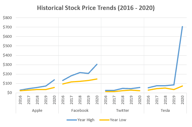
And there you have your lovely panel chart:
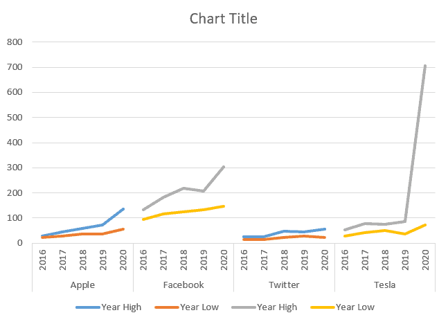
Step 7. Adapt the Color Scheme
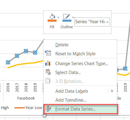
Basically, the trellis graph is a set of two simple Excel line graphs. For that reason, before we can call it a day, we need to add a bit more consistency to the color scheme to make the graph readable.
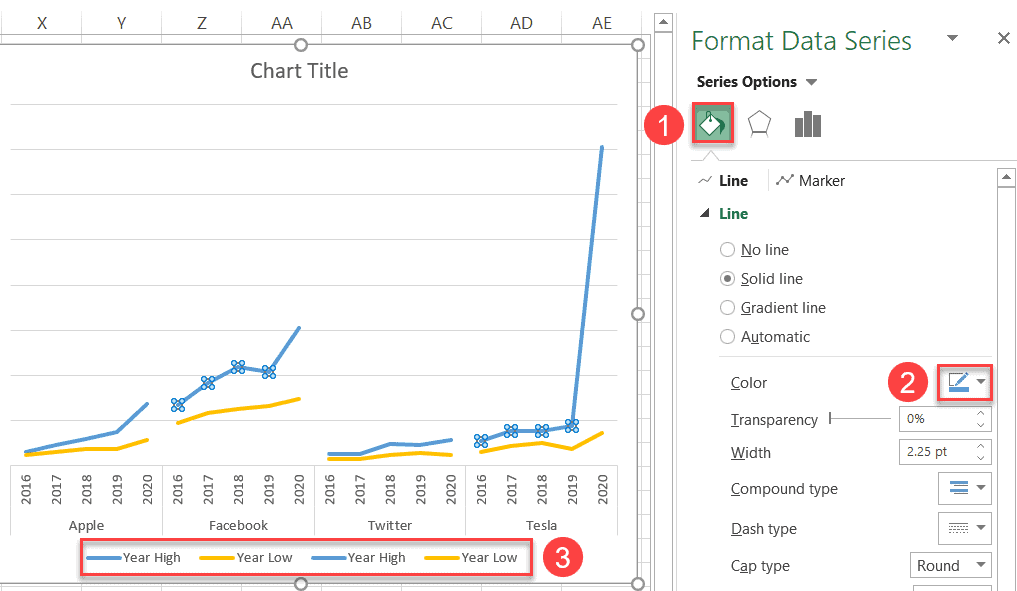
To recolor your data series, right-click on any of the lines charted on the plot area and click “Format Data Series.”
In the Format Data Series task pane that appears, do the following:
- Switch over to the Fill & Line tab.
- Open the palette and pick the color you want.
- Use the chart legend to double-check the color consistency.
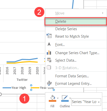
Step 8. Clean Up the Chart Legend
Finally, remove the redundant legend labels. Select the legend label you want to remove, right-click on it, and choose “Delete.”
Spruce up the graph with a custom chart title, and your panel chart is ready to go:
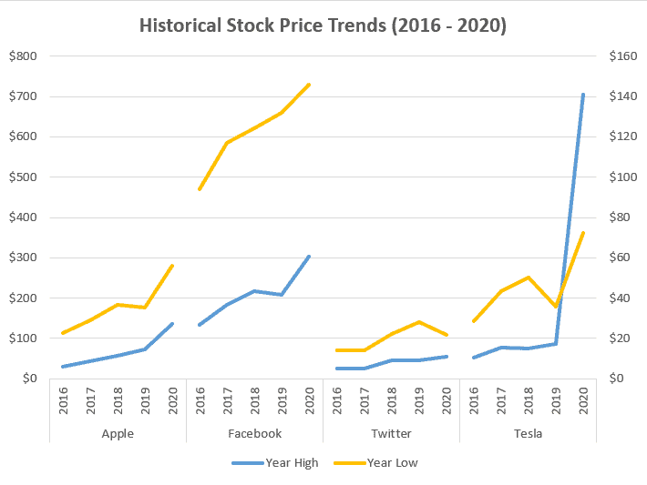
(Bonus) Step 9. How to Create an Excel Panel Chart with Different Scales
If you’re wondering how to create a panel chart with different scales, you’ve come to the right place.
For those who jumped straight to this section, first you need to build your panel chart using the step-by-step process outlined above—and before you close this article in a blind panic, know that this should only take a few minutes.
Once we’re on the same page, to plot your panel chart on two separate scales, right-click on the chart plot and choose “Change Series Chart Type” from the menu that appears.
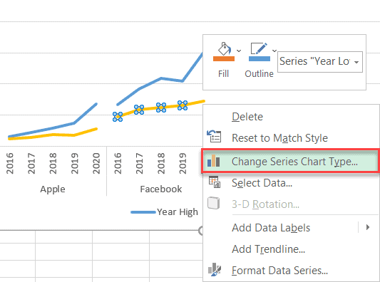
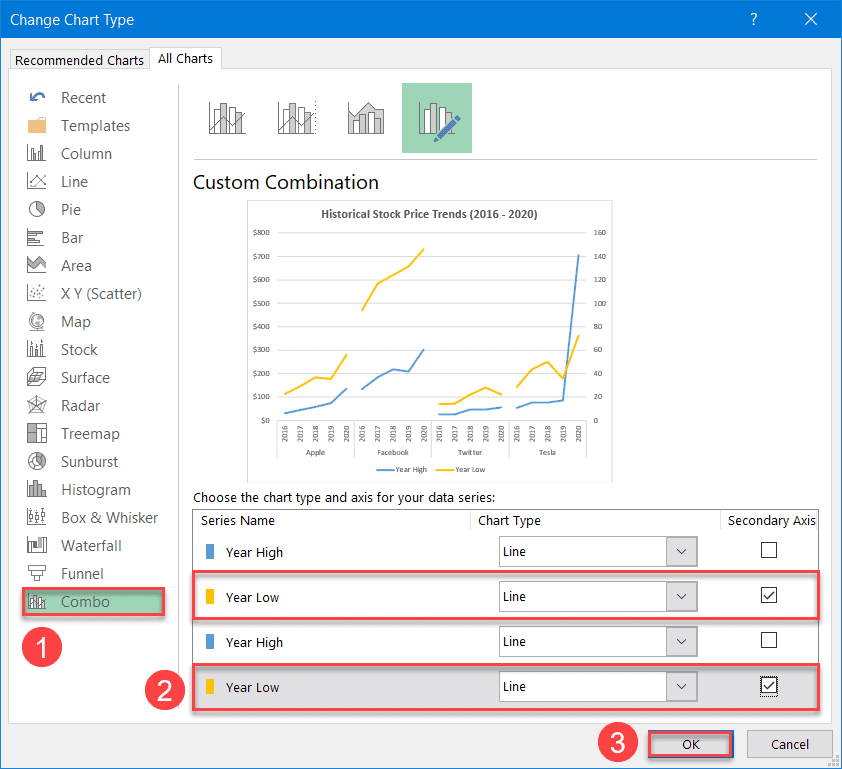
In the dialog box that pops up, chart some of the data series on the secondary axis:
- Switch to the “Combo” tab.
- Check the “Secondary Axis” box next to a set of identically named data series—in our case, Series “Year Low.”
- Click “OK.”
Finally, you have a clean, neat-looking panel chart with different scales ready to blow everyone away!