
Analyzing large amounts of data, at times, can become an ordeal, especially for newbies.
And that’s where a line graph comes into play to save the day, helping visualize a sea of data to empower decision-making.
Stick around to learn how to make a line graph in Excel in just a few clicks.
Prepare & Format Your Data
In order to create a line graph in Excel, you need at least one column of data. However, a good rule of thumb is to use two or more columns of similar data to compare them between each other.
To show you the process from A to Z, we’re going to use a simple two-column data table as a running example:
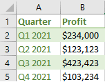
Here’s a quick overview of the columns to help you follow our footsteps:
- Column A (Quarter): This column contains the categories that define your data set. The values will be charted on the x-axis.
- Column B (Profit): The second column typically contains your actual values that are going to be mapped on the y-axis.
After a quick setup, you can get down to creating a line graph.
How to Make a Line Graph in Excel in 4 Easy Steps
The entire process of making a line chart in Excel is pretty straightforward and entails only four laughably simple steps:
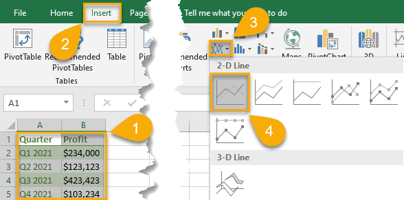
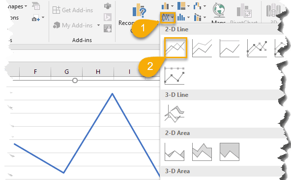
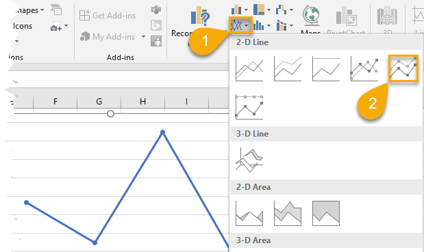
1. Select the data you want to visualize (A1:B5).
2. Next, navigate to the Insert tab.
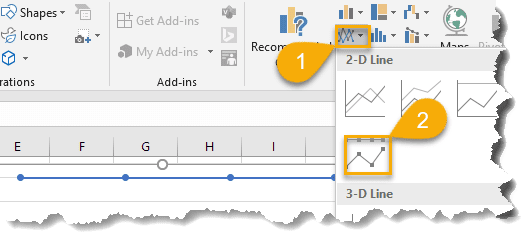
3. Navigate to the “Insert Line or Area chart” menu.
4. In the Charts group, under “2-D Line,” click the line chart icon.
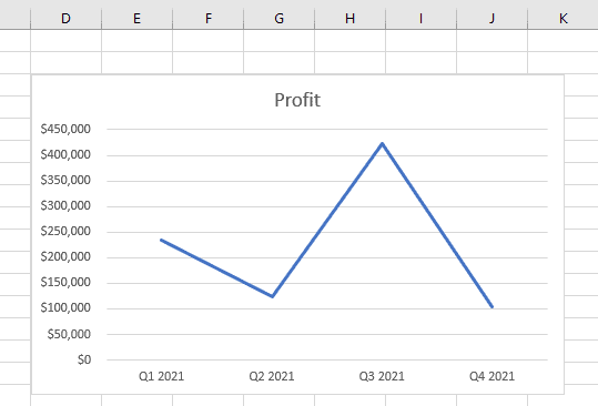
As a result, you get your data point visualized with the help of a simple line graph in just four clicks.
How to Customize Your Excel Line Graph
Your line graph is ready. But what if you go the extra mile and spruce it up a bit to improve its look and feel?
With some built-in Excel customization tools, you can give it a more attractive look.
How to Change the Chart Title to Your Line Graph in Excel
Any great graph starts with a catchy and descriptive chart title. Here are some easy-peasy steps to help gain full control over this chart element.
1. Сlick on your line graph.
2. Open the Design tab.
3. Choose “Add Chart Element.”
4. Click “Chart Title.”
5. Pick either “Above Chart” or “Centered Overlay” to set the position of the chart title.
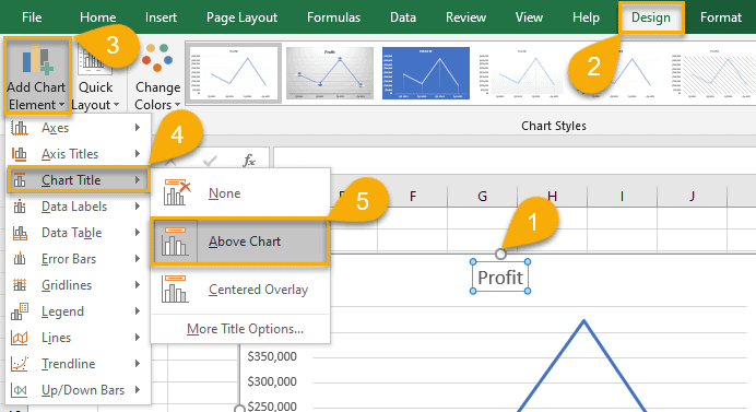
6. Enter your title.
7. Select the Home tab.
8. Change the color, size, font, and formatting of your chart title however you like.
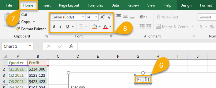
After such simple steps, your title will look neat and presentable.
How to Add a Legend to Your Line Graph in Excel
A legend helps make your line graph more descriptive, so it’s a good idea to set it up using these simple steps:
1. Click on the chart plot.
2. Select “Design.”
3. Choose “Add Chart Element.”
4. Click “Legend.”
5. Сhoose “Right,” “Top,” “Left,” or “Bottom” to position your chart legend based on your needs.
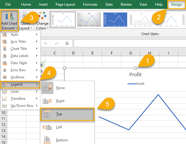
IIt’s a piece of cake, isn’t it? Check out our advances guide covering how to add a chart legend in Excel to spruce it up even more!
How to Add Data Labels to Your Line Graph in Excel
Data labels provide more context by displaying your actual values on the chart plot. Here are the steps you need to take to add data labels to your line graph in Excel:
1. Click once on your line graph.
2. Pull up the Design tab.
3. Hit the “Add Chart Element” button.
4. Open the “Data Labels” menu.
5. Сhoose “Center,” “Left,” “Right,” “Above,” “Below,” or “Data Callout” to specify the position of the data labels relative to the data points charted on the plot.
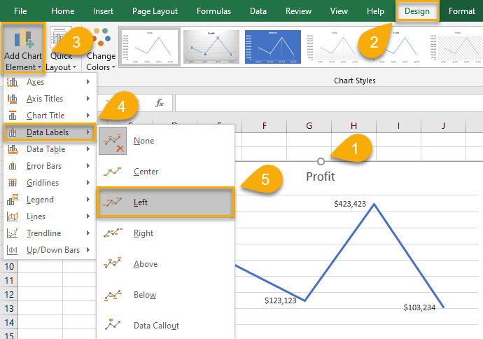
Once you have followed these instructions, your line graph is more informative and aesthetically pleasing.
How to Add Axis Labels to Your Line Graph in Excel
Axis titles are a great way to clearly convey what your line graph is all about without causing any confusion.
And how do you add axis titles to the vertical axis or horizontal axis without hardship? Let’s see!
1. Click on your line graph.
2. Select “Design.”
3. Pick out “Add Chart Element.”
4. Click “Axis Titles.”
5. Choose “Primary Horizontal” to create an axis title for the x-axis or “Primary Vertical” to add an axis title to the y-axis.
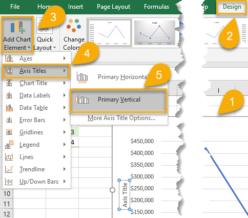
Pro tip: use this process to add, customize, or remove grid lines and modify other chart elements.
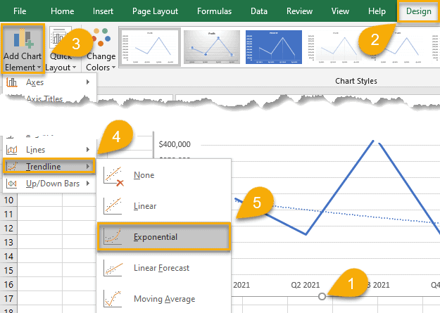
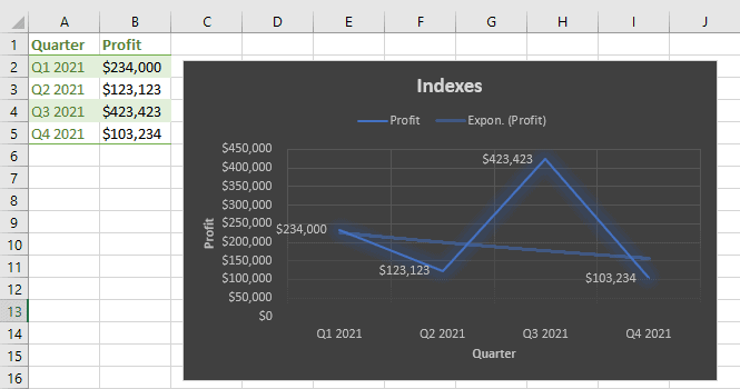
How to Add a Trendline to Your Line Graph in Excel
Using a trendline helps identify patterns and trends in your data set. And with Excel, you can easily add it to your line chart for more data insights.
1. Click on the chart plot.
2. Select the “Design” tab.
3. Choose “Add Chart Element.”
4. Click “Trendline.”
5. Choose “Linear,” “Exponential,” “Linear Forecast,” or “Moving Average” to build a specific trendline based on your unique charting needs.
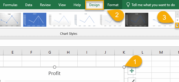
How to Apply a Different Chart Style to Your Line Graph in Excel
The aesthetic appearance of a line graph is no less important than the actual data. To take your line graphs to the next level, Excel offers a wide range of chart styles to accommodate your needs.
1. Click on the plot of your line graph.
2. Select “Design.”
3. Click the small arrow in the lower-right corner of the Chart Styles group to pull up all built-in chart templates.
4. Select the chart style that you like the most.
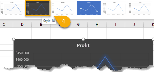
That’s it! Your enhanced line graph is good to go.
Excel Line Graph – Free Template
If you’re short on time, grab this free Excel line graph template and replace the placeholder values with your data. Click the link below to download the file:
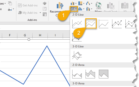
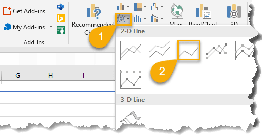
The Breakdown of The Types of Line Graphs in Excel
Apart from a basic line graph, Excel offers you multiple subtypes of line graphs to up your data visualization game.
Line Graph is used to depict trends over time and will help you highlight important values.
Stacked Line Graph – as the previous type of charts – depicts values by mapping them out on the chart plot and connecting them with multiple lines. The difference lies in the fact that the values stack on top of each other and do not intersect.
100% Stacked Line Graph depicts the relative changes in your actual values over a given period of time.
Line Graph with Markers uses data markers to single out the values charted on the plot.
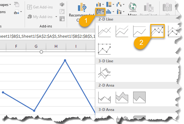
Stacked Line Graph with Markers, by the same token, uses data markers to highlight data points.
100% Stacked Line Graph with Markers, again, enhances the chart plot with dots that highlight the actual values.
FAQs
What is a Line Graph in Excel?
A line graph is a graphical representation of data that changes over time. Line graphs can be used to show how something changes over time or to compare items.
The line chart is a versatile and powerful tool for analyzing data. It can show one or multiple data series to illustrate trends that may be compared in order to make informed business decisions. Each line on a line graph represents a different data series.
Some people even use line charts for project management! Still, it’s an inferior option to Gantt charts, timeline charts, or Excel Kanban boards.
What Is the Difference Between a Line Graph and a Linear Graph?
A line graph is a graphical representation of data that plots points connected by straight lines, also called a line chart. The purpose of a line graph is to track trends over time.
On the other hand, a linear graph and its variations, such as a linear calibration curve, are used to analyze the linear relationship between two variables in mathematics and science. In particular, it can be used to find out how one variable changes when another variable is changed in a fixed manner.
What Are the Advantages of Using Line Graphs in Excel?
There are a few key advantages to using line graphs in Excel:
- They allow you to track changes in data over time. This is especially useful for illustrating trends or patterns.
- They can be used to compare different data sets. For example, you can use a line graph to visualize how two different companies are performing relative to each other.
- They are easy to create and customize. You can change the colors, lines, and labels to make your graph look exactly the way you want it to.
What Are the Limitations of Excel Line Graphs?
One potential limitation of using line graphs in Excel is that they can become very cluttered and difficult to read when you have a lot of data points. It may also be difficult to identify individual values on the graph if there are too many lines or data markers. In these cases, it may be better to use a different type of chart instead, including panel charts and clustered column charts.
Another limitation is that line graphs do not work well for non-linear data. For example, if you want to compare changes in sales over time but those changes are not consistent across all dates, a line graph will only show you the overall trend and hide important details about how your sales might change at certain times throughout the year or between different regions.
As you can see, there are many different types of line graphs that you can use in Excel, depending on your data and what you want to communicate with your graph.
Line graphs are a versatile tool that can be used in a variety of situations, so make sure to experiment with different types to find the perfect one for your data set.
