Skill Level: Beginner
Want to create a run chart in Excel?
Run charts are one of the simplest ways to identify trends and patterns in data without any specialized knowledge of statistics.
In this article, we will show you how to make a run chart in Excel and give away two free templates you can use with your data.
Let’s dive right in!
Run Charts: Overview
A run chart (also known as a trend chart or time series plot) is a modification of a regular line graph that displays data over time using the median to divide the values into two halves (check out our in-depth tutorial covering how to make a line graph in Excel).
This chart type is commonly used in quality improvement (QI) in healthcare to evaluate the impact of new implementations, identify problems, and generate new ideas to power decision-making.
Key Parts
The three building blocks that make up any run chart are as follows:
- The horizontal (category) axis is used to plot regular time intervals to organize the actual values in chronological order.
- The vertical (value) axis maps out the actual data tied to the process you are trying to analyze.
- The centerline is a horizontal line that represents the median (the middle of your data set—the 50th percentile—that splits it into two equally sized halves). In a run chart, the data points in the upper half are placed above the centerline while those in the lower half fall below the median.
Pros
- Easy to build
- Easy to read—even without any background in statistics
- Can be used from the start of a project
Cons
- Fails to account for any complex variations
- Can be misinterpreted without subject matter expertise
- Lacks statistical control limits to illustrate whether or not the process analyzed is predictably in control
How to Create a Run Chart in Excel
Run charts didn’t make it into Excel’s massive bag of built-in data visualization tools, but the silver lining is that they are ridiculously easy to make. All you need to do is follow a few simple instructions outlined below.
Step 1. Calculate the Median
A run chart can’t exist without the centerline reflecting the median of our data set. For that reason, our first step is to create one.
To start with, create a separate column next to your data table where the median values will be stored (column C).
Then, enter the following MEDIAN function into cell C2. It is designed to do all the dirty work for you. Double-click the fill handle to copy the computed values down into the rest of the column.
=MEDIAN($B$2:$B$14)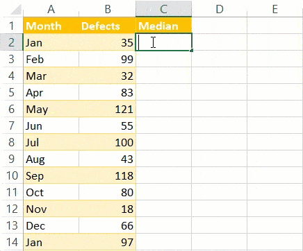
Step 2. Build a Line Chart
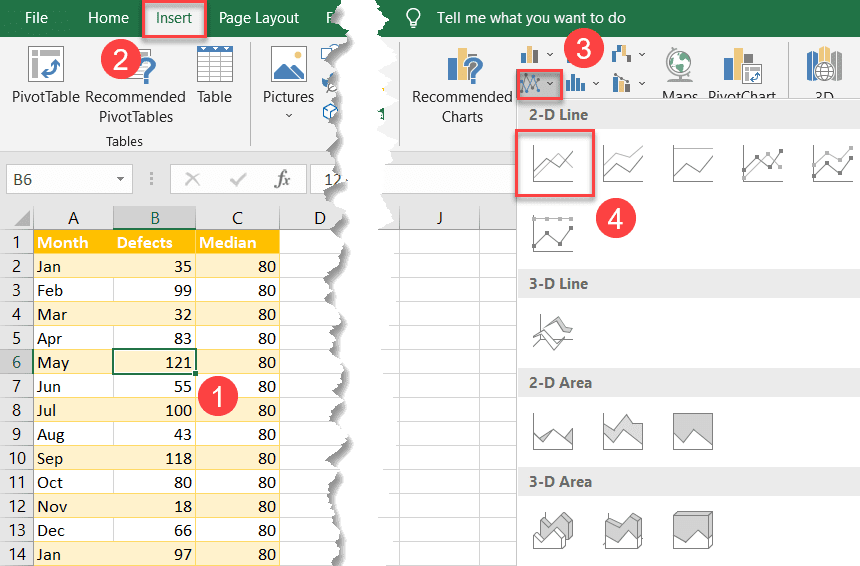
Now that you have recorded the median values, you have all the data you need to build out your run chart.
- Highlight any cell in the expanded data table (A1:C14).
- Go to the Insert tab.
- Click “Insert Line or Area Chart.”
- Choose “Line.”
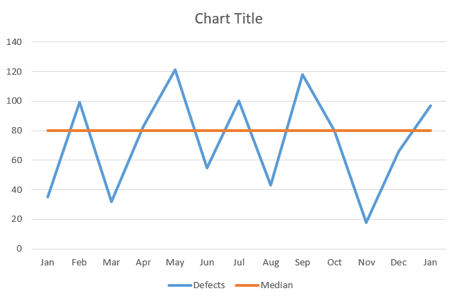
You now have your simple run chart as a result:
Step 3. Spruce Up Your Run Chart
Technically, you’re good to go, but if you’re looking to improve your chart from boring to beautiful in mere moments, here’s how you can quickly spruce it up.
Customize Your Data Markers
Right off the bat, right-click on the blue line representing your actual values (Series “Defects”) and choose “Format Data Series.”
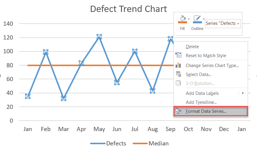
Once there, modify your data markers to make your trend chart so much more visually appealing.
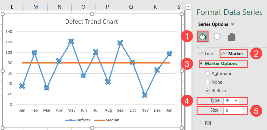
- In the Format Data Series task pane, switch to the Fill & Line tab.
- Click “Marker.”
- Select “Marker Options.”
- In the “Type” dropdown menu, customize your marker type.
- Set the “Size” value to “8.”
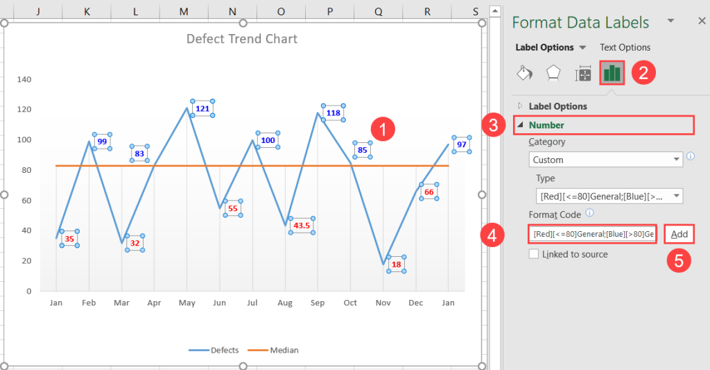
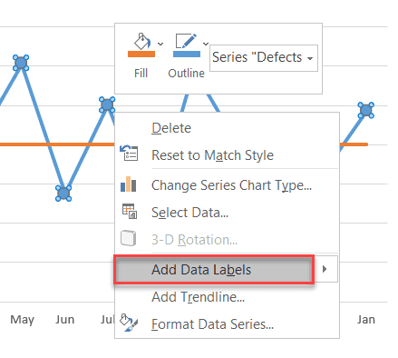
Add Custom Data Labels
You can make your time series plot more informative by adding data labels reflecting the actual values.
To do that, right-click on Series “Defects” and select “Add Data Labels” from the menu that pops up.
Once you have created your labels, fine-tune the details by doing the following:
- In the Font group on the Home tab, hit the “Fill Color” button and pick blue from the color palette.
- Change the font color to white (Home > Font Color > White).
- Make the data labels bold (Home > Bold).
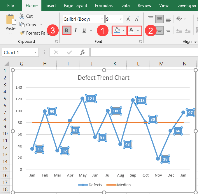
And that’s how you can bring life to dull Excel charts with the help of just a few simple tweaks.
Read more: How to Create a Gantt Chart in Excel
2 Excel Run Chart Templates
Let’s face it. Chances are that you have too much stuff on your plate to build a run chart from the ground up. Luckily, we’ve got you covered!
If you’re short on time, we’ve prepared two Excel run chart templates where everything has already been set up for you.
Just grab your copy, swap out the data, and you’re all set.
1. Defect Trend Run Chart Template
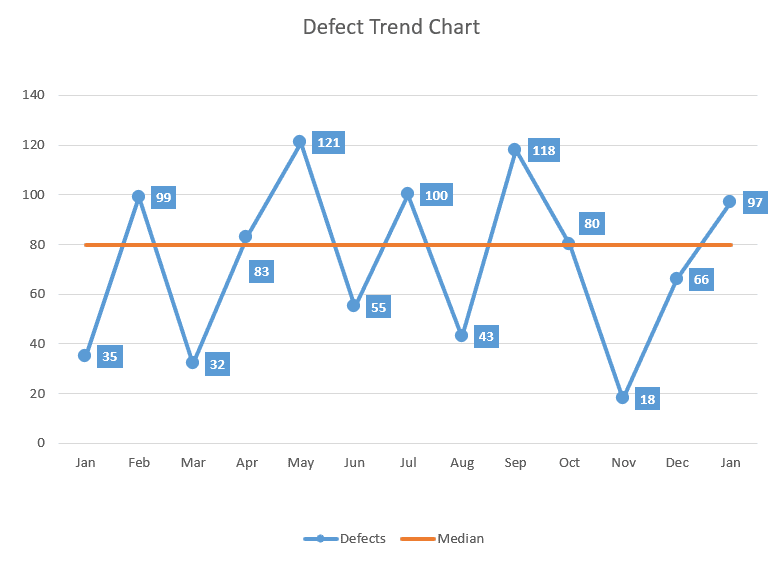
TThis is what we used in the article above as a running example to show you the step-by-step process of building a trend chart.
Download this Excel defect trend run chart template.
2. Run Chart with Dynamic Data Labels
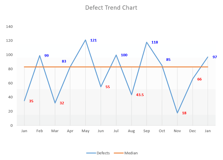
This template colors the actual values in red or blue based on whether they fall above or below the median.
Download this Excel run chart template with dynamic data labels.
Note: Since your median is going to be different, you need to adapt the custom number formatting accordingly (Format Data Labels > Label Options > Number > Format Code > In the “Format Code” field, replace “80” with your median value as shown below).