Video Tutorial
Excel Win-loss Sparkline Chart Template – Free Download
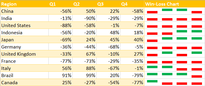
A win-loss sparkline chart is a series of tiny graphs inside worksheet cells that demonstrate a trend or pattern in your data. The sparklines show positive and negative changes over a given period of time.
The goal of the chart is to provide a quick overview of your data set as well as to help you gain more valuable insights for data-driven decisions. And the beauty of it is that it takes only a few laughingly simple steps to create this types of in-cell charts in Excel.
In this quick-and-dirty guide, you will learn how to create a win-loss sparkline chart in Excel in just a few minutes.
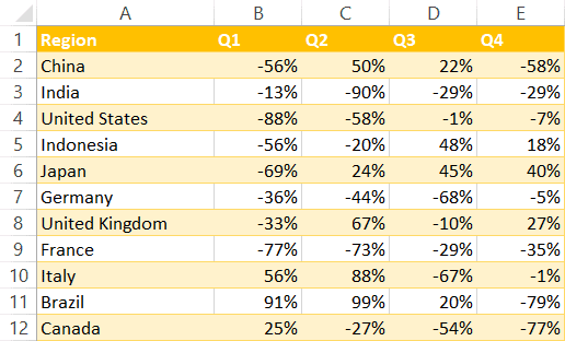
Sample Data
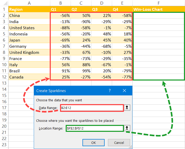
To show you the ropes, we need some sample data to work with. Here’s a simple data set (A1:E12) illustrating the revenue growth rates of a fictitious company across multiple countries:
Armed with this data, let’s build a simple win-loss chart.
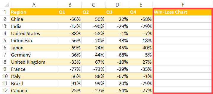
1. Create a Helper Column
To make sure your win-loss graph is easy to analyze, set up a helper column (column F) adjacent to the data set where the chart will be stored.
2. Create the Sparklines
Once your helper column is set up, use the sparklines feature to build the graph by doing the following:
- Go to the “Insert” tab.
- Select “Win/Loss Sparkline.”
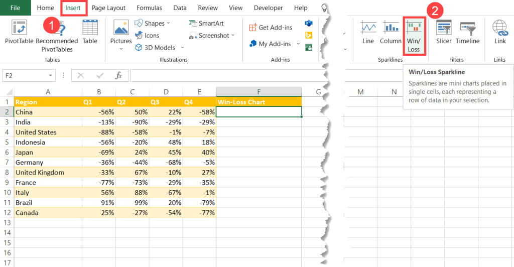
In the dialog box that pops up, add the data to the equation:
- For the “Data Range” field, highlight the actual values (B2:E12).
- For the “Location Range” field, select the cell range where you want the chart to be displayed (F2:F12).
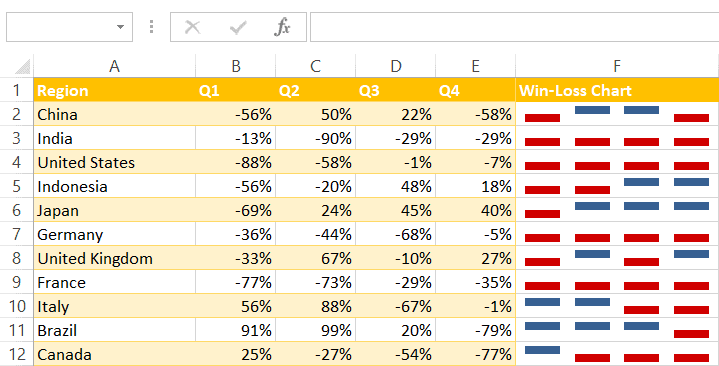
When you do that, the blank cells in column F will be filled with the sparklines illustrating the positive or negative change in revenue for each row.
3. Spruce up Your Win-Loss Chart
Conventionally, we use green for positive and red for negative. So, to make your graph easier to skim through, change its color scheme by following these simple steps:
- Select your win-loss chart.
- Navigate to the “Design” tab.
- Choose the chart style that best fits your needs.
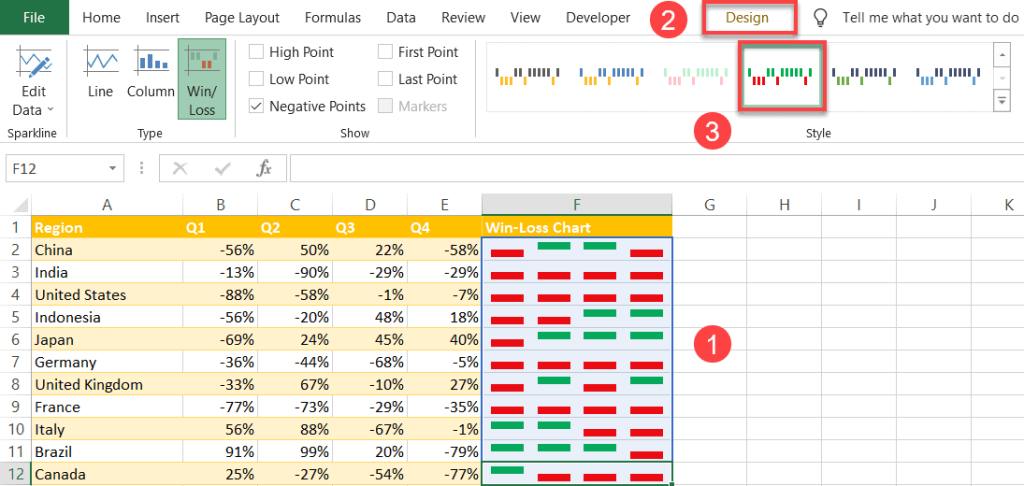
Finally, your Excel win-loss chart is ready to go. Now you know how to efficiently review your data with just a few quick clicks!