Excel In-cell Pie Chart Template – Free Download
In-cell Excel pie charts are a series of mini circle graphs built inside worksheet cells.
They are a great way to visualize your data without resorting to any default Excel charts, allowing you to analyze massive volumes of data quickly. This chart type is best suited to demonstrate progress toward a goal.
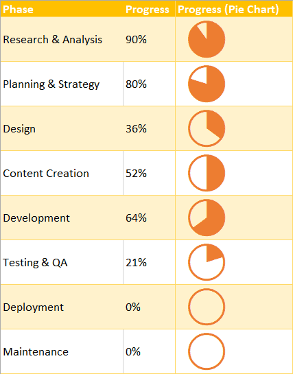
As an example, here’s how in-cell pie charts provide a bit more context around the actual data in column B:
And today, you will learn how to do the same thing.
Sample Data
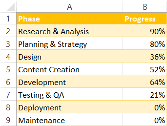
To walk you through the process step-by-step, we’re going to build out our mini charts based on this table demonstrating the progress of developing a fictitious web application:
The structure of the table is pretty straightforward, so let’s jump straight into action.
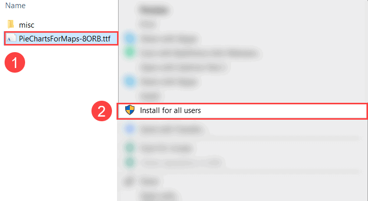
Step 1. Download and Install a Custom Pie Chart Font
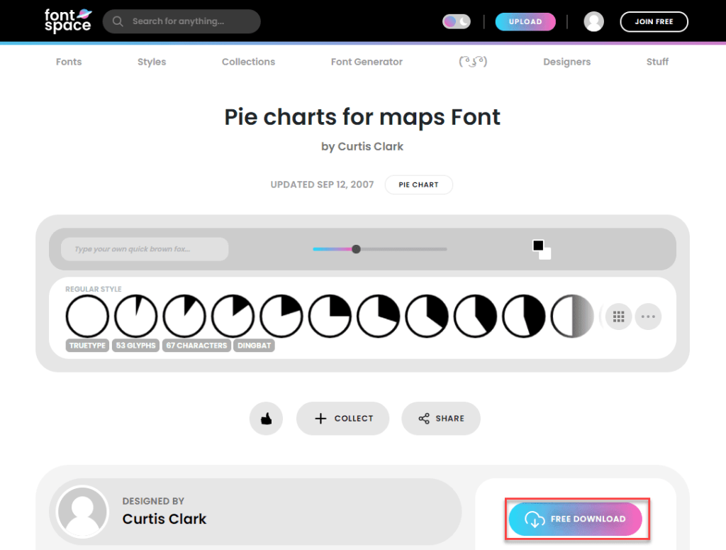
To make it possible to build those small in-cell charts right in your worksheet cells, you need to install a custom font developed by Curtis Clark that allows converting percentage values into respective in-cell pie charts.
Head over to FontSpace and hit the “Download” button as shown on the screenshot below.
Once there, extract the files from the ZIP archive, and install the font by following these simple instructions:
- Right-click on the file named “PieChartsForMaps-8ORB.tff” to open a contextual menu.
- Choose “Install for all users.”
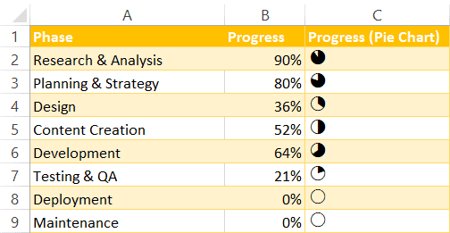
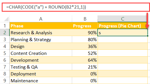
Step 2. Map out the Chart Data
Once the font has been installed, go back to your Excel worksheet, and create a separate column right next to your actual data table – column Progress (Pie Chart) – where your mini charts will be stored.
Then, enter the following formula into C2:
=CHAR(CODE("a") + ROUND(B2*21,1))The formula picks the actual percentage values from column Progress (column B) and converts them into corresponding custom values that can be accurately matched with one of the pre-drawn in-cell circle charts.
Don’t forget to apply the formula to the rest of the column (C3:C9) by dragging down the fill handle.
Related Article: How to Make a Pie Chart in Excel with One Column of Data
Step 3. Turn the Custom Values into In-cell Pie Charts
Finally, your last step is to convert the custom text values into the actual circle charts.
- Highlight all of the values in column C (C2:C9).
- In the Font group, select the “Font” dropdown menu, type “Pie charts for maps,” and press the Enter key.
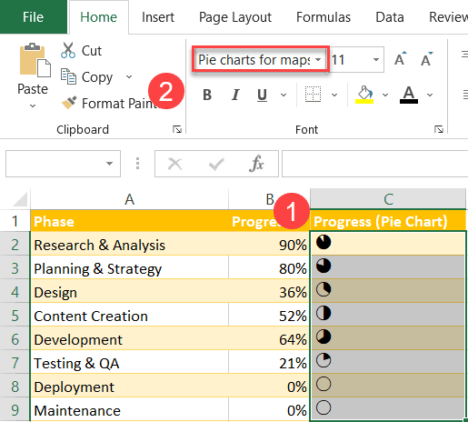
And that’s how you do it! Additionally, since Excel treats these mini charts as regular text values, tweak the font size and color to customize your graphs in bulk however you see fit.