Add a secondary vertical axis to a chart in Google Sheets using settings in the Customize tab of the Chart editor window. From the Customize tab, select Series and click Apply to all series to change it to the appropriate series. Go to the Axis section and choose Right axis. Your chart will update with the secondary axis.
If you have ever seen a chart with two y-axes and wondered how to set that up in Google Sheets, then you’re in the right place. This post will take you through the step-by-step process of customizing your chart with two y-axes.
How to Make a Chart with Two Y-axes in Google Sheets
Follow the steps below to make a chart with two y-axes in Google Sheets:
Step 1: Prepare Your Data
Before creating your chart, start by preparing your data. Any numeric dataset will work to create a chart with a secondary y-axis. However, to get more use out of the chart, be sure that the variables or dimensions to be plotted on both y-axes are measured in different scales.
The sample dataset we will use to demonstrate the process contains a record of the number of steps taken each day for a week and the corresponding number of calories burned.
If you look closely, you will find that the numbers in the Steps/day column are in the thousands while the numbers in the Calories burned column are in the hundreds.
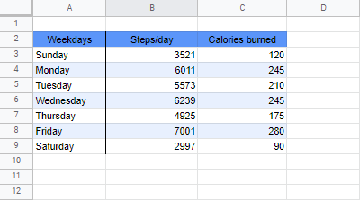
You can plot these values using a column chart with one axis. However, because the scale of measurement between both variables differs significantly (thousands versus hundreds), the values for the Calories burned will be so small that it will be almost impossible to take out any meaningful information.
This is where using two y-axes in Google Sheets can save the day!
Step 2: Insert a Chart
After inspecting and preparing your data, you will need to insert a chart.
To do this, follow these simple steps:
1. Click on the Insert menu.
2. Select Chart from the drop-down options.
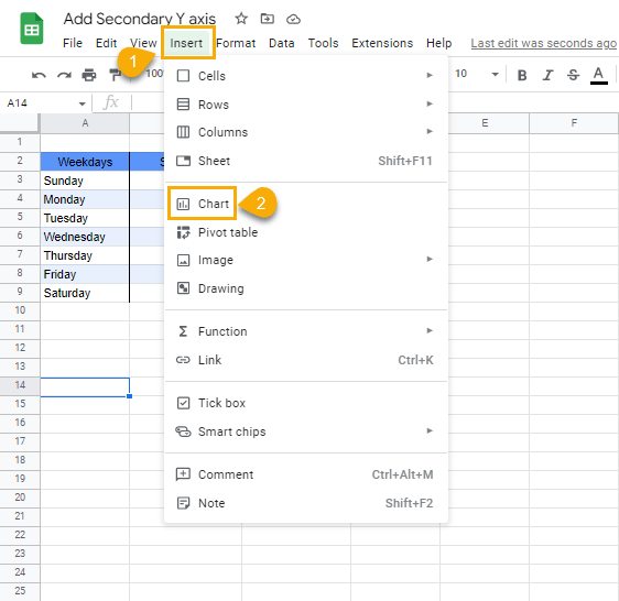
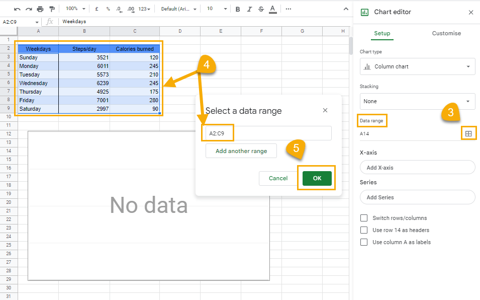
3. In the Chart editor, go to the Data range section. Click on the grid icon to open the Select a data range window.
4. When the Select a data range window opens, select the range containing the data you want to visualize (A2:C9). The range description should appear in the text box.
5 Click OK to lock in the selected ranges.
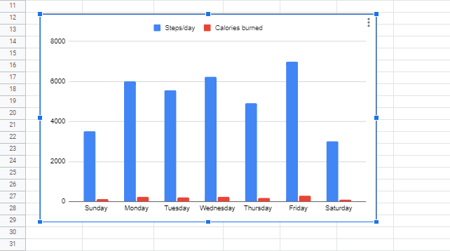
When you’re done, you should have a chart that looks like this in your spreadsheet:
Step 3: Add a Secondary Y-axis
Having now created a chart, you can see how small the Calories burned bars appear next to the Steps/day bars. Adding a secondary y-axis will help you properly visualize the Calories burned data.
To add the second y-axis, follow these steps:
1. In the Chart editor window, click on the Customize tab.
2. Select the Series option.
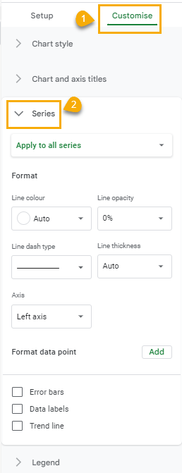
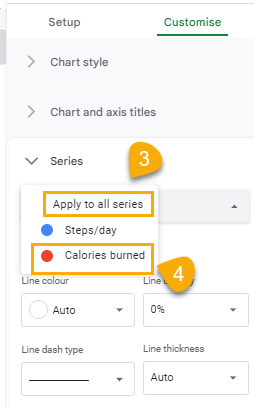
3. Click on Apply to all series.
4. Select Calories burned.
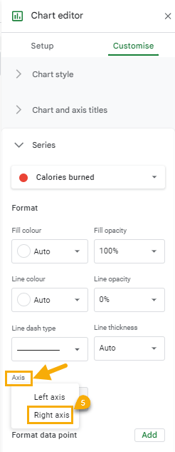
5. Go down to the Axis section. Click on the drop-down and select the Right axis option.
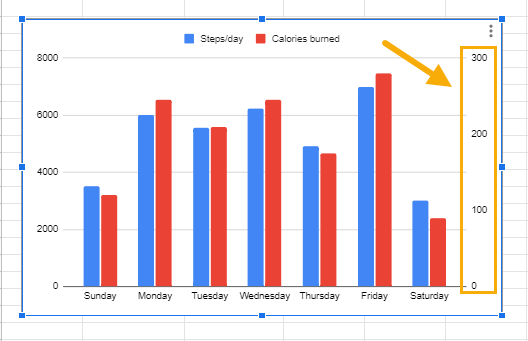
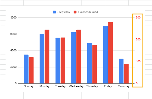
The second y-axis will now appear on the right side of the chart, ranging in scale from 0 to 300, thereby representing the measures of the Calories burned data. Adjust the axis scale to change how the data is displayed.
Step 4: Customize Label Text
Although the second y-axis is now on the chart, and the Calories burned data has become more visible, interpreting the chart has become a little difficult. This is because the bars visualizing the Calories burned data are higher or almost equal in size to the bars representing the Steps/day data.
This situation can create all sorts of confusion for anyone unaware of the second y-axis. But even after a user becomes aware of the second y-axis, it may not be immediately clear which variable each axis represents.
To make data plotted on a chart with two y-axes easily comprehensible, you can customize the label colors for each axis so each axis will match the color of the variables they measure.
Here’s how to do this:
In the Customize tab of the Chart editor window, click on the Right vertical axis section. From the drop-down menu, click on Text color. Select the red color from the options.
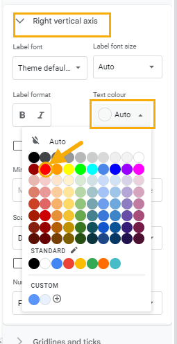
When you do this, the labels on the right y-axis will have the same color as the bars of the variable it measures (Calories burned).
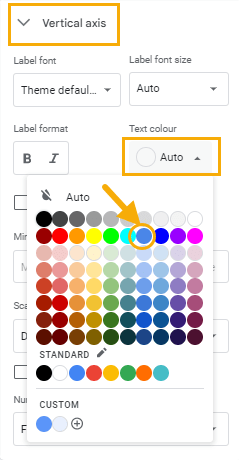
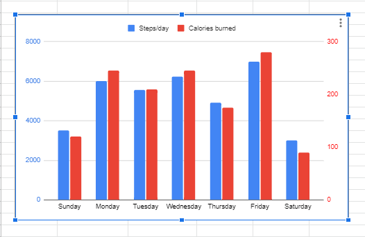
You can change the colors for the labels on the left axis as well. The process for changing the left axis labels is similar. However, this time you will be making the change from the Vertical axis section.
With the labels in the right colors, it’s now easier to make sense of the data on the chart.
Conclusion
As you see, knowing how to create two y-axes in Google Sheets is a straightforward process. Before making a 2-axis chart, always inspect the data to ensure it’s appropriate for the chart. After you create the chart, apply the appropriate custom setting so anybody using the chart can easily make sense of it.