
To make a multi-level nested pie chart in Google Sheets, you need to create two separate doughnut charts and stack them on top of each other by tweaking the donut hole size values since there’s no built-in alternative you can use in Google Sheets.
Keep reading to find out how to build a multi-level pie chart with subcategories in Google Sheets without using add-ons or complex workarounds.
Or grab a free copy of our multi-level nested pie chart Google Sheets template to simply swap out our sample data with your values.
Step #1: Prepare Your Data
Unlike a regular Google Sheets pie chart, a multi-level pie chart (also known as a sunburst chart or nested pie chart) is a set of concentric circles that allow to visualize symmetrical and asymmetrical tree structures (hierarchical relationships).
Since Google Sheets doesn’t offer this chart type by default, our workaround is stacking separate doughnut charts on top of each other using the built-in customization options.
The beauty of this method is that you can easily create a layered pie chart with two, three, four, five, or more levels relatively quickly. But to save you some time, we’re going to create a simple two-level pie chart.
To illustrate the process from A to Z, we need some sample data to work with.
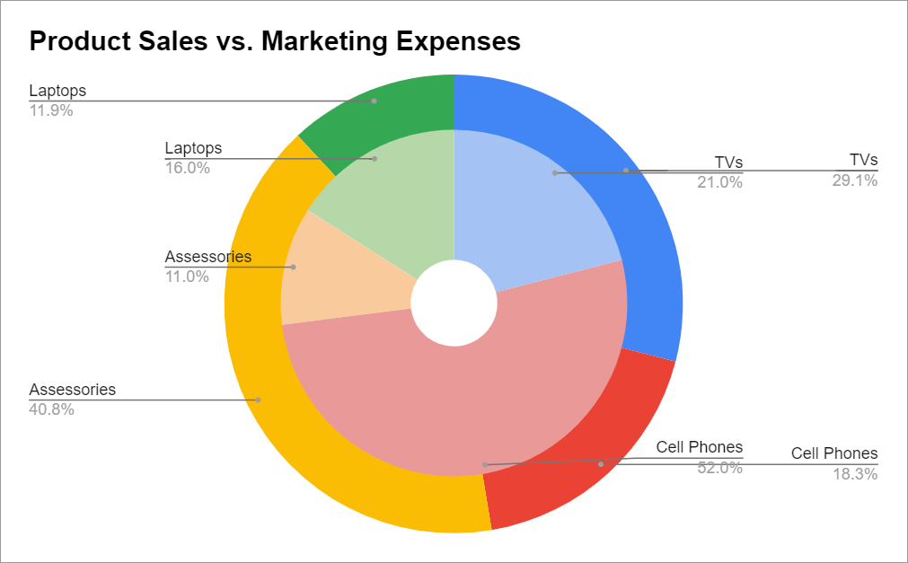
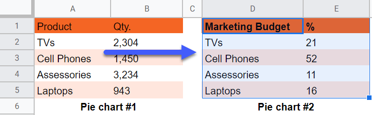
Suppose we have an online electronics store and want to compare the sales figures against the percentage of the marketing budget allocated to promote each product category.
By analyzing these two data sets, we can understand where we should deploy our marketing dollars to maximize the ROI of our campaigns.
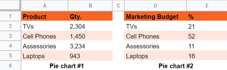
With all of that in mind, here’s our sample data:
In this case…
- Table 1 (A1:B5) – This table contains our sales figures that we’re going to visualize using the outer layer.
- Table 2 (D1:E5) – This data table shows how our marketing budget was allocated.
So, let’s get started!
Step #2: Create & Format the Outer Layer of Your Multi-Level Pie Chart
Our first step is creating a doughnut chart that will act as the outer layer of our Google Sheets nested pie chart.
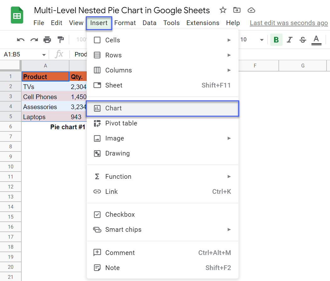
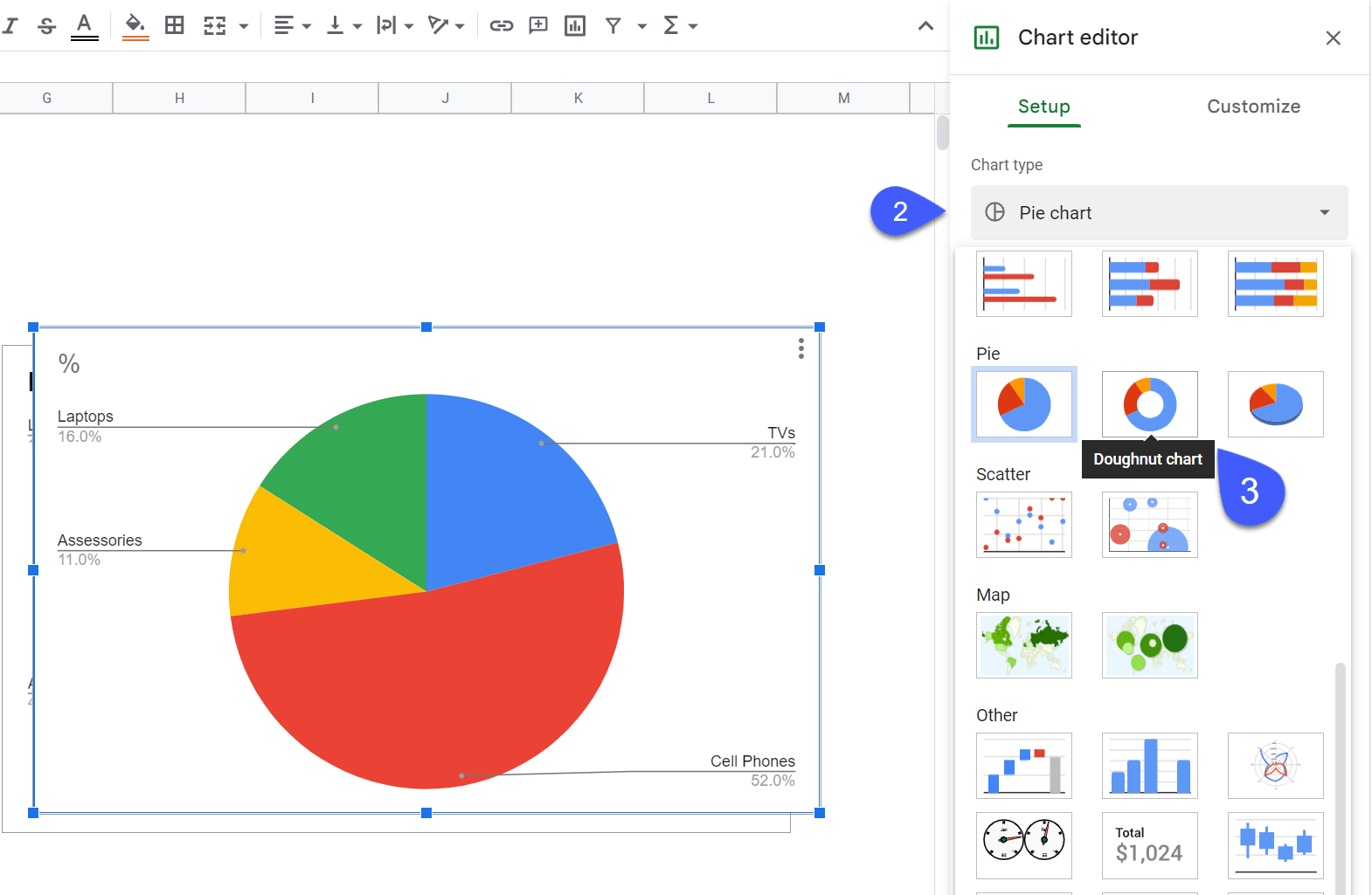
1. Start off by creating a regular doughnut chart. Highlight the first data table (A1:B5), navigate to the Insert tab, and select “Chart.”
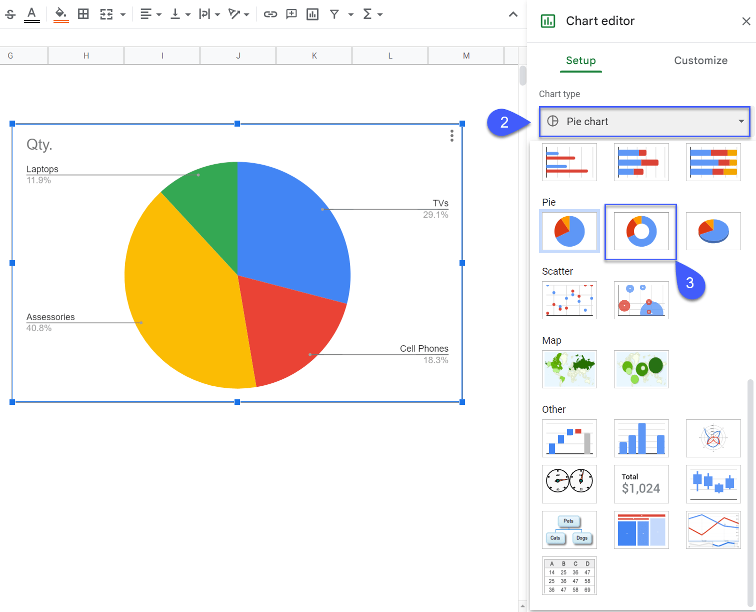
The Chart editor task pane will immediately pop up after we create our chart. But a pie chart is not exactly what we’re looking for, so we need to manually modify the chart type.
2. In the Setup tab of the Chart editor, open the “Chart type” drop-down menu.
3. Scroll down the menu and under “Pie,” select “Doughnut chart.”
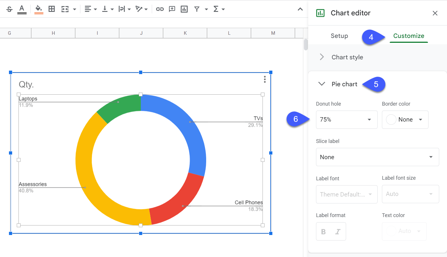
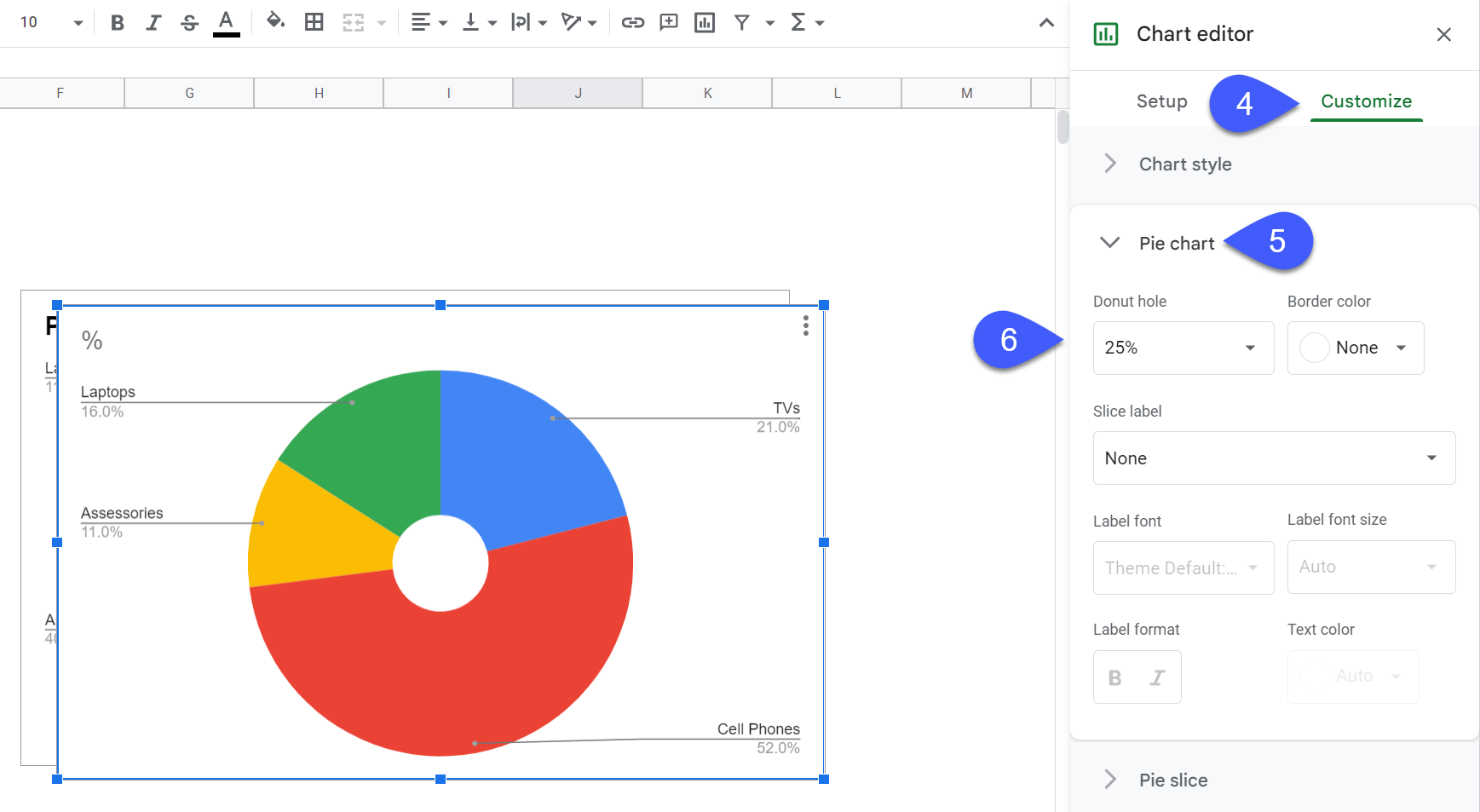
Now, it’s time to increase the size of the donut hole to accommodate the smaller inner layer inside it.
4. In the Chart editor, switch to the Customize
5. Navigate to the “Pie chart” section
6. Set the “Donut hole” value to “75%” to modify the amount of empty space in the middle of our doughnut chart.
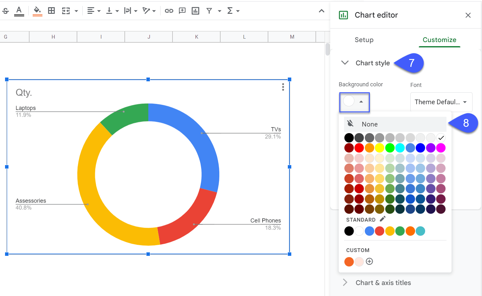
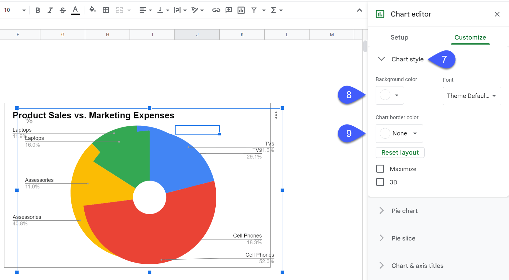
Once there, we need to remove the background of the chart area to seamlessly stack two doughnut charts on top of each other.
7. In the Customize tab, navigate to the “Chart style” section.
8. Under “Background color,” pull up the color palette and choose “None” to remove the background of your chart.
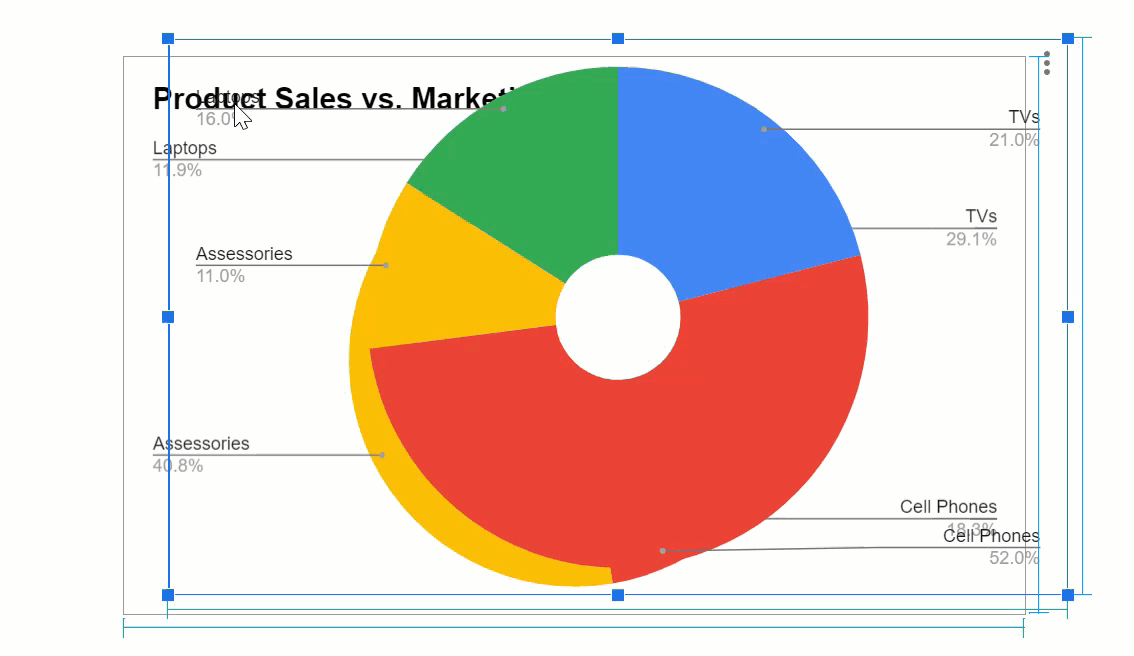
 9. Finally, change the chart title to something that actually helps the user understand what our Google Sheets multi-level nested pie chart is all about.
Step #2: Create & Format the Inner Layer of Your Nested Pie Chart
Now that we have our outer circle ready to go, we need to create another doughnut chart that will act as the inner level of the nested chart.
1. Start with creating a simple doughnut chart using the second table (D1:E5). We covered the actual process above (Select the second data table > Insert > Chart >).
 2. In the Chart editor, open the drop-down menu under “Chart type.”
3. Navigate to the “Pie” section and select “Doughnut chart.”
Once there, we need to adjust the donut hole size to create enough empty space near the center of the chart since, oftentimes, you may want to add a text box right in the middle describing the hierarchical structure visualized on the chart.
4. Jump to the Customize tab.
5. Navigate to the “Pie chart” section.
6. Adjust the Donut hole value to “25%.”
Once there, we need to remove the border and background of the chart area to seamlessly combine the two doughnut charts.
7. In the same Customize tab, navigate to the “Chart style” section.
8. Hit the “Background color” button and remove the background by choosing “None.”
9. Under “Chart border color,” select “None” to remove the border of the chart.
 10. Remove the chart title by double-clicking on it and pressing the Delete key since we don’t need it.
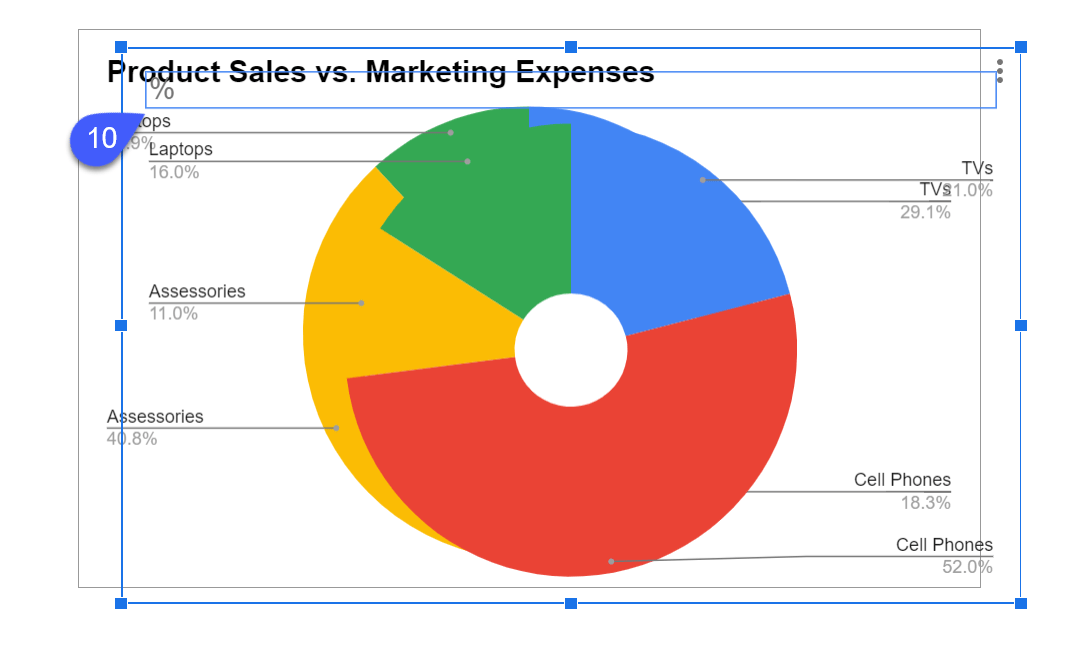 11. Resize the size of the second doughnut chart to fit the donut hole of the outer layer.
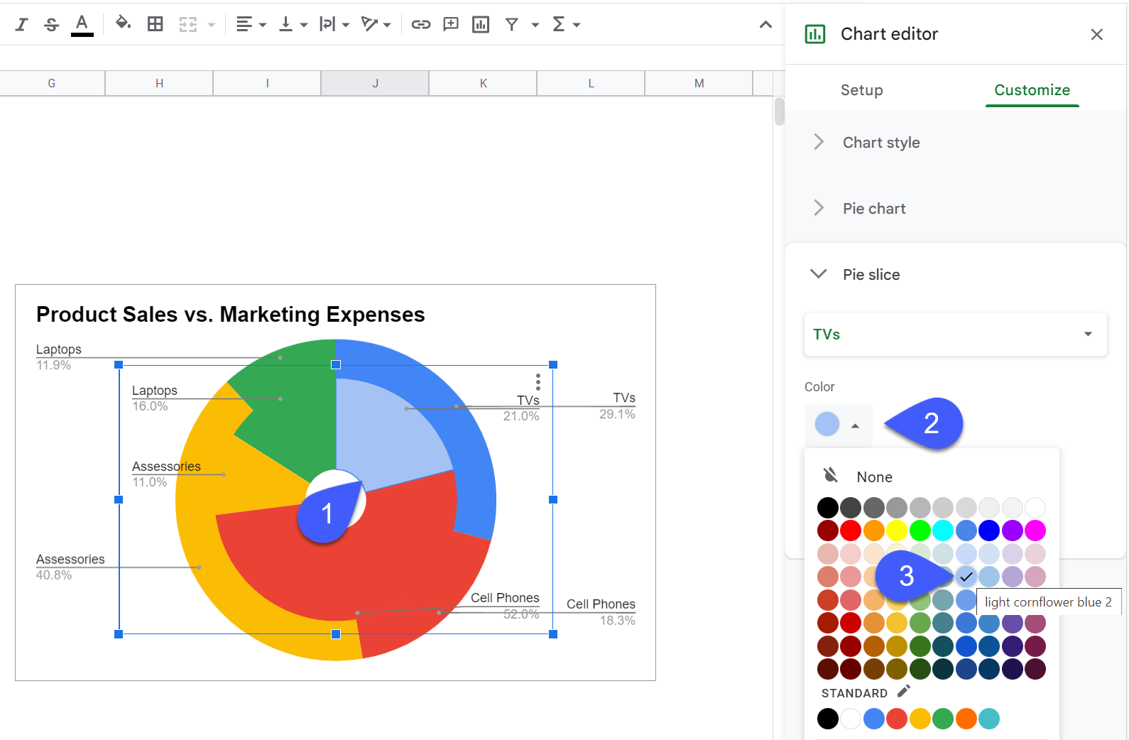
Step #3: Add the Final Touches
Technically, we’re pretty much done here, but this chart doesn’t really look presentable and is hard to read because we’re using the same colors for both of the charts.
Let’s quickly fix that by modifying the colors of the inner layer’s pie slices.
1. Double-click on the pie slide you want to recolor.
2. You’ll be immediately taken to the “Pie slice” section.
3. Under “Color,” select “light cornflower blue 2.”
 Using the same process covered above, recolor the smaller doughnut chart in the following way:
- Red > light red 2
- Orange > light orange 2
- Green > light green 2
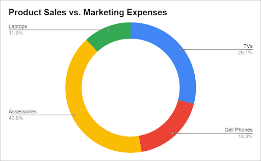
As a result, we get our professionally-looking multi-level nested pie chart in without using any premium Google Sheets add-ons.
Bonus Step: To add a custom value to the center of our nested pie chart, you need to create a custom drawing (Insert > Drawing > Text box > Type in your custom value > Save and Close). Once there, manually drag the text box in the middle of the chart to fit the white circle.
