
Experienced users and newbies alike use Excel not only to add and edit data but also to analyze it and display it in different ways. One way you can do this is by creating an interactive dashboard for better visualization of your data, providing a stunning image for your readers. This will help you organize your data and make it easier to work with for all users.
In this article, you will learn how to create an interactive dashboard and impress your colleagues. Just follow the steps below.
How to Create a Chart in Excel
In order to create an interactive dashboard, you need to start by preparing the data that will be displayed.
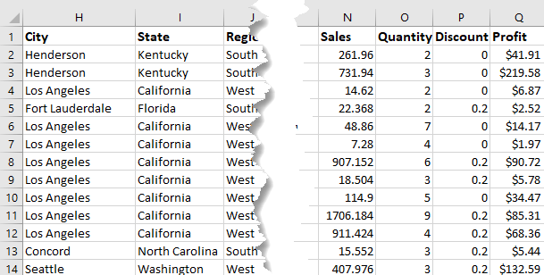
1. Select the data you wish to depict on your interactive dashboard.
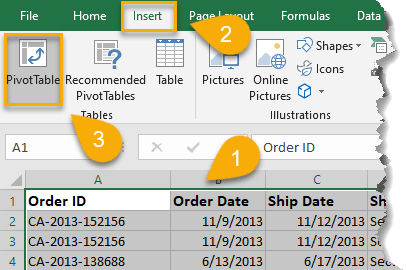
2. Go to the Insert tab.
3. Pick Pivot Table.
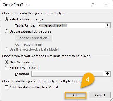
4. Click OK.
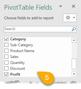
5. Select the fields you want to depict on the chart. These are based on your headings.
Now let’s move on to creating the chart.
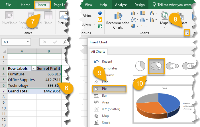
6. Select the data.
7. Navigate to the Insert tab.
8. In the Charts section, click the arrow in the corner to expand your options (for illustration purposes, we’re going to create a simple pie chart).
9. Choose the type of chart you would like to use.
10. Pick the style that best fits your design.
11. Click OK.
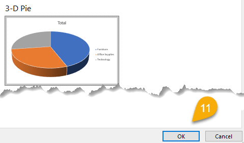
Just like that, you have added a chart to your worksheet.
Next, create another chart with other data categories. You can create as many charts as you need. For a more detailed study on creating charts, we suggest you to follow this link to delve into the topic and personalize your charts so they look amazing.
We’ll now move on, using a set of three charts to create an interactive dashboard!
How to Create an Interactive Dashboard in Excel
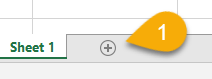
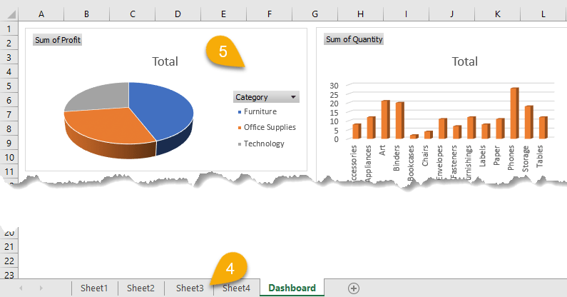
1. Click the plus sign at the bottom of the worksheet to create a new sheet.
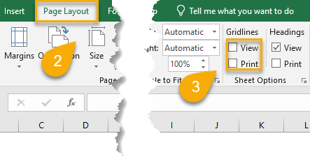
2. Go to the Page Layout tab.
3. Uncheck the View and Print options for Gridlines.
4. Return to the original sheet.
5. Using the Copy/Paste (right-click or Ctrl+C/Ctrl+V) options, transfer all the charts to the new sheet. This is where your interactive dashboard will be created.
In order to power your interactive dashboard, you need to add some options to help you easily find the data you need. Let’s take a look at how to do that.
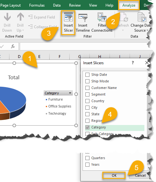
1. Select the chart.
2.Navigate to the Analyze tab.
3. Click on Insert Slicer.
4.Select the categories you want to manage.
5.Click OK.
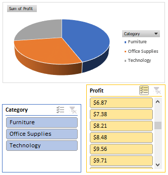
Repeat the process for each chart.
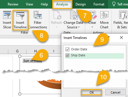
If you wish to create a time view function, you will need to insert the Timeline setting.
6. Again, click on the chart you need.
7. Go to the Analyze tab.
8. Choose the Insert Timeline option.
9. Select the categories you need.
10. Click OK.
Setting up an interactive dashboard is that simple!
If you follow the steps described above, your dashboard could look much like what you see below.
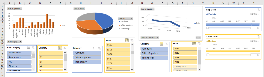
Feel free to play around with the details of your dashboard, adjusting fonts and colors and backgrounds to your liking.
The interactive dashboard will allow you to easily manage your data and keep all the important details in one place.
