
Line graphs are useful tools and provide a fantastic way to visualize how changes in a particular phenomenon occur over time. There are several types of line graphs to choose from, and they range from simple to complex. Line graphs can also be customized to achieve specific visual effects and display more information.
This post will thoroughly explore the key features of line graphs.
What Is a Line Graph in Google Sheets?
A line graph or line chart is simply a graph that has its data points connected with a line. Each data point on the chart represents a set of information, typically illustrating the correlation between the variables measured on the two axes: the x-axis and y-axis. Line graphs are appropriate for illustrating trends and variations in data that occur over a specific period.
A line graph can have one or multiple lines. In cases where a line graph has multiple lines, each line represents a distinct set of data points, thereby making it easy to identify trends and patterns and compare multiple sets of data.
Types of Line Graphs in Google Sheets
There are three types of line charts in Google Sheets: the regular line chart, the smooth line chart, and the combo line chart. Each one possesses unique strengths that make them suitable for specific assignments.
The Regular Line Chart
The regular line chart is the most popular and most common type of line chart you will come across. It’s basically a line graph with sharp or angled edges.
Advantages of a Regular Line Chart
1. A regular line chart is super awesome for plotting continuous data.
2. A regular line chart makes it easy to compare and find a connection between two or more items.
3. Missing data can be easily identified with a regular line chart. That’s because a gap, which will be easily spotted, will appear in the line.
Disadvantages of the Regular Line Chart
The primary disadvantage of a regular line chart is that comparison between datasets can be challenging when/if both datasets have similar values.
The Smooth Line Chart
The smooth line chart is practically the same as the regular line chart, with one stark, controversial difference: it doesn’t have any sharp or angled edges.
The smooth line chart “smoothens” out all the edges you will find in a regular line chart.
Advantages of the Smooth Line Chart
1. It is both visually pleasing and efficient for displaying large sets of data.
2. It provides a swift way to analyze data while also making it possible to efficiently identify gaps or clusters in the distribution.
Disadvantages of the Smooth Line Chart
1. Smooth line charts can misrepresent data because of the way they smooth out the edges, hence the reason for the controversy that surrounds their use.
2. The smooth line chart is difficult to use when the data includes decimal or fractional values.
The Combo Chart
A combo chart is the combination of two or more charts in one visualization. Usually, the combo chart uses a bar chart and a line chart. The combo chart is useful for easily spotting trends, patterns, and comparisons between two different categories.
Advantages of the Combo Chart
1. It makes it easy to compare data using different formats and charts. This way, different types of information can be efficiently represented in one single chart.
2. Because at least two different charts can be displayed in one graph, the combo chart makes it easier to identify trends and patterns that may have been missed when looking at data in separate charts.
Disadvantages of the Combo Chart
1. The combo chart can become complex and difficult to read, especially when it’s used to visualize large data sets.
2. When using different scales, which is usually the case in the combo chart, identifying the exact data values can become a challenge.
The Area Chart
An area chart is also another type of line chart. It shows the progression of one or more variables in a dataset over a specific time frame. Although very similar to the line chart, the area chart fills the space between the line segments and the x-axis with a color or pattern, thereby providing a visual representation of the rate of change.
While the area chart can have one or more line segments, it’s best put to use when comparing the progression of multiple variables. There are 5 variations of the area chart in Google Sheets.
Simple Area Chart
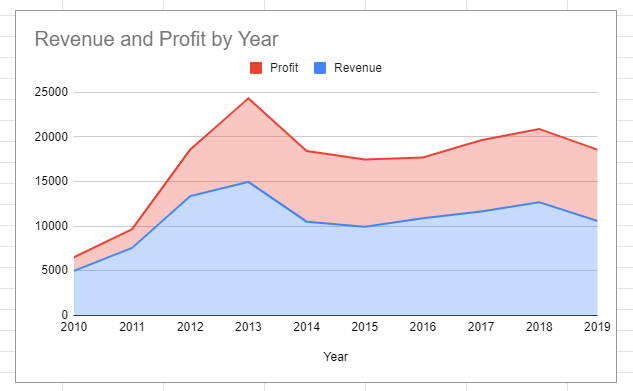
A simple area chart displays data in a way that coloured sections or chart areas are layered on top of each other, much like a mountain range. In Google Sheets, the data series with the smallest values are plotted first by default when using the simple area chart.
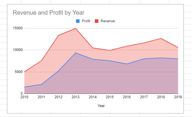
Stacked Area Chart
The stacked area chart is very similar to the simple area chart. The area under the chart is also coloured and stacked on top of each other. However, in the stacked area, data series start from the point where the previous one stops. This is unlike the simple area chart where data series are simply layered over each other.
In a stacked area chart, when reading the values on the y-axis of the top segment, you need to subtract the plot value from the value of the previous segment.
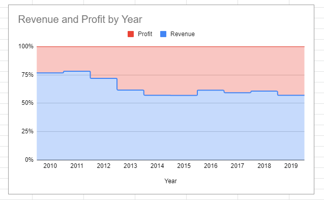
100% Stacked Area Chart
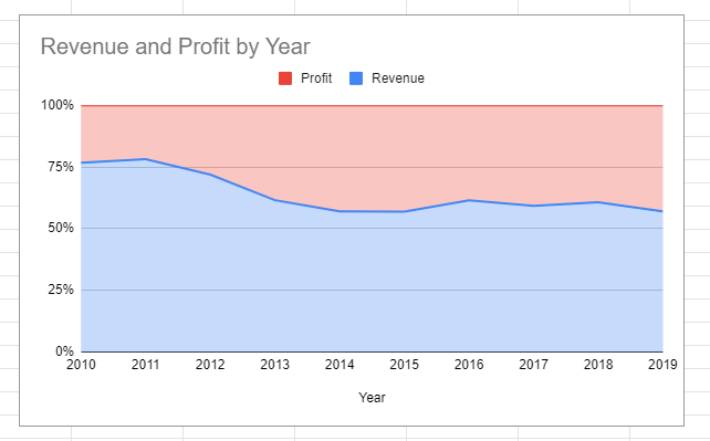
The 100% stacked area chart is an extension of the stacked area chart. In a 100% stacked area chart, the scale of the Y axis is represented as a percentage of the total data. This type of area chart is useful for calculating the percentage contribution of the data series over time.
To get the value of the top segment, you’ll need to subtract the percentage value of the lower segment from 100.
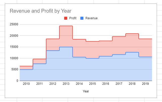
Stepped Area Chart
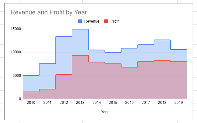
The stepped area chart is similar to the simple area chart. The difference between both is only in the visual appearance of the lines.
Stacked Stepped Area Chart
The stacked stepped area chart is also like the stacked area chart and only differs in visual representation.
100% Stacked Stepped Area Chart
This 100% stacked stepped area chart is the same as the 100% stacked area chart. It also only differs in the way the lines appear.
Advantages of the Area Chart
1. The area chart helps to visualize the proportion of different sets of data in comparison to the whole.
2. It makes the comparison of patterns and trends from multiple data sets very easy to see.
3. With an area chart, it’s easy to display the magnitude of data because the spaces between the lines and the X-axis are filled with color.
Disadvantages of the Area Chart
1. If the segments in the chart are too close together, it can be difficult to accurately read the chart.
2. An area chart can be misleading if the segments are not similar in size. Larger segments may appear more prominent even if they only have smaller values.
3. Area charts are biased toward the display of data proportions. This makes it difficult to understand the actual numbers creating the data segments.
How to Make a Line Graph in Google Sheets
To make a line graph in Google Sheets, you will need to follow these steps:
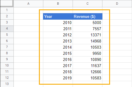
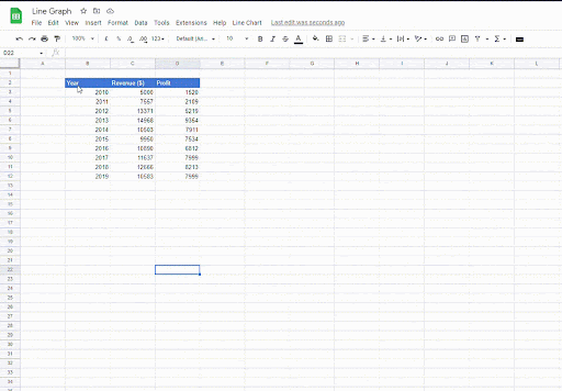
Step 1 – Enter your data.
The first step to creating a line chart is to enter your data. A line chart can plot quantitative and qualitative data seamlessly, so you need not worry about the nature of the data you’re using.
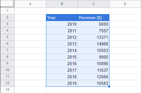
Step 2 – Select the data.
After preparing your data, the next step is to select the columns of data (column header included) that will appear in the graph.
Step 3 – Insert graph.
To insert a line graph, follow these steps.
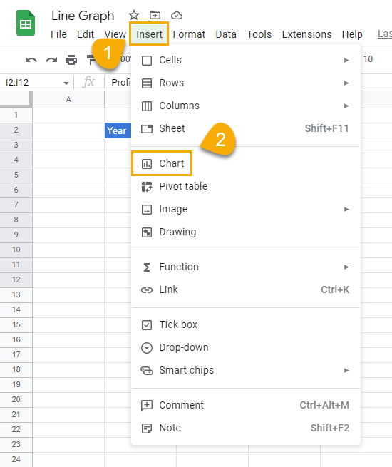
1. Go to the Insert menu and select Chart.
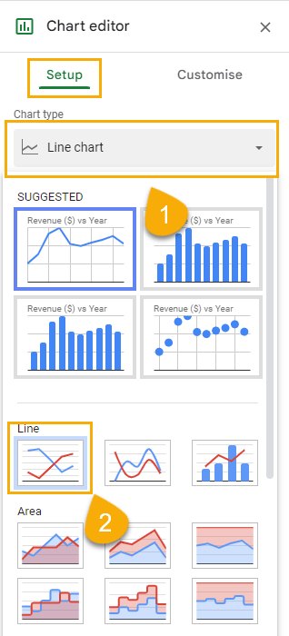
2. Under the Setup tab in the Chart editor window, go to the Chart type section and select Line chart from the dropdown options.
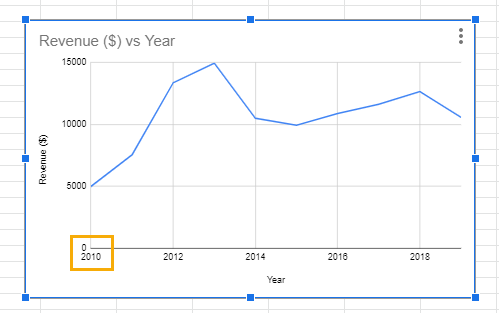
After this step, a chart will appear on the spreadsheet.
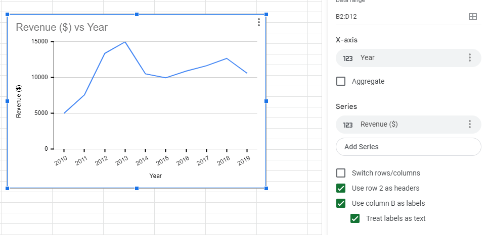
In your chart, the values on the X-axis of the chart may begin exactly at the origin. The line chart is great for displaying changes or trends over time; the data on the X-axis is expected to be nominal or ordinal. As such, if the scale for the values on the X-axis begins on the origin, you will have to change it because this means the values are treated as continuous or numerical.
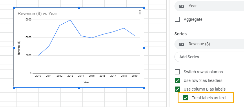
To make the data on the X-axis appear properly, insert a checkmark in the Treat labels as text box in the Chart editor.
How to Customize a Line Graph in Google Sheets
You can change how a line chart appears in Google Sheets by customizing it. In Google Sheets, you can customize individual areas of the line.
Customize Chart Style
You will find the option for customizing a line chart in the Customize tab in the Chart editor.
If you want to change aspects like the Background color, Font, and Chart border color, go to the Chart style dropdown.
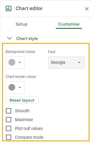
Other customize options in the Chart style dropdown include:
Smooth: Removes the edges and corners from the line to create a “smooth” curve.
Maximize: Enlarges the chart to fill up the entire space within the border.
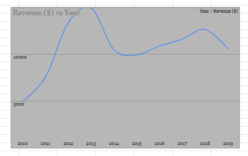
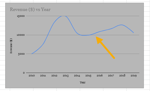
Plot null values: When your data has empty cells, the line chart will have gaps in between to show there are no values to plot.
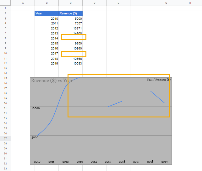
To eliminate the gaps in the chart while keeping the cells empty, add a checkmark to the Plot null values box.
Compare mode: You can use this mode to compare values from two datasets with two categories. When you use Compare mode, additional data will appear when you hover over a data point.
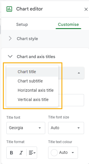
Customize Chart and Axis Titles
The Chart and axis titles option is directly beneath the Chart style option. From here, you can change the Chart title, Chart subtitle, Horizontal axis title, and Vertical axis title.
To change any of the titles, select the Chart and axis titles dropdown and click on Chart title to reveal other options and select the title you want to change.
After selecting the title you want to change, go to the Title text section and enter a new title.
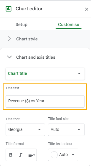
You can use the Title font, Title font size, Title format, and Title text color options to change the text format.
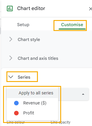
Customize Series
Series are the values plotted on the Y-axis. You can customize values on the Y-axis individually if you have more than one line in the chart using the Series dropdown.
In the Series dropdown, you can change the Line color, Line opacity, Line dash type, and Line thickness.
If you want to apply customization to only one line in the graph, click on the Apply to all series dropdown and select the line you want to customize.
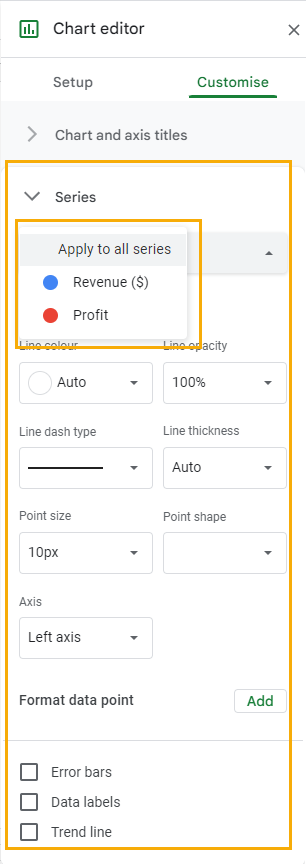
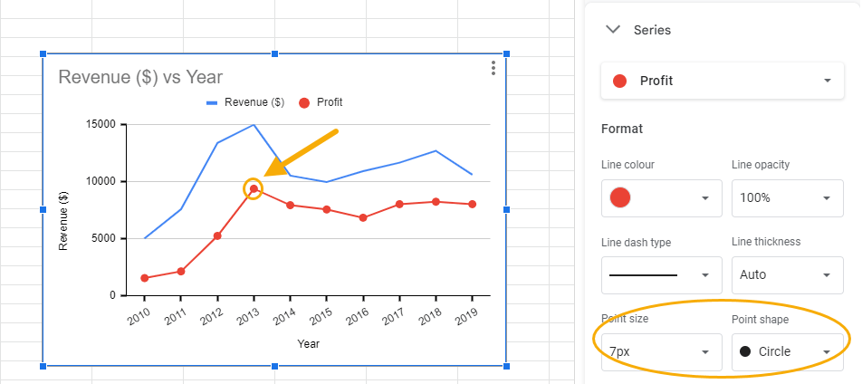
Other customization options in the series option are Point size, Point shape, and Axis (more on Point size and Point shape later).
The Axis customization allows you to change the location and scale of the selected line or series.
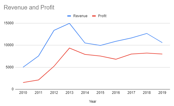
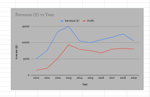
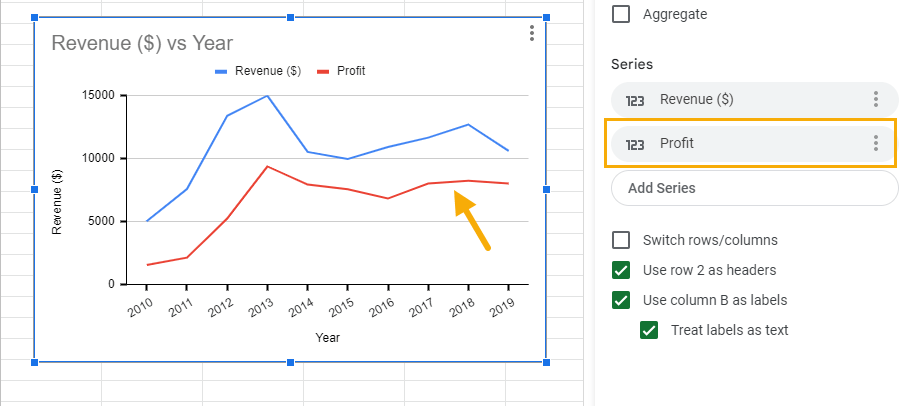
In our sample graph, when we plotted the Profit and Revenue variables together, they appeared on the same axis. The Profit line is lower than the Revenue line because Profit has lower values compared to revenue and also because they’re plotted on the same scale.
When we change the scale axis for the Profit line to the Right, the graph now looks different. A new scale appears on the right, and now the Profit and Revenue lines have almost the same height.
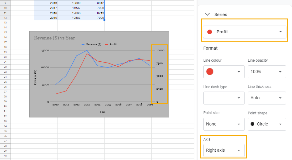
The Axis option is very useful when plotting variables that are measured using different scales.
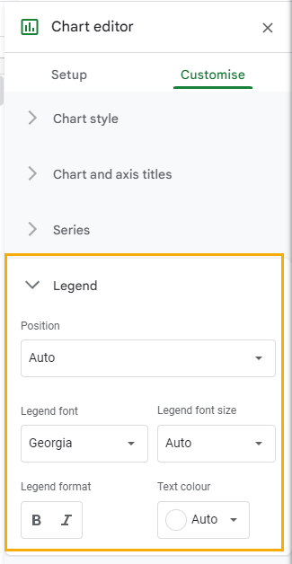
Customize Legend
The Legend explains the objects such as marks, lines, points, colors, etc., that are found on a chart. It’s very useful for a chart that has many different objects. Without a Legend, sometimes it can be impossible to make sense of a chart.
You can change the position and format the text in the Legend dropdown.
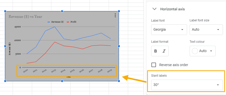
Customize Horizontal Axis
You can customize the Horizontal axis (X-axis) in its corresponding section under the Customize tab. In addition to the text formatting options, you can slant labels and reverse the axis order.
If you want to reverse the axis order so the chart will start from the highest value to the lowest, add a checkmark to the Reverse axis order box. In our sample chart, the years will start from 2019 as opposed to 2010.
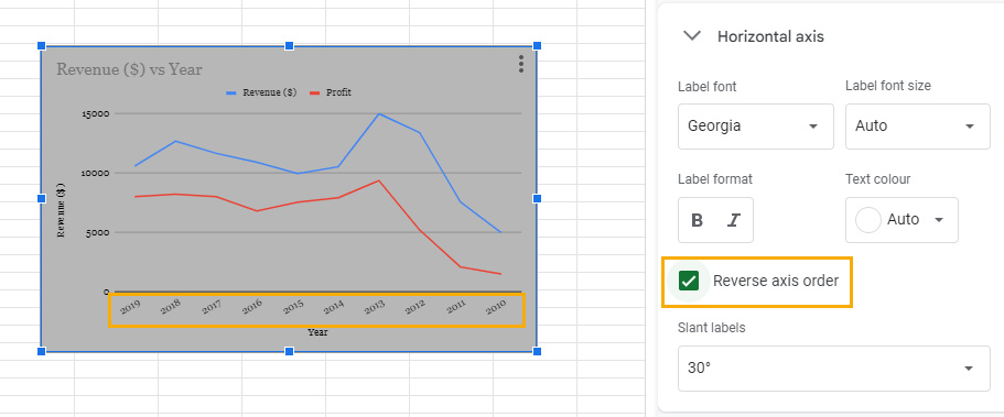
To Slant labels, click on the Auto dropdown and select the angle of slant you want.
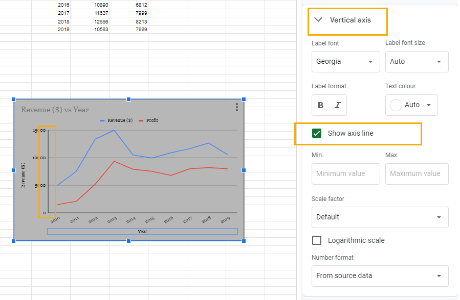
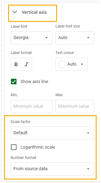
Customize Vertical Axis
The Vertical axis refers to the Y-axis, and it also has options for customizing label text. However, there are additional options that it offers.
For example, you can show the axis line. To do this, add a checkmark to the Show axis line box. This will add a thick bold line to the Y-axis.
Another option you have is changing the minimum and maximum values on the axis using the Min. and Max. search boxes.
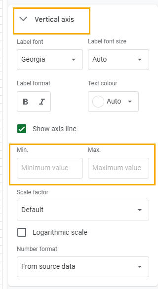
You can also change the Scale factor and Number format to change axis scales in Google Sheets.
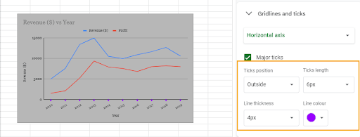
Customize Gridlines
In the Gridlines and ticks section, you can remove or alter the way gridlines appear in your chart. Also, you can add ticks to each axis. When customizing gridlines, the type of options available depends on the axis you select.
When you select the Horizontal axis option, there’s the option to only add ticks to the scale. To do this, insert a checkmark in the Major ticks box.
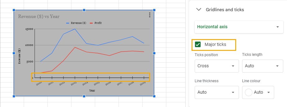
After adding ticks, you can go further to customize the way the ticks appear. You customize the Ticks position, Ticks length, Line thickness, and Line color.
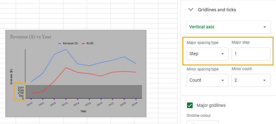
To customize the gridlines on the Y-axis, select the Vertical axis option.
You can change the scale interval using either Step or Count spacing.
For Step spacing, the scale would have 5 values per step, and the values on the scale will increase based on the number of steps used.
This is our sample chart when we increased the scale by one step.
The same chart when increased by five steps.
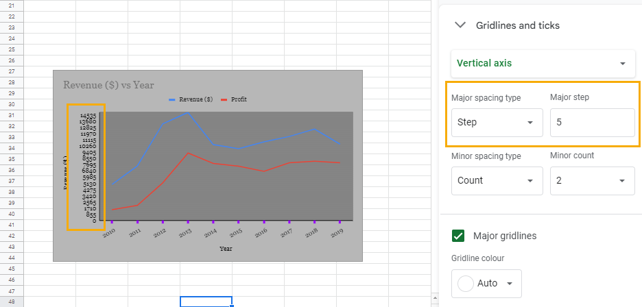
The benefit of the Step option is that it allows the chart to show smaller values on the scale. Paired with a tick, this can provide more detail, albeit creating a very busy chart.
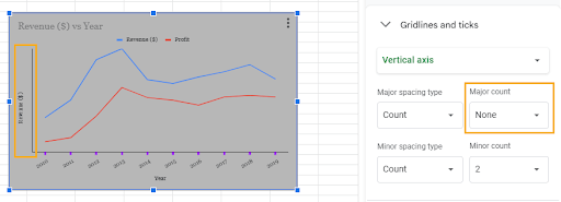
The other option you can use for showing axis values on the Y-axis is the Count. The count option allows you to determine the number of values you want to be displayed.
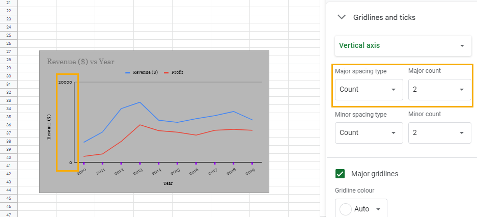
For example, this is how the scale on the Y-axis of our sample chart will appear if we want only two values to be displayed.
The more values you want to display, the higher the number you will choose.
You may also choose not to have any values on the scale. For this, you only need to choose None in the Major count section. This would remove all values, including the 0 that indicates the origin.
In changing how the scale values display, there are two options: Major spacing type and Minor spacing type. The Major spacing type affects the axis on the left side of the graph, while the Minor spacing type affects the scale on the right side of the graph, which is used when you use an additional scale to display different data.
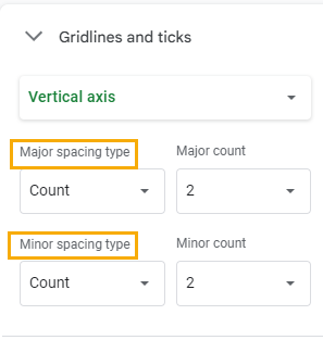
Other customize options in the Vertical axis option are the Major gridlines, Minor gridlines, Major ticks, and Minor ticks.
With these customizations, you can remove gridlines and add ticks to the major or minor axes on the chart.
How to Make a Line Graph in Apps Script
You can use a custom menu to create a line graph. The benefit of this custom menu created using Google Apps Script is that it’s a much more straightforward process for inserting a line chart.
To create the custom menu using Apps Script, follow these steps:
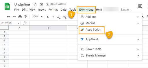
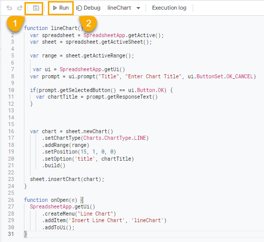
Step 1 – Go to the Extensions menu and select Apps script. This will open the editor window where you can create an Apps Script.
Step 2 – Copy and paste the syntax into the Apps Script editor.
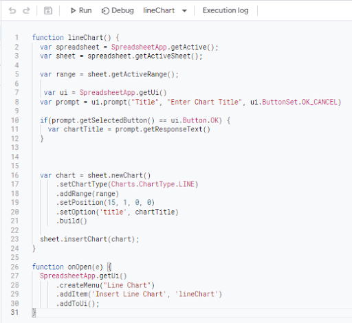
function lineChart() {
var spreadsheet = SpreadsheetApp.getActive();
var sheet = spreadsheet.getActiveSheet();
var range = sheet.getActiveRange();
var ui = SpreadsheetApp.getUi()
var prompt = ui.prompt(“Title”, “Enter Chart Title”, ui.ButtonSet.OK_CANCEL)
if(prompt.getSelectedButton() == ui.Button.OK) {
var chartTitle = prompt.getResponseText()
}
var chart = sheet.newChart()
.setChartType(Charts.ChartType.LINE)
.addRange(range)
.setPosition(15, 1, 0, 0)
.setOption(‘title’, chartTitle)
.build()
sheet.insertChart(chart);
}
function onOpen(e) {
SpreadsheetApp.getUi()
.createMenu(“Line Chart”)
.addItem(‘Insert Line Chart’, ‘lineChart’)
.addToUi();
}
Each line in the syntax is explained below.
function lineChart – This line creates and names the function using the function keyword.
var spreadsheet = SpreadsheetApp.getActive() – This line collects the active spreadsheet in the browser using the Spreadsheet.getActive() method and stores it in the spreadsheet variable.
var sheet = spreadsheet.getActiveSheet() – this line collects the active sheet within the spreadsheet using the spreadsheet.getActiveSheet(). This is then stored in the sheet variable.
var range = sheet.getActiveRange() – The range variable in this line stores the actively selected range in the spreadsheet using the sheet.getActiveRange() method.
var ui = SpreadsheetApp.getUi() – This line stores the spreadsheet user interface section in the ui variable. This is possible by using the SpreadsheetApp.getUi() method.
var prompt = ui.prompt(“Title”, “Enter Chart Title”, ui.ButtonSet.OK_CANCEL) – This line causes the spreadsheet to display a prompt that collect the chart title. The prompt will have an OK or CANCEL button.
if(prompt.getSelectedButton() == ui.Button.OK) {var chartTitle = prompt.getResponseText()}
In this if statement, the code prompt.getSelectedButton() == ui.Button.OK checks whether you click on the OK button in the prompt. If this condition is true, then prompt.getResponseText() returns the text entered in the prompt and stores it in the chartTitle variable.
var chart = sheet.newChart() – This code creates a new chart using the sheet.newChart() method.
.setChartType(Charts.ChartType.LINE) – This sets the chart to a line chart.
addRange(range) – This provides the chart with a data range by using the values stored in the range variable created earlier.
setPosition(15, 1, 0, 0) – This specifies the location in the spreadsheet where the chart would be inserted.
setOption(‘title’, chartTitle) – This line provides the chart title by using the text from the prompt that was stored in the chartTitle variable.
build() – The chart is built using this method.
sheet.insertChart(chart) – This line inserts the chart into the spreadsheet.
function onOpen(e) {
SpreadsheetApp.getUi()
.createMenu(“Line Chart”)
.addItem(‘Insert Line Chart’, ‘lineChart’)
.addToUi();
This function uses the onOpen(e) trigger to create a custom menu. To create this menu, the function gets the spreadsheet’s user interface using the SpreadsheetApp.getUi() method.
The createMenu(“Line Chart”) then creates and adds the Line Chart menu to the user interface. This menu is created automatically when the spreadsheet is opened, hence the reason for the onOpen trigger.
The Line Chart custom menu also has a submenu called Insert Line Chart which is created using the additem(‘Insert Line Chart’, ‘lineChart’) method. The submenu runs the lineChart() function.
After pasting this syntax into the editor, click on the Save and Run buttons. After you do this, you’ll be prompted to grant permissions before the script runs.
After granting permissions, reload the spreadsheet.
To use the Line Chart menu, follow these steps.
Step 1 – Select the data range you want to plot.
Step 2 – Go to the menu and select Line Chart, then click on Insert Line Chart.
Step 3 – Enter a preferred title for the chart in the prompt box and click on the OK button.
You can double-click on the chart to open the chart editor and customize the chart.
Line Graph in Google Sheets – Free Template
Click this link to grab a free copy of our line chart template.
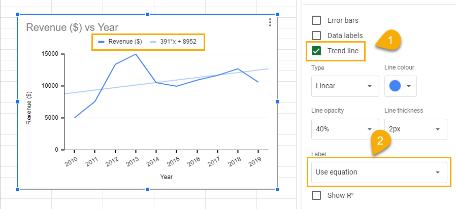
How to Add an Equation to a Line Graph in Google Sheets
To add an equation to a line graph in Google Sheets, follow these steps:
Step 1 – In the Series dropdown, add a checkmark to the Trend line box.
Step 2 – In the Label section, select Use equation.
How to Add Error Bars in a Google Sheets Line Graph
Error bars help to determine or visualize the expected variation expected of a value. This is particularly useful when working with projected figures.
To add error bars to your line graph, follow this step:
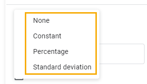
Step 1 – In the Series dropdown, add a checkmark to the Error bars box.
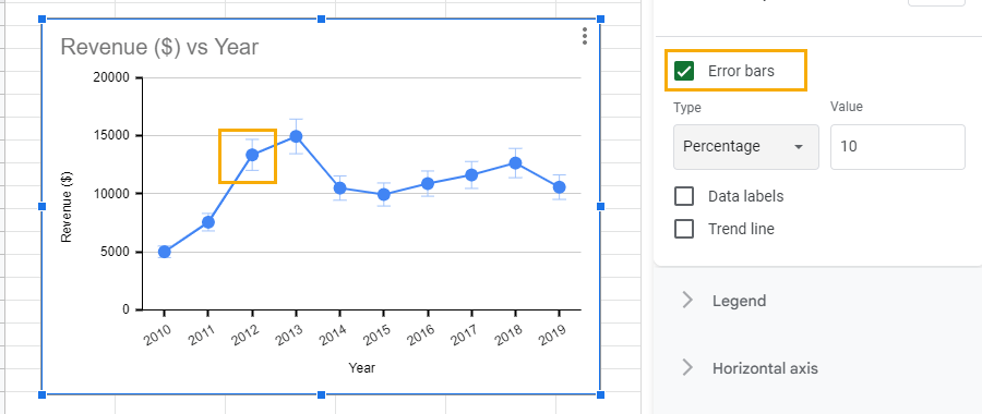
You can choose to show the error bars as a Constant, Percentage, or Standard deviation.
How to Add a Second Line in a Google Sheets Line Graph
To add a second line to a line graph, follow these steps:
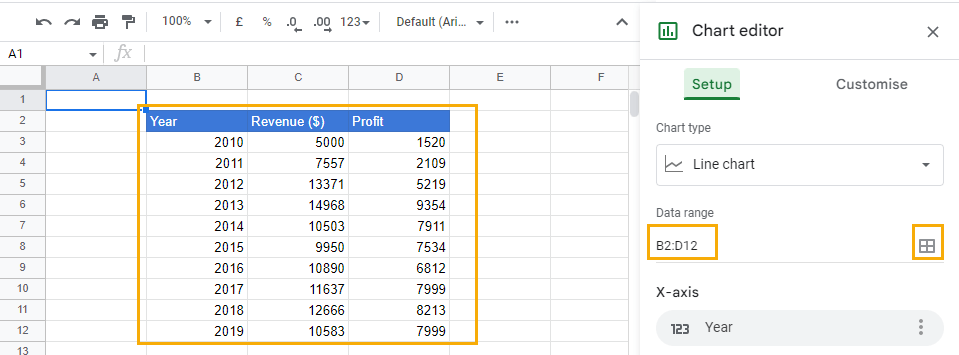
Step 1 – Prepare a column with a new data set and add it to the line chart range. To add a new range, go to the Data range section and edit the range. You can do this by using the grid icon or typing in the new data range manually.
Step 2 – Go to the Series section, click on Add Series, and choose the new column containing the new data.
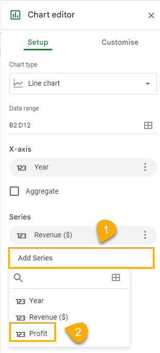
After selecting the new column, the second line will appear on the chart.
How to Add Points to a Line Graph in Google Sheets
To add points to a line graph, follow these steps:
Step 1 – Click on the Series dropdown in the Customize tab and select Apply to all series to choose the line where you want to add a point.
Step 2 – Click on the Point size box and choose your preferred size, then the Point shape box for your preferred shape.
How to Remove a Google Sheets Line Graph
To remove a line graph, click on the three dots at the top right-hand corner of the chart and select Delete chart from the options.
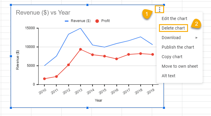
Alternatively, you can select the chart and use the Delete key on your keyboard to remove a line chart.
How to Remove a Line from a Series of a Line Chart in Google Sheets
To remove a line from a series in a line chart, follow these steps:
Step 1 – Go to the Series section in the Setup tab. Identify the series you want to remove and click on the three dots next to it.
Step 2 – Click on Remove from the options.
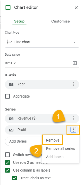
When you do this, the line will be removed from the graph.
FAQs
Does Google Sheets have line graphs?
Yes. Google Sheets has line graphs.
How do you make a line graph in Google Sheets?
To make a line graph in Google Sheets, select the columns containing the data you want to plot. Then go to the Insert menu and click on Chart. In the Chart editor that opens to the right of the spreadsheet and under the Setup tab, select Line chart from the chart options.
How do you make a line graph in Google Sheets with multiple lines?
To create a line graph with multiple lines—that is, two, three, or more lines—in Google Sheets, follow the process for making a line graph as described in the previous section. When this is done, go to the Chart editor and click on the Series section.
Under the Series section, you will see a dropdown menu labeled Add series. Select the data you want to add to the graph. You can do this again to add multiple lines to your graph.
When creating a line graph with multiple lines, you must make sure that all the data series you’re adding have the same x-axis.
