Quick Jump
ToggleCharts in Google Sheets are designed to help you visualize your data.
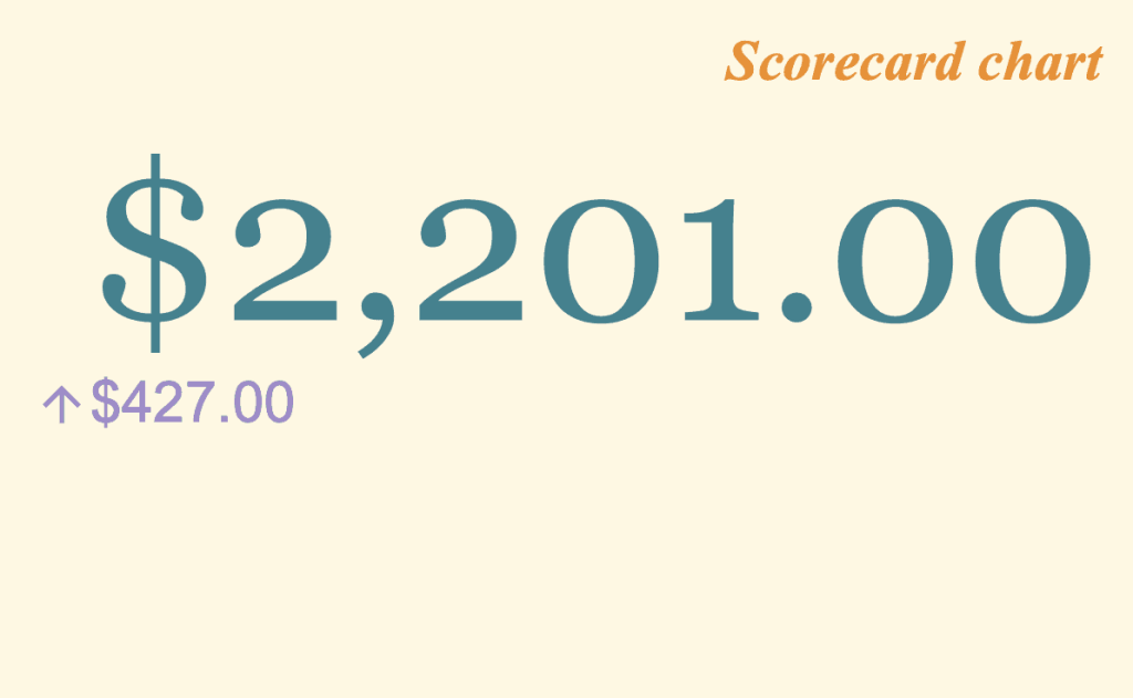
The Scorecard chart is a Google Sheets graph made to draw special attention to (key) performance indicators—aka KPIs. For example, a Scorecard chart can help you display the traffic to your blog during a particular quarter of the year.
It also provides the opportunity to compare two ranges of data in order to show differences between them, like changes over time.
In this step-by-step guide, you will learn how to create and customize a Scorecard chart in Google Sheets.
How to Format Data for a Scorecard Chart
First, we have to correctly enter and format the data for a Scorecard chart. Before creating a Scorecard chart, one of the essential things you must do is to find the sum of the values you have.
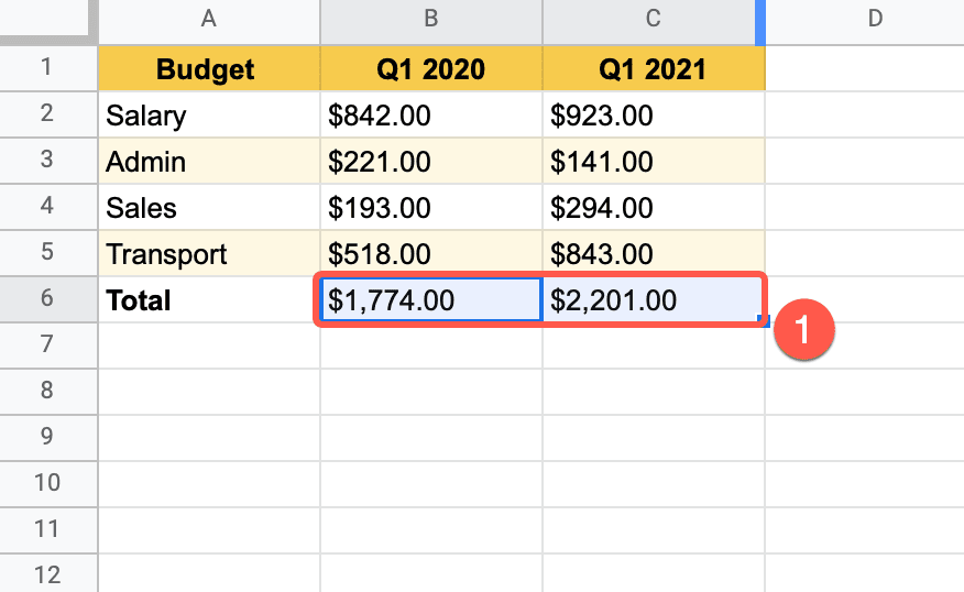
In the example provided below, the first column (column A) contains the labels while the other columns (column B; column C) contain the numeric values.
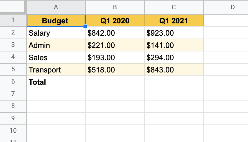
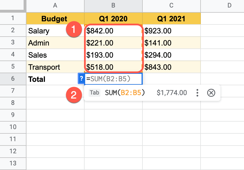
To sum up the values, there are two simple steps to follow:
1. Select cell B6 and type an equal sign “=” in the cell. Google Sheets will predict that you want a sum of the cells above it (B2:B5), shown in grey.
2. Press the “Tab” key to have it sum up that column.
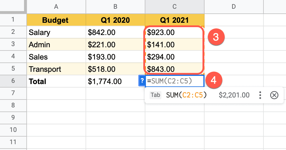
Follow the same steps to sum up the values of column C.
3. Select cell C6 and type an equal sign “=” in the cell. Google Sheets will predict that you want a sum of the cells above it (C2:C5), shown in grey.
4. Press the “Tab” key to have it sum up that column.
How to Create a Scorecard Chart
With all the basic steps done, we can now create a Scorecard chart.
1. Highlight the total values (B6:C6).
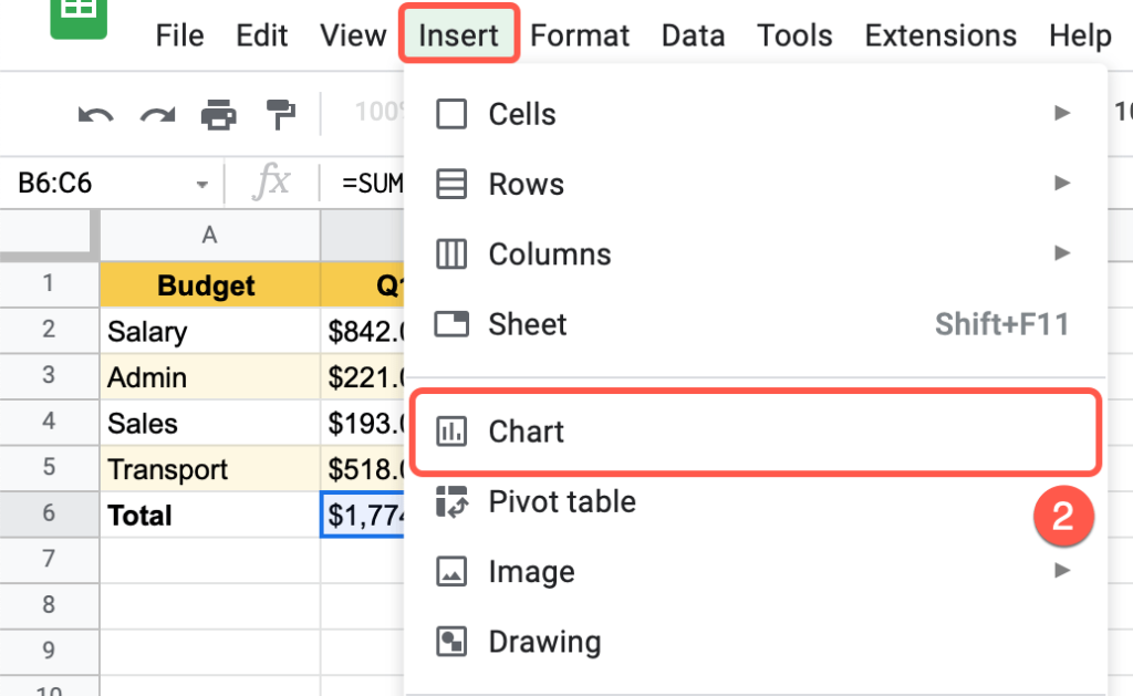
2. In the Toolbar, select Insert > Chart.
Google Sheets automatically suggests the best chart for you, in their view. However, we need a Scorecard chart.
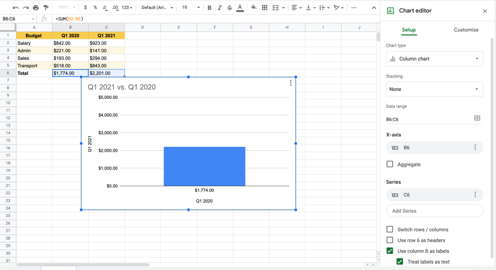
3. In the task pane, in the Setup tab, choose the Chart type section.
4. Under “Other,” select Scorecard chart.
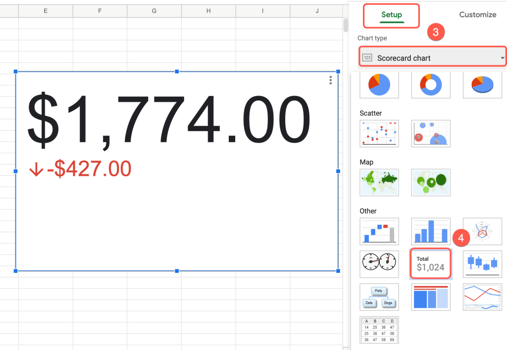
Your lovely Scorecard chart is ready. However, you might want to improve it. Customization tools will help you do this.
How to Change the Title for the Scorecard Chart
Each type of graph needs a good quality title so the reader can easily understand what the chart is about.
As you see, your Scorecard chart doesn’t have a title.
Follow these steps to change the title and make it unforgettable:
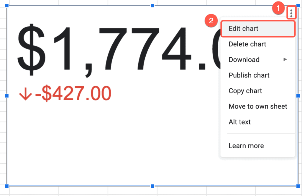
1. On the chart plot, click on the three-dot menu in the upper right corner. (You will need to select the chart first.)
2. Select “Edit chart.”
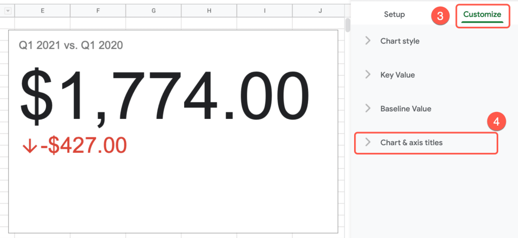
3. Navigate to the “Customize” tab.
4. Click on the “Chart & axis titles“ menu.
5. Under “Title text,” insert a title for the chart.
6. “Title font“ allows you to choose the best font for the title.
7. “Title font size“ maximizes or minimizes the title.
8. Under “Title format,” you can modify the position of the title and make it bold or italic.
9. The “Title text color“ menu allows you to choose a color for your title.
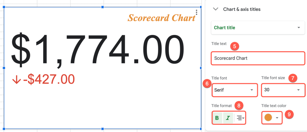
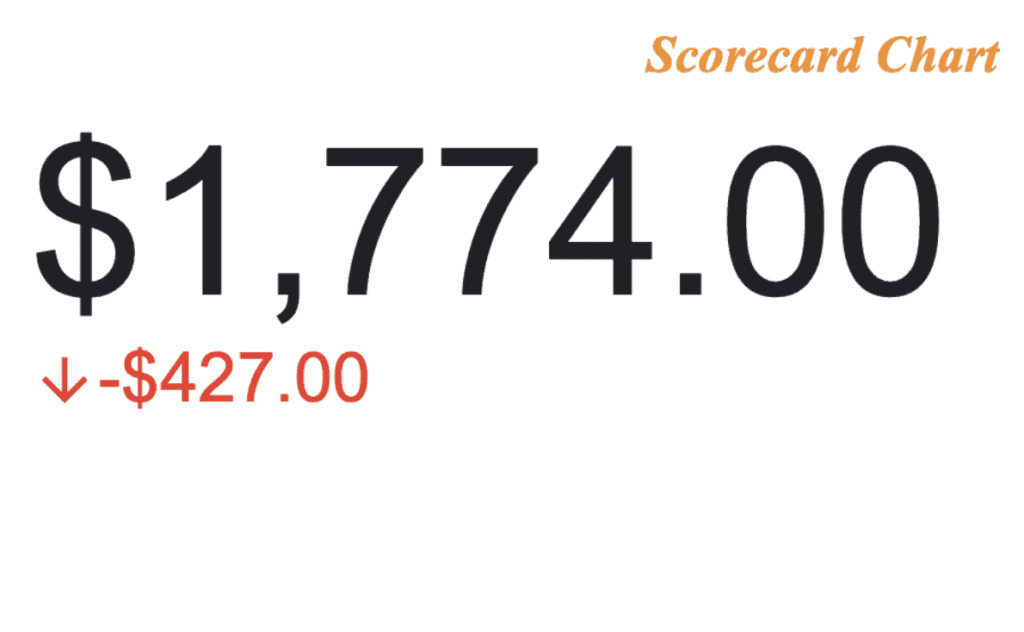
Amazing! A chart with a title looks much better.
How to Change the Key Value of a Scorecard Chart
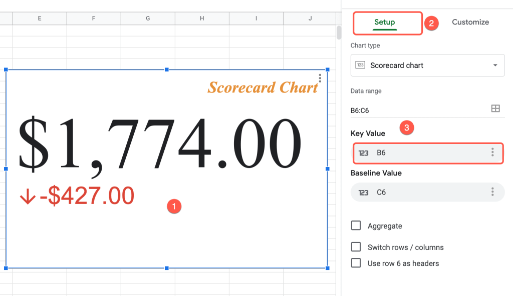
So, we have two total values in our data, but the Scorecard chart only shows one value: the key value. If you need to change the key value, follow these simple steps:
1. Click somewhere on the Scorecard chart plot.
2. In the task pane, navigate to the “Setup” tab.
3. Under “Key Value,” select the data you need to be represented as the key value.
How to Customize the Key Value of a Scorecard Chart
Google Sheets also gives you the opportunity to customize the key value.
Let’s modify the one we have.
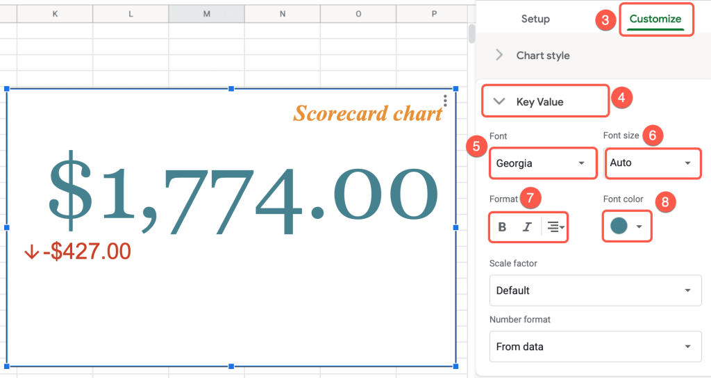
1. On the chart plot, click on the three-dot menu.
2. Go to “Edit chart.”

3. Switch to the “Customize” tab.
4. Open the “Key Value” menu.
5. Choose the best font from the “Font“ menu.
6. Under “Font size,” modify the size of the key value.
7. “Format“ allows you to change the alignment of the key value and make the numbers bold or italic.
8. In the “Font color“ field, select a color to make the key value stand out.
How to Change the Baseline Value of a Scorecard Chart
Changing the baseline value on the Scorecard chart is a piece of cake.
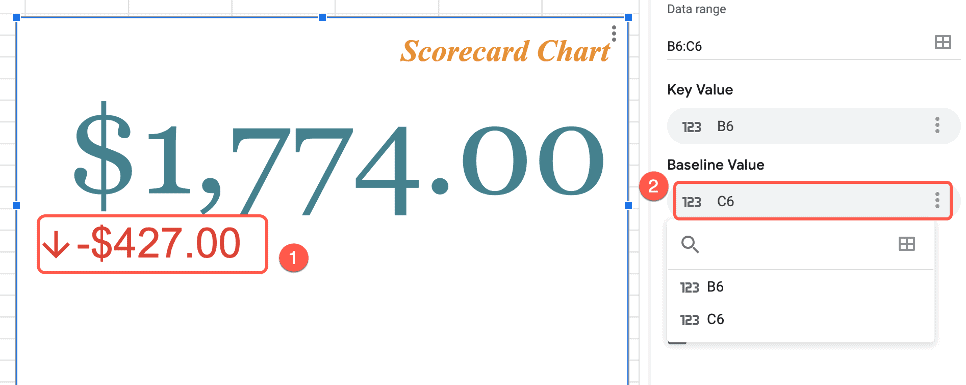
1. Click on the baseline value on the plot.
2. Under the “Baseline Value” box, change the cell connected to the baseline value.
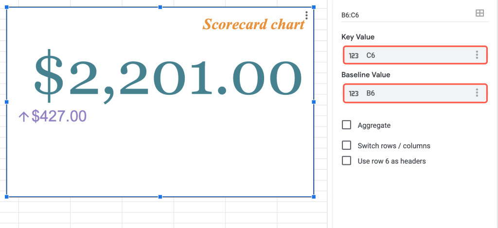
NOTE: It’s essential to change the key value and baseline value cells together; they have to be different from each other since they are comparing two ranges of data.
How to Customize the Baseline Value of a Scorecard Chart
Customizing can help the baseline value stand apart from the key value.
1. Select the three-dot menu on the chart plot.
2. Go to the “Edit chart” menu.
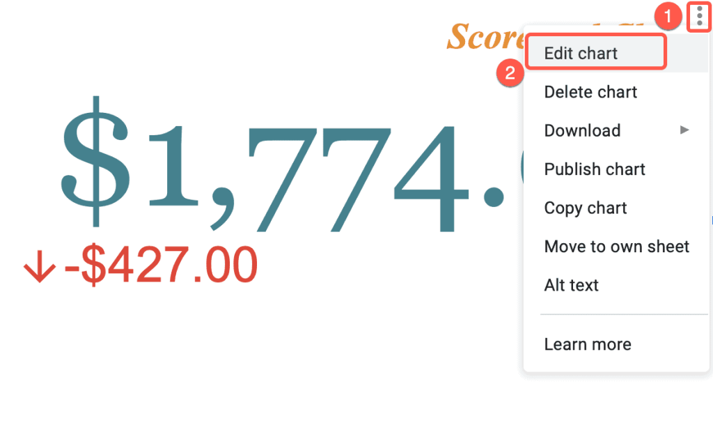
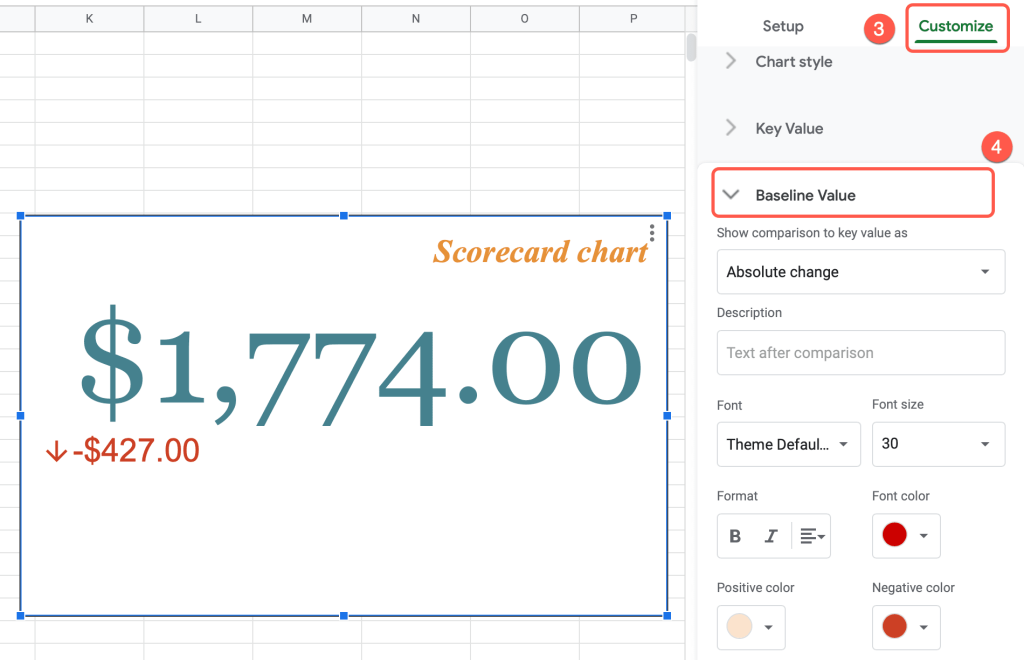
3. Switch to the “Customize” tab.
4. Select the “Baseline Value“ drop-down menu.
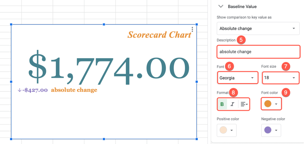
5. In the “Description” field, enter the text to go with the baseline value.
6. The “Font“ option allows you to select the best font for both the value and the description.
7. Change the size of the baseline value and its description in the “Font size” menu.
8. Use “Format” to adjust the alignment of the text and to bold or italicize it as desired.
9. To modify the color of the description, choose “Font color.”
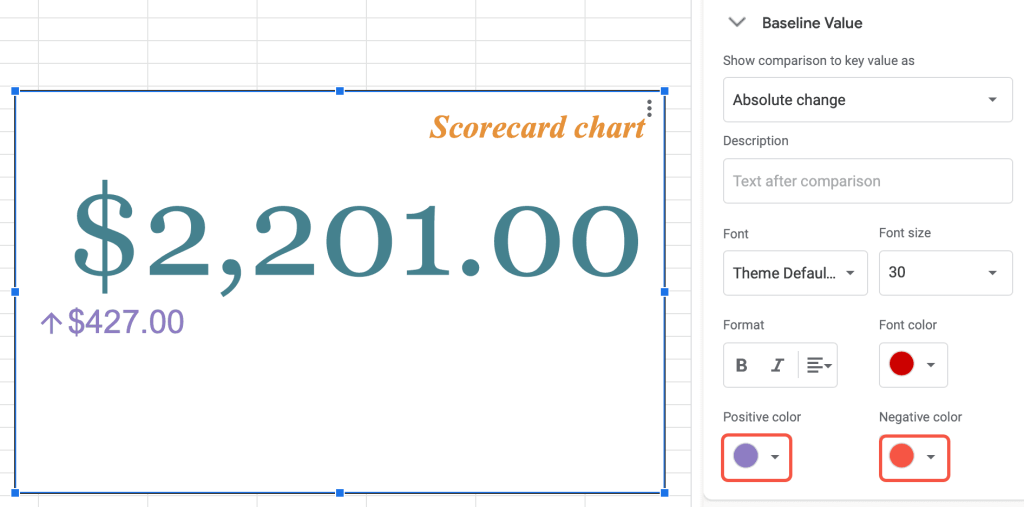
If the baseline value on the chart plot is positive, you can change its color under the “Positive color“ box. If the arrow goes down and the number is negative, you can adjust the color in the “Negative color“ box.
How to Change the Style of a Scorecard Chart
Changing the style and background color of your chart can be an effective way to bring attention to it.
1. Right-click somewhere on the chart plot.
2. Select “Chart style.”
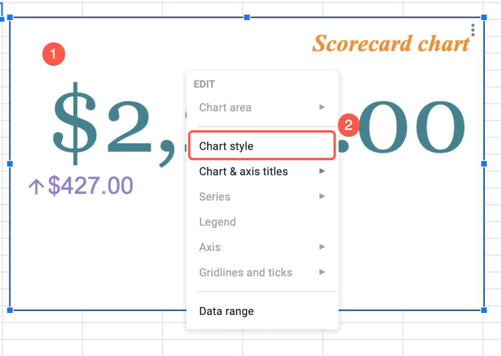
3. Under “Background color,” choose a color that fits your Scorecard chart style.
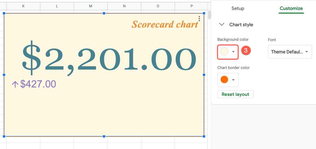
Now your Scorecard chart is ready to go!
Scorecard Chart in Google Sheets – Free Template
Creating a Scorecard chart can be easy. Just use the free template provided below to save time.
