
Quick Jump
ToggleDo you like blowing out birthday candles? How about candles on your Google Sheet?
While working in Google Sheets, you will come across many ways to visualize your data. There is a wide range of chart types to choose from, and one of them is known as the Candlestick chart.
A Candlestick chart works best with opening and closing values and summarizing the highest and lowest prices over a period of time. If you need to portray stock price movement, this would be a valuable choice. You can also use a Candlestick chart for a forecast.
In Google Sheets, the candlestick part of the chart looks like a filled box (the opening value is less than the closing value) or a hollow box (the opening value is more than the closing value).
Furthermore, Candlestick charts are quite visually effective because of the thick bodies of the candlesticks, making it easier to illustrate the differences between opening and closing values.
In this article, you will learn how to create and customize a Candlestick chart in Google Sheets.
How to Prepare Sample Data for a Candlestick Chart
To create a chart, you must always start with data.
For a Candlestick chart, you will need five columns. After the first column listing the x-axis data, the remaining four columns will be listed in this order: Low-Open-Close-High.
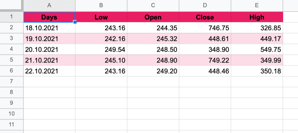
- The first column (A) contains the labels for the x-axis of your chart.
- The second column (B) includes the numbers for the low value (the base of a candle’s centerline).
- The third column (C) contains the numbers for the opening values (the vertical border of a candle).
- The fourth column (D) has the closing values (the second vertical border of a candle).
- For the fifth column (E), enter the numbers for the high value (the top of the candle’s centerline).
In our example below, we used the values of financial actions over the course of one week.
This is just the start. Let’s continue!
The next step is to convert the numbers into a “Financial” format.
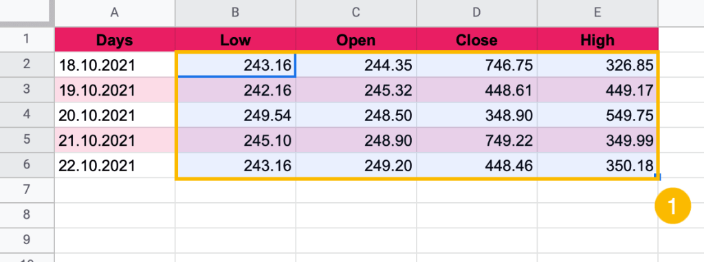
1. Highlight the values (B2:E6).
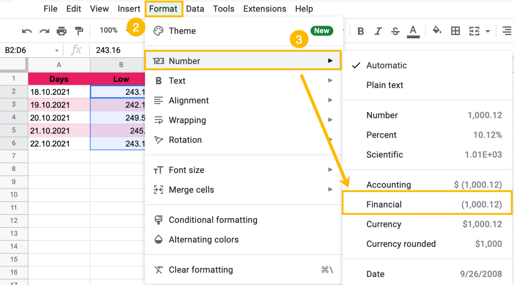
2. Go to Format.
3. Choose Number > Financial.
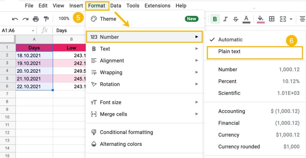
After that, convert Column A into “Plain text” format.
4. Select the dataset (A1:A6).
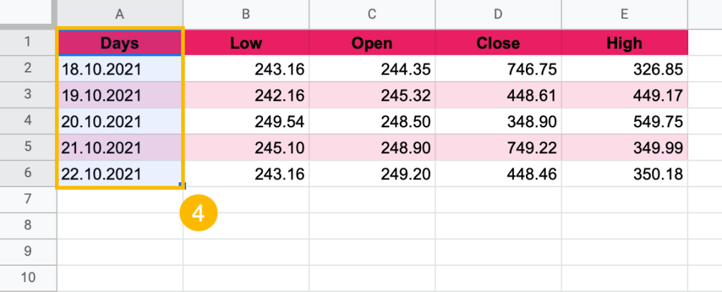
5. Choose Format and open the Number menu.
6. Select “Plain text.”
It’s that easy!
How to Create a Candlestick Chart in Google Sheets
Now everything is ready for creating your Candlestick chart.
To create a Candlestick chart, follow these simple steps:
1. Highlight the dataset (A1:E6).
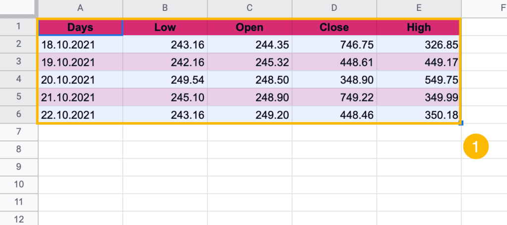
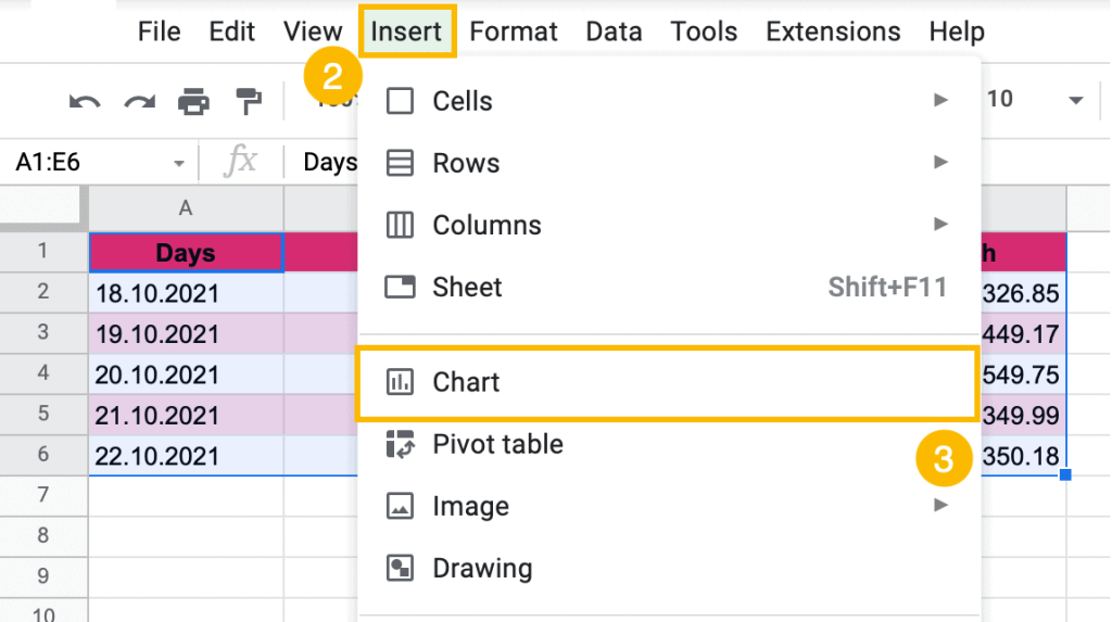
2. Select “Insert.”
3. Go to “Chart.”
Google Sheets offers you a random chart. This is okay. We can change it to what we want.
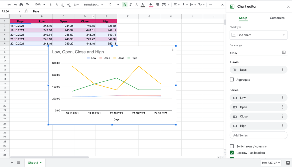
For a Candlestick chart:
1. Click on the three dots in the upper right corner of the chart. (You may need to select the chart first.)
2. Select “Edit Chart.” This will open the task pane side window.
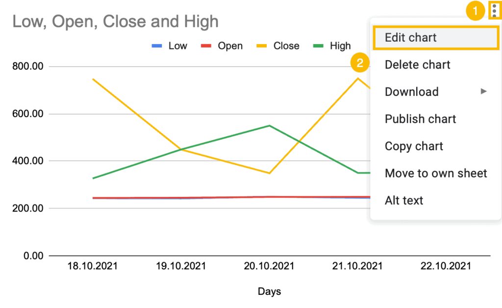
3. From the Chart type dropdown box, scroll down to choose “Candlestick chart.”
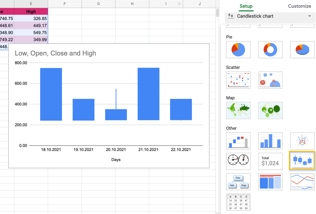
Amazing! You nailed it!
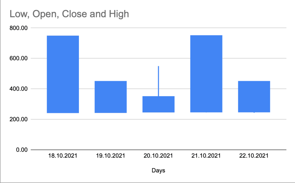
However, we don’t stop here. Let’s customize our chart!
How to Customize a Candlestick Chart
There is one thing you need to know: you cannot change the color of the candlesticks.
Don’t worry! Google Sheets gives you other options for making your chart unique.
Let’s dive right into all the customization tools.
How to Сhange the Chart Style of a Candlestick Chart
How can you make your chart stylish?
1. Right-click somewhere on the chart plot.
2. Choose “Chart style.”
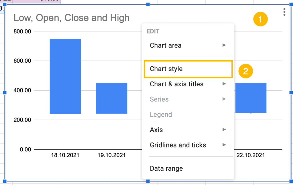
3. Change the background color under the “Background color” menu.
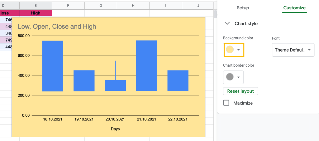
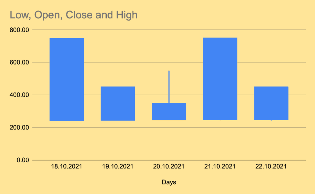
Looking great!
How to Change the Title on a Candlestick Chart
When the dataset was created, each column was given a title: Low, Open, Close, and High. This text defaults as the chart title. However, you can easily change it to something more suitable.
1. Double-click on the title on the chart plot.
2. In the “Title text” box, write your unique title for the Candlestick chart.
3. Modify the font of the title under the “Title font” box.
4. Increase or decrease the size of the title text under “Title font size.”
5. “Title format” allows you to change the alignment, emphasize, or distinguish words (modify the position, make the font bold or italic).
6. “Title text color” gives you the opportunity to choose the best color for the title to match your color scheme.
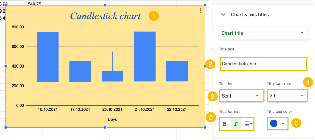
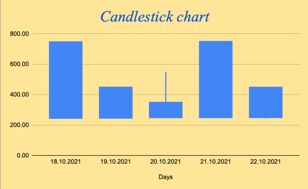
Amazing! With a proper title, the chart looks much more professional.
How to Modify the Horizontal Axis (X-Axis)
Each chart consists of two axes: horizontal and vertical. In the customization window, there is an option to modify each axis independently.
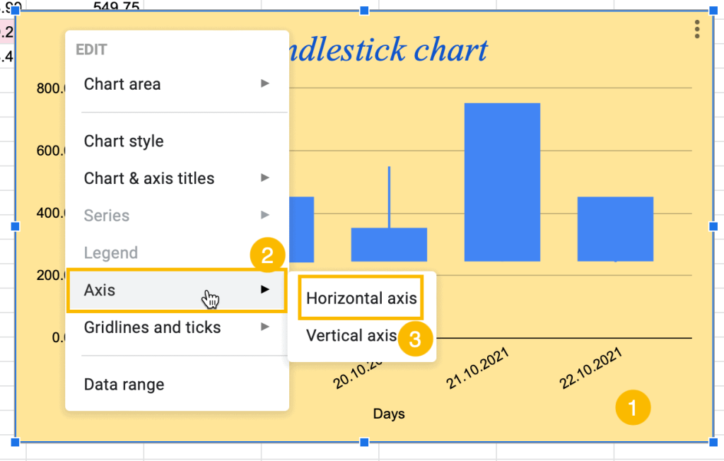
1. Right-click somewhere on the chart plot.
2. Select “Axis.”
3. Choose “Horizontal axis.”
In the task pane window, you will see customization tools.
4. Under “Label font,” you can change the font of the horizontal axis on the chart plot.
5. “Label font size” allows you to modify the size of the font.
6. In the “Label format” box, you can adjust the font’s formatting, making it bold or italic.
7. Choose the best color for the horizontal axis text in the “Text color” box.
8. Under “Slant labels,” change the slant of the horizontal axis. This is especially helpful when the text is too long to fit horizontally on the axis.
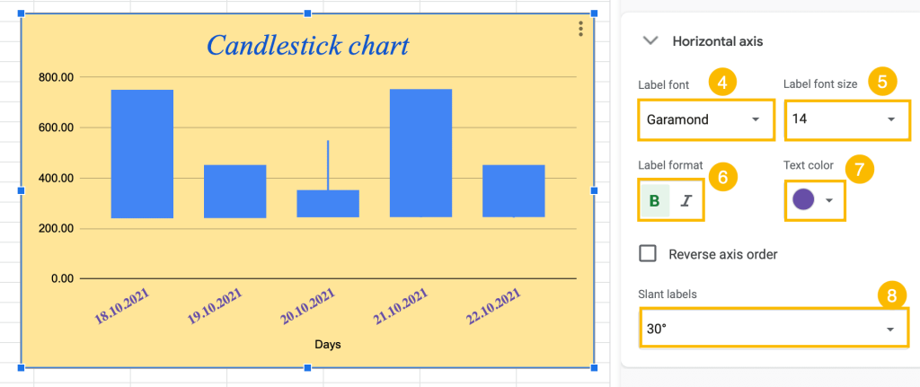
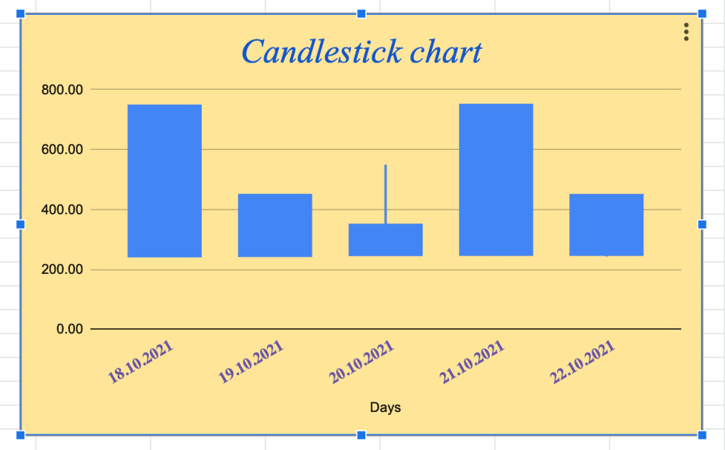
Adjusting the style of the horizontal axis gives your chart some flair.
How to Reverse the Axis Order of the Candlestick chart
Suppose you need to swap the order of the horizontal axis data so it goes in the other direction. No problem! You can do this in just a few clicks.
1. Double-click on the horizontal axis.
2. Check the box “Reverse axis order.”
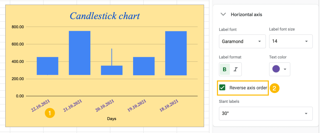
That’s all there is to it! To undo it, just uncheck the box.
How to Change the Vertical Axis (Y-Axis)
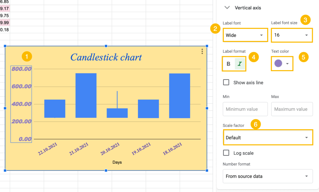
The “Vertical axis” has a few more features than the horizontal axis. For example, you may need to reduce the range of values so that the candlesticks appear larger. Let’s take a look at some of the functions.
1. Double-click on the vertical axis on the chart.
2. Change the font in the “Label font” box.
3. Adjust the size under “Label font size.”
4. Make the vertical axis bold or italic under “Label format.”
5. Modify the color using the “Text color” option.
6. Adjust the axis scale by choosing one of the options under “Scale factor.”
How to Add (or Remove) the Gridlines and Ticks of the Candlestick Chart
Finally, the last option to customize is “Gridlines and ticks.” Perhaps you’re wondering why you would need them at all on our Candlestick chart?
Gridlines are extremely helpful in making the data more accessible and easier to read.
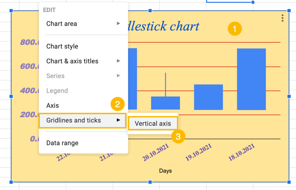
1. Right-click somewhere on the Candlestick chart.
2. Navigate to the “Gridlines and ticks” option.
3. Select “Vertical axis.”
4. To add Major and/or Minor Gridlines, tick the box “Major gridlines” and/or “Minor gridlines.”
5. To modify the color of major or minor gridlines, click on the “Gridline color.”
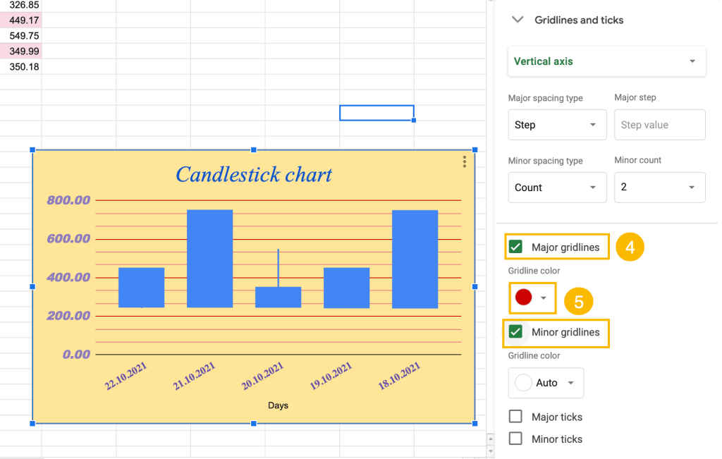
To remove gridlines and ticks, simply unselect the boxes.
Note: You can hide gridlines and keep axis labels—just use the same color for the gridlines and chart background. To customize the number of gridlines in your chart, enter a number in the box under “Major gridline count” or “Minor gridline count.”
Congrats! You can modify the Candlestick chart as you wish.
Follow these customization tips to make your chart unique and special!