
Knowing how to create a residual plot is so key to improving your regressions.
In this step-by-step guide, we will show you how you can chart your residuals in Excel in just a few steps – even if you’re a complete newbie.
What Is a Residual Plot and Why Is It Important?
The answer is quite simple: a residual (e) is the difference between the observed value (y) and the predicted value (ŷ).
e = y – ŷ
For example, if your observed value is “2” while the predicted value equals “1.5,” the residual of this data point is “0.5”. For each data point, there’s one residual.
In regression analysis, a residual plot is a scatter plot where the independent variable (x) is plotted on the horizontal (x-) axis while the residual is on the vertical (y-) axis.
The goal of a residual plot is to help you understand whether the regression line you’re using is good at explaining the relationship between the variables.
For example, it can check:
- the linear relationship between the independent and dependent variables (the pattern must be linear, not U- or inverted U-shaped);
- homoscedasticity (whether or not the residuals are scattered evenly);
- the independence of observations (whether or not there are any distinct patterns).
Long story short, if you don’t know whether a given regression model is suitable for your data, creating a residual plot is one of the quickest ways to test it out.
Without beating around the bush, let’s move on to the practice part of building one in Excel.
Step 1. Load and Activate the Analysis ToolPak
Our first step is enabling the Analysis ToolPak, a built-in data analysis tool that allows you to take a deeper dive into your data.
If you’ve never used the tool before, here’s how you can activate the Analysis ToolPak:
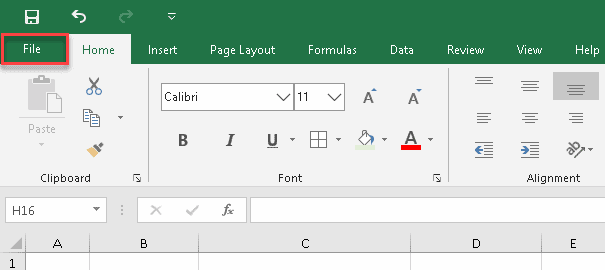
1. Click the File tab.
2. Click “More…”
3. Select “Options” from the sidebar menu.

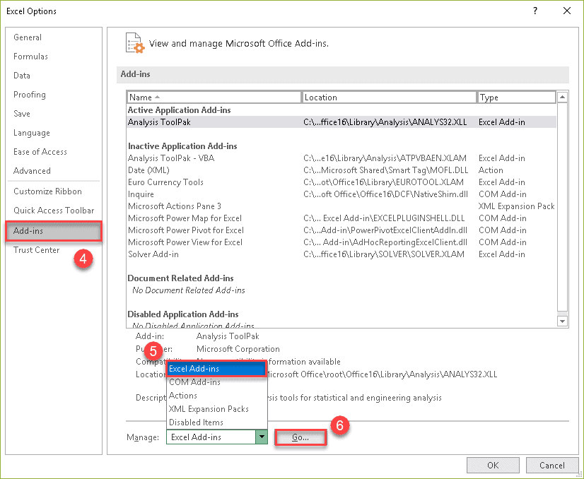
4. In the Excel Options dialog box, navigate to the Add-ins tab.
5. Select “Excel Add-Ins” from the “Manage” drop-down list at the bottom.
6. Click “Go…”
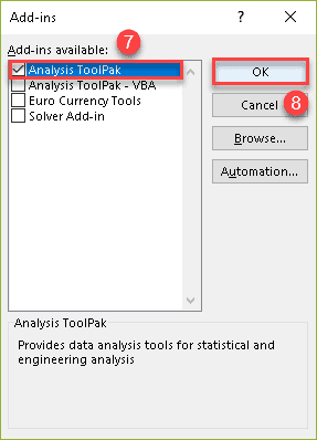
7. In the Add-ins dialog box, check the “Analysis ToolPak.”
8. Click “OK.”
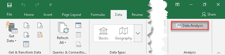
Once there, the “Data Analysis” button should appear in the “Analysis” group of the Data tab.
Step 2. Arrange the Data
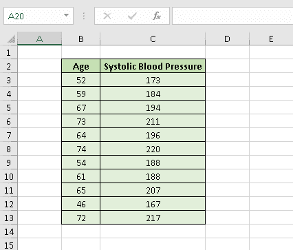
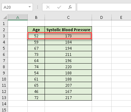
To demonstrate the process of creating a residual plot, we’re going to analyze the correlation between age and systolic blood pressure.
9. Let’s create a table with the independent variable (age in years) in the first column and the dependent variable (systolic blood pressure) in the second one.
Once it’s done, we can finally get down to business.
Step 3. Create a Residual Plot
Although it may seem a bit complicated initially, creating a residual plot in Excel is not rocket science. Just follow these simple steps:
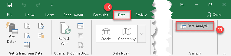
10. Click the Data tab.
11. In the “Analysis” group, click the “Data Analysis” button.
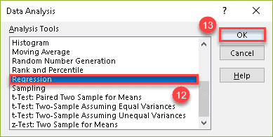
12. In the “Data Analysis” dialog box, skim through the list under “Analysis Tools” and choose “Regression.”
13. Click “OK.”
14. In the “Input Y Range” field, specify the cell range where the dependant (predictor) variables are stored. In our case, it’s column Systolic Blood Pressure (C2:C13).
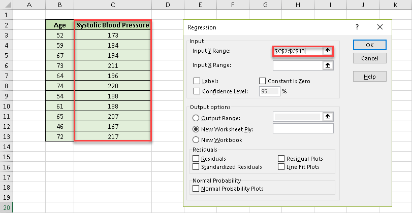
15. After that, in the “Input X Range” field, select the range where the independent (explanatory) variables are stored. In our case, it’s column Age (B2:B13).
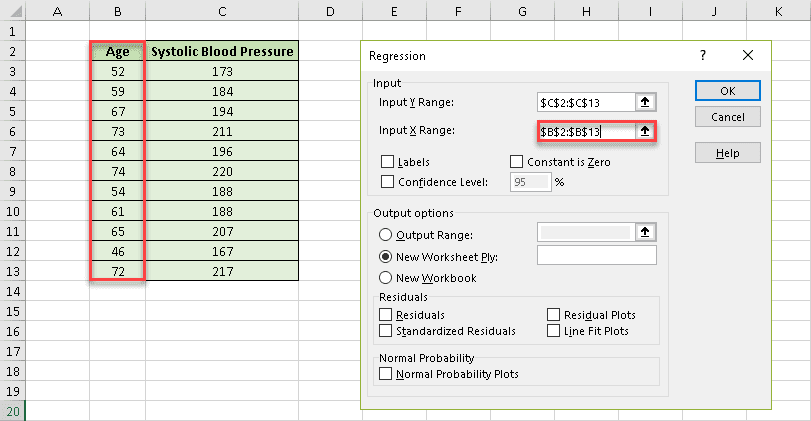
16. Check the “Labels” box to help Excel locate and ignore the header row (B2 and C2).
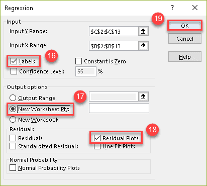
17. Under “Output options,” choose where you want Excel to return the regression analysis output. We highly recommend selecting the “New Worksheet Ply” option to keep your residual plot and any supporting data separated from the original data set.
18. Check the “Residual Plots” box.
19. Click “OK.”
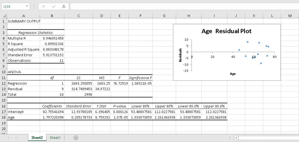
Easy-peasy! Excel has done all the hard work of crunching the numbers and charting the residuals on a simple, pre-formatted scattered plot:
Step 4. Interpret the Output
Whenever you run the regression analysis in Excel, the output can be broken down into four distinct categories:
- Regression Statistics
- ANOVA Table
- Coefficients Table
- Residual Output
Although Excel assists you in performing complex calculations, it cannot interpret those numbers for you.
For that reason, in this section, we will cover how to analyze all of those scary numbers generated by the Analysis ToolPak.
Regression Statistics
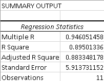
This part is all about the so-called goodness of fit (GoF) measures. They compare the observed data with the predicted values to check how suitable your model is for a given set of data.
1. Multiple R
This numerical measure is also called the correlation coefficient. It shows the strength of the statistical relationship between two variables and can range from −1 to +1, where:
- +1 indicates a perfect positive linear relationship;
- −1 indicates a perfect negative linear relationship;
- 0 means no linear relationship at all.
2. R Square
Called the coefficient of determination, this number is calculated as (Multiple R)². It shows the relationship between the observed and predicted data values, which makes it a primary indicator of a good model. If you work with raw data, here’s how to square a number in Excel.
The closer the coefficient is to 1, the more robust and reliable the model is. For example, our R² is ~0,895, so we can conclude that our regression model does a great job at showing the relationship between the data points.
3. Adjusted R Square
This modified version of R² takes into consideration the number of predictors in a regression model.
Therefore, it is a perfect choice for multiple regression analysis with a lot of independent variables.
4. Standard Error
The standard error of the regression shows the standard deviation of the coefficient by estimating the average distance between the observed values and the regression line.
5. Observations
This value indicated the overall number of observations used in your regression model, plain and simple.
ANOVA Table
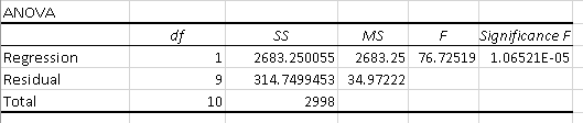
Analysis of variance (ANOVA) determines the significance of your research. It examines the differences between groups of data to identify whether they are caused by systematic (statistically significant) or random (statistically non-significant) factors.
The results of the ANOVA test are presented in the ANOVA table.
Let’s examine its contents:
1. df
Degrees of freedom is the number of logically independent values. There are only two simple rules you must keep in mind:
- The bigger the data set, the higher the degrees of freedom.
- The more parameters you add to the model, the lower the degrees of freedom value is.
2. SS
The sum of squares helps measure the deviation of your data from the mean value. If the number is high, that indicates a huge variation in the data – which means that your model is not the most optimal way to analyze a given data set.
3. MS
The mean sum of squared residuals is a number calculated by dividing the sum of squares by the corresponding degrees of freedom (SS/df.) It is also used to determine the spread of the data points.
4. F
Named in honor of Sir Ronald Fisher, the F-test for the null hypothesis checks the overall validity of your model. If this number is high, the model is a good fit for your data.
5. Significance F
The Significance F value indicates the probability of the null hypothesis – in other words, the probability of all the coefficients in our regression output being zero.
Checking the Significance F value is the quickest way to understand if your regression model is reliable. If it’s more than 0.05 (as in our case), the model may not be the most reliable way to analyze your data.
Coefficients Table
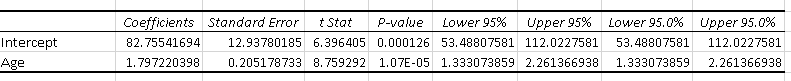
The regression coefficients table provides you with the detailed breakdown of the data you used in your analysis, such as:
1. Coefficients
The least squares estimation by which the predicted values in an equation are multiplied.
2. Standard Error
The standard deviation of the coefficient by which it varies across different cases.
3. t Stat
The ratio of the estimated coefficient to its standard error which is used to support or reject the null hypothesis.
4. P-Value
The probability that the results of the statistical hypothesis test will be at least as extreme as the results observed in the data set, assuming the null hypothesis is correct.
5. Lower & Upper 95%
The lower and upper boundaries of the confidence interval.
The first row of the coefficients table shows the results for the intercept (also known as the constant), which is the expected mean value of y when the value of x is 0.
The second row deals with the slope, which describes the steepness of the regression line by comparing the rate of change in y against the change in x.
You can use these values to build a simple linear regression equation:
y = mx + b
- y is the dependent variable (systolic blood pressure);
- x is the independent variable (age);
- m is the slope;
- b is the intercept.
Let’s say we know that a person is 52 years old and want to predict their systolic blood pressure (for convenience, we’ve rounded the numbers to three decimal places):
y = 1.797 * 52 + 82.755
1.797 * 52 + 82.755 = 176.199
Voilà! Now you know that the estimated systolic blood pressure of a 52-year-old person is approximately 176 mmHg and can do the same calculations for any other age you need.
Read More: How to Create a Linear Calibration Curve in Excel
A Final Note
Wait a minute! If you’re attentive enough, you probably have noticed that there’s a slight difference between what we have just calculated and our actual data:
Why is that the case? To answer this question, we need to look at the residual table:
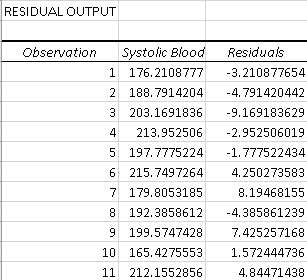
The thing is that you can never reach the prediction accuracy of 100%, and this table shows how the actual and predicted values differ from each other.
If you take the predicted value of the first data point (176.21) and add the residual (-3.21), you will get the actual value:
176.21 + (-3.21) = 176.21 – 3.21 = 173
You now have all the information you need to create and analyze a residual plot in Excel.
Doing regression analysis in Excel might seem like a daunting task, but with a bit of effort and patience, you can master the art of creating residual plots and go on to explore new Excel horizons! But there’s so much more to that when it comes to analyzing data. Check out our guide on creating a run chart in Excel to up your data analysis game.
