
To make a time series chart in Google Sheets, select your values, go to the Insert tab, and select “Chart” to plot your time or date series. In the Setup tab of the Chart editor, under “Chart type” pick the chart type most optimal to visualize your data.
Plotting time and date series is a seemingly simple task, but sometimes, you might not be able to get your values plotted the way you need.
And it comes down to one simple thing.
Stick around to learn the ins-and-outs of the process of making time series charts in Google Sheets.
Grab a free copy of our practice spreadsheet to access different types of time series charts.
Step 1: Prepare Your Data
Let’s start off by getting our original data in order. Here’s a quick table representing how John Doe was trying to pay down his debt throughout 2022—and it seems like he did a pretty good job!
Here’s the breakdown of the columns in the data table to help you adjust with your data:
- Column A (Date) – This column represents our time values. Whenever possible, always, always, always try to plot your time series of the X-axis. This is where most people get stuck. We want Google Sheets to automatically treat the date values as categories. Otherwise, you’ll likely get a mess of a chart and need to take some extra steps to tweak the charting options to make your chart work.
- Column B (Debt Left) – These are the absolute values we’re going to use to make our time series graph.
Note: If you still fail to create a chart from your time or date values after following the steps covered below, you might need to use the DATEVALUE and/or TIMEVALUE functions to convert your date values and time values into a regular string.
Having prepped our data, let’s get down to the process of making a time series chart in Google Sheets.
Step 2: Create a Graph from Your Time Series
First, create a simple Google Sheets chart.
1. Highlight the entire data table.
2. Hit the “Insert” button to open the drop-down where most of the available data visualization options are located.
3. Choose “Chart” to create a graph based on your data.
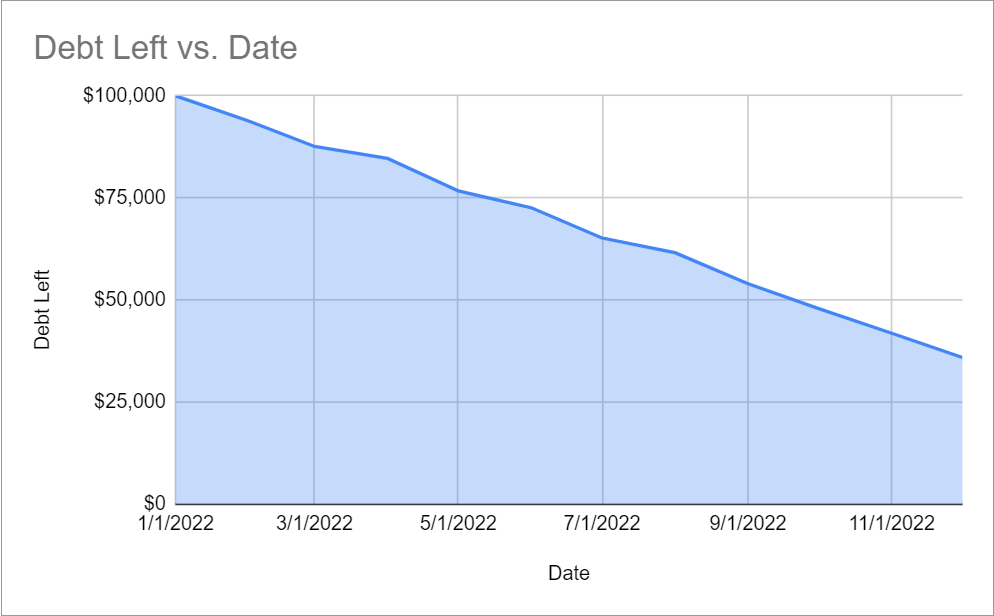
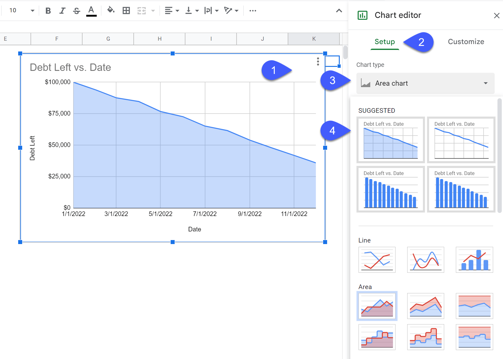
Once there, Google Sheets will automatically return a chart based on your underlying data. In our case, we got this basic area chart.
If you’re happy with the chart you got, good for you! You’re done with your task and have successfully created a chart using time series.
However, if you want to change the chart type, here’s what you need to do.
Step 3: Change the Chart Type (Optional)
Here are the steps you need to take to change the chart type of your time series graph.
1. Double-click on your chart to open the Chart editor.
2. Navigate to the Setup tab.
3. Open the “Chart type” drop-down menu to explore the chart type options available for you.
4. Choose the chart type that fits your needs.
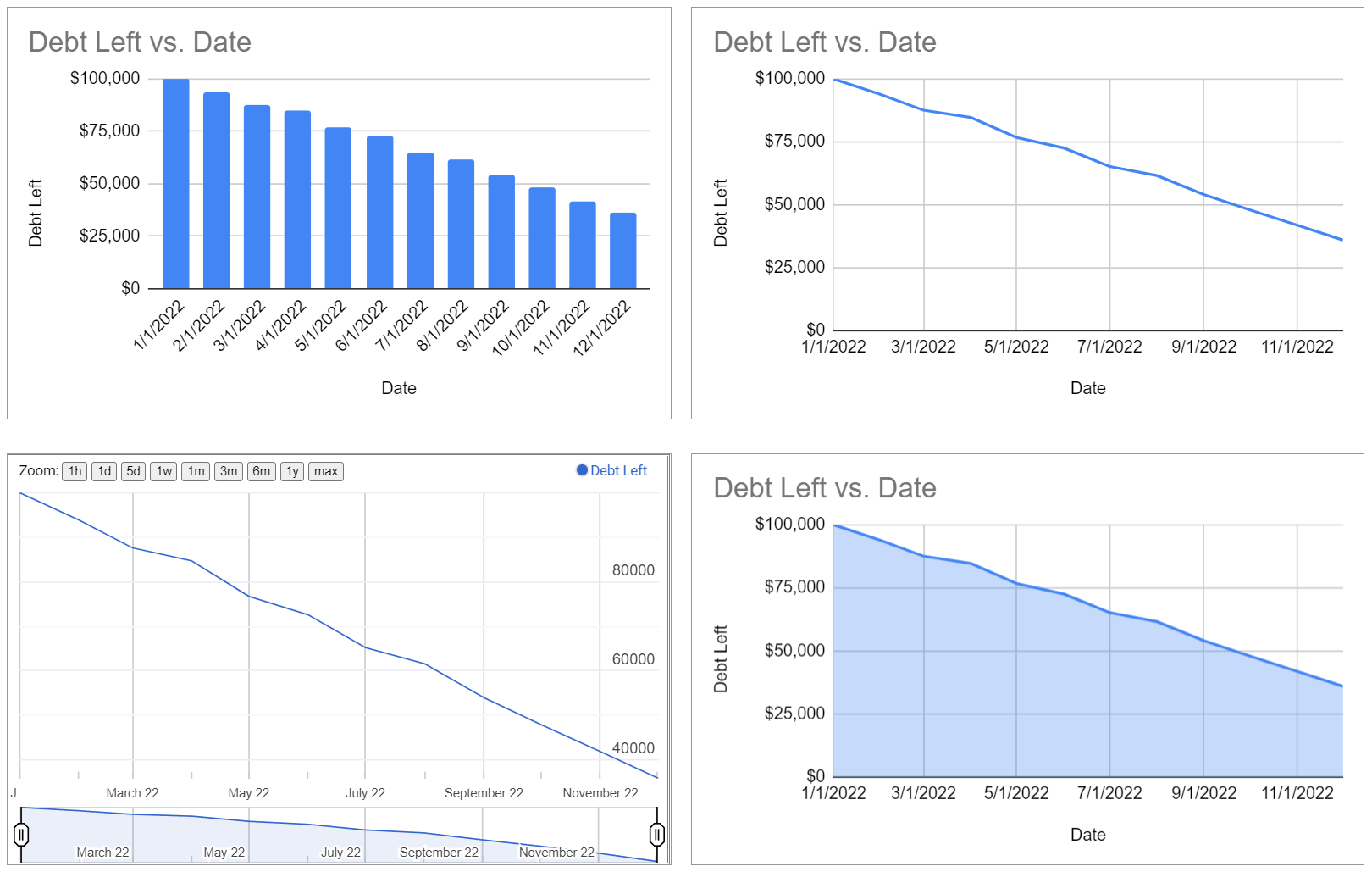
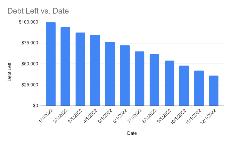
As for me, I really like what this column chart looks like because, as opposed to other chart types, it shows all the date values we have in our data table.
3 Best Chart Types to Use with Date/Time Series
Feeling stuck and don’t know which chart type would work best with your data?
We’ve got you covered!
When it comes to plotting time or date series, these three Google Sheets chart types never fail to deliver.
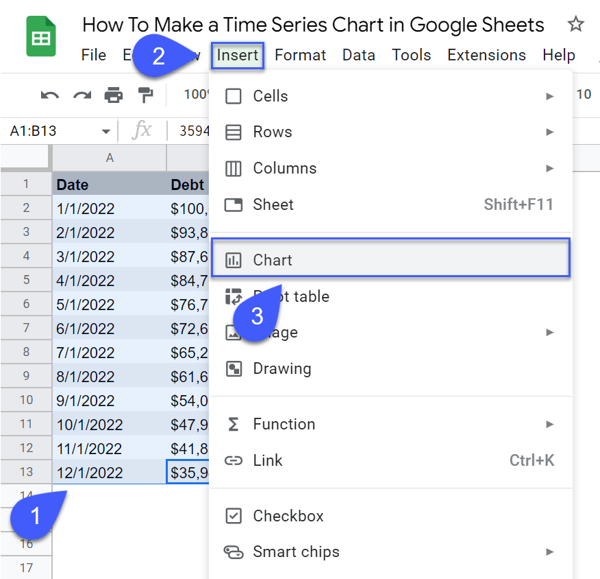
Timeline Chart
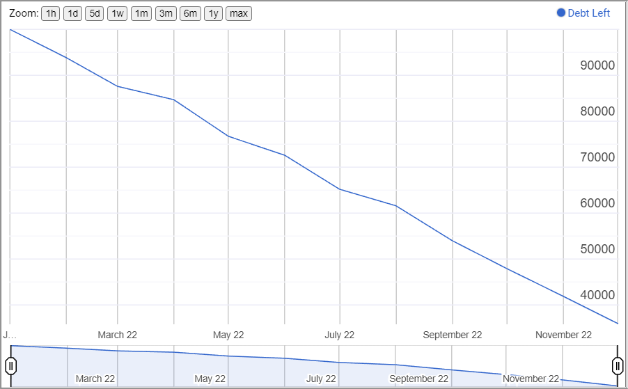
A Google Sheets timeline chart is, hands down, one of the best chart types to use when working with time or date series.
Timeline charts are great because they allow you to zero in on a specific segment of your graph, allowing you for a more granular view of your data.
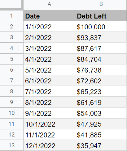
Line Chart
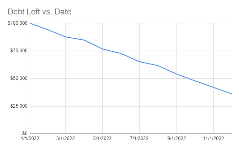
Line charts, by definition, are used to compare a continuous change in values over time, making it one of the go-to chart types for date values. As simple as that.
Clustered Column Chart
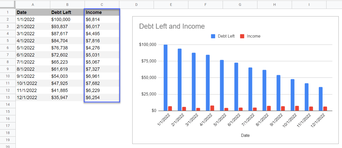
Clustered column charts work best when you have multiple data series compared using the same unit of measurement.
Let’s add Сolumn Income to our data table. While we can still use a regular line chart, as you add more series to your data, a clustered column chart becomes an increasingly better option.
So use this chart type when you have five or more data series you need to plot.
