
Did you know that in France a “pie chart” is called a “camembert”? Yes, just like famous soft cheese! In fact, it doesn’t matter what you call it; what matters is that it can help you visualize your data in a catchy and simple way.
In this step-by-step guide, you will learn how to create and customize a male/female pie chart in Excel.
Overview
A male/female pie chart depicts a part-to-whole relationship between (surprisingly!) men and women by dividing a circle into proportional segments.
The goal of such charts is not to make accurate or precise comparisons but to help the audience understand how constituent parts of the chart contribute to the overall picture.
Here’s a quick list of where male/female pie charts may come in handy:
- Sociological surveys
- Market research reports
- Advertising and promotion
- Academic papers
- Infographics, brochures, and posters
So, let’s get the ball rolling.
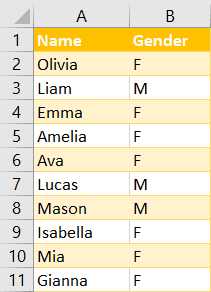
Sample Data
To show you the ropes, we need to start with some initial data. This is a two-column table that contains the names and genders of ten imaginary people.
Our task is to visualize the proportional distribution of the males and females in the list.
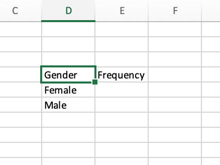
Step 1. Count the Number of Occurrences
The first step is to count how many males and females there are. Of course, if the data set is small, it won’t be a problem to do it manually. However, what alternatives exist for those working with large volumes of data?
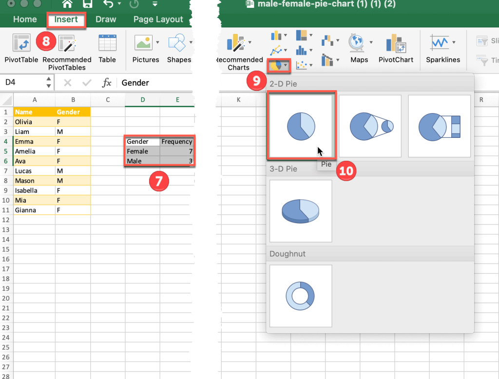
1. Let’s create one more table. This can go anywhere on the sheet.
2. Once you have this basic table set up, select the blank cell beside “Female” and type the formula =COUNTIF followed by an open parenthesis.
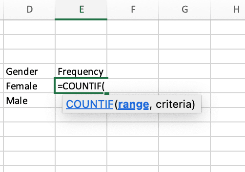
As you can see, there are two arguments we need to include: range (Where do you want to look?) and criteria (What do you want to look for?).
3. Click and drag through the cells that you want to use as part of the calculation (B2:B11) and add a comma after the range.
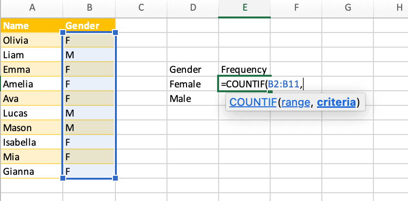
4. Well done! But the condition is still missing. Type our criteria (“F”) in quotation marks or single quotes, and don’t forget to close the parenthesis.
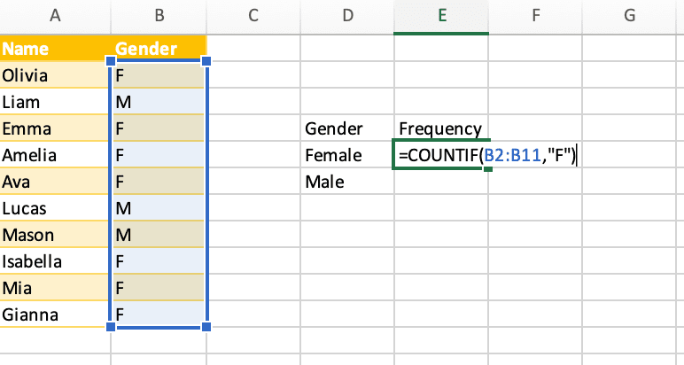
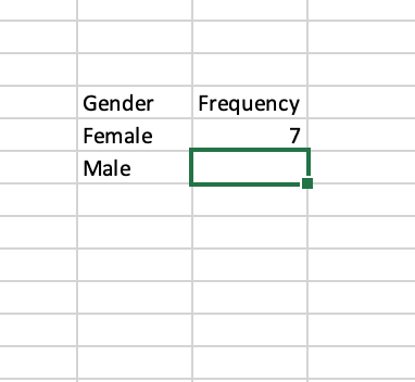
5. At last, press ENTER to apply the formula to that cell.
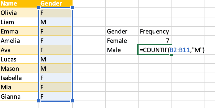
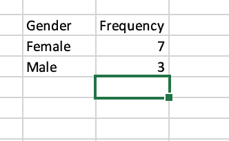
6. Voilà! Now let’s do the same thing for males. Just change the criteria from “F” to “M.”
Everything is now ready to create a pie chart.
Recommended: How to Type Statistical Symbols in Excel: X-bar, Y-bar, and P-hat
Step 2. Add a Pie Chart
Once you have all the necessary data ordered, it’s high time to bring it to life with the help of a pie chart. Here’s how we do it:
7. Select the entire dataset of the table you just made (D4:E6).
8. Switch to the Insert tab.
9. Choose Insert Pie or Doughnut Chart.
10. Pick the chart you want (we chose the simplest: 2-D Pie).
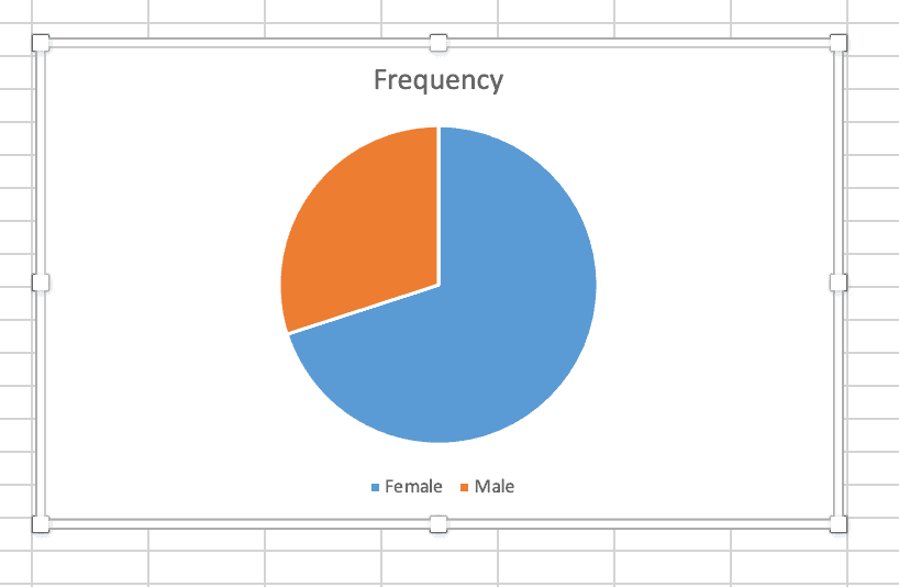
Congrats! You’ve just created a fully functioning pie chart.
Basically, the main goal of the guide has been achieved, so you can stop reading here. However, you can express your artistic flair by making this plain pie chart a little fancier. The final steps will help us sort it out.
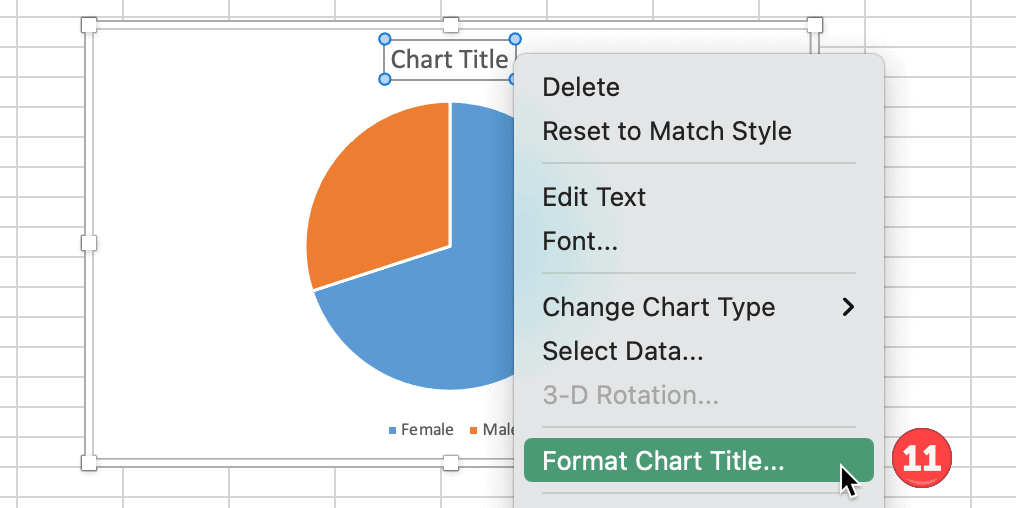
Step 3. Change the Chart Title
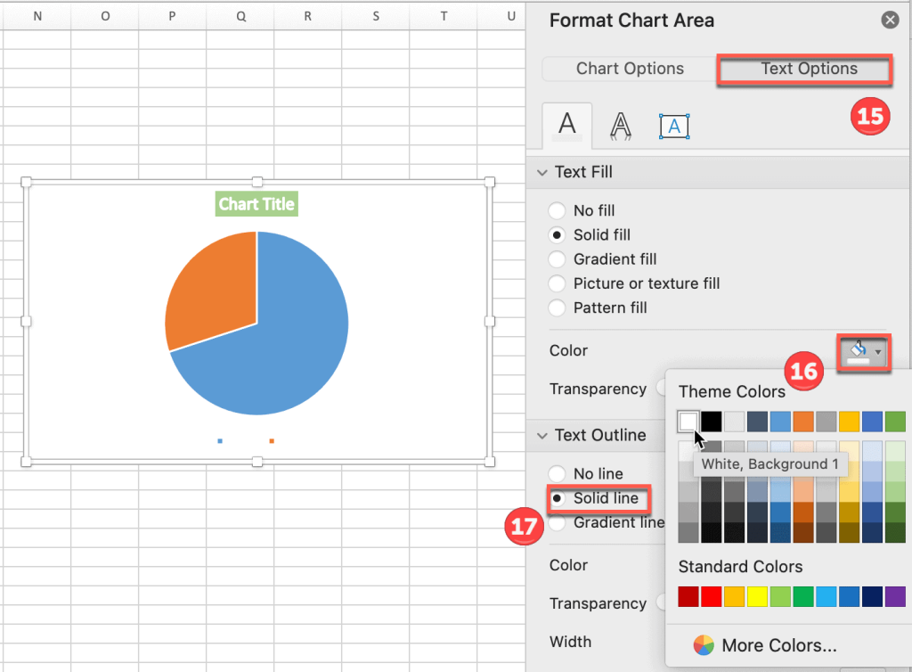
11. Let’s start with changing the title of our pie chart. Just click it and type whatever you want. By right-clicking the title, you can choose Format Chart Title and then select the formatting options you want to apply.
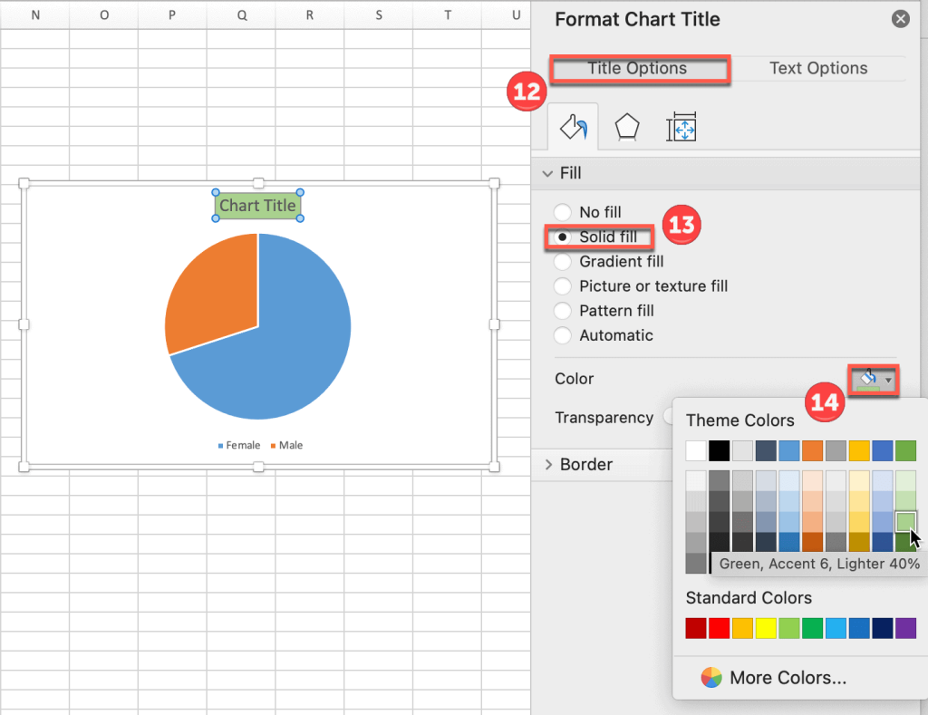
12. First, we’ll fill the title box with a green color. Use the task pane Format Chart Title on the right and select Title Options.
13. Expand the “Fill” menu and choose the “Solid fill” option.
14. Click the icon next to “Color” and choose any color you want (we went with green).
15. Now let’s make the font white and bold. Select the tab Text Options from the same task pane.
16. Click the icon next to “Color” and pick the color you would like for your font (such as white).
17. Expand the “Text Outline” menu and choose the “Solid line” option to make the text bold.
Step 4. Recolor the Chart
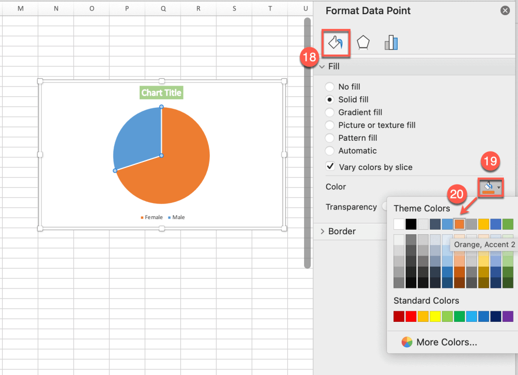
Awesome. Now let’s try to change the color of the pie segments. For instance, say you want blue to be used for men and orange for women. Double-click the pie chart slice you want to recolor.
18. In the Format Data Point task pane that appears, switch over to the Fill & Line tab.
19. Under “Fill,” hit the “Fill Color” button.
20. Pick orange (or any other color) from the color palette.
Repeat these steps for the other slice(s) of the pie.
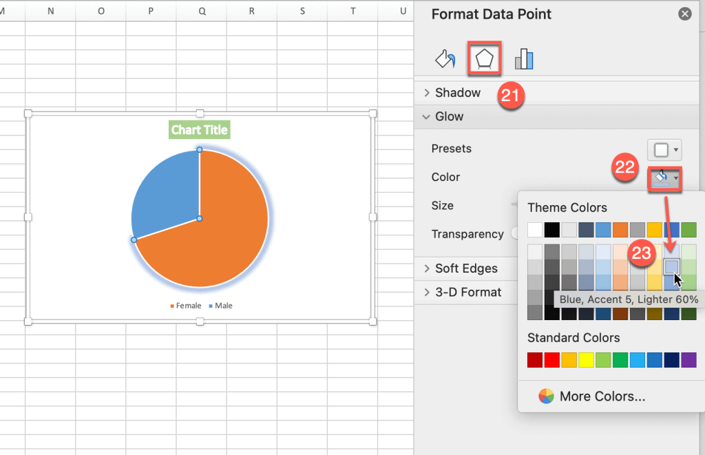
Using the same task pane, you can also add some glow to make your pie chart shiny and eye-catching.
21. Switch over to the Effects tab.
22. Under “Glow,” hit the “Glow Color” button.
23. Choose the desired color of the glow (we used blue for the orange slice to make it stand out).
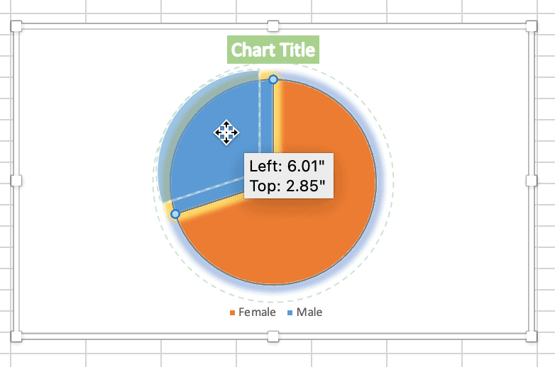
Step 5. Explode a Single Slice (Optional)
24. If you want to draw attention to a specific segment of your pie chart, you can click the slice you want to “explode” and then drag it away from the center of the chart.
Related: How to Make a Pie Chart in Excel with One Column of Data
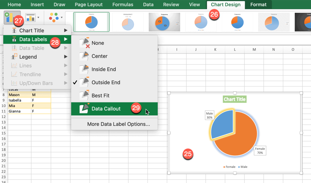
Step 6. Create Data Labels
Another helpful option that you can add to your pie chart is to include data labels. It will make it easier to read because people won’t have to keep looking from the legend to the pie in order to match the colors. Here’s the quickest way to do it:
25. Click your pie chart to select it.
26. Open the Chart Design tab.
27. Click the “Add Chart Element” icon.
28. Choose “Data Labels.”
29. Pick the best position or click “Data Callout” (this wraps data labels in a shape).
Step 7. Add the Male/Female Icons
Finally, if your creation still doesn’t seem to be exciting enough, there’s one more tool you can use. Add some free icons for visual learners.
30. Click the Insert tab.
31. Choose Icons.
32. In the task pane that pops up, you will see a search menu. You can scroll through a wide range of icon categories, including people, animals, food, business, and more.
33. Once you find the icon you need, select it and click Insert. After that, you can drag and drop the icon where you want it to be.
As you have probably noticed, this was just a brief overview of all the incredible visualization tools available for making pie charts.
If you spend some time diving into more complex functions, you will be able to create small digital masterpieces that will meet your unique objectives. Take that step and make something amazing!
