
The Quick Analysis tool is the Swiss knife of data analytics that offers a set of easy-to-use yet powerful tools to manage data sets of any size – everything at the tip of your fingers.
If you have never used it before, this seemingly simple Excel feature will become your best friend to navigate the mean streets of spreadsheets with ease and quickly analyze data.
In this ultimate beginner’s guide, you will learn everything you need to know to use the Quick Analysis tool in Excel.
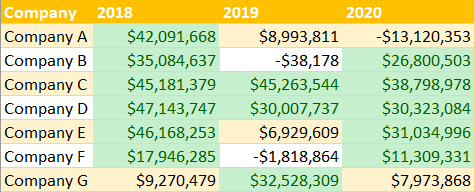
Sample Data
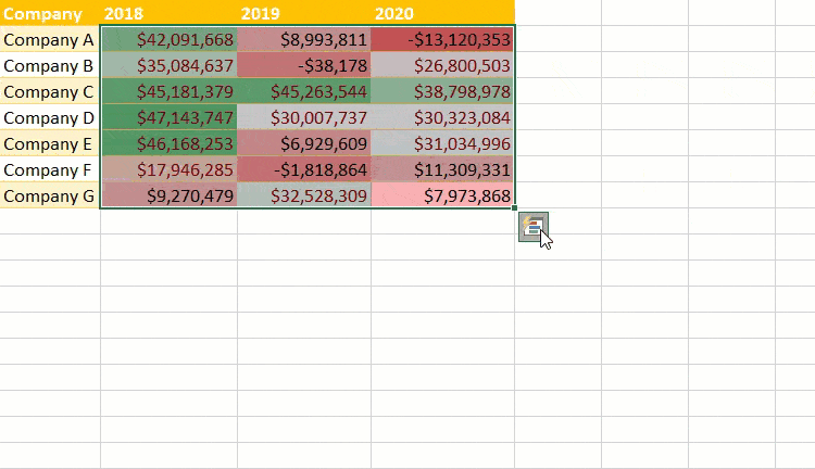
To show you the full potential of this tool, we’re going to use the following table that contains the historical revenue data of six fictitious companies:

Without further ado, let’s dive right in.
How to Turn on the Quick Analysis Tool
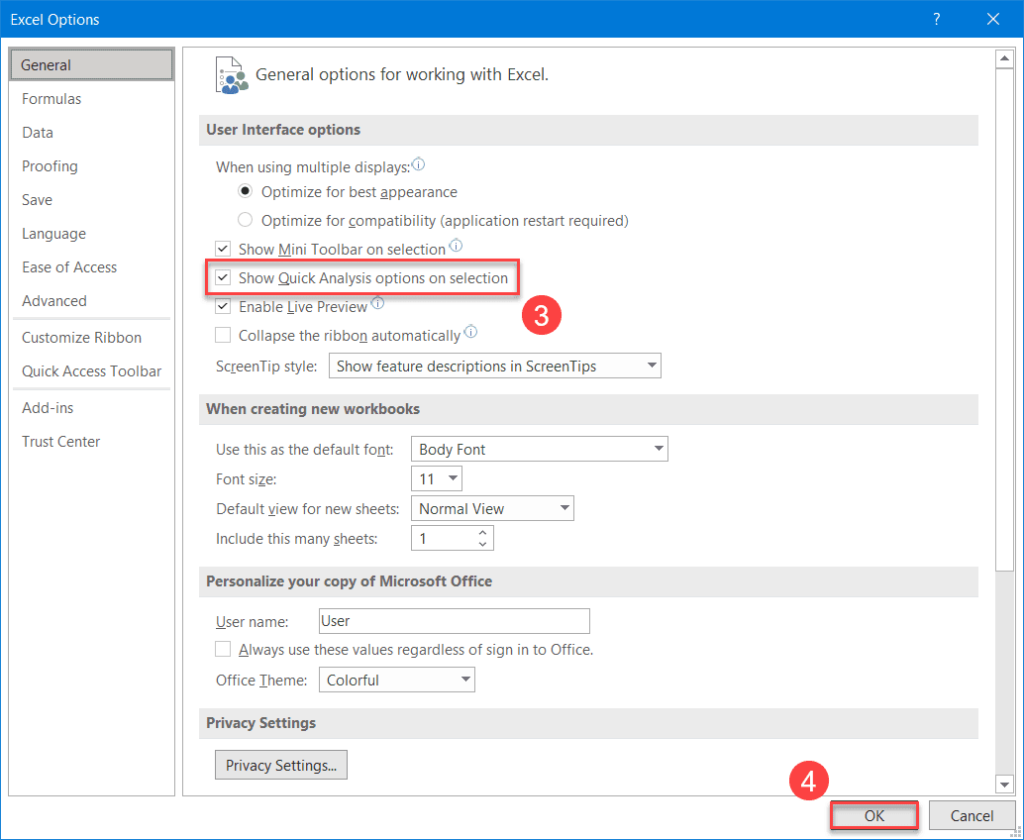
To start with, make sure the Quick Analysis tool is enabled. If that’s not the case, you can turn on the Quick Analysis feature by doing the following:
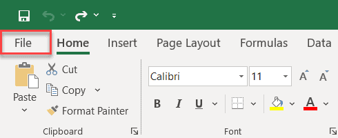
1. Go to the File tab.
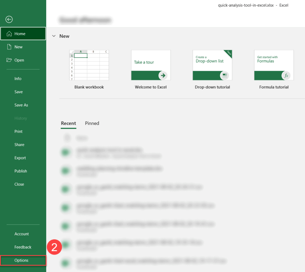
2. Click the “Options” button.
3. In the General tab, check the “Show Quick Analysis options on selection” box.
4. Click “OK” to close the dialog box.
Where Is The Quick Analysis Tool in Excel?
The beauty of this tool is that it’s just a few clicks away at any stage of working with your data. To open the Quick Analysis tool, you need to complete a few simple steps.
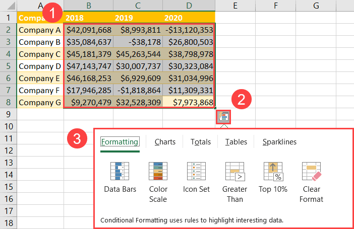
1. Highlight the cell range you want to apply the tool to (A1:D8).
2. Click the “Quick Analysis” button – or simply press the Ctrl + Q shortcut.
3. Once there, the Quick Analysis tool button will appear at the right bottom corner of the selected range.
In order to help you wring every last drop of value out of this handy tool, we will cover its every single feature.
Related Article: How to Clear the Clipboard in Excel
The Formatting Tab
The Formatting tab contains six data visualization tools that allow you to apply conditional formatting to your data, making it easier to analyze large volumes of data.
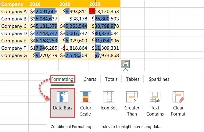
Data Bars
Data bars are a great tool to visualize your actual values. The length of the bars reflects the relative size of each value in comparison to the largest value in a data set. The color of the bars differentiates positive and negative values.
To add data bars using the Quick Analysis tool, in the Formatting tab, click “Data Bars.”
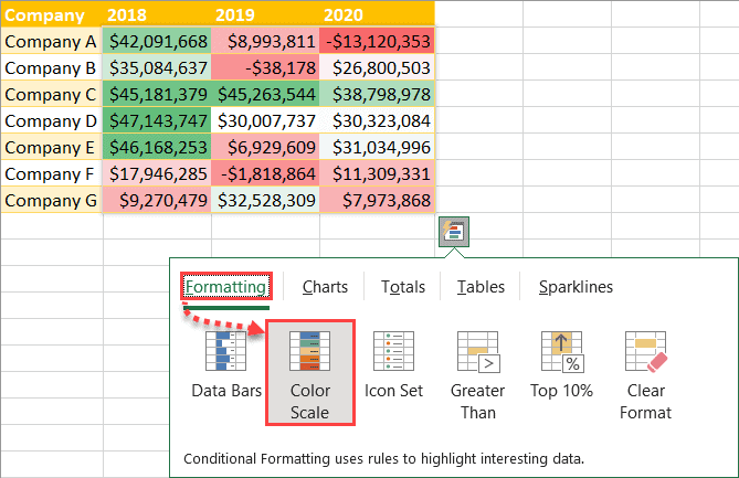
Color Scale
Color scales are a type of conditional formatting that modifies a background fill based on the actual values of each cell.
When you apply a color scale in Excel, the largest value ($47,143,747) is colored in dark green while the smallest value is colored in dark red (-$13,120,353). The rest of the values are colored proportionally based on where they stand relative to the median (the 50th percentile).
In order to use a color scale and formatting style in Quick Analysis, under “Formatting,” click “Color Scale.”
Icon Set
An icon set adds icons to all of the values in a data set based on dynamically calculated threshold values. When you do that using the Quick Analysis tool, your values are broken down into three categories.
In order to add an icon set, under “Formatting,” click “Icon Set.”
Greater Than
This conditional formatting type colors all worksheet cells that are greater than a specified value. Here’s how you can do this with your data.
1. In the Data Analysis tool, in the Formatting tab, choose “Greater Than.”
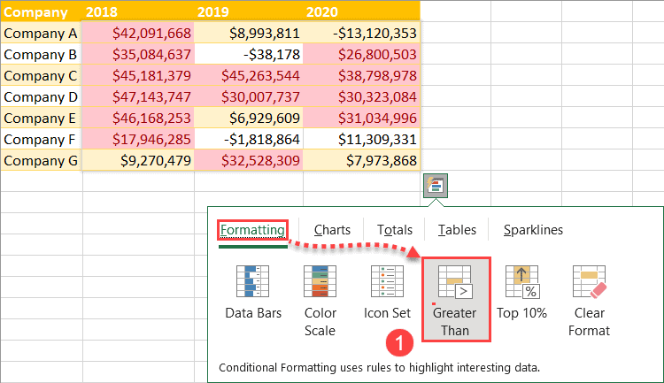
2. In the dialog box that appears, under “Format cells that are GREATER THAN:”, enter “$10,000,000” to color all of the cells in our data set greater than this value.
3. Next to “with,” choose “Green Fill with Dark Green Text” to create a conditional formatting rule.
4. Click “OK.”
As a result, all of the values that are greater than $10,000,000 will be colored in green.
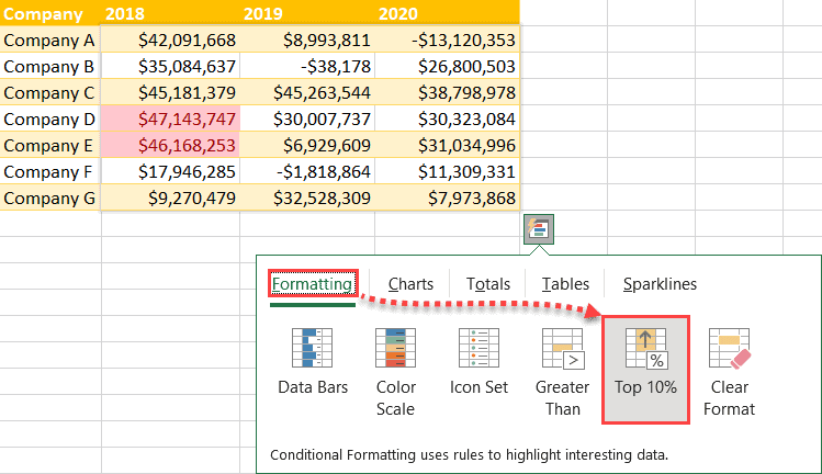
Top 10%
This conditional formatting rule works similar to “Top 10 Items,” recoloring the top 10 percent of values based on the number of items in the entire data set.
To highlight such values, in the Formatting tab, simply click “Top 10%.”
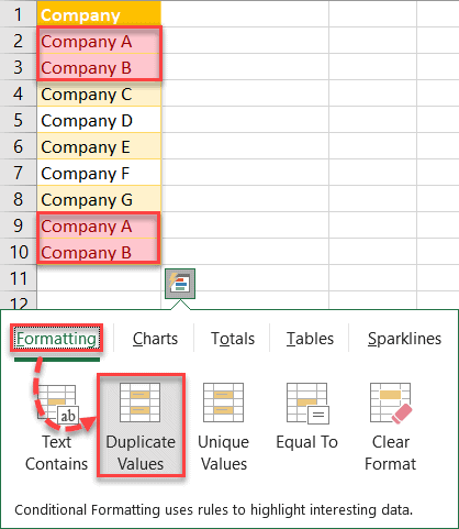
Duplicate Values
This conditional formatting rule colors sifts through the highlighted data and colors all of the duplicate occurrences in a given data set.
To highlight all of the duplicate values in your data table, under “Formatting,” click “Duplicate Values.” To pull off the same task of highlighting duplicate values in Google Sheets, you’ll need to resort to custom formulas or add-ons.
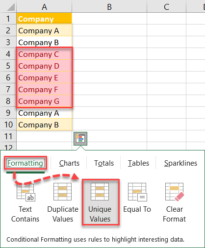
Unique Values
This conditional formatting rule changes the color of cells that contain the values that occur only once in the selected data table.
To highlight the unique occurrences of values in your data set, in the Formatting tab, choose “Unique Values.”
Clear Format
To remove any conditional formatting from the highlighted cells, under “Formatting,” click “Clear Format.”
The Charts Tab
If you think that conditional formatting options is everything the Quick Analysis tool has to offer, then think again.
With the help of this lovely tool, you can quickly put together an Excel chart to visualize your data. Here’s how you can pull it off.
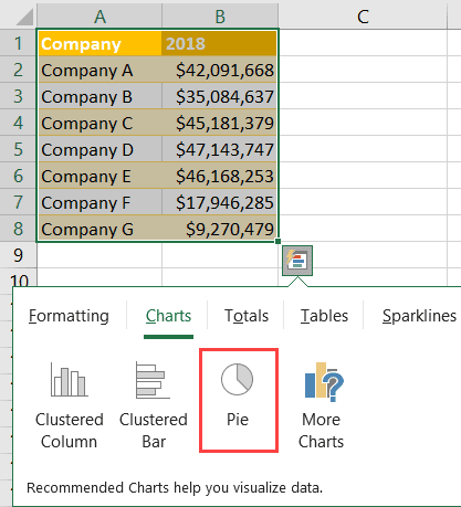
1. Highlight your data table, open the Quick Analysis tool, and switch over to the Charts tab.
2. Select the chart type that you think works best with your data using the options suggested by Excel (“Clustered Column,” “Clustered Bar,” “Line,” “Stacked Column,” or “Stacked Bar”) or click “More Charts” to access more data visualization tools.
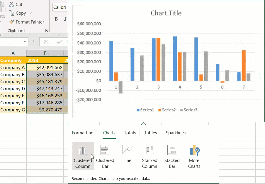
Note: Each time you want to create a chart using the Quick Analysis tool, Excel automatically tries to analyze your data set to provide custom recommendations based on the actual values. Notice how the suggested charts change once we remove two columns from the data table.
Finally, let us walk you through the “More Charts” option for those looking to create advanced Excel charts with the help of the Quick Analysis tool.
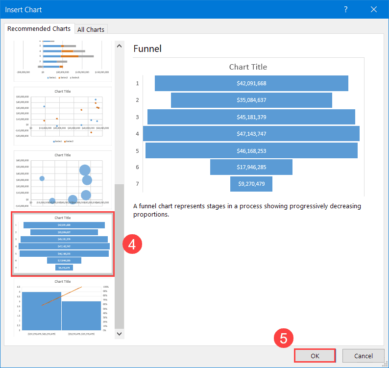
3. In the Charts tab, click “More Charts.”
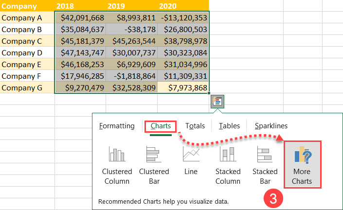
4. In the Recommended Charts tab, you can choose from a wider selection of Excel charts – alternatively, click the All Charts tab to access even more chart types.
5. Click “OK” to close out of the dialog box.
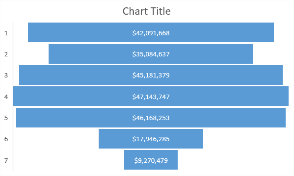
Once you have followed all of the steps outlined above, you should get this lovely funnel chart.
The Totals Tab
You think we’re done, right? We’re just getting started. In this section of the tutorial, we will show you how you can use the Quick Analysis tool to perform a quick data analysis.
The Totals tab offers you two sets of five identical data analysis tools (Sum, Average, Count, % Total, and Running Total) that you can apply both to rows and columns.
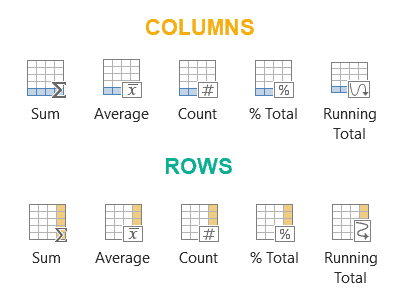
Let’s break down how to use each of these tools in greater detail.
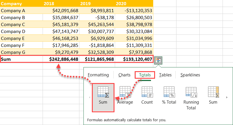
Sum
Click “Sum” to summarize data in each column using the SUM function.
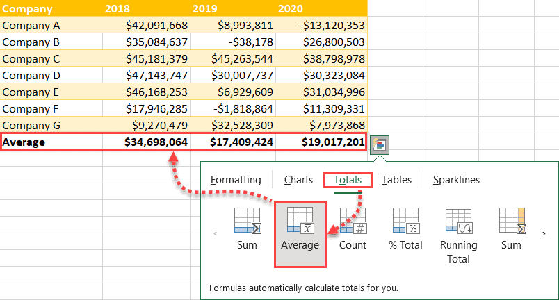
Average
Click the “Average” button to calculate the average value for each column (or row) using the AVERAGE function.
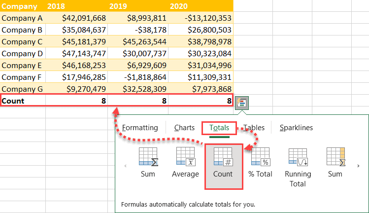
Count
Click “Count” to calculate the number of rows in each column – or the number of columns in each row – using the COUNTA function.
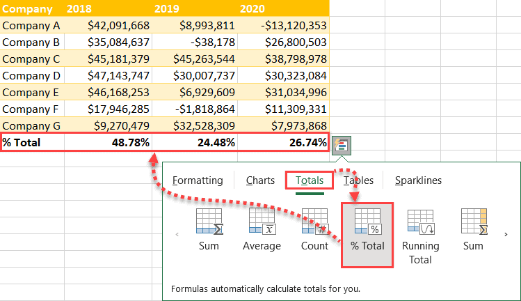
% Total
Click “% Total” to show the relative size of the sum of values in each column within the entire data set.
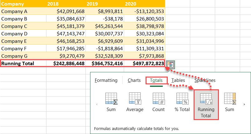
Running Total
Click “Running Total” to calculate a cumulative total – when you stack the sum of values in each column on top of each other.
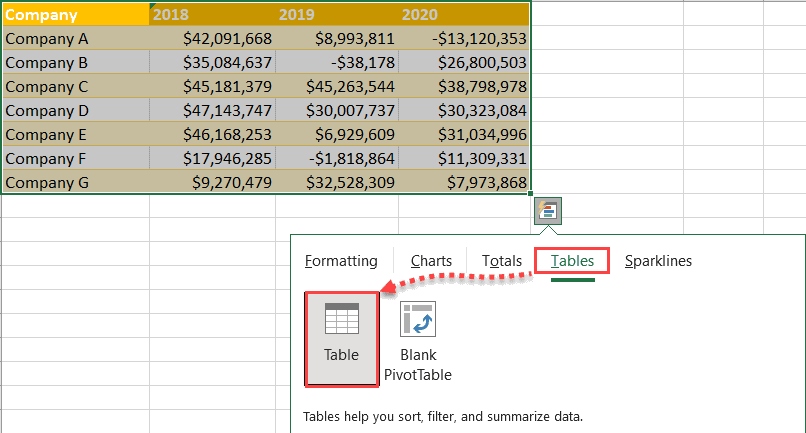
The Tables Tab
The Tables tab allows you to quickly convert your worksheet cells to a table or create a pivot table based on your data.
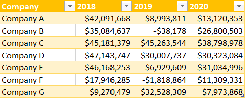
Table
Click “Table” to convert your regular range of data to a table.
At this stage, your cell range will be turned into a table:
If you want to reverse the changes, either use the Ctrl + Z keyboard shortcut or use any method to convert your table to a normal cell range.
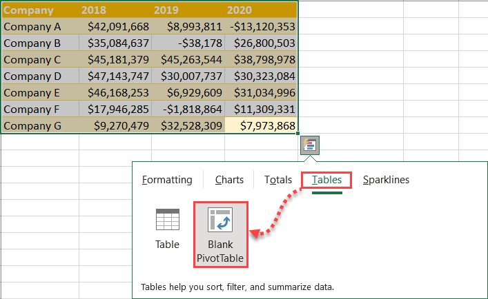
Blank PivotTable
Another thing you can do in the Tables tab is to create a blank pivot table.
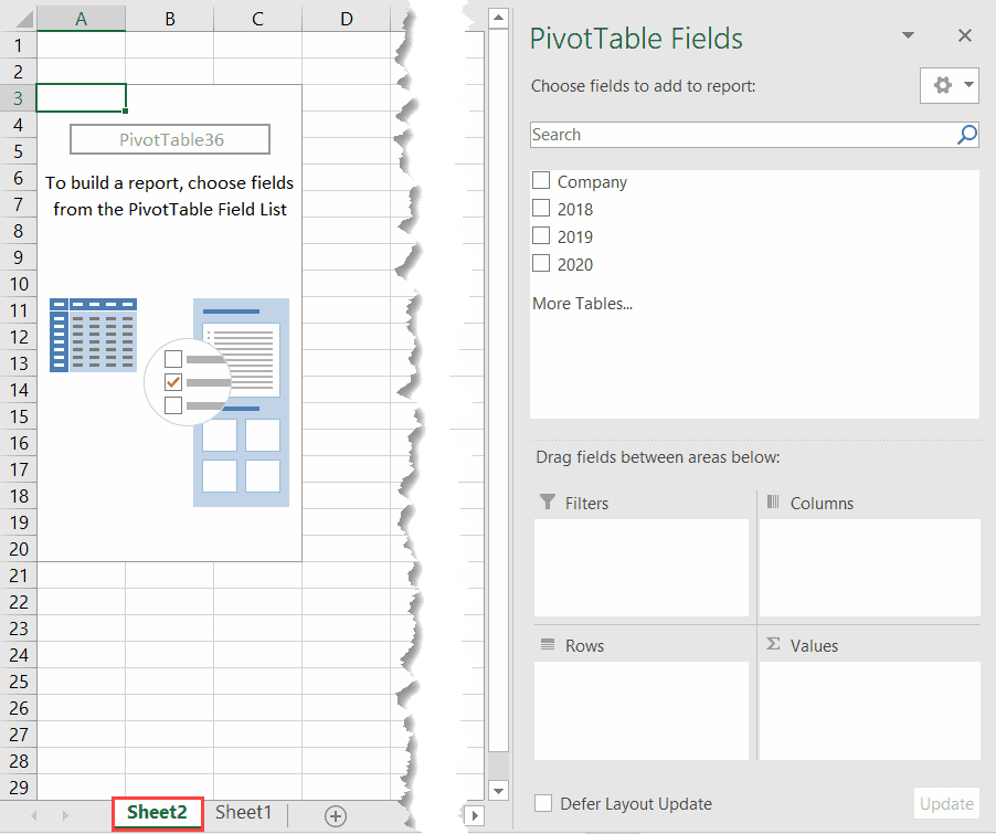
To do that, under “Tables,” choose “Blank PivotTable.”
If you do that, Excel will create a new worksheet with the corresponding PivotTable fields set up for you.
The Sparklines Tab
The last tab enables you to create simple in-cell sparkline mini charts to illustrate a pattern or trend in your data.
With the help of this tab, you can create line, column, and win-loss sparkline charts.
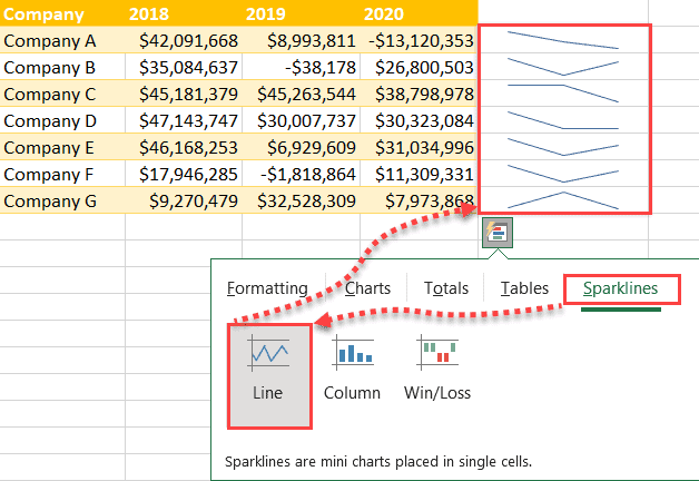
Line
To create a line sparkline in Excel using the Quick Analysis tool, under “Sparklines,” hit the “Line” button.
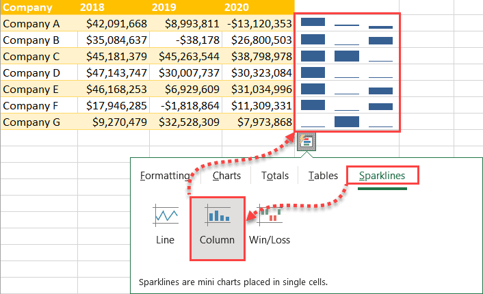
Column
In order to put together a column sparkline in the Quick Analysis tool, under “Sparklines,” select “Column.” If you need to create its larger counterpart, use our guide on how to create a clustered column chart in Excel.
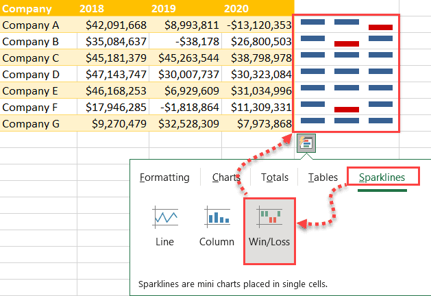
Win/Loss
Finally, armed with the Quick Analysis tool, you can create a win/loss sparkline chart to illustrate positive and negative changes in values over a certain period of time.
To do that, under “Sparklines,” hit the “Win/Loss” button.
FAQs
What Is the Quick Analysis Tool?
The Quick Analysis Tool is an Excel feature that allows you to quickly analyze data in a table or range of cells.
You can use the Quick Analysis Tool to quickly summarize data, find averages and sums, and calculate percentages. You can also use the tool to create charts and graphs of your data.
What Are the Limitations of the Quick Analysis Tool?
There are a few limitations to the Quick Analysis Tool in Excel. First, it only supports two-dimensional data.
This means that it can’t effectively analyze data that has more than two variables. Second, the Quick Analysis Tool is only designed to work with numerical data. This means that it can’t effectively analyze data that includes text or non-numerical values.
Finally, the Quick Analysis Tool is limited to analyzing data from a single worksheet. This means that it can’t effectively analyze data from multiple worksheets or from an external database. Despite these limitations, the Quick Analysis Tool can still be a helpful tool for quickly analyzing small sets of data.
